The sad Discovery of the Existence of too much Blue

It’s time for some resin. I never catch up with posting all the stuff I create, but I’m doing my best.

I did my first tries with the burl Marcus sent and alas, there is something like too much blue.

©Giliell, all rights reserved

The structure of the burl pretty much vanishes inside , leaving only the outside visible. You can also see that I didn’t catch all the scratches, but I left it at that because they’re only visible when seen against sunlight, which isn’t something that usually happens when you wear a pendent.

©Giliell, all rights reserved

This one is smaller than the one at the top, cut from the same cast. With a lot of light you can guess the gold I added. I still love the burl and the second attempt is a lot better, but not yet cut and polished.

©Giliell, all rights reserved

These ones, OTOH, turned out exactly as blue as I wanted them. Because here the focus is on the contrast between the birch and the resin. I cut this and the second piece from one block as well, both being about 3X5 cm.

©Giliell, all rights reserved

©Giliell, all rights reserved

Awww fuck it, there isn’t such a thing as too much blue, because, well, blue.
©Giliell, all rights reserved

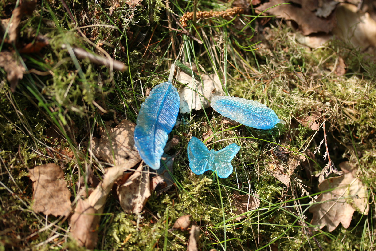
Here’s some trinkets that will probably get incorporated into other pieces. They’re cast in silicone moulds for fondant, so the finish isn’t glossy, but I quite like them.
The Art of Book Design: The Feet


John Lord Peck. Dress and Care of the Feet. New York: Fowler & Wells, 1871 — Source.

The complete title is actually:

Dress and care of the feet : showing their natural perfect shape and construction; their present deformed condition; and how flat-foot, distorted toes, and other defects are to be prevented or corrected : with directions for dressing them elegantly yet comfortably; and hints upon various matters relating to the general subject


Via: The Public Domain Review

Natural Dyes

Since a few years ago, when I read a very intriguing article, Eastertime has become a time for experimentation – for experimenting with natural dyes! For the eggs, obviously.

Now, tradition has it that you use onion skins – gives a nice warm reddish-brown tone, and if you stick little leaves and shoots and spring flowers around the surface of the egg and wrap it in some extra onion skin and gauze (or old pantyhose), you can get some wonderful imprinting and marbling on your egg, in tones of yellow and green.

My original break with tradition occurred about 5 years ago, when I read about red cabbage – apparently, using boiled red cabbage produces a lovely shade of blue, plus you can also do the usual addition of shoots-and-flowers, and also get marbling effects.

It works.

Also with snowdrops and an onionskin direct on the shell. One of this year’s efforts – and boy is it difficult to get some good focus on eggs! © rq, all rights reserved.

That blue tone at the bottom? If you use red cabbage correctly, it gets even more vivid.

However! In subsequent years I have read about other plant-based materials that can be used as dyes: beets (for raspberry red), turmeric (for deep yellow), blueberries (for dark blue/black), etc. This year I decided to experiment a little again, since I have transferred my knowledge of red cabbage to the immediate family, and it’s time to try something new (the blue colour is no longer original once everyone is doing it).

Meet this year’s subjects:

From left to right: curry and chamomile; red cabbage; beets; hibiscus tea; onion skin. © rq, all rights reserved.

To review the results:

  1. I expected more from the turmeric, but this just proves you can’t trust online blog posts raving about the wonderful shades of golden-yellow, even if you follow their instructions word for word;
  2. Red cabbage is both a stable value and also quite versatile with the patterning, adding an onion skin for colour will not ruin the dye;
  3. Beets are fakers – I tried beets a few years ago with similar results but was willing to give them a second chance, but alas, if this is raspberry red, then someone needs to review their colour wheel;
  4. Hibiscus tea is a keeper and shall be repeated because it has a wonderful deep shade of blue-black and also holds up well with patterning for some very interesting colouring;
  5. Onion skins is old reliable onion skins and to ensure at least a few good-looking eggs should be used every year.

A few close-ups:

Hibiscus tea with dandelion and a few other new leaves. © rq, all rights reserved.

Curry and chamomile, plus some directly applied onion skin, which is what provides the brilliant colour; probably will not repeat this shade in future. © rq, all rights reserved.

Raspbery red, tplrplrplr. The applied botanicals is what saves this one. © rq, all rights reserved.

Paired red cabbage with onion skin again – this colour pairing, along with hibiscus with onion skin, are my favourites for the contrasts it provides. © rq, all rights reserved.

Onion skins with new leaves of goutweed and dandelion blossom. Classic. © rq, all rights reserved.

The family portrait: a nice spectrum of naturally produced colours. © rq, all rights reserved.

So there you have it – low effort and high quality coloured eggs from ordinary things you can find in your kitchen (or get for cheap). If I don’t forget, I might do a tutorial post for next year, because the whole process is ridiculously easy.

(Choir Juventus  cover, original here.)

The Art of Book Design: The Dark Way of Love

Le Goffic, Charles,.Dark way of love. Westminster : Archibald constable, 1898

A change of pace for today with a Celtic design from the late 1800’s. The lettering has a handwritten feel to it and I think it’s simplicity works perfectly with the complex, serpentine knots.


via:  worldcat.org, (which is a great site for anyone looking for a specific piece of written work. The site will tell you which libraries carry the book you’re looking for and how far away they are.)