The obvious answer is: “be Afghani.” That implies being in place, having local support (whether coerced, enthusiastic or not) and being indistinguishable from the local population. That’s an approximate recipe for a successful insurgency.
But what if you’re the invader? Then you need a complicated plan. There is a simple plan but it’s unacceptable, and that’s to wipe everyone out. Anything more complex requires: Powerpoint.
“An army,” said Napoleon Bonaparte, “moves on its powerpoint decks.”
Let us begin the lesson with some powerpoints from the US Department of Defense, regarding how to win counter-insurgency operations (COIN) in Afghanistan. In this era of action verbs, we are going to plan dynamically because static planning is bad because Maginot Line and Vietnam.
Next things begin to go awry:
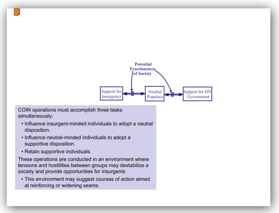
The problem is simple:
- Collect underpants
- ??
- Profit!
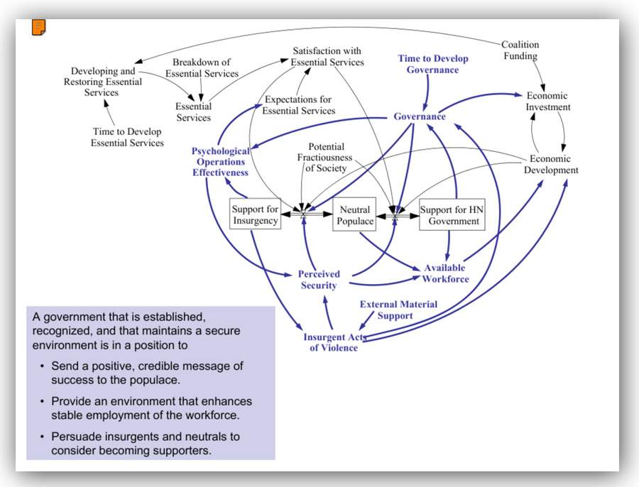
Masters of powerpoint are already familiar with this: too much information gets jammed onto a slide, ineffectively, so the fonts on the bullet points get smaller and smaller. In this slide, the author of the disaster has opted to move the commentary into a separate-colored box in order to confuse the enemy.
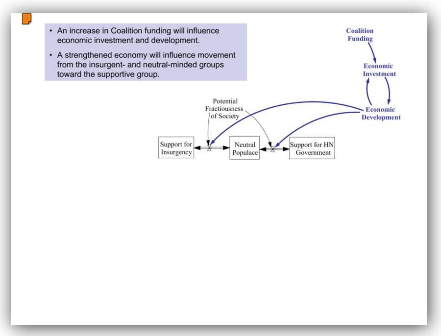
I have a team of experts that has invested 3 weeks in decoding the slide: “if we throw money at them, they will like us.”
Note that that’s the strategy that has been attempted all along. Something is not getting through. There is a horrible similarity to the 8×10 glossy crime-scene photos from Alice’s Restaurant Massacree [bbc] – too many circles and arrows and paragraphs are a warning sign. But the author of this powerpoint deck has decided to demonstrate, conclusively, that the US Department of Defense can write a powerpoint deck like no other.
By now, I’ll excuse you if you think I am just making this up as part of a deception strategy. Perhaps you are thinking that I am a “crisis actor” trying to cause a crisis of confidence in the wisdom of the DoD’s warfighting strategy.
It gets worse.
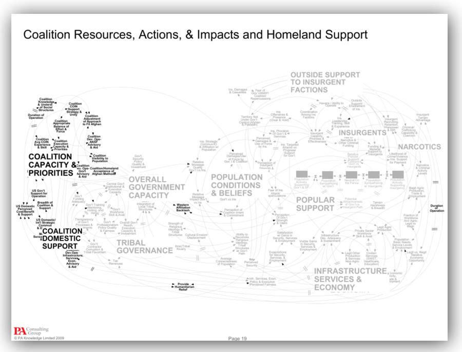
That scene in 1984 where O’Brien breaks Winston – that was not really rats; it was powerpoint. Picture being strapped to a chair with your eyelids held open, while some self-important DoD prat burbles on and on about these slides. The level of detail is high and a lot of explanation is necessary – the audience must be made to understand all the points on every slide. The entire deck is 30 slides long, as this is #19. It can get worse.
Color can be used to convey excess information. This is becoming the F-35 of powerpoint decks – purposeless, expensive, over-powered, unreliable, and overboard.
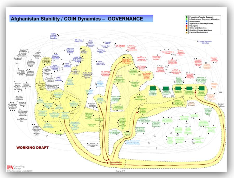
Unfortunately, we are left with a “working draft” conclusion – it does not bring the slide deck down to a soft landing. I was hoping that the final slide would be a blank reading only:
“Questions?”
Note the title of the slide: “Claim the Information Initiative” – I am willing to grant that they have accomplished this. Is that what the giant yellow octopus represents?
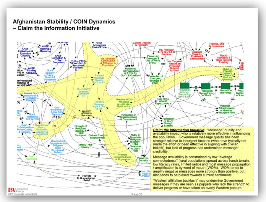
Now I know why Afghanistan is the US’ longest-running war: they haven’t gotten to the end of the powerpoint deck, yet.

Hat tip to Richard Thieme who stumbled across the powerpoint deck in question while investigating DOD powerpoints (I had told him that they were horrible and mind-numbing and then he discovered this monstrousity).
The original deck is here: [oss] in case you need to torture someone.
The Vogons became notorious for their poetry, but that was because they were better at poetry than they were at powerpoint. You should have seen their powerpoint decks.

Well … I now feel *a lot* less bad for my first powerpoint presentations in school and uni!
Don’t forget that PowerPoint is also good for software products!
I’ve seen more than one that ran better on PowerPoint than any other platform.
Seconding what avalus said.
I mean, I’ve seen some bad bad baaaaaad presentations in my time (because when it comes to complex diagrams, tiny tiny statistics charts, long fancy words and workflow charts, the field of DNA and databases can certainly keep up with the … uh… best? of them), but this is an atrocity. Just looking at it reduces my ability to understand anything anyone might be saying about those slides – sure, I can concentrate on that one small section the presenter is explaining right now, but the 50 million other sections are meanwhile distracting the parts of my brain that should be digesting what my ears are hearing. Confusion for everyone!
This was hilarious. I had a good laugh while reading this post. Am I here the only person who perceives these PowerPoint slides as funny rather than headache-inducing? When I see so many arrows pointing everywhere and all that visual complexity and cluster, my brain just shuts off any attempts to decipher the diagram, I don’t even try to read any of the text there. Instead I just stare at the image as if it was some sort of surrealist artwork. These images really look like modern art for me. They are also hilarious, as in “look at how many arrows and lines and colors are there.” Now that I think about it, an artist could create such images as a form of social commentary (what can I say, I really like artworks with social commentary hidden in them). One could hang such an image in an art museum with a comment “look at how silly human attempts at communicating have become.”
In this case, since we are talking about Afghanistan, upon reading the words “throw money at them,” I imagined the most literal possible scenario how money could be “thrown” at somebody, namely I envisioned Americans dropping very expensive bombs on these people.
I’m pretty sure they think AMERICAN EXCEPTIONALISM! is going to let them succeed in Afghanistan where no other imperialist power could.
Off-topic other than ‘weird UI’, but…
I just re-logged-in here yet again, and this time there was a new box that told me to ‘Prove my humanity’ – which, well, that’s definitely assuming some shit, isn’t it? – but it said ’10 + 3 = ‘.
What? I’m pretty sure computers can do math. What about this in ANY WAY ‘proves humanity’?
But being a contrarian, I typed ‘no’ into that field. And it logged me in.
…
Is this broken or is it doing 10-dimensional chess? This is a weird thing to do, guys. DID I prove humanity by bitching at the terrible captcha??
Ieva Skrebele@#4:
One could hang such an image in an art museum with a comment “look at how silly human attempts at communicating have become.”
A powerpoint deck on “how not to communicate” would be pretty funny. Especially if it started out with “1) do not use powerpoint” and “2) do not use twitter”
Again:
“Afghani” – official monetary unit of Afghanistan, worth less than a penny; an insult.
“Afghan” – adj: anything to do with Afghanistan; noun: a native or citizen of Afghanistan.
I can’t help but picture a starfleet bridge with this thing on the main viewer and the captain repeatedly – and with increasing desparation – barking magnify! at their underlings as they all try to make sense of what they’re seeing.
“Captain, it’s a powerpoint unlike any we have ever encountered. It appears to be… fractal!”
Anyway, I looked at the slides but couldn’t concentrate because I kept asking myself: What the heck does the “HN” stand for. I didn’t even notice that it plops up as “Host Nation” in some random place and point in the presentation. How very helpful.
I also note that hosts generally invite someone in and that it does not anywhere (I think) mention a “democratic” government. Judging by the rest of the diagrams these aren’t intended as lies but just the usual military vocabulary of half-lies. C.f.: “collateral damage” – we didn’t look where we were shooting, “breakdown of essential services” – perhaps we should have looked, and my new favourite, “Potential Fractiousness of Society” – People might be angry and upset for some reason.
Oh, a suggestion for future powerpoints: Make every other slide a tactical plan and / or flow chart that tells the audience how to read the developing diagrams. I feel directions are needed here.
P.S.: You could turn some of these slides into a magnificent gif!* (e.g. 2-7) It would add so much unclarity if you just had that thing cycling and growing (metastasizing?) on screen. Call it the “evolving strategem” or something similarly buzz-wordy and you’ll no doubt score big with the attending brass.
*Great Scott, that would make it a tactical gif! A tactical powerpoint gif!!! *runs for cover*
Isn’t it a pdf rather than a PowerPoint?
Also, I don’t like having seven lines on a single slide, and that’s the whole slide.
So Afghanistan is the casino of the Middle East? The best way to win is to be the house.
komarov @9:
Powerpoint is a presentation tool: it’s content is supposed to be an aid to a presenter doing a presentation, not the presentation itself.
(You’re doing the equivalent of looking at the citations to a paper and complaining they don’t in themselves inform you of the paper’s thesis)
—
colinday:
“a PowerPoint”? <snicker>
(Also, Portable Document Format is file format for encapsulating something that is displayable by any application or device that supports it. Quite clever, though I hated it early on for its horrible implementations and even now because it lacks reflow)
PS https://www.youtube.com/watch?v=MjcO2ExtHso
(Life After Death by PowerPoint (Corporate Comedy Video), Don McMillan)
Does the mess of lines and nodes eventually coalesce into an accurate relief map of Afghanistan, showing troop movements in real time?
Those five green boxes must be deployments in and around Kabul, and operation “Reconciliation Effectiveness” must be an insurgency into Kandahar in the south.
What we are looking at is a brilliant piece of misdirection, hiding US disposition maps in plain sight!
komarov @9:
Not necessarily. When a parasite infests another organism, that organism is typically referred to as the “host”.
@ John Morales
#11
Yes, but it’s easy to generate pdf from LaTeX. I use it in places where reflow doesn’t matter.
I recommend Edward Tufte’s essay, “The Cognitive Style of PowerPoint”, available as a pamphlet or e-book and well worth the price IMO. A sample chapter is available here, though rather annoyingly presented as images of the printed document rather than text. Tufte may be proud of his typographic skills (as anyone who’s read his books will attest, they’re always beautifully printed and laid out) but there are limits! The chapter in question covers the analysis of the foam strike during the launch of the Shuttle Colombia that led to the loss of the orbiter and the death of its crew, and how the use of PowerPoint during the risk-assessment may have contributed to the disaster.
colinday@#10:
Isn’t it a pdf rather than a PowerPoint?
It’s a PDF of a powerpoint. Don’t get lost in the details.
Cat Mara@#16:
I recommend Edward Tufte’s essay, “The Cognitive Style of PowerPoint”, available as a pamphlet or e-book and well worth the price IMO.
I’ll second that, with the note that David Byrne has also done some good work to rehabilitate PowerPoint as a delivery vehicle for art.
I’ve been a PowerPoint power user since Powerpoint V1.0, and it has been an important part of my life. So I may be biased. I always regretted turning in my C compiler for Powerpoint…
I have hated PowerPoint for years. Whenever I needed to make a presentation for university, I created all the slides in CorelDRAW, then I exported them as images and inserted into blank PowerPoint pages. Doing graphic design, even simple one, in PowerPoint is incredibly frustrating. The real graphic design software is so much nicer to use.
Re: John Morales (#11):
True, but in this case I’d like to know just how long it took the presenter to explain their slides. Or how long a Q&A session at the end might have taken, for that matter. The only realistic way to really untangle those diagrams is to already know what’s there, rendeing a presentation pretty much useless.
Re: konrad_arflane (#14):
Good point. Somehow it didn’t occur to me to consider parasites while looking at US occupoation plans. It’s a silly mistake to make.
Ieva Skrebele@#19:
I used to know an art director for a major marketing firm, who did all his material in photoshop. He was so fast with photoshop that it was quicker for him to throw everything away and start over on each revision, rather than use a tool with style-sheets.
komarov@#20:
The only realistic way to really untangle those diagrams is to already know what’s there,
“OH MY GOD IT LOOKS LIKE A CLUSTERFUCK!”
In other words it exactly encapsulates US strategy in Afghanistan.
Marcus Ranum @ 18:
I used PowerPoint 1.0x too– do you remember it had a feature where you could pick a foreground colour, background color and accent colour for your slides and it would generate a set of palettes of complementary colours for you to use? It was a genuinely useful feature that avoided the “angry fruit salad” kind of presentation you see so often but it seemed to vanish in later versions, pushed out by (IMHO) utterly useless flab
Cat Mara – my laptop at the time had a grayscale display! I didn’t rate color, I was a presales dweeb.