
Leonard Russell, The Saturday Book no. 11, 1951. Cover by Joan Hassall – source
Because it’s Saturday, of course.
From: Pinterest.ca
Leonard Russell, The Saturday Book no. 11, 1951. Cover by Joan Hassall – source
Because it’s Saturday, of course.
From: Pinterest.ca
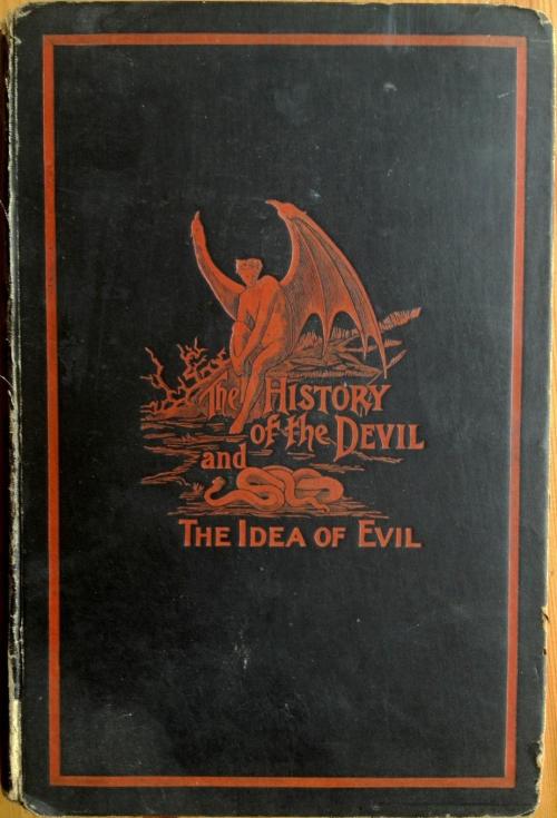
The History of the Devil and the Idea of Evil; from the earliest times to the present day. Paul Carus, Chicago: The Open Court Publishing Company, 1900- Source
A devilish design today done in flame red on matte black replete with a bat-winged demon (who’s looking very contemplative) and a seductive snake.
From: Pinterest.co.UK

Evie Wild. All The Birds, Singing: Penguin Random House., 2014. Cover design by Joan Wong
A change of pace for today as we look at something modern. The cover design of this book is in such stark contrast to the cheerful title that it makes me want to pick it up.

Edward J. Goodman. Too Curious. London; Guildford: Bentley & Son, 1888 — Source.
Simple. Elegant. Effective.
From: The Public Domain Review, The Art of Book Covers (1820 – 1914)

E. A. Bowles. My Garden in Spring. London: T. C. & E. C. Jack, 1914 — Source. Cover design by Katherine Cameron
I love books. Real books with real paper are a treat for the senses. I love the way they feel in my hand, the way they smell and the way they catch my eye. That last bit, the eye-catching, is what this new series is all about; the art of designing striking books that make you stop and take a closer look. My original interest in starting this series came from The Public Domain Review and I’ll be pulling from their collections and lots of other sources. Every day you’ll get a beautiful book to admire. Many will be old, but not all. There will be a lot of art nouveau because I like art nouveau, but I’ll try to change it up and keep it interesting. I’m also willing to feature any book you might want to share as long as it’s beautiful and eyecatching. Send any of your suggestions to me at affinitysubmissions@gmail.com. The address is always in the sidebar.
Our Book today is in celebration of Spring. The art nouveau design is by Katherine Cameron and together with E.A. Bowles they created a series of garden books. If you click on the link below you can also find the covers for My garden in Autumn and Winter and My garden in Summer. Together they make a beautiful set.
From: My Beautiful Book Finds
Opus has sent us another colourful treat. This time it’s shoes and they are wonderful. It’s no secret that I love shoes, but I could never hope to have shoes quite this wonderful. They’re bright, bold and such interesting designs. Opus says,
More pictures, this time from Reykjavik. Shooting through glass is tough, but I think they worked out well. More of the sights that one sees when traveling with fabric artists. I might never have noticed if not for them.
Well, Opus, I think traveling with fabric artists is definitely a good thing, but your camera skills are what makes it all come alive in photos. Thanks so much for sharing.

©Opus, all rights reserved
I don’t think I would have the patience or the dexterity to do this type of art, but Kestrel has it in spades. She’s sent us a gorgeous example of the horsehair braiding that she does and I’m in awe. Thanks so much for sharing, Kestrel.
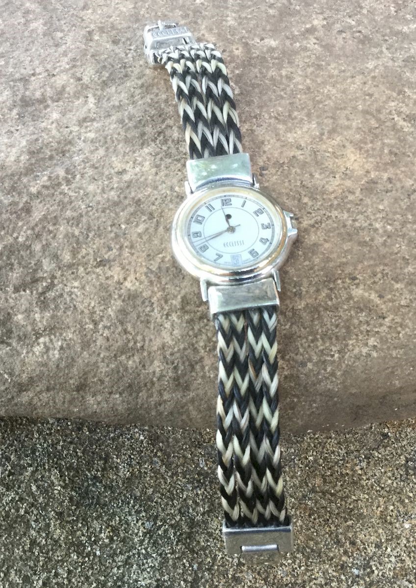
Years ago a lady had me braid a horsehair bracelet for her from her horse. She told me she was really having trouble with a watch that she truly loved: an Ecclissi watch that was just simply falling apart. She told me she had bought it over 30 years ago but loved to wear it. This is how it started out:

©kestrel, all rights reserved
You can see the chains were falling apart. The lady asked me if I could possibly repair it with braided horsehair. She said she would really like it if it looked like twill. I set to work counting hair and working out how to perform this repair.

©kestrel, all rights reserved
The finished watch had 4 bands of 8-strand braiding on each side of the watch. Because I used two different colors I got the twill effect.
©kestrel, all rights reserved
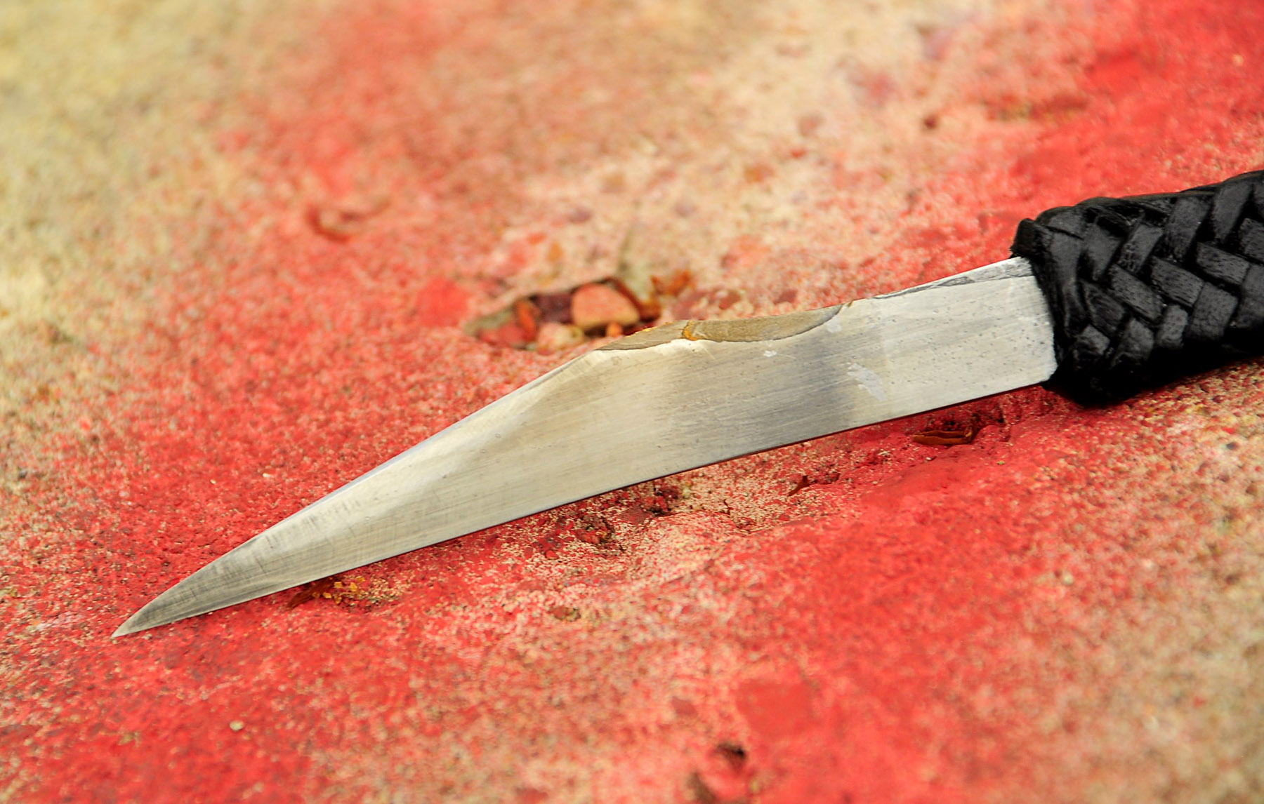
An amazing gift, from Marcus & Kestrel, who collaborated on this little slice of perfection. It wouldn’t be perfection to some one else, but it is to me – absolutely gorgeous, fantastically sharp, my favourite colours in that magnificent braiding, giving a wonderful grip, and the beauty of the blade. Fits my hand perfectly, and is properly sharp and lethal. Honestly, I was speechless when I opened this up, and I still just babble about it. I will cherish this, always. I couldn’t possibly come up with enough of a thank you to you both for your work, especially such finely done and thoughtful work. Thank you, thank you, thank you. She definitely needs to be named, but I have to spend more time with her to find what’s right.
Clickety for full size.


© C. Ford, all rights reserved.
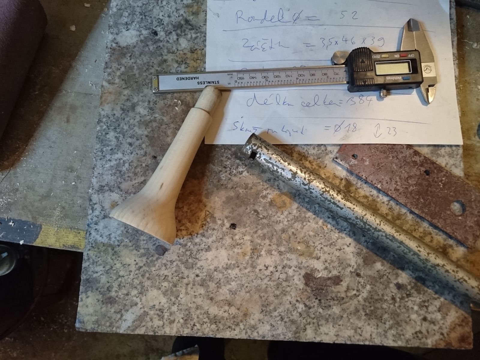 Whilst the blade was the most time-consuming part, in a project like this there is still a lot of metalwork to be done. Once the handle is turned, next step is to make a bolster and a guard, and fit all these four parts together. Precision is important here. Not precision as in adhering to measurements from a drawing, but precision of how the parts fit together. I have made myself a set of measurement from the game 3D model that I aim to get near to, but I will not fuss about getting them exactly.
The bolster I have made from a piece of pipe of unknown origin that has almost the exact diameter that I actually want to have. It is also completely free of rust, which has made me suspicious whether it is not stainless steel. No matter, I have simply cut off a piece and polished it.
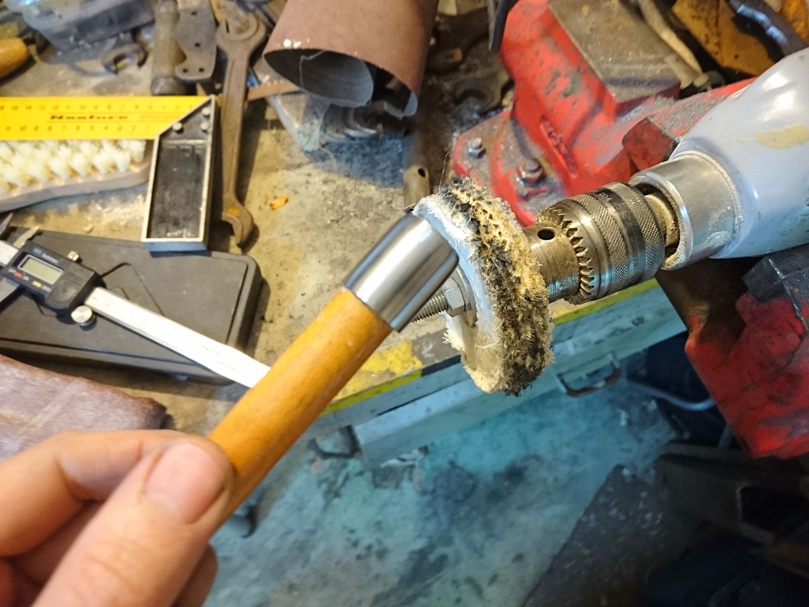 I did not polish it on the belt grinder all the way through the finest belts, but I stopped at around Trizact A16 and I went straight tot he buffer after that. Only I did not use the felt wheel straightaway, but a coarse sisal one with coarse polishing paste, then a felt wheel with medium polishing paste, then felt with fine polishing paste and finally felt wheel with jeweler’s rouge.
In order to be able to work with the piece on the buffer safely I have hammered it on a round dowel. During the polishing I took care to turn it in different angles against the wheel in order to get slightly satin surface – buffing in one direction only makes mirror polish and I did not want that.
 The bolster is not completely round, but very slightly oval. I wanted to be able to feel the edge alignment of the dagger when held in bare hand. To further help with this I have also filed a fine grid of grooves on each side of the bolster. With that done, I could affix it to the handle. For that I have coated the relevant part with hot hide glue, stuck the bolster on there and hammered a few wooden splinters between the bolster and the handle to center it properly and to hold it in place.
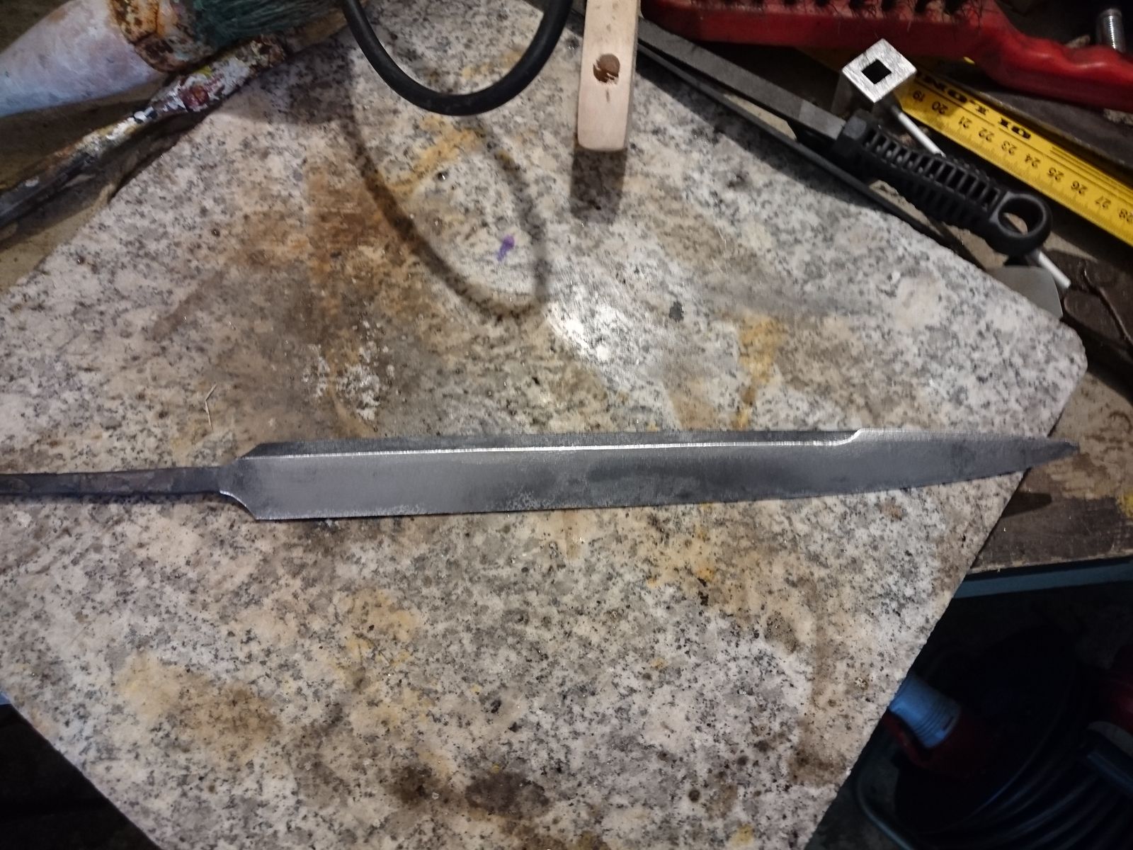
With that done I had to shape the tang on the belt grinder so it was continuously ever so slightly smaller than the blade and square the shoulders (those were round prior to hardening because a sharp edge could lead to the tang breaking of in quench). To protect it from scratches I have covered the whole blade with masking tape. When the tang was shaped, I have affixed the blade in the vice with additional protection of a wet rug, and I shaped the hole in the handle to fit by the previously shown burning technique. I had to be careful for the heat to not overheat the blade base, but to be hot far enough to get a fit where the bolster was mere 3 mm from it.
 Next piece in this jigsaw was the guard. I wanted that to be between 3 to 3,5 mm thick, but I had no suitable piece of steel that was not pitted too much. In the end I had to cut a piece of a structural steel V profile that was way too thick. I have spent rather more time on truing it and grinding it down to desired thickness than I wished to. Unlike for the bolster, I had no good and comfortable way to hold on that small flat piece of steel safely, so I nearly ground my finger tips off. Luckily only fingernails got slightly chewed and I have learned how to do this safely later on, when I was polishing it. I have to finish the supporting table for my belt grinder in order to do these finicky things.
 When ground to slightly above the desired thickness, I have punched the centre and drawn the design of the guard. I like to make my own tools, and I have indeed made my drawing needle, but I wimped out and bought the compass. The work required to make it might be fun, but it would be way too much time that would definitively be spent better elsewhere.
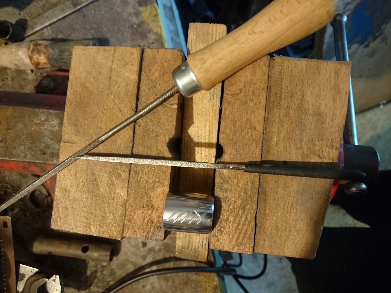
Next step I have just drilled a 4 mm hole in the center, 0,5 mm smaller than the maximum width of the tang at the blade base. In order to transfer the outline of the blade base onto the steel I have poked a hole with the tang into a piece of paper – Lipton tea box was the right thickness and firmness.
 Cutting the hole for the tang I have done with a fret saw. In the past I broke a lot of blades whilst doing this, but it seems I have finally learned how to do it properly this time. I broke none and it was done in lickety-split. Note the aluminium covers for the vice jaws. These are important, because I need the piece to be held firmly and safely, but I do not wish the hardened jaws of the vice damage the soft steel of the worked piece.
After cutting the rough outline of the hole came of course the most difficult part – fitting and shaping the hole to fit the tang precisely. This took the better part of an hour with fine and diamond files, and another hour or so the final shaping and polishing of the piece to the same finish as the bolster.
 Here you can see the face of the guard. The other side, facing the hand, has rounded edges. I was thinking about doing that, then I was thinking about doing both sides flat and in the end I had no choice because before I figured out how to polish it properly, my hand slipped and I chamfered an edge that I did not want to chamfer. I was lucky – the result is comfortable even against bare hand and it looks good. I might however take some more time for polishing this piece. A few hand courses with coarse hematite might be needed, right now it shines a bit like a bare arse among the bushes.
Here you can see the parts assembled. Of course there is a lot of masking tape covering all the bits that I do not want to get dirty or scratched, and most of the focus is on the mess that is my workbench. But you would not expect me to show you pretty pictures at this stage, would you?
I received another care package, full of wonderful, from Giliell. I love everything, and I am so very thankful. I have the best friends on the planet. The bookmark was put to use immediately, and shortly after that, the bag filled with all the essentials, and I can’t say how much I appreciate that one! I love the embroidery and the fabric, but it’s especially nice because it holds all the important stuff, and I don’t have to haul a purse around everywhere. I used the creme right away too, it’s lovely, and the scent is fine. Thank you so much, Giliell!
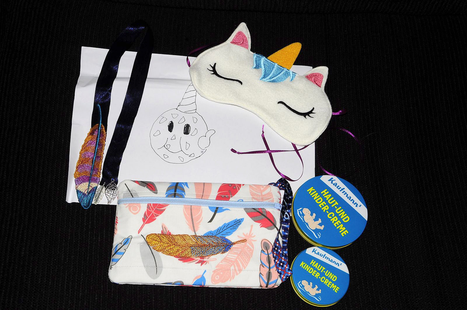
A gorgeous bookmark, a sleep mask, small bag, cream, and my very own Cookie Corn. :D

Packed with the essentials, ready to go.
I got distracted. Again. Seems my brain has been having a bit of a vacation too, I’ve been quite the space case lately. Anyroad, came upon these um, attachments? Extensions? Falls? (Does anyone else remember falls?) I’d love to have some of these done with my hair, if it ever achieves thickness again. These are from 1840. Click for full size!

The logo for “Be Best” allegedly designed by Melania Trump herself (image courtesy the White House).
As logos go, we’ve all certainly seen better. Much better. This is astonishingly simplistic, with minimal attraction to it. There’s no bite, nothing to sink teeth and tongue into at all. Mrs. Trump wanted something which would appeal to children, but my first thought was that sprogs of all ages would simply dismiss this as vague and boring. This, um, logo, brand, whatever it is wouldn’t have taken 5 minutes in photoshop. You could simply go to DaFont,* type in “Be Best” and look at it in thousands of different fonts, and you’d probably come up with something better.
Graphic designers the world over probably groaned at the news that First Lady of the United States Melania Trump designed the logo for her new “Be Best” initiative, which New York Times journalist Julie Davis reports came about because the First Lady likes “clean lines” and “wanted something that would appeal to children.”
The logo is part of a campaign aimed at “encouraging children to BE BEST in their individual paths, while also teaching them the importance of social, emotional, and physical health.” Cue eye roll.
[…]
Let’s remember that FLOTUS has an originality problem, so it seems only fitting that the Be Best pamphlet is an almost exact copy of a document published by the Federal Trade Commission in January 2014 — h/t @RMac18. Of course, this isn’t the first time she’s cribbed from the Obama administration, or even the second. Perhaps we’ll soon discover that she copied this logo, too.
lmao… the White House/Melania Trump Be Best pamphlet about your kids being online is almost the exact same thing that the FTC published in Jan. 2014:
2014: https://t.co/s14hU9e6Cc
2018: https://t.co/dNas3LM8UP pic.twitter.com/WJTobZAPC1
— Ryan Mac (@RMac18) May 7, 2018
You can read more at Hyperallergic, and vote in their poll about “Be Best”.
*I went back to DaFont, switched to cartoon fonts, and decided on Good Morning by imagex. I am in no way a graphic artist, and have zero skills in that regard, but a few minutes mousing in photoshop resulted in this:

I know which one would have attracted my attention as a sprog.

Pepper saying hello to staff at the Smithsonian Castle. (all photos courtesy Smithsonian).
The next time you visit a Smithsonian museum, the first greeting you get may come from a gleaming, four-foot-tall android extending their hand. This would be Pepper, one of 25 humanoid robots that were introduced two days ago to six Smithsonian spaces, from the Hirshhorn Museum to the National Museum of African American History and Culture. Donated by their engineers at Softbank Robotics, the platoon of Peppers is intended to enhance the visitor experience and ensure that daily operations run smoothly.
Pepper, which was designed to interact with humans, is the first bot capable of recognizing our emotions. These models already work in an array of industries around the world, serving as receptionists in Belgian hospitals and even as priests in Japan that lead funerary rituals. While the robot has been on display in museums, the Smithsonian now represents the first museum complex to actually use these wide-eyed automata for their services.
“We see them as a new tool for the docents to use, especially since they are always paired with a person,” a spokesperson for Smithsonian told Hyperallergic, noting that the Peppers are “absolutely not replacing docents.”
Softbank Robotics donated the Peppers for an experimental, pilot program intended to help the Smithsonian solve problems, from boosting visitorship to “under-attended galleries” and encouraging greater engagement with artworks. While the robots can provide helpful information by answering commonly asked questions, they can also indulge in more lighthearted activities for which human docents do not always have the time (or patience); visitors can ask Pepper to dance, play games, and even pose for a selfie. While the robots currently do not have captioned speech, the Smithsonian said that it is working to caption images that appear on their screens and “will continue with our software partners to make Pepper as accessible as possible.”
Very cool! I’d like to meet Pepper. You can read and see much more at Hyperallergic.