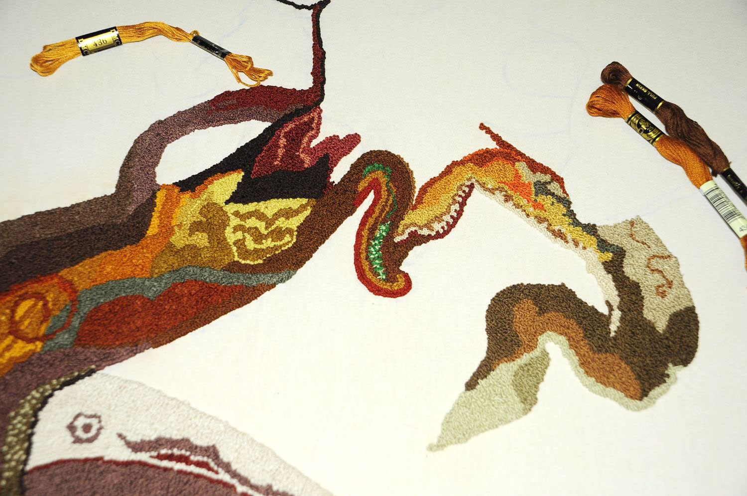
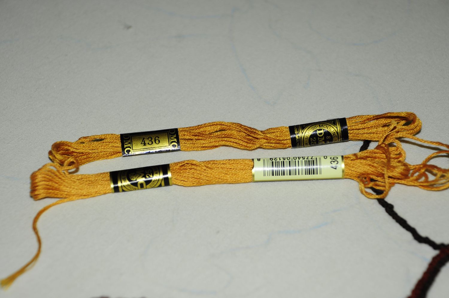
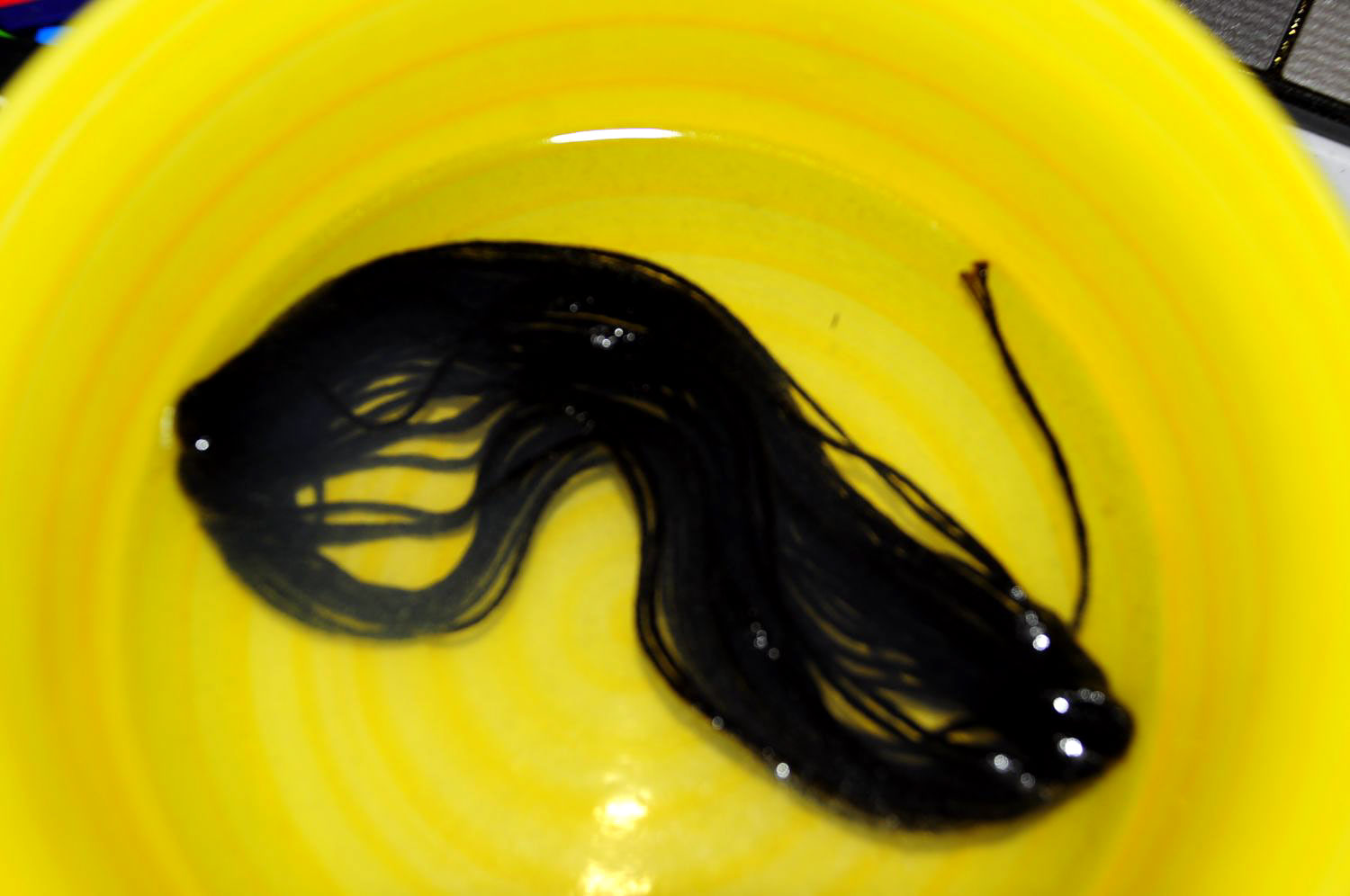
National Parks: WPA to 2050.

What America’s National Parks will look like by 2050 if we fail to act against climate change.

Hannah Rothstein has taken some of the iconic WPA (Works Progress Administration) National Parks Posters, from 1938 to 1941, and updated them to 2050 and a catastrophic future if we do not act on climate change. It’s a striking and effective way to get the message across, because the art and legacy of these posters is so well known, and they are beloved by many people. The WPA posters were a message and invitation to weary, beaten down people dealing with the Depression, that there were wonders, come and see! They were a promise of hope, of a better future. Now we have too many people who are actively denying climate change, or apathetic about it, little realizing that yes, it will most certainly impact them, and not in a good way. These re-worked posters are as brilliant as the originals, reminding people that if we choose to not act, we are inviting the harbingers of doom. These are a call to action, and I hope they start popping up all over the place.

You can see all of the posters, and purchase an original or fine art print here.

Via Raw Story.

Art, Illness, and An iPad.

Three Dotty Foxes in the Pines.

The textural, nuanced scenes of brightly colored, frolicking creatures look collaged out of paper or brushed onto canvas, but in actuality, Michèle Brown paints with pixels on an iPad. A former art teacher and typography-trained artist who worked in fine art for most of her adult career, Brown was forced to pivot her professional and artistic goals due to an unexpected change in her health.

“I had to stop working because of a long-term illness,” Brown tells Creators, “which only allows me to be out of bed for about five hours a day. When the iPhone came out, I started playing and drawing on it while I was bed bound, and really got into it when the iPad first came out. I have tried all sorts of styles with it, but it really seems to suit my illustrative and imaginative side.”

Brown’s scenes evoke children’s book visuals are defined by an earth-toned texture and warmth. Her individual artworks often include imagery of wide-eyed animals that slice together large swaths of color, coming together in a scene that mimics a paper mâché or acrylic piece, but in reality, is a work of tablet and iPhone artistry. Brown’s fine art offerings are similarly immersive. Less amiable and imbued with their own unique texture, the artist’s fine art works possess a different lexicon of shape and form. Based in Cornwall, the British artist grew up both in France and the UK and has honed her bilingual skills and understanding of both cultures.

“I’ve created an imaginary world which I call Spottyland because of one of the first characters to come out of it, Spotty the fox. Nothing awful happens in Spottyland; the animals can be a bit naughty, but they are all vegetarian and underneath they have hearts of gold. Humor is a big part of what I do. I’ve been influenced by cartoon strips and dreadful puns, but only if it is kind. I like to make people smile and bring a bit of lightly mischievous harmony to the world. It is a place of safe retreat in an increasingly uncertain world.”

You can see and read more at The Creators Project. To see more works by Michèle Brown, visit her main Instagram, as well as Spotty the Fox’s website, and Brown’s fine art Instagram.

The Hague Goes Mondriaan.

WHO’S AFRAID OF RED, YELLOW AND BLUE: Citydressing Campaign / Mondriaan to Dutch Design / The Haque (NL)  2017.

THE CITY AS CANVAS
Dutch art movement De Stijl was founded one hundred years ago this year. Inspired by Stijl artist like Piet Mondriaan, Bart van der Leck, Gerrit Rietveld and Theo van Doesburg, studio VOLLAERSZWART developed this citydressing campaign to “Mondriaanising” The Hague.

FREESTYLE
To start the citydressing for the celebration of the theme year “Mondriaan To Dutch Design, The Hague unveiled the largest Mondriaan in the world. The painting with the familiar red, yellow and blue surfaces and straight lines is being exhibited in one of the city’s most striking buildings: City Hall. A unique composition, precisely because of the combination of Mondriaan’s work and the iconic architecture of architect Richard Meier. The Hague City Council decided to honour the world renowned artist, as Gemeentemuseum The Hague has no less than 300 of his paintings in its possession. The design was created by artists Madje Vollaers and Pascal Zwart of Studio VOLLAERSZWART. Last weeks, a number of prominent buildings and locations in The Hague got a Mondriaan / De Stijl makeover.

Special Thanks to: Gemeentemuseum The Hague, Municipality The Hague, The Hague Citymarketing and Cubord Signmakers.

What an amazing celebration! I love all of it. There’s much more to see at the website!

Happy Ēostre Day!

“Ostara” (1901) by Johannes Gehrts.

Eostur-monath, qui nunc Paschalis mensis interpretatur, quondam a Dea illorum quæ Eostre vocabatur, et cui in illo festa celebrabant nomen habuit: a cujus nomine nunc Paschale tempus cognominant, consueto antiquæ observationis vocabulo gaudia novæ solemnitatis vocantes.

Eosturmonath has a name which is now translated “Paschal month”, and which was once called after a goddess of theirs named Eostre, in whose honour feasts were celebrated in that month. Now they designate that Paschal season by her name, calling the joys of the new rite by the time-honoured name of the old observance. – Bede, in De temporum ratione.

Don’t know about you, but Ēostre has smiled upon me, the sun is shining today! Hope everyone has a lovely day, and remember, Jesus is mything in action!

Descent of Night.

Descent of Night. A very hurried shot, rain still threatens. Now, all I need are some trifolds and good weather to get a good shot. Click for full size.

Descent of Night, acrylic and ball point pen on gesso panel, 18″ x 24″. © C. Ford, all rights reserved.

The Amazing World of AMKK!

Azuma Mokoto and Shiinuke Shunsuke.

Need to brighten up your universe and recapture a sense of wonder, delight, and glee? Look no further than AMKK, a world of intense, joyful artistry and botany. They are featured on The Creators Project, where you can see so much, and read all about these magical artists, then you can go and wander over to their website, and get absolutely lost in the most amazing, oh, well, just have a wander, it will do your non-existent soul so much good!

Picasso in 3D.

I confess, I’ve never been enamored of Picasso, most of his works leave me indifferent. When it comes to his works being translated, that changes, and I like his work much more after it has been run through the mind and hands of designer Omar Aqil.

In this self-initiated project by designer Omar Aqil, Pablo Picasso’s painted masterpieces get a 3-dimensional makeover. using cinema 4D-ray, photoshop, and illustrator, the Pakistan-based creative re-imagined six of picasso’s figurative works as contemporary 3D graphics. titled ‘Mimic’, the series of visual experiments offers an alternative interpretation of some of the world’s most famous artworks.

Head over to design boom to read and see more!

Bull vs Girl.

Arturo Di Modica holds a model of his Charging Bull sculpture during a news conference Wednesday, April 12, 2017, in New York. CREDIT: AP Photo/Craig Ruttle.

The artist of the Charging Bull sculpture wants the ‘fearless girl’ removed, and so do I.

At a press conference on Wednesday, Di Modica’s attorney Norman Siegel argued that Fearless Girl infringes on Di Modica’s artistic copyright by “changing the creative dynamic” of his original work and ask that it be removed and placed elsewhere in the city:

“Very simply, we request, respectfully, that the Fearless Girl statue be removed. We’re not asking it to be banned… Gender equality is a very serious, substantial issue. It’s permeated throughout our society. For years, civil rights people have fought for gender equality… So that’s a real issue. None of us here today are in any way not proponents of gender equality. But there are issues of copyright and trademark that needed to be and still need to be addressed. So, remove her and place her somewhere else in the city.”

[…]

Fearless Girl is cloying, corporate feminism sponsored by a company that only has three women on its fourteen person board of directors. Only 28 percent of State Street’s senior vice-presidents are women, as are a measly 23 percent of executive vice-presidents. In defense of those stats, the company’s head of public relations told the Huffington Post that those numbers are “better than zero.” Can’t argue with that kind of logic. Who says women are bad at math?

So Fearless Girl is a cutesy signifier that signifies nothing, an accessory for selfies. She doesn’t challenge any preconceived notions about what girls can do or be; girls have long worn skirts and ponytails and played outside. Fearless girls are adored and celebrated in literature, popular culture, and life. It’s once girls become women that all their ambition scans as irritating instead of spunky, as off-putting instead of endearing. The same society that roots for ambition in girls is one that that socially, professionally, and politically punishes ambition in the women those girls will become. It’s women, not girls, who have pesky needs and opinions and goals and sex drives and reproductive organs that make their ambition too problematic to accept.

Oh, I could not possibly agree more. That girl irritated the hell out of me from the start. What, exactly is radical about a young girl in a dress? The image itself is stock straight out of the 1950s, ponytail and flared skirt. Might as well have done her up in a poodle skirt. That aside, my major problem with it was that it was a girl. The protests, the marches, they were about women. Adult women, who in the United States, are still treated as barely above chattel, and who every single day, face a fight over their right to live with the full rights accorded to men. Do we have bodily autonomy? No. Are we paid equal wages? No. Is violence against women taken seriously? No. Is there widespread parental leave and accommodation? No. Are male parents treated the same as female parents? No. Is harassment taken seriously? No. And on it goes. You can idealize girls all you like, you can tell girls they can do anything they like, but what is the point of that when they run smack into the reality of being a woman? And what about the actual reality of growing up girl? It’s not all sweet, rosy, and flying high with ambition as represented. Young girls hit the wall of rooted misogyny very early. Just ask any parent. Parents of boys are just as challenged, as they watch their sons absorbing deep rooted toxic sexism and toxic masculinity. It’s a constant fight, and it’s not one which will get any easier unless we tackle these issues head on, clear-eyed, with a focus on reality.

I don’t really care why the “fearless” girl is removed, as long as she is, and I do take Mr. Di Modica’s point. His art work should not have to suffer at the whim of a piece of marketing fluff straight out of the 1950s. Go away, fearless girl. Give me a call when you’re all grown up.

Full story at Think Progress.

Flight Pattern.

A ballet about the plight of refugees, commissioned for the Royal Opera House, has been showered with five star reviews and described with words like potent and sombre. It’s the work of the Canadian Crystal Pite who has built a reputation as one of the most respected choreographers of her generation – and who is the first woman to have created a new work for the Royal Ballet in almost two decades. It’s titled ‘Flight Pattern’ and Kirsty Wark went to speak to her about using dance to engage in a difficult harrowing subject.

Beautiful and so very poignant. I wish I could see this in person.