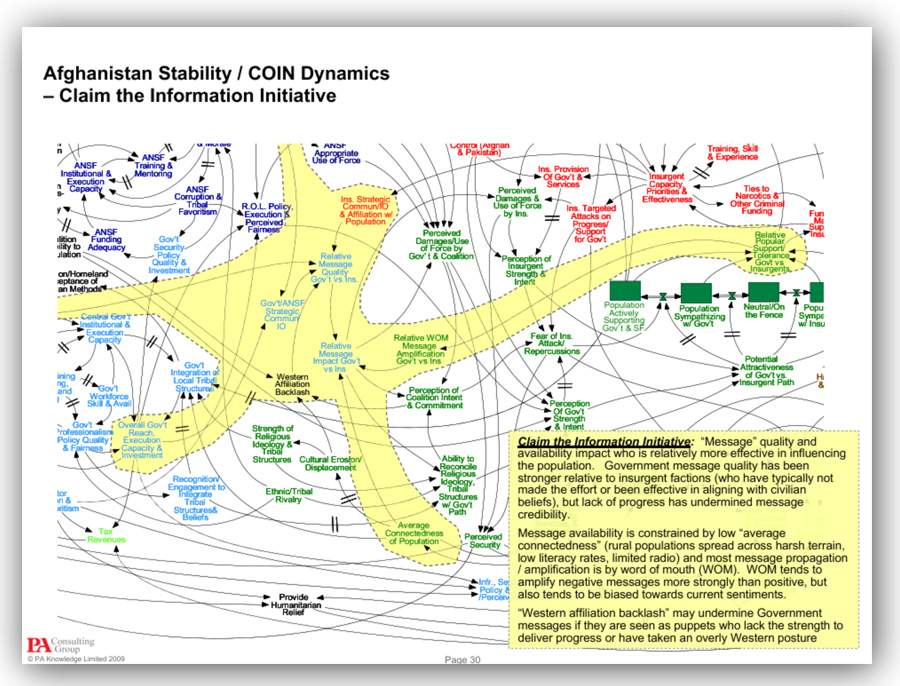
Back in the day, I was subjected to some military powerpoint briefings. Those were CIA and NSA briefings and were generally better written than Army or Air Force Briefings.
That does not mean that they did not suck. [stderr]
Powerpoint is a morally neutral tool: it can be used to enlighten or endarken; you can have great slides or terrible ones; you can use it to argue in favor of bad ideas or great ones. You can have readable slides, or absolutely cryptic ones.
I was a Powerpoint 1.0 “power user” – when I started at Digital in the 80s, the state of the art was to take viewgraph foils (sheets of plastic) and a magic marker, and carefully write your presentation on the plastic, which was then projected using an overhead projector. In my first year at Digital, they had a program where all the presales staff got a laptop (a great ugly slab-sided thing with 1Mb of memory!) and software keys to Digital’s Windows software archive. That included Photoshop and Powerpoint and Visual Basic – all three of which I immediately set out to master. If you want an interesting tipsy debate with Marcus, sometime, let’s argue as to whether Powerpoint, Excel, or Photoshop are the greatest pieces of software ever written.
If I recall, at the time, I had to find Microsoft design documents and do a bunch of digging in the file tree, in order to figure out how to make template files. At that time, it was not as easy as it is now (“Save as template”) – but I managed to produce some fairly plausible document layouts and an official template with the Digital logo in the correct place, in the correct font, etc. Suddenly, a lot of people were using my template and I owned the template until Marketing came stomping up and said “that is our domain!” and grabbed it. Soon afterward, it was getting more complicated and ugly and I had a great belly-laugh every time I was told to switch my presentations to the new template. Since then, I have had related experiences: I used to consult for one conference that had an official template that was all messed up and arranged a call with the marketing team to give them a quick 1-hour lecture on how Powerpoint works inside. For example, you may not know this, but Powerpoint can be set up so that slides adopt a particular look based on what slides they come behind; you can also lock elements like logos and page numbers so that people don’t accidentally delete them or nudge them onto the edge of the page.
Powerpoint, in other words, is not just a presentation tool: it’s a tool for organizing how you present your own thoughts. That forces you to think, ideally, about how you want to order your points and clarify them. Unless you work for the military, that is. I should mention in passing that being a “powerpoint consultant” is a thing; there are graphic designers who specialize in taking crappy pitch decks from venture capitalists and turning them into zingy, dynamic, incomprehensible pitch decks.
So, imagine how happy I am to learn that there is a Powerpoint World Championship! [slate]
Last week, Seth Maddox, a recent high school graduate from Geraldine, Alabama (population: 900), won the Microsoft PowerPoint World Championship.
The competition was straightforward: Students were tasked with quickly recreating a printed-out presentation. (Separate tests were held for Excel, Word, and an older version of PowerPoint.) Maddox was the only American to win an event at the championships, beating 850,000 students from 119 countries over the course of the state, national, and world rounds. He emerged with $10,000 in prize money, a laptop, a trophy, and a very niche kind of bragging rights.
$10,000 is chump change. That’s what one of the aforementioned Powerpoint consultants can make from a venture capitalist in an afternoon. I hope Seth does better.
Take us back to the beginning. How did you get into this competition?
I was in class, and [my teacher] was doing certifications for showing that you are proficient and know how to use the various Microsoft Office products. And so I took the Microsoft PowerPoint 2016 certification test. I didn’t even know this competition existed.
Powerpoint 1.0 was a lot tighter than Powerpoint 2016. I still have trouble finding things in the current version of office, because the menus have become so bloated with the unnecessary. Good for Seth; he must have a remarkable memory for places! [I believe that learning application menus is a skill based on our ability to remember places]
How did you prepare for the world competition?
I would just create a PowerPoint, and I would start typing stuff into it, and then just kind of start clicking buttons to try to find stuff I never found before. In total since I started preparing for the national championship, it’s probably close to 24 to 30 hours [of practice].
Back in 1996 I contracted with Arthur Andersen to do a 3-day course on UNIX system security auditing. It covered everything from system lockdown, basic UNIX, penetration audit, log analysis, etc. There were hands-on exercises, screenshots, the whole bit. To produce 3 days of slides, it took me a week – which was good, because I had a week and 3 days to get to Downer’s Grove outside of Chicago and present the class. I’m not trying to diss Seth but if he thinks 24 to 30 hours in Powerpoint constitutes “practice” then he does not know what the rocky path to Powerpoint nirvana takes.
Why do you think you were so good at it in the first place?
[I took] a multimedia design class, so we did a lot of work with PowerPoint. And for a little bit, I had been creating lyrics for my church for their Wednesday night worship service, so we used it for that. I’m also the kind of guy who plays with stuff and tries to learn how to use it.
I would like to ask Seth if he knows about outline mode. I believe that Microsoft has not yet screwed up Powerpoint so badly as to take outline mode out of the software; in fact Microsoft’s strategy appears to be treating Powerpoint as “append-only” software: features get added and never re-assessed or removed. That probably explains why it is such a junk bucket, now. But, fear not: you can ask the help system “how do I add a footnote?” and it will add one, without incidentally showing you where and how you can add your next footnote.
Back in 1999 I served as a consultant to Microsoft, for a while, regarding designing feature-sets for firewalls and system logging. While the money was good, and I met some nice people, I am sure my efforts were entirely wasted: my suggestions revolved around making products do less rather than more. True fact: in 1999 Microsoft was seriously planning to release a firewall that had a voice-recognition command set – you could call it up and say “Hi this is Marcus, allow Port 25 inbound all!” I could dig up my report and check but I am pretty sure my comment on that feature was “brain damaged.” The point of all of this being: how do these sorts of weird things wind up in product designs in the first place?
That’s a topic that fascinates me. If I were responsible for Powerpoint, when you created a new file, it would immediately start in outline mode. When you open an existing file, it would immediately start in slide view mode. Or, I think it would: I’d demand that someone did some studies of how the software was used in various clearly identified processes (creating a new deck, editing an existing deck, presenting a deck, ?) and the software would have distinct modes optimized for the things that most people use it for.
I hope you caught the bit that the Powerpoint contest assumes people know how to use Excel, at least a bit. So, it’s not really a Powerpoint contest at all! Contestants are being measured on how well they understand Powerpoint and the integration of Powerpoint and Excel; for example, I wonder if we are expected to know that you can drag a whole row from Excel into Powerpoint in outline mode, and it will automatically create bullet point slides? They’re ugly, of course, but you can take a great leap ahead of your competitors if you know that.

Edward Tufte, the famous information design maven [I think Richard Saul Wurman is better, fwiw] notoriously hates Powepoint “chart junk” and the totalitarian tendency in bad Powerpoint presentations. I think that Tufte’s problem is that he has seen a lot of bad Powerpoint, though he has probably neither seen nor created as much as I have.
David Byrne, the motivator behind The Talking Heads, famously loves Powerpoint as an art-form. I’m inclined to see that situation as “I love David Byrne as an artist” not “I love Powerpoint as an art-form.” The media is not the entirety of the message, in other words. Da Vinci or Shakespeare would have done OK as web designers, too. Content is king, in other words.
A case in point: [gov]

That little piece of brilliance has been floating around the internet for a long time. It’s great, though it makes too much use of “builds” and animations. On the other hand, it’s still quite funny. You need a copy of Powerpoint to view it (sorry!) and you need to turn off the security on the deck, to allow all the animations and such to run. Microsoft added so much crap to Powerpoint back in the 90s that they invented a huge ecosystem of macro-viruses and had to respond by turning macros off. Brilliant.
Let me finish with three more little stories about Powerpoint.
One: there was a time in the early 00’s that I was consulting to one of the worlds’ foremost makers of automated teller machines. They had a “special operations team” that was chartered with making recommendations for “next generation security.” Since they also made electronic voting machines, the special operations team’s charter included making recommendations that would make all of the systems better. As usual, I started following my standard consulting process: meeting with managers and asking them how they understood the system to work, and why. One of the things that I wondered was why on earth anyone would make an automatic teller machine or voting machine that ran on Microsoft Windows XP. I finally got the answer from one manager: it turned out that the splash screens on an ATM are driven using Powerpoint viewer. The ATM requires windows because Powerpoint viewer is exclusive to Windows. Then, I asked the electronic voting machine team lead the same question… My report suggested that they switch to an intelligently designed operating system that has a functioning security model and could be locked down – i.e.: QNX or BSDi or even Minix and to use a tiny bit of the money saved on operating systems to develop a “splash screen language” for scripting splash screens for vote machines and ATMs, which ran a limited set of operations in a sandbox. Their response was, basically, “Thank you.”
Two: Around the time when I was mastering Powerpoint at Digital, I attended a non-disclosure presentation by Armando Stettner. Armando was one of the upper crust of the top tier of the UNIX team at the company and he was a very popular and dynamic presenter. He walked over to the overhead projector and began apologizing: “I am sorry these are written in chicken-scratch. I wanted to share the latest stuff with you, so I wrote this deck on the airplane on the way out.” It was a fascinating presentation. The next week, I saw him do another presentation: “I am sorry these are written in chicken-scratch. I wanted to share the latest stuff with you…” I told my then-boss and mentor, Fred A., and he laughed, “Armando has been using that deck for years.”
Three: At a conference in 1997 I was doing two talks – one an invited talk about industry trends, another about the problem of how to benchmark intrusion detection systems. [It’s hard!] Dan G, the fellow I recently made a knife for, [stderr] was also presenting a talk and, I believe, doing some executive consultation. Dan and I were talking around the coffee machine and he said, “how many talks are you doing?”
Me: “Two. One big picture talk, one on benchmarking.”
Dan: “Did you write two decks?”
Me: “Yeah, I was up all night.”
Dan: “Amateur.”

I also recommended to Microsoft that they have different sets of interface junk tied to purpose not some other intellectual grouping. And, it would start with most of them turned off, and, as you used more advanced features they would stick to the interface. That way, the software would configure itself to present for you the tools you actually used, not all the tools that are in there.
David Pogue did a TED talk about complexity in Microsoft Office, [ted] At one point he turns on all the optional menu-boxes in Word, and it turns into a hellscape of option menus, surrounding a little tiny text-input area.
Powerpoint sucks. I hate it. I make my own presentation slides in CorelDRAW, afterwards I export each slide as an image, and then I import said images in Powerpoint (or LibreOffice Impress). Powerpoint is designed for an artistically clueless user who will apply one of the presets. For a person who wants to create their own unique slide Powerpoint sucks. Real graphic design software like CorelDRAW or InDesign is so much better at it.
Here’s one more reason why I hate Microsoft office and Powerpoint—in Latvia school kids are taught to use this crap instead of LibreOffice Impress. Thus after finishing school I had to learn to use LibreOffice on my own. If I have to use crappy office software, I might as well use the free and open source versions, I’m not going to pay for crappy software.
I was never forced to use Excel much, so I just don’t care about it.
Photoshop is cool, I like it. Granted, if it was the only graphic design software available for me, then that would suck. I use Lightroom and CorelDRAW for all those tasks that Photoshop is bad at.
Speaking of simplicity, I like graphic design software with simple tools that are very versatile. For example, in CorelDRAW there’s the rectangle tool, which I can use in countless different ways while creating any custom image. Simple and versalitile tools allow me to create any image I want. A bunch of complicated presets (like in Powerpoint) instead only allow me to use one of the presets without being able to create a unique look.
Regarding simplicity, I just thought of another example. In Powerpoint there’s the “Insert WordArt” feature, which allows you to select one of the preexisting presets. In CorelDRAW there are no such presets, but I can use a multitude of other simple yet versatile tools that allow me to create similar look for any text. Back when I was taking CorelDRAW lessons, my teacher gave us a task to recreate identical texts as the ones created in Powerpoint with the “Insert WordArt” feature. We’d start by just creating a basic text, selecting a font, bending or skewing it, adding outlines, manipulating the text color and texture, adding transparencies, even creating faux 3d effects or shadows. A small set of versatile tools can allow me to create literally anything in a graphic design software.
QFT
As a programmer, few things gave me more pleasure or satisfaction than deleting code. Maybe killing ill-advised requests from a product manager was more satisfying, but that was a chore to accomplish. I was the “code janitor” (my phrase) that was brought in after the functionality was mostly/sort of there, usually from a fast development cycle that didn’t worry too terribly much about details like locking out interrupts or losing track of memory allocations. Things worked great, until the thing was put under load.
I still recall, lo those many years ago, when I got a request from a product manager to add security behavior to code that I responsible for. When I pointed out that the existing security framework could be used for the desired functionality, I was told that it would be more convenient to be able to configure the security behavior specific to our protocol along with its other parameters. Citing my fervent wish to never have my code specifically cited in a CERT bulletin, I refused. Thus, no security configuration misbehavior in our protocol code.
Many many a year ago a mathematician named Mel Henriksen showed up to give a keynote, arriving with his customer enormous stack of foils covered with his terribly handwriting. In his introductory remarks, he happened to refer to the honor he felt at being given a full hour to speak.
His planted shill piped up “But Mel! It’s only a 30 minute talk!”
Mel accordingly looking surprised, but bounced back with admirable spirit, and simply sorted through his deck like a card shark, throwing every other side onto the floor.
@ 1 Andreas Avester
I was never forced to use Excel much, so I just don’t care about it.
You are very lucky.
Spreadsheets of any kind including Excel are extremely dangerous. It is just too easy for even an experienced spreadsheet user to make serious errors. And most users are self-educated in creating spreadsheets just do not understand basic principles and pitfalls that one gets with spreadsheets. As I went to put it,
I have reached a point where my advice is that one should not use a spreadsheet for anything more complicated than the weekly shopping list.
There are just too many horror stories out there what can happen when someone messes up with a spreadsheet. As I once put it, “I tend to live in fear that some spreadsheet calculating a drug dose for me will use my telephone number rather than my weight “.
Did you actually type “foil”?
I thought that was exclusively an IBM acronym:
FOIL = Foil Over Incandescent Light
Excel is a fantastic piece of technology that can a) do almost anything, and b) is almost never the right tool for the job. You have not seen true horror until you have witnessed business-critical information stored in multiple tens-of-MB-sized interlinked spreadsheets with no concept of secutiry or version control.
It is pretty nifty for writing things up in a tabular format tho, still haven’t seen a better tool for organising and to-do lists.
Funnily enough, I’ve just come off a project that was trying to help out a large organisation (who shall remain nameless) that was trying to use this sort of thing to do enterprise-scale project management and resource planning… Bonus points for every manager having their own versions of the files in question with different fixes / hacks applied. It was not the most enjoyable of projects.
I suspect that the world will end in a #REF! error, when God accidentally deletes something he shouldn’t have in the spreadsheet that is simulating the universe.
@Dunc and Ketil Tveiten:
I used to regularly encounter executives that would say “we don’t do software development, so we don’t have to think about security.” My standard come-back was that pretty much everything to do with computers can be thought of as “programming” – even system administration or writing Excel spreadsheets. Whether you’re doing application development or spreadsheets you need to worry about revision control, QA, correctness, development lifecycle, etc. Security is a subset of system reliability (resistance to deliberate attack instead of user error)
Computing seems to be one of the pinnacles of “there ain’t no such thing as a free lunch” along with space travel and Formula-1: you simply cannot cut corners without paying unpredictable downstream costs.
Excel would be a lot more useful for me if source control could understand (a) spreadsheets, and (b) changes to spreadsheets. Not just binary file changed, not human-“readable” XML (ha! in your face, human!) file changed, but actually handle things like rows and columns inserted and deleted. A left-to-right, then top-down text format is mostly fine for cell changes and row operations, but not good for columns: insert a column, and all rows will have changed. Even if cells are stored one per line, that’s still as many diff chunks as there are rows in the file: not useful.
What I really want is 2D diff in version control.
That, and a mode in which Excel highlights, for the cell under the mouse pointer, the cells it depends on*, and, in a different color, the cells that depend on it. (It would also do this when I change the current cell using the keyboard, obviously.) Several levels of dependencies each way would be even nicer. Excel already has a mode that changes the way the inputs work: Scroll Lock makes arrows scroll the sheet rather than change the current cell.
* This part exists, when editing a formula, but it takes two clicks per cell, which is more than zero.
Speaking of Excel-as-programming, a friend of mine recently asked me how “programming” spreadsheets are, which made me think, and it’s really quite mad: every cell is a variable declaration possibly depending on other variables, and whenever anything is changed, the “virtual machine” loops through everything updating until things stop changing, and whenever it catches a problem, it just leaves that cell with a hashtag signaling that the programmer should git gud’er in some particular way. There’s probably a lot of quite clever stuff going on under the hood, but it’s still pretty stupid.
For ‘horrible Excel’, I’ve had to deal with spreadsheets that created digital signal timing diagrams by having a few hundred columns at 2 pixels wide and drawing the timing diagram using the cell borders. There wasn’t anything in any of the cells, just data conveyed by the cell borders.
Things that make you go Whyyyyyyyyyy??
Marcus, it might interest you to know that at least as recently as 2005 the standard behavior for business case competitions – i.e. training elite MBA students to bullshit effectively and at speed – was still to do the presentation part with an overhead, transparencies, and markers.
I was on such a team then, and one of the things I was useful for was actually being able to make legible, pleasant-looking slides by hand, complete with graphs and tables when needed.
I work in finance, and our industry is run on Excel. Every now and then a youngster will come and say “why don’t we use XYZ software I learned at Uni” and I always say “sure, go for it, but at some point you’ll want to do something that Excel just does better than anything else on the market, so don’t neglect it.” Our company is heavily invested in an expensive statistical software package, but the vast majority of users basically just use it to access, transform and summarise the data, which they then export to a csv and analyse in Excel. It’s just so insanely flexible, and doesn’t require a degree in Computer Sciences or Statistics to get value from it.
The easiest way for me to blow people’s minds is with Pivot Tables. They’ll be building wracking their brains over how to get to the information they need, and I’ll come along, tidy up their data structures and throw out a pivot table that quickly gives them what they wanted and more. It’s amazing how much time it saves people.