
Lassie (CBS) 1954 – 1974 Shown: Jon Provost (as Timmy Martin, 1958-1964), Lassie the Dog.
In a fit of nerdiness, I must point out that in the photo, that is not Lassie the Dog, that’s Pal playing Lassie. All the ‘Lassies’ were played by male dogs, all of them Pal’s descendants. Over at that stew of conservative, christian nuttery, Barbwire, one Dr. Michael Brown opines over the state of television. It’s quite clear that Mr. Brown watches entirely too much television. It never seems to dawn on these glorifiers of a non-existent past that watching television is a choice, you don’t have to watch.
He lists one television show after another, mourning how great they were. No one ever thought Leave It To Beaver was corny back in the day, oh no! Because of course, we all know that yes, all housewives did indeed clean and cook in a dress, heels, perfectly done make-up, and pearls. No one ever joked about that, no. The Andy Griffith show was a perfect reflection of Southern cops. Good thing Mayberry didn’t have any black people. Lucy and Ricky slept in separate beds, which was right and proper! And on and on it goes. In the end, the whine is simply a shill for his book. He does mention a different article though, which centers around The Game of Thrones. We’ll get to that in a bit. What did make me snort tea laughing was this particular comment:
Where are the CENSORS of the 1950’s and 1960’s who would not have permitted such filth and violence to be aired on TV, especially during PRIME TIME???? Even the famous LAW AND ORDER programs have become progressively vulgar and violent over the course of their tenure, and they are not the only TV programs to undergo such anti-societal changes!!!! Again, WHERE ARE THOSE CENSORS THAT WE NEED TO CLEAN UP THE FILTH AND VIOLENCE ON TV, RADIO, THE MUSIC INDUSTRY, AND VIDEO GAMES??????????
Goodness, there’s enough melodrama there for Game of Thrones! This is no longer the age of Comstock, thankfully, and nasty personifications of sourness no longer get to rule over all. Societies change over time. That’s called progress. There isn’t anything new, there just isn’t one tabu after another in regard to talking about something. Or singing about it. Or acting it. There’s a great deal of naughtiness in the works of Shakespeare, all different kinds. Of course, it helps to have a functioning brain to get all that naughtiness. There’s always been naughtiness. Pursing your lips and pretending it doesn’t exist doesn’t get you anywhere, you know.
Moving on to Game of Thrones, the naughtiest of them all! After watching a full six seasons of the show, one Matthew Walther came to the conclusion that Game of Thrones is bad. Very bad. That it took six years for him to figure this out says quite a bit about Mr. Walther. I can’t make any judgments about it; I heard early on about the high amounts of rape in the books, and decided this wasn’t for me. It’s very difficult for me to read such scenes, and I certainly can’t do that on a repeat loop. Nor can I watch it, so I have not read the books or seen the show. In his fervor of complaint, Mr. Walther swallowed a couple of thesauruses doused in deep purple ink.
I used to watch Game of Thrones. Then I realized it was endangering my immortal soul.
You don’t have an immortal soul, dude. Even if you did, I’d expect you’ll have to work off that six years you spent reveling in the show. After all, Jehovah really isn’t the forgiving sort, in spite of all the PR attempts.
Game of Thrones is unquestionably the most acclaimed and beloved show on television. But HBO’s hit fantasy series, which returns for a seventh season this Sunday, is not a drama for adults. It’s not even a soap opera. It is ultra-violent wizard porn — and boring ultra-violent wizard porn at that. Two decades ago, watching it would have gotten you shoved into a locker.
Ooooh, boring ultra-violent wizard porn. Quick question, Matt: if it was so damn boring, why did you watch it for six years? 20 years ago would have been 1997, and no, I don’t think anyone would have been shoved in a locker over watching Game of Thrones. I expect it would have been right popular then, too, just like Tolkien has been popular, Dungeons & Dragons has been popular, and Warhammer has been popular.
Popular culture in the English-speaking world is in the grips of a downward nerd-driven death spiral. Outside of the art-house theaters of our major cities it is almost impossible to find more than one semi-decent film a month that is not an adaptation of some decades-old picture book franchise about men in rubber costumes punching each other.
A “picture book franchise.” Hee. Oh, you can’t manage to say comic book. Or graphic novel. Oh, and they aren’t rubber suits, dude. That would be something quite different. It’s lycra, and lots of people wear the stuff. Besides, it allows us to check out all those finely honed bodies. What’s the point of a world-class arse if it can’t be seen? The punching does get tiring, though. So, it’s impossible to find more than one semi-decent film a month? Hmmm. Glancing over Netflix, I have to disagree. Lots and lots of good stuff that isn’t comic-book based. As for what comprises ‘decent’, well, we’d need to define that word first. There’s always plenty of crappy christian flicks being churned out of one mill or another. Watch those.
The average video game player is more than 30 years old. The only book that most Americans between the ages of 23 and 40 seem to have read whose title does not begin with some variation of “Harry Potter and the” is a fable about talking animals that they were assigned in middle school. Things are bad.
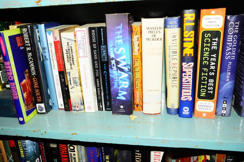
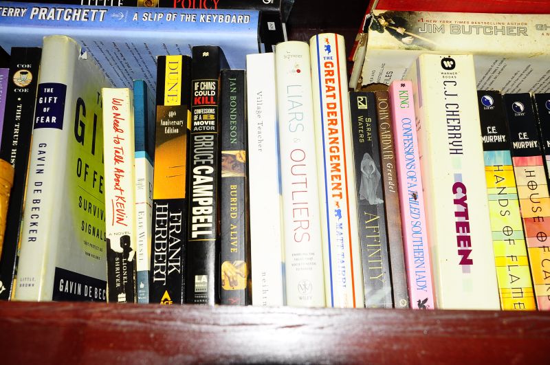
Apparently you can’t bring yourself to type Animal Farm by George Orwell. It’s much more than a fable, you flaming idiot. Obviously, your schooling didn’t do much good. Oh, the utter horror of 30 year olds playing games. I have news for you, Matt, people of all ages love games, video and otherwise. Humans need to play, we are all much better people for having play time. It’s not just for kids. I’ve read the Potter books. I’ve read much more than that. Here’s a tiny slice of the 2,000something books in my house:

How many books do you own, Matt? And how many of them have you read? What’s your library checkout rate? You don’t seem to be nearly as interested in books as you are in movies and television. From where I sit, you don’t get to moan about the reading habits of others without disclosing your own.
There is a deeper sense in which the old problems that were the hallmark of realist fiction and drama — the old stand-bys of morals, manners, marriage, and money — are simply not interesting to people who are not emotionally mature enough to engage with them.
The old stand-bys are still very much with us, you fuckwitted pontificator. I expect there’s plenty of all that stuff in Game of Thrones. Old movies are still popular, y’know. And escapism was every bit as prevalent then as now. People need that, too. Most people have the sense to know that life is not as neat as any movie or television show. We learn early on that stuff isn’t real. Most of us learn that anyway.
We really are, emotionally speaking, a nation of teenagers — albeit horny ones with generous allowances.
Hahahahahaha. Oh my. Speak for yourself, cupcake. My teen years are long behind me, and good riddance to them.
But the real problem with Game of Thrones is not that it is, like most American popular culture these days, fundamentally adolescent. It is that it is obscene. It is not just bad art; it is art that is bad and bad for you.
I had this realization sometime last year. My wife had gone to bed, and I was sitting up having just finished the penultimate episode of the show’s sixth season on my laptop. Then it occurred to me.
Ah yes, the meat of it all – the great revelation, after six years! If you’re a representative example of what Jehovah has to work with, no wonder it never gets anything done. Everyone ready? Here it is:
My goodness. I’ve just spent an hour watching to see if a guy who raped a teenage girl at bow-and-arrow point is going to be eaten alive by the animals he has spent the last few seasons subjecting to forms of cruelty that make Michael Vick look like a PETA ambassador or beaten to death in the freezing cold by his victim’s half-brother. Thank goodness the guy who set his terminally ill daughter on fire in a pyromantic oblation to a heathen god at the behest of a witch who never seems to wear any clothes is not around to prevent justice from being carried out here — the woman whose size makes her the frequent butt of bestiality-related jokes killed him just in time! Lucky that she has a wealthy and well-connected benefactor in a one-armed knight whose hobbies from childhood on have included killing people and sleeping with his queen sister — including in a church right next to the corpse of one of their unacknowledged sons — to whom we were first introduced when he pushed the little brother of the above-mentioned rape victim out of a window to conceal his incest from her drunken prostitute-addicted domestic-abuser husband! Almighty God has made me in His own image and endowed me with faculties of reason and sense perception and given me free will so that I can tune in next week to see whether the unidextrous dueling champ’s royal sister sets her daughter-in-law and the rest of her extended family on fire or just a bunch of priests. Hallelujah!
You certainly are dim, Matt. So, let’s see: rape, cruelty to animals, sacrifices to a god, nakedness, filthy rich people, incest, drunks, other assorted addicts, prostitutes, and abusive husbands. Got it. Which ones of those are not present and rife in current societies, Matt? Those are all part and parcel of what might be termed the human condition. And no, you don’t have to watch it, or read it, if you don’t want to do so. Glad you finally got that one figured the fuck out. Took long enough. Bet it won’t be long before you’re being tormented by your desire to find out what the heck happens in the 7th season.
What does it say about our culture and the state of the souls of millions who participate in it that anyone could find any of this even mildly diverting, much less praise it as a triumph of man’s creative energies and subject it to endless hours of analysis and speculation?
You found it entertaining for SIX YEARS. You are spending many words on it now. Perhaps you should turn your attention inward.
Half a century ago, when our absurdly generous obscenity laws were still occasionally enforced, a program like this could not have been conceived, much less produced at great expense and broadcast.
That would have been 1967, and you are so full of shit, Matt. Yes, it could have been conceived and produced, and likely would have been, and people would have been deliciously scandalised, like they are now, and enjoyed it thoroughly. Just because you couldn’t be quite so explicit in years past, you could certainly imply whatever you liked, and there was a hell of a lot of implication going on. In a famous film, M, starring Peter Lorre, the murders of the children aren’t dwelt upon, but the movie is horrifying nonetheless. There are distinct parallels between the criminal underworld and the cops, too. There’s a tremendous amount of nasty in that film, and strikes all too true to actual life. That was in 1931. The 1960s saw some of the most lurid films ever in the horror genre. You also seem to know absolutely nothing about the actual history of royalty, and their habit of inbreeding. Are you sure you had any schooling?
One of the most persistent liberal myths is that art has no moral content, that reading or watching or listening to something can never be in itself evil.
Oh for fuck’s sake. That’s a myth you made up, Matt. There’s no such thing. I’m an artist. Everything we do is dependent on the subjective perceptions and gaze of others. A great deal of art speaks to morality or issues, and has done throughout the ages. That doesn’t mean all of it does. Sometimes, it’s just something pretty or interesting.
You can only watch so many decapitations and eye-gouges and rapes and brother-on-sister grope fests before you either give up on the wretched proceedings in disgust or decide to pretend that “Lol, nothing matters” and it’s not worth having feelings anyway. Not exactly, in the latter, case a resounding victory for the human spirit.
Well, it did take you six fucking years. Doesn’t say much for your intellect or your spirit.
Game of Thrones reminds us that boredom and despair are, theologically speaking, synonyms.
No, you flaming dipshit, no. Boredom and despair are not synonyms, and have very different meanings, theologically speaking or not.
Both the messes: Alassie! and Matt Walther Is An Idiot.