Marketing people have a problem with limited creativity. The moment their target audience are primarily women, they will go for the most pink and over-the-top feminine advertisement design imaginable. Once the audience are men, they will go for macho imagery. Such strongly gendered advertisements with extremely feminine or masculine images are off-putting for some people. Not every person who is anatomically female adores pink. Not every person who is anatomically male likes macho imagery.
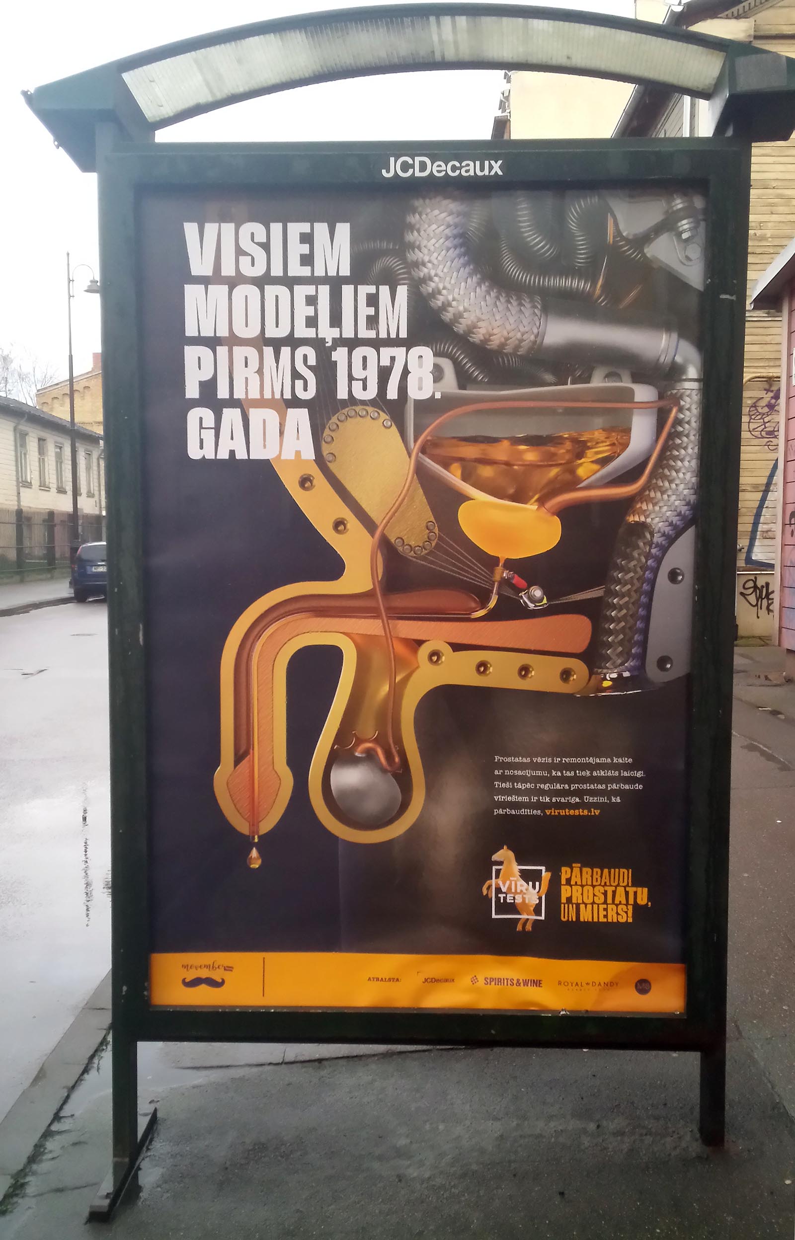
Here you can see an advertisement that recently appeared close to my home. Text in the large font on the left side translates as: “For all the models before the year 1978.” Smaller text at the bottom right: “Prostate cancer is a repairable malfunction, but only if detected early. This is why regular prostate checkups are so important for men. You can find out how to get yourself tested at virutests.lv.” Text on the horse: “Men’s test.” Yellow text on the right of the horse: “Check your prostate and basta.”
I do not have a prostate, so I am not the target audience for this advertisement, but, as a guy, I do perceive this poster as silly. I am not that much into cars (I don’t even have a driver’s license). I perceive macho imagery as indicating insecurity rather than strength. Personally, I’m confident enough in my masculinity, and I don’t need to cling to manly symbols. At least I perceive this poster as silly and mildly hilarious rather than off-putting. Besides, it’s a bad idea to compare human bodies with machines. Human bodies might also require “maintenance and checkups,” but are nowhere near as straightforward and simple as cars.
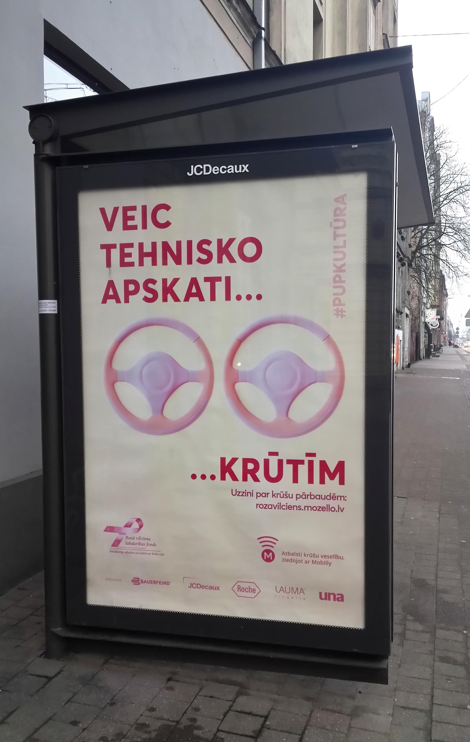
Here is the breast cancer version.Translation: “Get a technical inspection… for breasts.” Smaller font: “Find out more about breast cancer screening at rozavilciens.mozello.lv.”
Now this is a poster that I actually perceive as disgusting and off-putting. Steering wheels normally don’t come in pink, and I dislike how various consumer goods are painted in pink and advertised explicitly for women. I have nothing against pink pens, pink laptops, pink cars, or even pink steering wheels inside those pink cars. But I do get annoyed when marketing people have to explicitly say that the pink product is intended for women. People who like pink color know their own preferences, and, as far as I’m concerned, anybody is free to use pink consumer goods regardless of their anatomy or gender identity. I don’t want marketing assholes to tell the society that pink is for women.
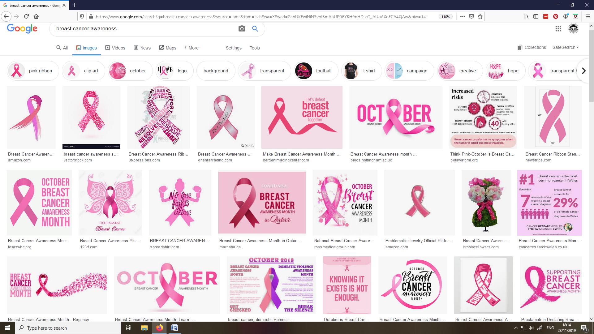
Here is what I get in my image search results when googling for “breast cancer awareness.”
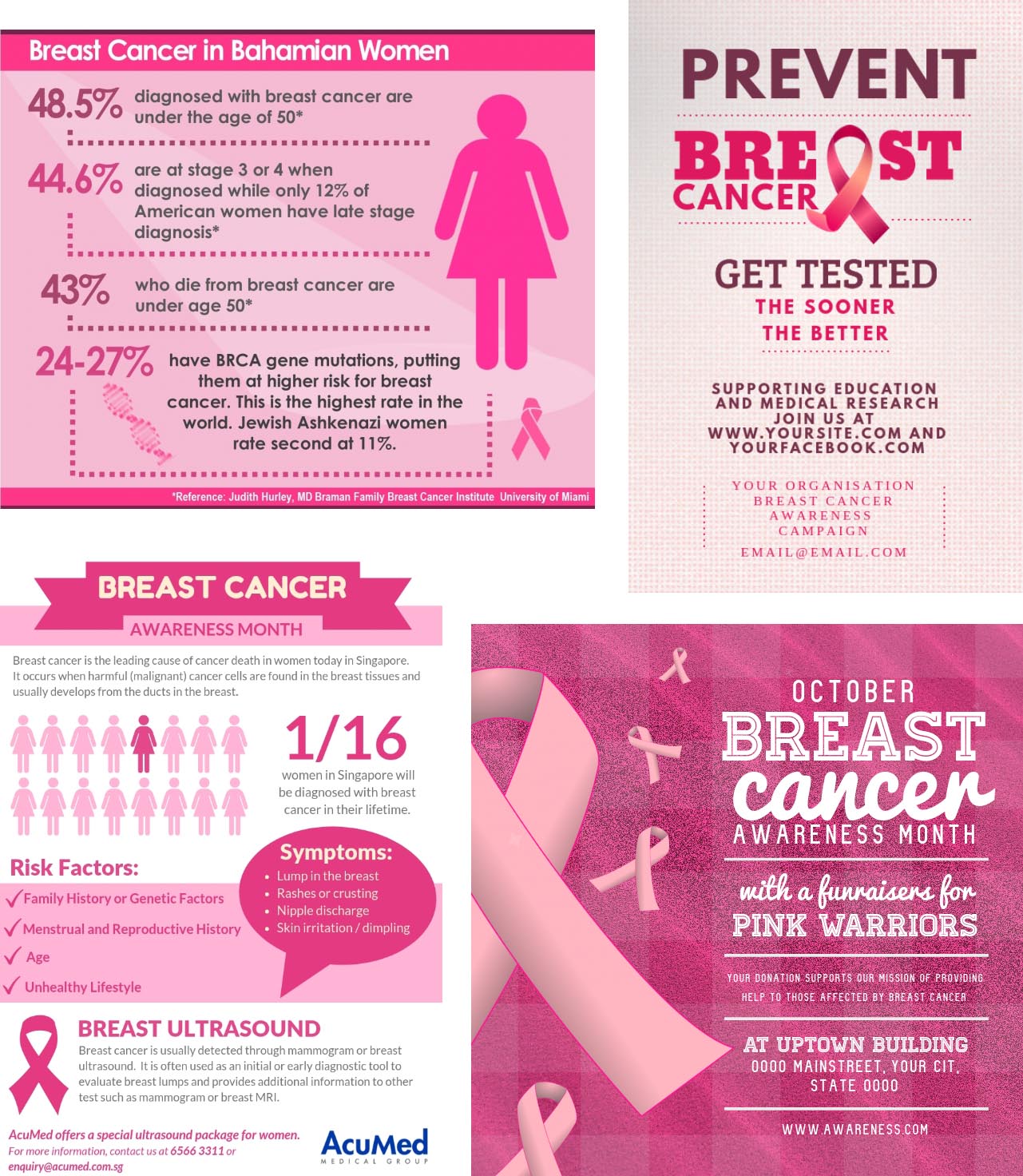
And here is a random sample of some of the posters I found via google image search.
Have you noticed something? Everything is pink as hell.
A cis man who loves cars might like this prostate cancer awareness poster in which human bodies are compared to machines. A feminine cis woman who adores pink and loves ribbons might respond positively to a breast cancer screening advertisement poster that is so over-the-top feminine. But the problem is that some people, maybe even a pretty large part of human population, aren’t so fond of ridiculously gendered messages.
Every time I see an advertisement for a mammogram, the first thing that crosses my mind is, “I wish I had more money so that I could afford a breast removal surgery.” I dislike pink, I’m not fond of ribbons, and I don’t want to participate in this pink fest. I understand the necessity of regular health checkups, but I do get repulsed once they are packaged in pink. I might have been assigned female at birth, but I do not live as a woman, I don’t like being treated as a woman, and I don’t want to be bombarded with pink imagery. If mammograms are associated with femininity, turned into a pink fest, and presented as the most womanly experience imaginable, some people who actually need them will get repulsed.
If you were advertising some clothing store which sold only the most feminine fashion imaginable and all the dresses and skirts were pink in this store, then a super pink advertisement would be appropriate. After all, people who are interested in buying a pink dress probably also respond positively to a ridiculously pink advertisement.
But these are advertisements for health tests, which every person should get regardless of whether they conform to traditional gender stereotypes. Every person, who has breasts or prostate, needs to regularly have these cancer tests. My aunt died of breast cancer a year ago. She was only fifty. I get that there’s a problem, and people should be reminded to regularly get these cancer tests. But you don’t have to make these reminders repulsive to a part of the society. Some trans men need mammograms. Butch lesbians need them. Besides, even among straight cis women many aren’t particularly fond of pink color or extremely feminine imagery.
Healthcare and medical tests cannot be advertised in a cisnormative way that reinforces gender stereotypes thus sending a message that gender nonconforming people aren’t welcome at the doctor’s office and might as well stay at home and wait for death. And, yes, trans people do get this message on a regular basis. Transphobic doctors have been rude to me or outright kicked me out of their offices on countless occasions.
I understand that the pink ribbon is already a recognized symbol. Thus replacing it with a different symbol would be problematic. Still, a graphic designer can create an advertisement where the pink ribbon is relatively small, the background is not pink, and the text is also not pink. Such a design would no longer feel so off-putting for a person like me who prefers to be more masculine. I can put up with a pink ribbon displayed somewhere in the poster, but I do get annoyed about the entire poster being completely pink.
Personally, whenever I see something packaged in pink, my mind automatically files it as “intended for other people.” People who design posters reminding people about highly necessary health checkups shouldn’t use images that are off-putting for a part of their target audience. They could just pick something more neutral.
They could have kept the theme going and had the breast cancer one be a nice twin turbo setup. The housings could be anodised pink if they want.
Cis people have major problems with gender
Yep, that’s exactly how I see it. It’s funny that they imagine me to be the one who has a problem with gender.