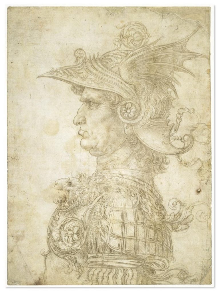
A silverpoint drawing by Leonardo da Vinci.
Looking at online images of silverpoint or metalpoint drawings, you will probably notice that many of them look very light and pale. Is this the norm? Why are they so light? And most importantly—how comes that only some metalpoint drawings look so pale while others appear much darker? Different computer monitors display images differently, thus you cannot be certain whether some artwork appears on your monitor the way it was intended to look like by the artist who scanned/photographed their work. Moreover, with image editing software like Photoshop, it is possible to alter how light or dark some digital image looks like. So how do these drawing actually look like in real life?
Here you can read the full article, which I published yesterday in my website. There I publish my more technical art-related blog posts that are intended mostly for readers who either are artists themselves or at least are interested in reading about how my artworks are made.
Leave a Reply
You must be logged in to post a comment.