I don’t like including twitter links but when someone uses that medium, you’ve either got to ignore them or suck it up.
These are by Mario Cavalli
[Article on Petapixel] produced in Midjourney. I’m amazed by these results, and they look light years better than what I’ve been able to squeeze out of the engine. These are just a few:


Either I’m an idiot, or it takes a lot of work to get this kind of result. I suppose that’s not an “or” situation, I could be an idiot and it takes a lot of work.

It looks like the AI can’t spell.
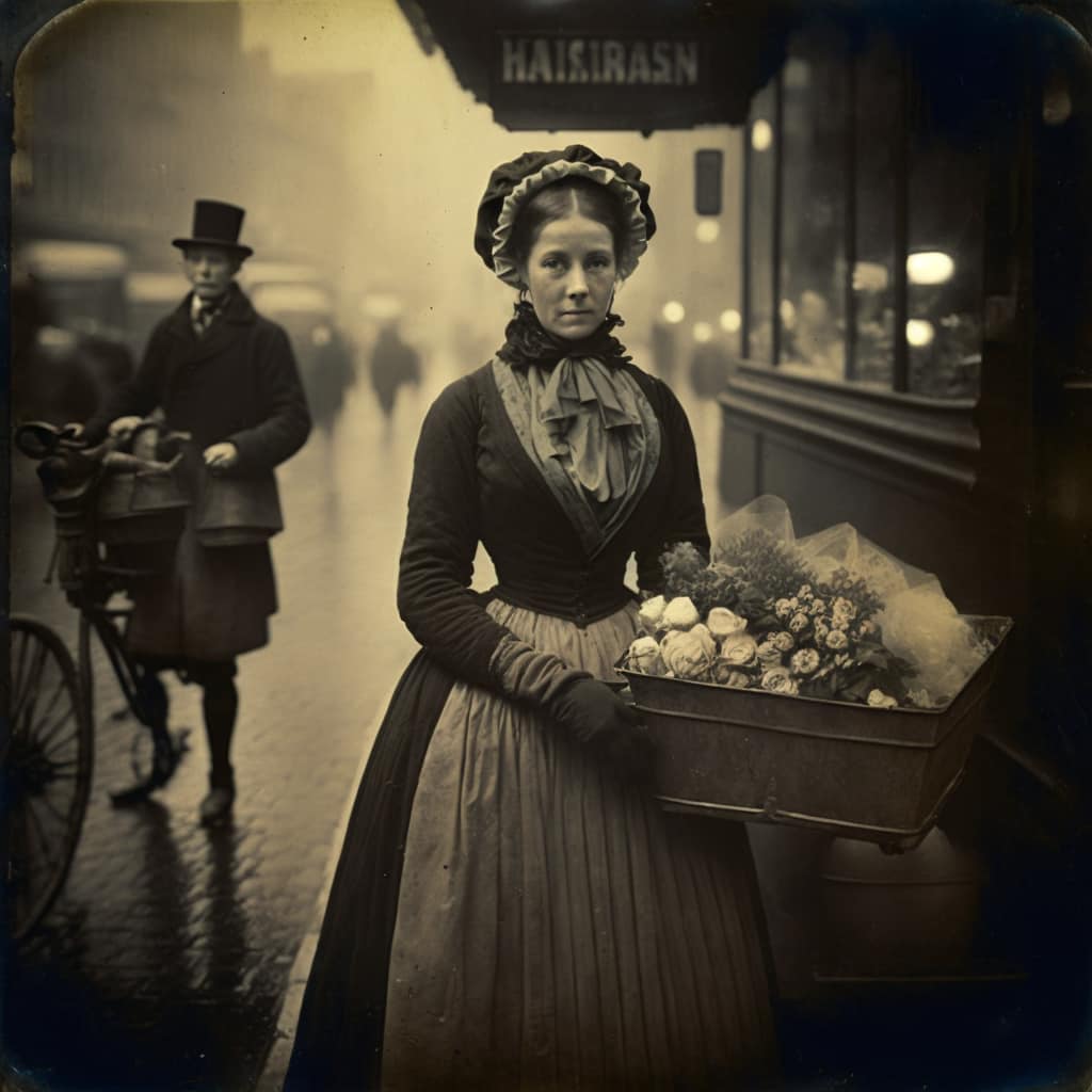
I’m looking at the sign above the woman’s head in picture #2, and it seems to say “HAIAIRASN”
Or something like that. (Maybe HAIRIRASN. Or HAIЯIRASN.)
But, yeah, the pictures are pretty well done, assuming they were looking for pictures of 19th century working class city folks.
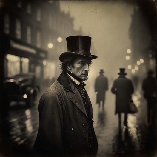
Extraordinary, although there are a few details which hint that these are not real photos.
The first thing I notice is that the primary subject in the first two pictures are in just about perfect focus, to the point where you can convince yourself that the background is really a painted backdrop rather than a real background. It’s subtle, but there.
One other thing I see odd about the first picture is that it looks to me like the subject cravat is tied incorrectly. Either the collar should be upright, and the cravat seen as under the collar, or the collar should be folded over and the neck ribbons of the cravat hidden by the collar. It looks like the AI put the neck ribbons of the cravat over a folded collar. I’m no expert in nineteenth century sartorial splendor, but I don’t think the collar was intended to be worn that way. I think the ear is also a little off in the first image, but it may be just out of focus. Which is odd because other parts of the face at the same depth are in focus.
Then in the second picture, the box the woman is carrying is apparently metal, but it would be heavy and awkward to carry a metal box, even filled with lightweight flowers, in that position. Not necessarily impossible, but odd and awkward. Also in the second picture, the legs of the cyclist do not appear to be human. The knee on their left leg is too far down, and the right leg looks almost like a prosthetic if it’s even there at all.
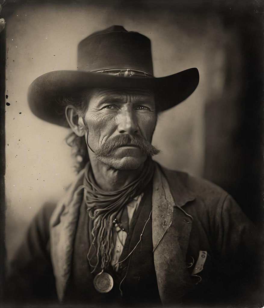
On the third and forth pictures the eyes are still a little uncanny. They don’t quite look human to me, I think the corners are a little off. Very close, but just a hair off. Also on the third picture, the nose is out of focus when the depth of field for the rest of the face and the chest implies it should be in focus. Again, it’s really hard to see, but it isn’t quite right. I think there is something just a little off on the nose in the forth image as well, but I can’t really put my finger on it.
But overall these are incredible images. Climbing out of the uncanny valley, on the human side. In the future reality will need corroboration.
Photographers get great results because they can use photography terms to get the depth of field, focus, lighting, and other such things they’re looking for.
Another trick I’ve found is to keep the image as simple as you can. The more you try to fit in the more likely the AI will get lost as some point. Of all the images above, the one that is easiest to spot as AI generated is the second image with the woman. There’s the text like Allison pointed out, but the man with the bicycle to the left has an odd looking hand, his right foot is off, he’s not really holding the bike, and the bike itself has no back wheel and isn’t connected to the front.
But he’s not the focus of the picture. Unless someone is examining the whole image they’re not going to notice these things. These are incredible images and that last one in particular if I were to see it in any other context I wouldn’t even question if it was a real photo.
@flex: Yup. The first guy’s collar and cravat are way wrong. Also the bicycle is wrong.
But the AI appears to sort of understand depth of field.
It seems to me that our brains sort of automatically make excuses for the mistakes. I seem to remember some psychology study that concluded that people look almost entirely at eyes and mouths once they have figured out the person’s gender. These images nail a lot of important cues.
If I understand correctly these things are generated based on probabilities extracted from many other things. So the shiny carriage thing in the first scene is typical street scene material circa 1900. Not that the AI knows that, it’s just seen so damn many victorian street scenes that it has a very good probability matrix of what is likely. One thing I would like to understand, without having to read an AI text is whether the AI is just working with the probabilities of what follows what, or if there is some kind of layer where it is still “thinking” conceptually. I.e: does it do “victorian street scene should have a carriage and lets throw in a store front and a beggar” and then it unpacks those concepts into more concepts and then uhhhh this looks like magic to me, for reals. It really makes me realize that I don’t understand what “understanding” is (now Consciousness Razor or Rob Grigjanis would say understanding is just a state we assign to something when it appears to act like what we call understanding, or something. I’m saying that I probably have my ontology backward, which is typical for me)
Somehow it goes from concepts down to pixels. I suppose that the human artists I know do the same things as the AI. They have to “understand” what I want. Or don’t they?
John Scalzi published a midjourney piece based on the prompt “a gingerbread kaiju attacks a gingerbread Tokyo” or something like that. And it’s awesome. [The AI probably is programmed to do Scalzi specific stuff, though. /silly]
#3 Tabby Lavalamp wrote,
I agree. If I wasn’t looking for things which were not quite right, if this was just an illustration for some fiction or a article about the time, I would probably not even notice the things which are not quite right. Or if I did, explain them as an accident/deliberate affect of the photography.
Not my area of expertise at all, but since you were wondering what I would say…..
Nah. If these were sentient, full/general AIs, then it’s maybe a different story, but that’s not what these things are. For the record, I’m not saying those are impossible in principle — maybe someday, probably in the distant future assuming people can even survive that long — but until you’re talking about an AGI or something like that, anthropomorphizing them in that way just isn’t warranted or helpful/informative.
I think terms like “concept” are rather loaded and ought to be avoided entirely in this cases. The meaning is supposed to be at least close or analogous to “concepts” people like you or I have in our minds when we are thinking about something, but I can’t see how that could be right….
(It’s maybe worth pointing out that this is just a different question than one about the sort of nonconceptual mental content that we may have. At any rate, if you just mean “information-processing activity” or some very broad thing along those lines, that’s also not the same as having “concepts” which has a much more specific and restricted meaning.)
That said, my understanding is that these AIs are using some neural networks (perhaps with some extra features) to process natural language and output an image. Now, granted, I don’t know exactly what you might mean by conceptualizing/understanding, but I don’t think it fits at all with those terms, when we’re talking about something that is essentially some big data collected from the web (for the sake of simplicity, let’s say a bunch of images found on google) being funneled through a process like that and then transmogrified into a set of pixels.
You search for the word “cat,” and first of all, notice that that isn’t a concept, although it might be confused for one if you’re not careful. That’s a written word in a particular language, English…. Those are what gets interpreted (differently) by different people, since there’s no chance that the letters/words themselves will wake up one day and start interpreting themselves. So, all that interpretive work which has to be done (by things like your brain) isn’t actually part of a package deal with something like the letters C, A, and T. That’s because those are essentially just some shapes (or bits stored in a computer for printing/displaying such things), which don’t possess a meaning all by themselves.
The images aren’t concepts either, and neither is any of the other stuff in between A and B (i.e. whatever sort of black box it is that makes up the neural network plus other goodies). So, no, all of those cat photos from all over the world which were put on the web definitely don’t constitute a concept of a cat, nor do they in some way amount to understanding of a cat or thoughts about a cat. Not even a little bit, because this is like a category mistake. Some of the people who posted such images were probably thinking about cats at the time (or about something, presumably), but that is of course neither here nor there, because that property isn’t the sort of thing that could transfer over to the search terms themselves or to the images, the processing, etc.
The point is just that if you forgot that we had started with an English word and some images, then juggled the data around enough until people got themselves too mystified by the whole process to be capable of analyzing it as a whole, now’s a good time to remember that and simply follow whatever implications that may have.
There’s not one part of this that should lead you to think this must involve understanding, as far as I’m concerned. But as I said above, if all you’re really talking about is just “information processing” which is extra-fancy or which has useful new features or whatever, then okay, (1) you should use that sort of language instead, and (2) it shouldn’t be too hard to see why that’s significantly lowering the bar or at least changing the subject away from what it means to understand/conceptualize/etc.
Tabby Lavalamp @3:
It looks to me like it’s one of those old bikes with a large front wheel and small rear wheel. I think I see the small rear wheel.
One other thing that’s wrong is that the post that, presumably, connects the front wheel to the handlebars for steering is connected to the rim of the wheel, not the hub.
They certainly have the look of sepia prints, but as noted, the uncanny is evident when you start to look closely at the details.
I think #3 is Sam Eliot, and #4 is obviously a tin miner though I’ve no idea why that’s obvious.
The look of suffering and the cap?
billseymour @8
A penny-farthing had a much larger front wheel though, and I see what you mean for the back wheel but it was bigger than that and much closer to the front wheel. My mind is seeing that as the cogs the pedals are connected to and both interpretations make sense as our brains are trying to interpret what they’re seeing with an object that’s not quite right.
#3 is clearly Pierce Brosnan :-)
This, and the linked article, provide a wonderful intro to “how to spot an AI generated image.” As noted already, it has problems with hands, and doesn’t even try to compose readable signage.
I would note it seems to have a serious problem with the crowns of men’s hats. That’s especially noticeable in the linked article. There, see the picture of the weatherbeaten chap leaning on the bar; the top of his hat just kind of wanders off.
OK, I’m a hat-wearer so I pay attention to the shape of men’s hats. But there are issues with clothing in general. In the final picture above, how many vests is the man wearing? I count three, and his neckerchief tucked into the innermost. In the next-to-last picture above, there’s another weird crown to a hat, but look at the neck scarf: folds morphing into strands, and one strand dribbles off to form his right lapel. Speaking of strands, what’s that running down from his hair along his right cheek? And who ever wore a pocket-watch around their neck? Especially suspended on what appears to be a hoop of bent wire.
The more you look, the more you see.
That’s hair running down his right cheek. A least it didn’t start at his lower eyelid. I get that a lot. I didn’t see that at a watch around his neck because the lighting implies it’s concave so I wasn’t sure what it was. The lighting mostly comes from the man’s right and up a bit, so for it to be convex with the bright side to circle’s left, it would have to have it’s own lighting source.
I noticed that the hat of #3 is morphed from a cowboy hat, and whatever the flat topped, wide brimmed hat worn in Deadwood is called.
Fabric folds, draping, and translucence are effects that are considered very difficult to render well, just like hands.
I think that drifting curl of hair and the strangeness of the neckerchief of the Cowboy add movement and a sense of wind blowing to the image.
The ‘Miner’ gets more uncanny the longer you look at him. Very skull like, but his stare is piercing.
The AI even made flaws in the ‘photos’ and gave them rounded corners. Those small details add quite a bit to your eye seeing these as real photos.
Those photos have much better use of depth of field than an actual camera of the selected period would.
Or Midjourney has updated its engine and you didn’t notice the e-mail or whatever?
Ursula Vernon did some threads where she started asking for works in the style of three completely fictional artists, and, interestingly, the AI started doing different stuff for each.
https://nitter.nl/UrsulaV/status/1597025577214836736
(She eventually added a sister artist)
More:
https://nitter.nl/UrsulaV/status/1598452736063950886
Speaking of “finger”, one thing the engine still does not understand is digit anatomy. There’s multiple pictures it’s generated with something like seven fingers on one hand and four on the other, or sometimes digits not quite attached to hands, just floating near by or something. It’s not all the time, but the problem’s there.
@ 10 Tabby Lavalamp
A penny-farthing had a much larger front wheel though
There were 5 ft wheels but I have never see a penny farthing with that small a front wheel. The rear wheel looks a bit too small; the seat should be directly over the front wheel.
It was so strange that I first tried to figure out if it was some kink of pushcart before I realised there was a tiny wheel there.