We had no idea this was going on, so we were heading toward the arms and armor (naturally) and took a turn through medieval and byzantine art, and walked into another world.
The medieval and byzantine art is something I usually avoid, because it’s generally heavily religious – I just look at it and feel bad for the ancient rubes who were forced to tie their economic activity up in the great power-structure of the church. It’s also what I consider “bad art” – a lot of medieval art looks like kids’ refrigerator art – stuff you hang up because you’ve got it, not because you like it.
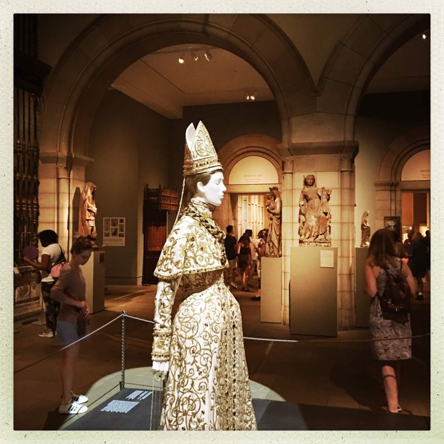
(My camera automatically brightened everything up about 2 stops; the actual room light was darkier and contrastier)
That section of the museum is housed in an area that mimics the aesthetics of The Cloisters, a 12th century monastery which was moved from Europe to New York in 1938: lots of big stone arches, granite floors, and metal-work. The Costume Institute,[metci] which is also part of the Met, was putting on a very innovative and extremely cool show about catholic costumes. What they had done was to recruit the great design-houses of the world and ask them to contribute something for the show – neo-catholic vestments. To set the effect, all the lights in the wing had been dimmed somewhat, and the new haute couture vestments were interspersed with the truly ancient medieval art. It was quite successful – everything really fit together – the old and the new, obviously a deliberate effect of visual references. Instead of the usual museum silence, there was dark gothic music with lots of drums echoing and creating an auditory space that was much larger. The crowd was big, and it felt like being inside the Cathedral of Notre Dame in Paris on a busy sunday morning. Obviously, that was a deliberate effect, and it was quite successful.
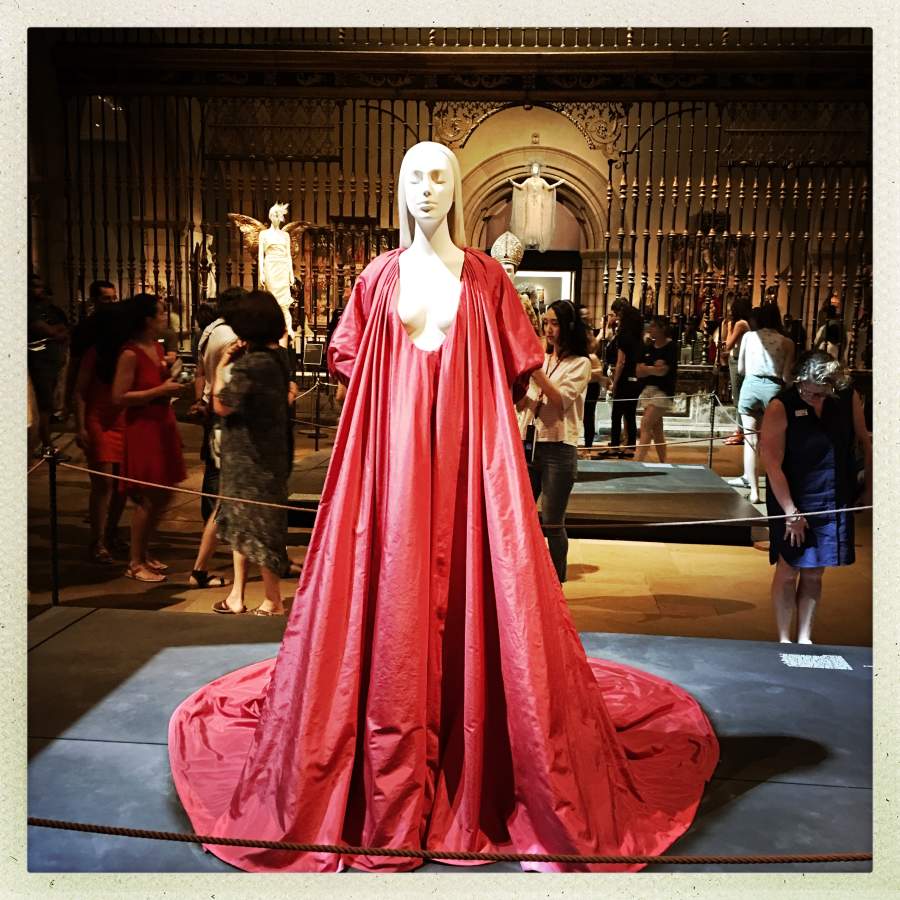
One of the best tricks in haute couture is to make an outfit that is simple but which depends on the properties of the cloth. If you know what you’re doing, it’s “easy”
The Met does a lot of stuff like this – it’s a great way to have a big gala opening, attract some star-power, and collect donations. When it all works, it’s magic.
Back in 199?8 or thereabout I made a random trip up to The Met and discovered that they were having a huge exhibition of Napoleonic costume – including some amazing stuff they managed to borrow somehow from the French: napoleonic marshal’s uniforms covered in disk-work of hammered gold, linen handkerchief-weight gowns for the women that you could read a book through, etc. Glorious stuff. Imperialism at its best. And there was another time they were doing a show on House Worth and had an amazing collection of golden age couture that was absolutely superb in all respects. The last time I was in London, the V&A was putting on a show of lingerie that consisted mostly of stuff from the collection of the founder/owners of Agent Provocateur. More amazing handmade stuff from the 1920s than you could dream about.

When the haute couture gang stop farting around trying to create eye-catching garbage and decide they are going to go after an established visual language, they are really, really, good. Imagine how fun it must be to dig into the barely hidden fetishism of liturgical wear, and blast holes in the gender barriers of catholicism.

motorcycle leathers under open corseted justaucorps frock, made of dupioni silk/satin that references the leather
Everyone who was anyone was there: Chanel, Balenciaga, Galliano, St Laurent, etc. I assume that the big houses have a whole team that specializes is doing things like this, just for events like this. These shows must be the fashion equivalent of Formula-1: a chance to show what you can accomplish when money is no object.
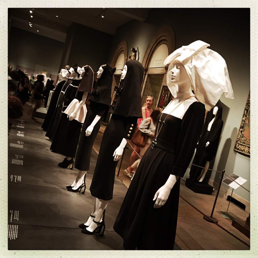
I wish I had gotten a closeup of the habit on the far left – it looked exactly like what I imagine the Bene Gesserit nuns wear.

What I saw
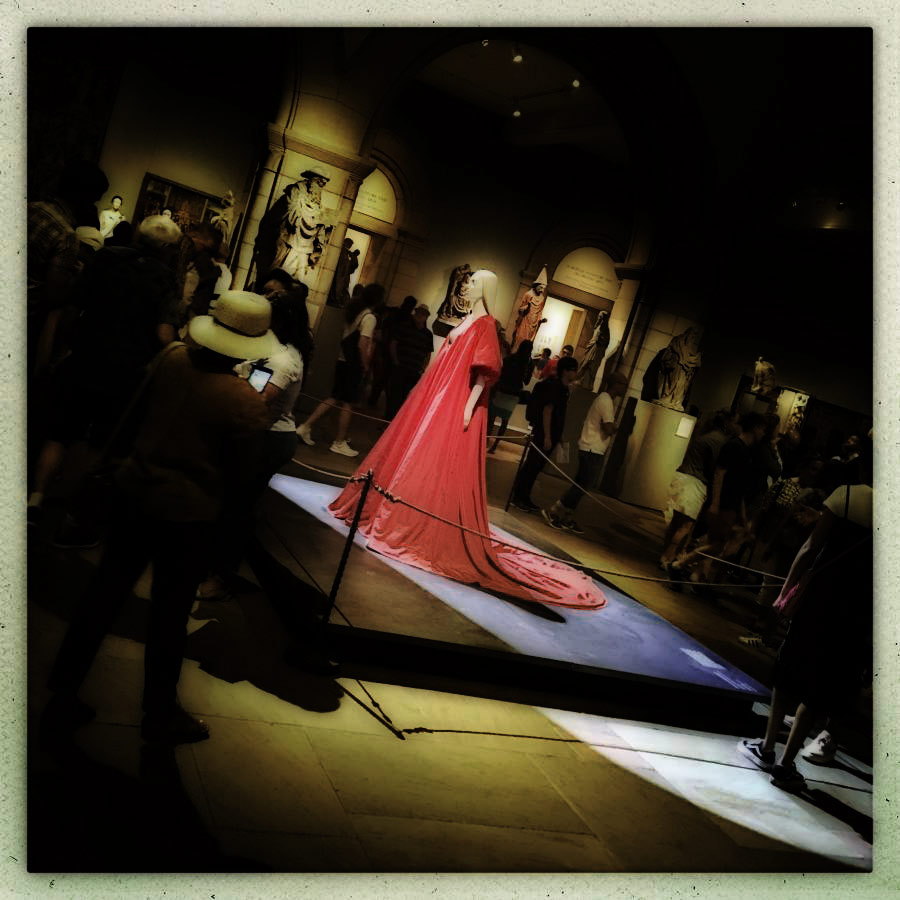
What I felt
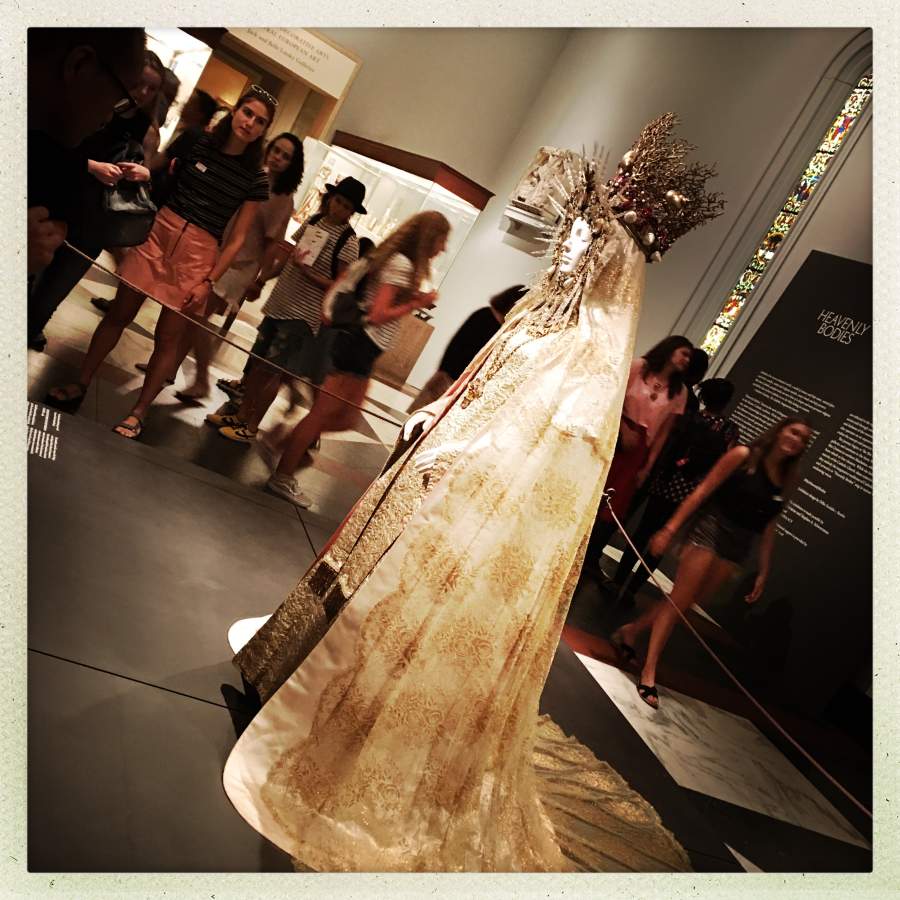
It must be a great pleasure, and a great challenge, to curate a show like this. Figuring out which piece will go where, and in what lighting – it’s not a small project at all. The red ‘bride of cthulhu’ (how I thought of it) outfit was in the center of everything, because its simple drape and dramatic lines (plus its eroticism/fetishism) immediately grab the eye. My picture does not adequately convey the impact of this mass of red silk, blaring out of the darkness under a single hard spotlight. Look at the sharpness of the shadow it casts and the light-spill from the spotlight and you’ll see what I mean.
I just loaded the previous image into photoshop and tone-shifted, blurred and curve-adjusted it to give a bit of a better rendering of the emotional impact of the scene when you’re actually there. It’s just a simulation, but I think it’s close to right. When we look at things, our brains adjust out interpretation of the light and shadow and detail, based on the overall gestalt – meanwhile, the camera doesn’t exactly lie (though an iPhone running hipstamatic never tells the truth) – I see this as selective interpretation of a view based on our emotions. The curator of this exhibit understands that, and used placement, lighting, and music to perfect effect.
There are byzantine visual references all over that outfit. And look at all the hand-embroidery and bead-work! I forget which couture house did that one, but that’s a ton of work.
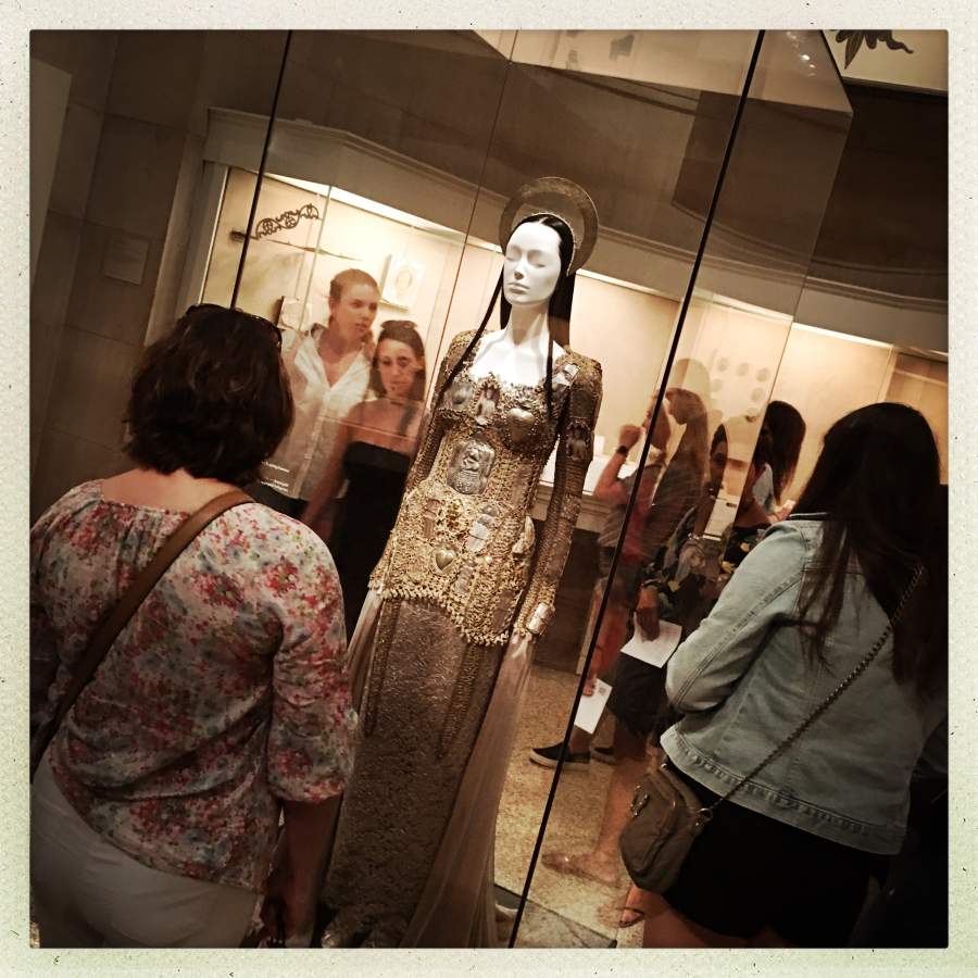
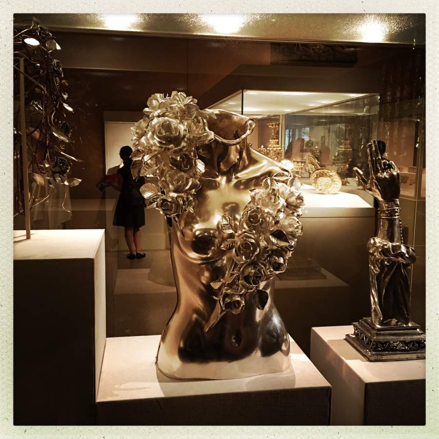
There is a curved stone cove wherein is displayed a lot of gold and silver jewelry; the curator cleverly decided to put this outfit right in the center of it – it matches the surroundings perfectly. The whole outfit is assembled from small pieces of metal, much like the idols reliquaries catholics keep of their saints’ bones.
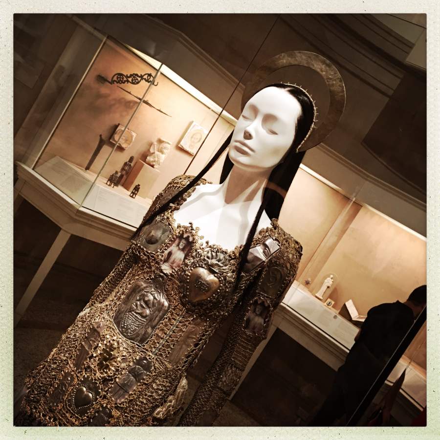
That headpiece is the shit.
The village priest’s “soutane” even came in for re-invention: a subtle phase-shift – gender neutrality subverting catholicism’s innate sexual fetishism. I always thought it was pretty funny that the catholics are so bent out of shape about gender roles, when their leaders wear little pink satin Prada slippers and dresses.
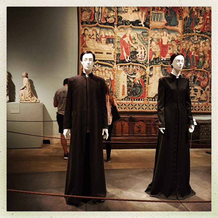
Echoes of The Matrix
Set against the backdrop of medieval tapestries, it’s perfect.
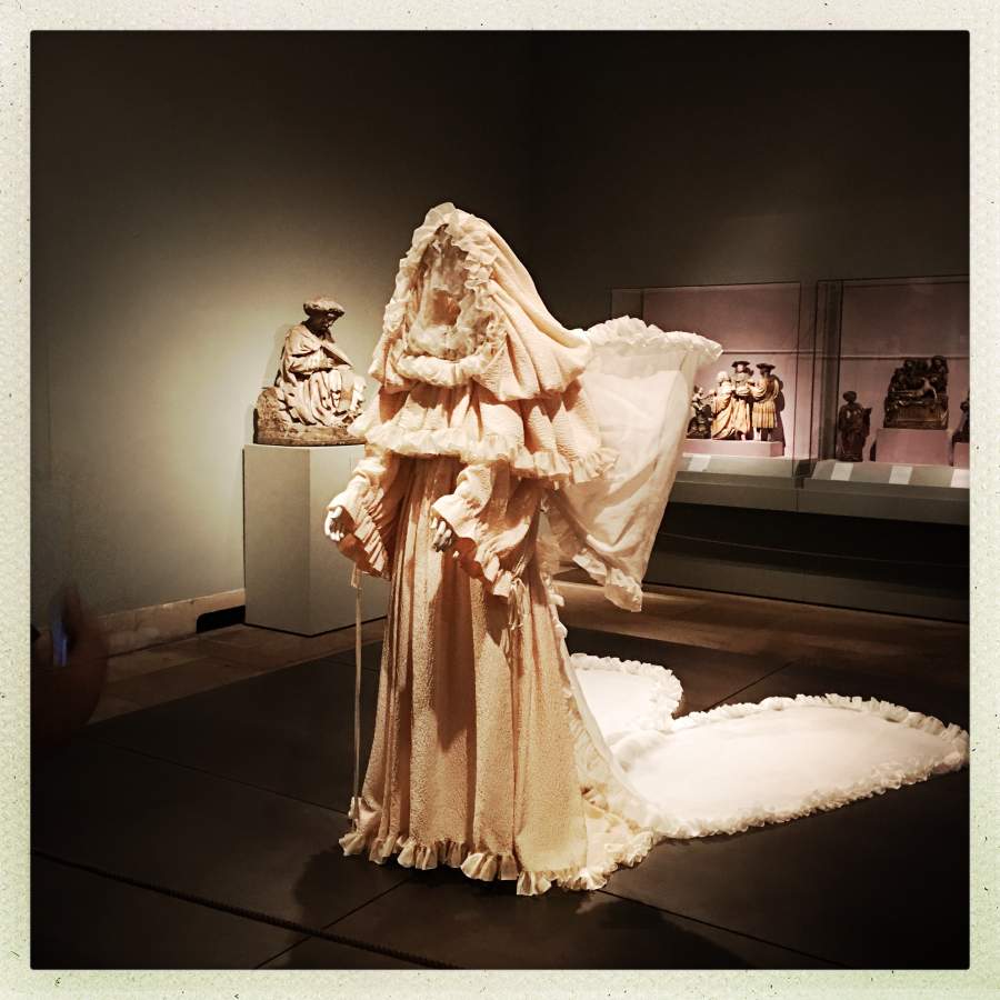
See how the curator references the texture of the fabric in the medieval sculpture in the background, with the fabric and lighting in the foreground? There’s no way that’s accidental. Curating an exhibit like this is an art-form of its own.
Some of the designers named their pieces, but I didn’t read the details on the plaques. I already had my own ideas. The outfit above is clearly the kind of ceremonial robes that the priestess of Cthulhu wears as she brings in the baby that is to be sacrificed and eaten.
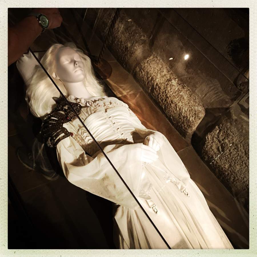
Cenotaph of a dead paladin? Look at the super cool shoulder armor it’s wearing. And the stocking suspenders are a perfect touch with the ruched corset that echoes coffin-lining.
This piece was displayed on the opposite side of the barred arch between rooms – on one side was an actual medieval cenotaph of some long-dead knight, on the other was this, in a glass box that matched the one the medieval knight was in. Very clever. I feel like I’m falling all over myself praising the curator, but, damn – that was nicely done.
Last picture: this one made me want to cheer out loud. Other people who were attending the show were just walking by the cases of existing (“old”) stuff but then I noticed they had placed some of the new stuff in with the old stuff, where it fit:

The official blurb about the show is here [met] and has pictures taken by a professional photographer with the correct lighting and so forth. You can get the catalog [here] for $65.
The New York Times’ Establishment Rag of Record review of the show: [nyt]
Back in 200?4? I was in Paris and spent an afternoon at The Louvre, where they were having a show about the Statue of Liberty. They had invited great couture-houses to re-clothe the great lady. It was also amazing – Galliano had her in this little slip-dress of clinging silk cut on the bias, Gaultier had her in cone-bra and corset, etc. I wish I had bought the catalog from the show but I didn’t want to carry this gigantic slab of gloss heavyweight paper in my suitcase.

Marcus:
Most Medieval Art is not remotely bad; most of it is exquisite, religious or no. And yes, most artists had to do religious subjects, but I rather imagine it’s your bias doing the judging when you actually bother to look, and your bias which prevents you seeing the art work itself, rather than the religious theme, whatever it might be.
Caine@#1:
I rather imagine it’s your bias doing the judging
Possibly. It’s probably less my anti-religion bias than my anti-boredom bias. My parents death-marched me through every great museum of medieval art in Europe and a bunch of no so great ones. By the time I was 15, I never wanted to see another piece of medieval art, unless it was pointy steel.
I would like to see Liberty clothed by Gianni Versace.
Wow. That is impressive. I wonder when I can get down to The City again?
These are great photos and what an amazing exhibit. Yes it looks like it was very well done.
I do want to say that I agree, the human eye sees light very differently from a camera. I keep getting reminded of this when I take a photo of what I am perceiving as a beautiful scene, but the camera is showing me something very banal. So frustrating. I think I am recording the mood but no, I am not…
Marcus there is a good shot of what I think is the farthest habit to the left on your picture in the Met pictures you linked to, can’t remember which page.
The exhibition looks very beautiful.
I mostly agree. Medieval artists had no idea how to portray perspective; they generally also failed to utilize tonal shifts in order to portray depth and 3-dimensionality. Compared to, for example, renaissance masters, medieval art was significantly worse. Besides, I perceive all the religious themes as boring. Jesus on the cross, yet another saint praying God, etc. images are not exactly interesting for me.
Still, there are some things that I like about medieval art. I have an interest in calligraphy, and some of the illuminated manuscripts are amazing.
Then there’s also all the funny and satirical art that can be found in the margins of sacred books. Here’s an overview of that: https://www.collectorsweekly.com/articles/naughty-nuns-flatulent-monks-and-other-surprises-of-sacred-medieval-manuscripts/ Drawing porn or illustrating poop jokes in the margins of sacred religious texts gives a whole new meaning to the term “sacred art.”
Also, have you seen the dick tree (“L’Albero della Fecondità”): https://commons.wikimedia.org/wiki/File:Albero_della_Fecondit%C3%A0_(Massa_Marittima)_01.jpg ? I know the art itself isn’t well done, it just looks flat, totally lacking tonal shifts. But it’s still hilarious, so I sort of like it anyway.
I also perceive the architecture of medieval churches as beautiful. My attitude towards churches is somewhat complicated. Some of the old ones are extremely beautiful. Yet I just don’t feel comfortable inside a church, even a beautiful one. I cannot not think about what they represent (and I sure dislike Christianity).
Good photographers can also do the exact opposite. They can create a photograph in which something that’s perceived as boring and banal in real life becomes beautiful and interesting in the photo.