Game-Master: “You peer over the edge, down into the cave. Below is a huge dragon, lying on a mound of gold.”
Rogue: “Is it asleep?”
Game-Master: “You hear deep rumbling snores.”
Party-Leader: “Great. We sneak back to town and take all the villagers’ gold. Then we sneak back to the cave, and add the villagers’ gold to the dragon’s pile without waking it up. The dragon will create jobs for everyone!”
That’s a slightly polished-up retelling of a joke I saw on facebook the other day. It is not my work of genius; I can only stand in awe of what is clearly the work of a level 20+ Snark-mage. I remember one battle my high school D&D club had with a Snark-Lich … whoo, boy! But I digress.
It turns out that high level economists can also turn into snark-liches; the title of the email I got from FREDblog was “Seasonally adjusted greetings from FRED!”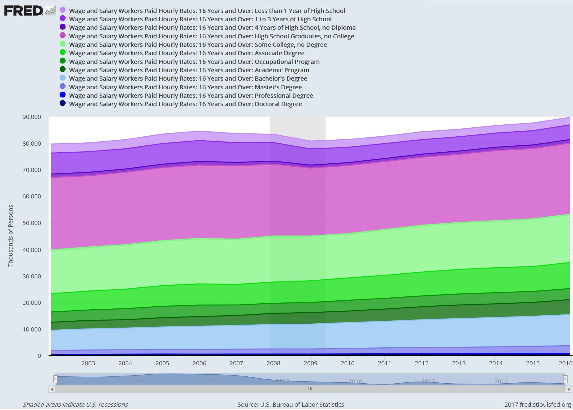
As with all of FRED’s amazing offerings, the chart includes directions for how you can create it yourself using FRED’s database and tools. Be careful if you decide to explore their system, you can get lost for days in farting around with numbers. One of the things you will learn if you do that is exactly how much farting around with numbers there is to do, and where all those charts in magazines come from.
#include <fallacies/texas_sharpshooter.h>
So, what does this chart mean? I’m interpreting it as “there is job growth in the shit job sector.”
Does that sound about right to you?
If what we’re seeing here is the “gig economy” and job growth in the shit job sector, we’re looking at a lot of people with degrees driving cars for Uber on behalf of the vanishing middle class. I’m going to mess around with the data set more and see if I can map in job growth in professional salaried positions. Does anyone want to bet that there is lower job growth outside of the shit job sector?

I’m probably going to be kind of quiet the next couple days. Still shovelling out from last week.
I’m seeing the opposite: “shit jobs” (pink and purple areas) have been hit hard before and during the recession, and never recovered (the bands do not get wider). All the growth has been in the areas with degrees (and “some college”, to an extent), with the last five bands having the most relative growth: the Master’s band is almost twice as wide in 2016 than in 2002.
Where I may be wrong is that we have no idea what kind of jobs people with degrees are doing. Maybe they’re working shit jobs too, only there’s more of them now. This could be a chart of the effectiveness of advertising for master’s programs, for all I know.
cvoinescu@#1:
All the growth has been in the areas with degrees (and “some college”, to an extent), with the last five bands having the most relative growth: the Master’s band is almost twice as wide in 2016 than in 2002.
Those are people with masters’ degrees working hourly jobs.
I’m trying to think of typical hourly jobs and “senior executive” doesn’t come up on that list.
I’m not trying to argue with you, though. That’s what’s interesting to me about interpreting these charts. They’re a sort of funhouse mirror.
@cvoinescu #1
I think you may be misreading it. The ENTIRE CHART is shit jobs* – note that all jobs represented here are described as ‘hourly rates’. The colored sections differ only in the educational level of the people doing them. Most of the stripes remained relatively steady, except the light blue ‘Bachelor’s Degree’ section which grew noticeably. So what we are seeing here is a devaluing of bachelor’s degrees: where once upon a time high school was considered the education people needed to enter the job market, now it’s bachelor’s degrees and the massive debt associated therewith.
* All shit jobs are in this chart, but it’s not certain that all ‘wages by hourly rates’ jobs are shit jobs – I think sometimes trades jobs operate on that scheme but still pay reasonably well with decent work. But we are pretty safe in assuming that retail wage slaves outnumber plumbers quite a bit.
More and more jobs require ridiculous white-collar educational qualifications. The band that should be five times as wide, if we had a decent and human public education system, would be “occupational schools.” At-cost, publicly funded if necessary, occupational school for every high school graduate who wants it. The occupational schools are predatory sociopathic bloodsuckers now. As usual, look to Germany, where they know the value of the man or woman who works on your Porsche.
You’re absolutely right: I misread the legend of the chart (language and/or culture barrier, sorry).
So, understanding now that the chart includes all the shit jobs and some less-shit ones, I see that a lot of the least educated people lost their jobs during the recession (including the not-so-good couple of years before the official recession). After the recession, those people never regained their jobs*, and did not benefit from the growth; instead, the re-created and newly added shit jobs went almost entirely to people with degrees. Am I getting the shitty picture now?
One take-away seems to be that being overqualified makes your shit job relatively safe during a recession — the bottom bands did not shrink at all.
___________
* Or, they got good jobs not counted in this chart. That must be it!
MARCUS! Unrelated to this chart, but… https://securityplanner.org/ is a thing. What do you think of this and its recommendations?
Visualisation is primitive.
Peter Watts in, um, Blindsight mentioned the vampire strategist visualising variables in multiple dimensions encoded as human faces .
–fair use hopefully but please delete if concerned–
[oops, premature postification. Link should be to
https://en.wikipedia.org/wiki/Chernoff_face ]
@ 5 cvoinescu
I misread the legend of the chart (language and/or culture barrier, sorry)
No, it is just that it is an incredibley bad plot. I am not about to even try to figure out what it may be trying to say but just looking at it seems to suggest incompetence in presenting data graphing data. Tufte’s concept of chart-junk is well illustrated.
abbeycadabra@#6:
Unrelated to this chart, but… https://securityplanner.org/ is a thing. What do you think of this and its recommendations?
I’ll have a look. Sounds interesting!
@ 7 & 8 John Morales
Not primitive so much as total incompetence in graphing. It is not intended to be anything other than eye-candy. If that. It’s so crappy it looks like an Excel graph!
Someone like Tufte or Wilkinson would be horrified.
BTW, I don’t think I have ever seen a good practical use of Cheroff Faces though the idea is fascinating.
John Morales@#7:
I’m still not sure if I liked Blindsight. I read it right after Chixin Liu so maybe it lost some in comparison.
Marcus @12, it’s not exactly literature. But it is chock-full of ideas.
—
jrkrideau @11, I think it’s even worse than that. For example, it plots absolute numbers over time without reference to the base demographics (e.g. the population grew from around 290M to 326M over the plotted interval).
Re Chernoff Faces, I kind of like the principle of leveraging the innate pattern recognition most humans have, but yeah.