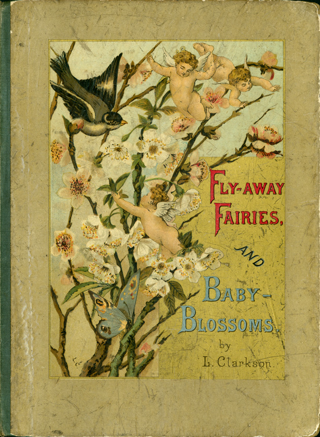
Louise Clarkson Whitelock. Fly Away Fairies and Baby Blossoms. New York, E.P. Dutton and London, Griffith and Farran, 1882.
The artwork in this week’s fairy tale book is typical of the Victorian period. I’m not especially fond of this style of art, but I think this book is interesting because its fairies look a lot like like cherubs. I also think the eyes of the children in the book look dull and creepy which is an unexpected bit of a laugh in a children’s fairy story book.
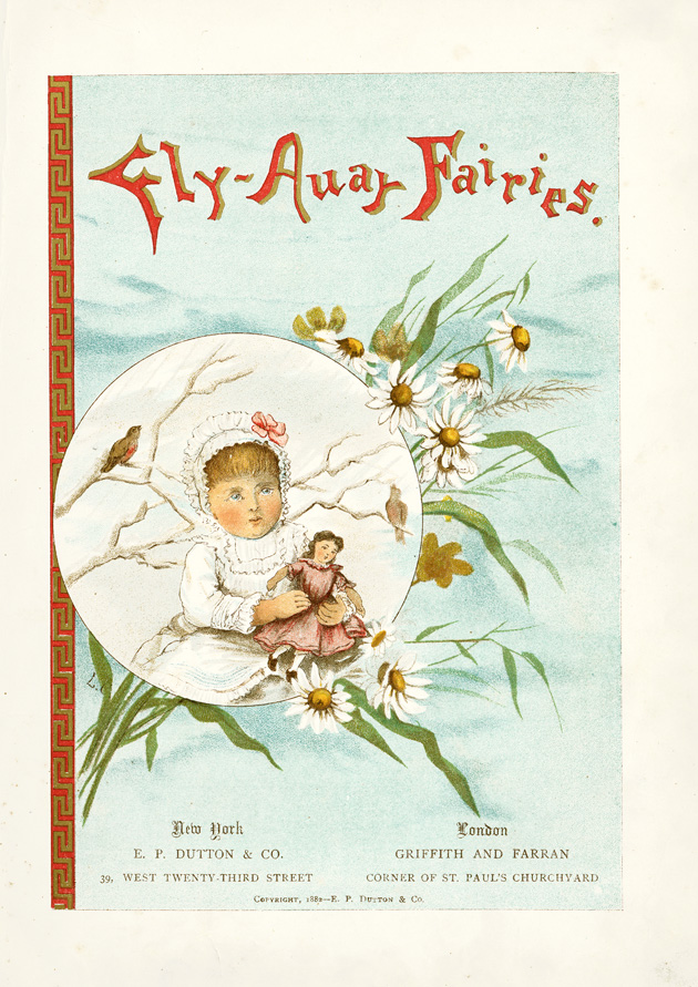
Fly Away Fairies and Baby Blossoms, Title page

Fly Away Fairies and Baby Blossoms, page 4

Fly Away Fairies and Baby Blossoms, page 6

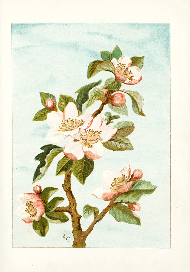
Fly Away Fairies and Baby Blossoms , page 8
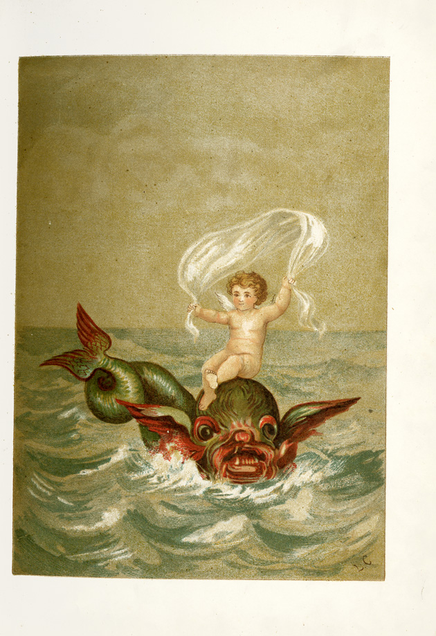
Fly Away Fairies and Baby Blossoms, page 10

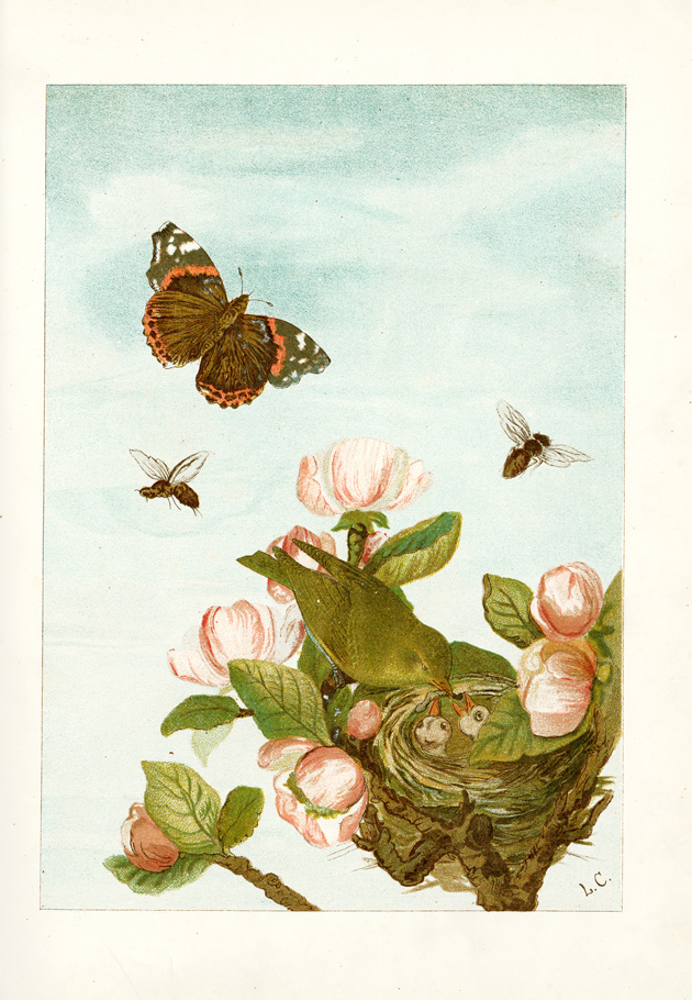
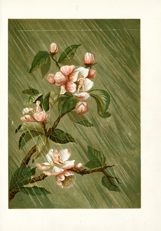
Fly Away Fairies and Baby Blossoms, page 12

Fly Away Fairies and Baby Blossoms, page 14

Fly Away Fairies and Baby Blossoms, page 16

Fly Away Fairies and Baby Blossoms, page 18
Fly Away Fairies and Baby Blossoms, page 20
Fly Away Fairies and Baby Blossoms , page 22

Fly Away Fairies and Baby Blossoms, page 24
Fly Away Fairies and Baby Blossoms, page 26

Fly Away Fairies and Baby Blossoms, page 28

Fly Away Fairies and Baby Blossoms, page 30

Fly Away Fairies and Baby Blossoms, page 31
I do not like this at all, creepy and nasty. Plus why are the flying babies hi-jacking o many other creatures to carry them? Lazy little creeps.