Well, if you came here for sex, or torture, or Nazis, I am not sorry to disappoint you. I just stole that title from the CBC article featured in this post.
Instead, I want to talk about Norm Eastman. For someone whose art was so ubiquitous, there is surprisingly little information to find – some sources even label him an American artist. He is, however, Canadian – the CBC story is fairly short, but it provides interesting insight into an artist whose art is simultaneously recognizable and somehow obscure. I think part of this obscurity is due to the perceived anonymity of many cover artists, especially those working in pulp fiction (that is, not ‘literature’, according to… someone). Well, perhaps with time, notoriety – or at least, recognition – eventually follows:
Few people would have guessed that shy, unassuming Norm Eastman — born in St. Stephen [New Brunswick] and trained at Mount Allison University — was one of the top illustrators fuelling the fantasies of a generation of young men.
“We used to hide those illustrations under the bed or in the closet,” said Jane Eastman, Norm’s wife of 27 years.
“He thought it was funny. Norm probably was the most moral person I’ve ever known, he really was. It was a matter of being able to afford a loaf of bread and peanut butter to eat.”
Times sure do change. In 2019, original Norman Eastman illustrations can sell to collectors for as much as $15,000.
But how Eastman’s bodice-ripping illustrations made it from small-town New Brunswick into the hands of millions of readers is a story that remains, for the most part, untold.
Pause here, because I would like to point out that Eastman was certainly talented – I particularly like this one, one of his early self-portraits:

Portrait of the artist as a young man: a self-portrait in oils Norm Eastman painted in 1952 as his final project in the fine arts program at Mount Allison University. (Submitted by Owens Art Gallery ) From the CBC link.
I like his feel for light and shadow, all those detailed accents and reflections. His style here reminds me of someone well-known, but I can’t for the life of me say who. Anyway, moving on:
In 1958, Eastman brought his portfolio to the iconic U.S. artist Norman Rockwell, who said Eastman’s art was “of very high quality” and encouraged him to move to the United States.
Eastman took Rockwell’s advice — and in 1959 moved to New York City, where he rented a studio in an badly heated, roach-infested warehouse. Breaking into the publishing scene was slow going.
“He was very poor in New York,” his wife said. “It was really, really poor living.”
He got his first big break drawing for men’s magazines — but the subject matter was fairly predictable.
“They wanted beautiful girls, big bosoms and torture,” Jane said. “But never show the girl grimacing. She’s always got to be pretty.”
That last line there. How tenacious these ideas can be.
But it wasn’t just pretty girls in trouble, no. How about some ultra-manly cowboys?

In addition to his large body of erotic work, Eastman also illustrated cowboy magazines, including this April 1973 issue of Frontier West. (Republished with the permission of Jane Eastman) Via the CBC.
And he also did romance:

A 1970 Eastman illustration for the Pocket Books paperback A Nice Girl from Peyton Place, by Roger Fuller. (Republished with the permission of Jane Eastman) Via the CBC.
(69 of his works – I presume, from the previews, mostly romance covers – are compiled here.)
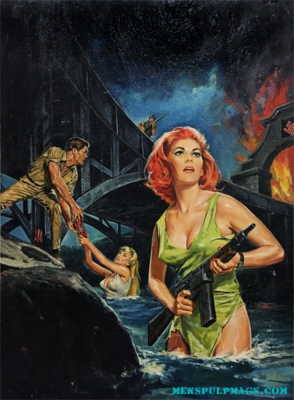
And of course, women fighting Nazis (I add this one because of her unusual state of dress – other cover models are not so covered, as it were…):

What I like most, though, is what his models thought about him:
In an as-yet-unpublished interview with Deis, pin-up model and actress Eva Lynd recalled Eastman as “respectful” and “my favourite artist to work with.”
“I had the feeling that he had no idea how good he was. I still think he was the best of all the men’s adventure magazine illustrators that I have seen.”
I get the feeling that he was someone absolutely dedicated to his work, but who also managed to have fun with it.
Sometimes, Eastman would paint himself into the covers, “getting a friend of his to take a photo of him posing as the bad guy. It was awful, just terrible, terrible!” Lynd said, laughing.
Looking at these covers now, they truly feel outdated, and definitely not – as the CBC article states – politically correct, but I can still admire the vitality, the expression and realism (and I mean that in the general stylistic sense, not necessarily the actual illustrated situations, ha) that Eastman captures on paper. Still, as iconic as his art has become, I can’t help but wonder what he would have produced, if he had been a little less poor and a little more free to indulge his own creative directions.

Considering the confusion regarding Eastman’s origins, here’s a real piece of Canadiana to finish up:
The style looks familiar. I read a lot of schlock as a kid (but I was reading so much it was proportionally small). I still see artistic value in Frank Frazetta’s work…
Art style reminds me a lot of Norman Rockwell -- as if this guy’s commercial illustrations were the id to Rockwell’s superego.
But I’m no art critic, maybe I’m just reacting to deviation from the Norms (nyuk nyuk).
What, you too? “It just had to be said”? *groooooooaaannnnnn* :D