Rationality Rules is an Abusive Transphobe

Abuse comes in more forms than many people realize. Take financial abuse, where someone uses economic leverage to control you, or reproductive coercion, or this behaviour.

Gaslighting is a form of emotional abuse where the abuser intentionally manipulates the physical environment or mental state of the abusee, and then deflects responsibility by provoking the abusee to think that the changes reside in their imagination, thus constituting a weakened perception of reality (Akhtar, 2009; Barton & Whitehead, 1969; Dorpat, 1996; Smith & Sinanan, 1972). By repeatedly and convincingly offering explanations that depict the victim as unstable, the abuser can control the victim’s perception of reality while maintaining a position of truth-holder and authority.

Roberts, Tuesda, and Dorinda J. Carter Andrews. “A Critical Race Analysis of the Gaslighting against African American Teachers.” Contesting the Myth of a” Post Racial Era”: The Continued Significance of Race in US Education, 2013, 69–94.

A small but growing amount of the scientific literature considers gaslighting a form of abuse. It’s also worth knowing about a close cousin of gaslighting known as “DARVO.”

DARVO refers to a reaction perpetrators of wrong doing, particularly sexual offenders, may display in response to being held accountable for their behavior. DARVO stands for “Deny, Attack, and Reverse Victim and Offender.” The perpetrator or offender may Deny the behavior, Attack the individual doing the confronting, and Reverse the roles of Victim and Offender such that the perpetrator assumes the victim role and turns the true victim — or the whistle blower — into an alleged offender. This occurs, for instance, when an actually guilty perpetrator assumes the role of “falsely accused” and attacks the accuser’s credibility and blames the accuser of being the perpetrator of a false accusation. […]

In a 2017 peer-reviewed open-access research study, Perpetrator Responses to Victim Confrontation: DARVO and Victim Self-Blame, Harsey, Zurbriggen, & Freyd reported that: “(1) DARVO was commonly used by individuals who were confronted; (2) women were more likely to be exposed to DARVO than men during confrontations; (3) the three components of DARVO were positively correlated, supporting the theoretical construction of DARVO; and (4) higher levels of exposure to DARVO during a confrontation were associated with increased perceptions of self-blame among the confronters. These results provide evidence for the existence of DARVO as a perpetrator strategy and establish a relationship between DARVO exposure and feelings of self-blame.

If DARVO seems vaguely familiar, that’s because it’s a popular tactic in the far-Right. Brett Kavanaugh used it during his Congressional hearing, this YouTuber encountered it quite a bit among the Proud Boys, and even RationalWiki’s explanation of it invokes the Christian far-Right. DARVO may be common among sexual abusers, but it’s important to stress that it’s not exclusive to them. It’s best to think of this solely as an abusive tactic to evade scrutiny, without that extra baggage. [Read more…]

The Crisis of the Mediocre Man

I was browsing YouTube videos on PyMC3, as one naturally does, when I happened to stumble on this gem.

Tech has spent millions of dollars in efforts to diversify workplaces. Despite this, it seems after each spell of progress, a series of retrograde events ensue. Anti-diversity manifestos, backlash to assertive hiring, and sexual misconduct scandals crop up every few months, sucking the air from every board room. This will be a digest of research, recent events, and pointers on women in STEM.

Lorena A. Barba really knows her stuff; the entire talk is a rapid-fire accounting of claims and counterclaims, aimed to directly appeal to the male techbros who need to hear it. There was a lot of new material in there, for me at least. I thought the only well-described matriarchies came from the African continent, but it turns out the Algonquin also fit that bill. Some digging turns up a rich mix of gender roles within First Nations peoples, most notably the Iroquois and Hopi. I was also depressed to hear that the R data analysis community is better at dealing with sexual harassment than the skeptic/atheist community.

But what really grabbed my ears was the section on gender quotas. I’ve long been a fan of them on logical grounds: if we truly believe the sexes are equal, then if we see unequal representation we know discrimination is happening. By forcing equality, we greatly reduce network effects where one gender can team up against the other. Worried about an increase in mediocrity? At worst that’s a temporary thing that disappears once the disadvantaged sex gets more experience, and at best the overall quality will actually go up. The research on quotas has advanced quite a bit since that old Skepchick post. Emphasis mine.

In 1993, Sweden’s Social Democratic Party centrally adopted a gender quota and imposed it on all the local branches of that party (…). Although their primary aim was to improve the representation of women, proponents of the quota observed that the reform had an impact on the competence of men. Inger Segelström (the chair of Social Democratic Women in Sweden (S-Kvinnor), 1995–2003) made this point succinctly in a personal communication:

At the time, our party’s quota policy of mandatory alternation of male and female names on all party lists became informally known as the crisis of the mediocre man

We study the selection of municipal politicians in Sweden with regard to their competence, both theoretically and empirically. Moreover, we exploit the Social Democratic quota as a shock to municipal politics and ask how it altered the competence of that party’s elected politicians, men as well as women, and leaders as well as followers.

Besley, Timothy. “Gender Quotas and the Crisis of the Mediocre Man: Theory and Evidence from Sweden.” THE AMERICAN ECONOMIC REVIEW 107, no. 8 (2017): 39.

We can explain this with the benefit of hindsight: if men can rely on the “old boy’s network” to keep them in power, they can afford to slack off. If other sexes cannot, they have to fight to earn their place. These are all social effects, though; if no sex holds a monopoly on operational competence in reality, the net result is a handful of brilliant women among a sea of iffy men. Gender quotas severely limit the social effects, effectively kicking out the mediocre men to make way for average women, and thus increase the average competence.

As tidy as that picture is, it’s wrong in one crucial detail. Emphasis again mine.

These estimates show that the overall effect mainly reflects an improvement in the selection of men. The coefficient in column 4 means that a 10-percentage-point larger quota bite (just below the cross-sectional average for all municipalities) raised the proportion of competent men by 4.4 percentage points. Given an average of 50 percent competent politicians in the average municipality (by definition, from the normalization), this corresponds to a 9 percent increase in the share of competent men.

For women, we obtain a negative coefficient in the regression specification without municipality trends, but a positive coefficient with trends. In neither case, however, is the estimate significantly different from zero, suggesting that the quota neither raised nor cut the share of competent women. This is interesting in view of the meritocratic critique of gender quotas, namely that raising the share of women through a quota must necessarily come at the price of lower competence among women.

Increasing the number of women does not also increase the number of incompetent women. When you introduce a quota, apparently, everyone works harder to justify being there. The only people truly hurt by gender quotas are mediocre men who rely on the Peter Principle.

The like ratio for said talk. 47 likes, 55 dislikes, FYI.Alas, if that YouTube like ratio is any indication, there’s a lot of them out there.

Rationality Rules DESTROYS Women’s Sport!!1!

I still can’t believe this post exists, given its humble beginnings.

The “women’s category” is, in my opinion, poorly named given our current climate, and so I’d elect a name more along the lines of the “Under 5 nmol/l category” (as in, under 5 nanomoles of testosterone per litre), but make no mistake about it, the “woman’s category” is not based on gender or identity, or even genitalia or chromosomes… it’s based on hormone levels and the absence of male puberty.

The above comment wasn’t in Rationality Rules’ latest transphobic video, it was just a casual aside by RR himself in the YouTube comment section. He’s obiquely doubled-down via Twitter (hat tip to Essence of Thought):

Of course, just as I support trans men competing in all “men’s categories” (poorly named), women who have not experienced male puberty competing in all women’s sport (also poorly named) and trans women who have experienced male puberty competing in long-distance running.

To further clarify, I think that we must rename our categories according to what they’re actually based on. It’s not right to have a “women’s category” and yet say to some trans women (who are women!) that they can’t compete within it; it should be renamed.

The proposal itched away at me, though, because I knew it was testable.

There is a need to clarify hormone profiles that may be expected to occur after competition when antidoping tests are usually made. In this study, we report on the hormonal profile of 693 elite athletes, sampled within 2 h of a national or international competitive event. These elite athletes are a subset of the cross-sectional study that was a component of the GH-2000 research project aimed at developing a test to detect abuse with growth hormone.

Healy, Marie-Louise, et al. “Endocrine profiles in 693 elite athletes in the postcompetition setting.” Clinical endocrinology 81.2 (2014): 294-305.

The GH-2000 project had already done the hard work of collecting and analyzing blood samples from athletes, so checking RR’s proposal was no tougher than running some numbers. There’s all sorts of ethical guidelines around sharing medical info, but fortunately there’s an easy shortcut: ask one of the scientists involved to run the numbers for me, and report back the results. Aggregate data is much more resistant to de-anonymization, so the ethical concerns are greatly reduced. The catch, of course, is that I’d have to find a friendly researcher with access to that dataset. About a month ago, I fired off some emails and hoped for the best.

I wound up much, much better than the best. I got full access to the dataset!! You don’t get handed an incredible gift like this and merely use it for a blog post. In my spare time, I’m flexing my Bayesian muscles to do a re-analysis of the above paper, while also looking for observations the original authors may have missed. Alas, that means my slow posting schedule is about to crawl.

But in the meantime, we have a question to answer.

What Do We Have Here?

(Click here to show the code)
Total Assigned-female Athletes = 239
  Height, Mean           = 171.61 cm
  Height, Std.Dev        = 7.12 cm
  Weight, Mean           = 64.27 kg
  Weight, Std.Dev        = 9.12 kg
  Body Fat, Mean         = 13.19 kg
  Body Fat, Std.Dev      = 3.85 kg
  Testosterone, Mean     = 2.68 nmol/L
  Testosterone, Std.Dev  = 4.33 nmol/L
  Testosterone, Max      = 31.90 nmol/L
  Testosterone, Min      = 0.00 nmol/L

Total Assigned-male Athletes = 454
  Height, Mean           = 182.72 cm
  Height, Std.Dev        = 8.48 cm
  Weight, Mean           = 80.65 kg
  Weight, Std.Dev        = 12.62 kg
  Body Fat, Mean         = 8.89 kg
  Body Fat, Std.Dev      = 7.20 kg
  Testosterone, Mean     = 14.59 nmol/L
  Testosterone, Std.Dev  = 6.66 nmol/L
  Testosterone, Max      = 41.00 nmol/L
  Testosterone, Min      = 0.80 nmol/L

The first step is to get a basic grasp on what’s there, via some crude descriptive statistics. It’s also useful to compare these with the original paper, to make sure I’m interpreting the data correctly. Excusing some minor differences in rounding, the above numbers match the paper.

The only thing that stands out from the above, to me, is the serum levels of testosterone. At least one source says the mean of these assigned-female athletes is higher than the normal range for their non-athletic cohorts. Part of that may simply be because we don’t have a good idea of what the normal range is, so it’s not uncommon for each lab to have their own definition of “normal.” This is even worse for those assigned female, since their testosterone levels are poorly studied; note that my previous link collected the data of over a million “men,” but doesn’t mention “women” once. Factor in inaccurate test results and other complicating factors, and “normal” is quite poorly-defined.

Still, Rationality Rules is either convinced those complications are irrelevant, or ignorant of them. And, to be fair, that 5nmol/L line implicitly sweeps a lot of them under the rug. Let’s carry on, then, and look for invalid data. “Invalid” covers everything from missing data, to impossible data, and maybe even data we think might be made inaccurate due to measurement error. I consider a concentration of zero testosterone as invalid, even though it may technically be possible.

(Click here to show the code)
Total Assigned-male Athletes w/ T levels >= 0        = 446
                             w/ T levels <= 0.5      = 0
                             w/ T levels == 0        = 0
                             w/ missing T levels     = 8
                             that I consider valid   = 446

Total Assigned-female Athletes w/ T levels >= 0      = 234
                               w/ T levels <= 0.5    = 5
                               w/ T levels == 0      = 1
                               w/ missing T levels   = 5
                               that I consider valid = 229

Fortunately for us, the losses are pretty small. 229 datapoints is a healthy sample size, so we can afford to be liberal about what we toss out. Next up, it would be handy to see the data in chart form.

(Click here to show the code)

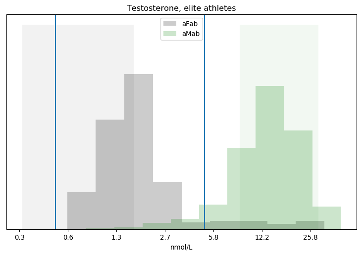
Testosterone, elite athletes

I've put vertical lines at both the 0.5 and 5 nmol/L cutoffs. There's a big difference between categories, but we can see clouds on the horizon: a substantial number of assigned-female athletes have greater than 5 nmol/L of testosterone in their bloodstream, while a decent number of assigned-male athletes have less. How many?

(Click here to show the code)
Segregating Athletes by Testosterone
Concentration  aFab  aMab
   > 5nmol/L    19   417
   < 5nmol/L   210    26
   = 5nmol/L     0     3

8.3% of assigned-female athletes have > 5nmol/L
5.8% of assigned-male athletes have < 5nmol/L
4.4% of athletes with > 5nmol/L are assigned-female
11.0% of athletes with < 5nmol/L are assigned-male

Looks like anywhere from 6-8% of athletes have testosterone levels that cross Rationality Rules' line. For comparison, maybe 1-2% of the general public has some level of gender dysphoria, though estimating exact figures is hard in the face of widespread discrimination and poor sex-ed in schools. Even that number is misleading, as the number of transgender athletes is substantially lower than 1-2% of the athletic population. The share of transgender athletes is irrelevant to this dataset anyway, as it was collected between 1996 and 1999, when no sporting agency had policies that allowed transgender athletes to openly compete.

That 6-8%, in other words, is entirely cisgender. This echoes one of Essence Of Thought's arguments: RR's 5nmol/L policy has far more impact on cis athletes than trans athletes, which could have catastrophic side-effects. Could is the operative word, though, because as of now we don't know anything about these athletes. Do >5nmol/L assigned-female athletes have bodies more like >5nmol/L assigned-male athletes than <5nmol/L assigned-female athletes? If so, then there's no problem. Equivalent body types are competing against each other, and outcomes are as fair as could be reasonably expected.

What, then, counts as an "equivalent" body type when it comes to sport?

Newton's First Law of Athletics

One reasonable measure of equivalence is height. It's one of the stronger sex differences, and height is also correlated with longer limbs and greater leverage. Whether that's relevant to sports is debatable, but height and correlated attributes dominate Rationality Rules' list.

[19:07] In some events - such as long-distance running, in which hemoglobin and slow-twitch muscle fibers are vital - I think there's a strong argument to say no, [transgender women who transitioned after puberty] don't have an unfair advantage, as the primary attributes are sufficiently mitigated. But in most events, and especially those in which height, width, hip size, limb length, muscle mass, and muscle fiber type are the primary attributes - such as weightlifting, sprinting, hammer throw, javelin, netball, boxing, karate, basketball, rugby, judo, rowing, hockey, and many more - my answer is yes, most do have an unfair advantage.

Fortunately for both of us, most athletes in the dataset have a "valid" height, which I define as being at least 30cm tall.

(Click here to show the code)
Out of 693 athletes, 678 have valid height data.

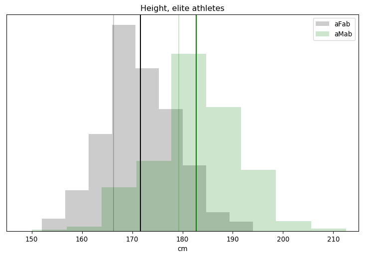
Height, elite athletes

The faint vertical lines are for the mean adult height of Germans born in 1976, which should be a reasonable cohort to European athletes that were active between 1996 and 1999, while the darker lines are each category's mean. Athletes seem slightly taller than the reference average, but only by 2-5cm. The amount of overlap is also surprising, given that height is supposed to be a major sex difference. We actually saw less overlap with testosterone! Finally, the height distribution isn't quite Gaussian, there's a subtle bias towards the taller end of the spectrum.

Height is a pretty crude metric, though. You could pair any athlete with a non-athlete of the same height, and there's no way the latter would perform as well as the former. A better measure of sporting ability would be muscle mass. We shouldn't use the absolute mass, though: bigger bodies have more mass and need more force to accelerate as smaller bodies do, so height and muscle mass are correlated. We need some sort of dimensionless scaling factor which compensates.

And we have one! It's called the Body Mass Index, or BMI.

$$ BMI = \frac w {h^2}, $$

where \(w\) is a person's mass in kilograms, and \(h\) is a person's height in metres. Unfortunately, BMI is quite problematic. Partly that's because it is a crude measure of obesity. But part of that is because there are two types of tissue which can greatly vary, body fat and muscle, yet both contribute equally towards BMI.

That's all fixable. For one, some of the athletes in this dataset had their body fat measured. We can subtract that mass off, so their weight consists of tissues that are strongly correlated with height plus one that is fudgable: muscle mass. For two, we're not assessing these individual's health, we only want a dimensionless measure of muscle mass relative to height. For three, we're not comparing these individuals to the general public, so we're not restricted to using the general BMI formula. We can use something more accurate.

The oddity is the appearance of that exponent 2, though our world is three-dimensional. You might think that the exponent should simply be 3, but that doesn't match the data at all. It has been known for a long time that people don't scale in a perfectly linear fashion as they grow. I propose that a better approximation to the actual sizes and shapes of healthy bodies might be given by an exponent of 2.5. So here is the formula I think is worth considering as an alternative to the standard BMI:

$$ BMI' = 1.3 \frac w {h^{2.5}} $$

I can easily pop body fat into Nick Trefethen's formula, and get a better measure of relative muscle mass,

$$ \overline{BMI} = 1.3 \frac{ w - bf }{h^{2.5}}, $$

where \(bf\) is total body fat in kilograms. Individuals with excess muscle mass, relative to what we expect for their height, will have a high \(\overline{BMI}\), and vice-versa. And as we saw earlier, muscle mass is another of Rationality Rules' determinants of sporting performance.

Time for more number crunching.

(Click here to show the code)
Out of 693 athletes, 227 have valid adjusted BMIs.
                     663 have valid weights.
                     241 have valid body fat percentages.

Total Assigned-female Athletes = 239
 total with valid adjusted BMI = 86
  adjusted BMI, Mean     = 16.98
  adjusted BMI, Std.Dev  = 1.21
  adjusted BMI, Median   = 16.96

Total Assigned-male Athletes = 454
 total with valid adjusted BMI = 141
  adjusted BMI, Mean     = 20.56
  adjusted BMI, Std.Dev  = 1.88
  adjusted BMI, Median   = 20.28

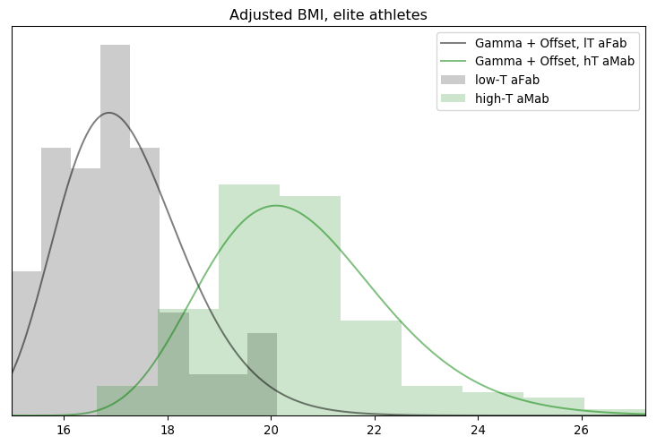
The bad news is that most of this dataset lacks any information on body fat, which really cuts into our sample size. The good news is that we've still got enough to carry on. It also looks like there's a strong sex difference, and the distribution is pretty clustered. Still, a chart would help clarify the latter point.

(Click here to show the code)

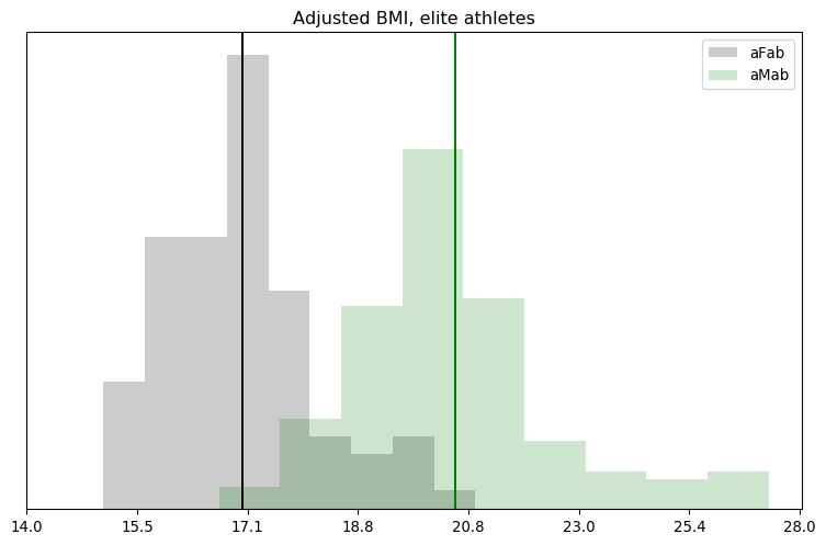
Adjusted BMI, elite athletes

Whoops! There's more overlap and skew than I thought. Even in logspace, the results don't look Gaussian. We'll have to remember that for the next step.

A Man Without a Plan is Not a Man

Just looking at charts isn't going to solve this question, we need to do some sort of hypothesis testing. Fortunately, all the pieces I need are here. We've got our hypothesis, for instance:

Athletes with exceptional testosterone levels are more like athletes of the same sex but with typical testosterone levels, than they are of other athletes with a different sex but similar testosterone levels.

If you know me, you know that I'm all about the Bayes, and that gives us our methodology.

  1. Fit a model to a specific metric for assigned-female athletes with less than 5nmol/L of serum testosterone.
  2. Fit a model to a specific metric for assigned-male athletes with more than 5nmol/L of serum testosterone.
  3. Apply the first model to the test group, calculating the overall likelihood.
  4. Apply the second model to the test group, calculating the overall likelihood.
  5. Sample the probability distribution of the Bayes Factor.

"Metric" is one of height or \(\overline{BMI}\), while "test group" is one of assigned-female athletes with >5nmol/L of serum testosterone or assigned-male athletes with <5nmol/L of serum testosterone. The Bayes Factor is simply

$$ \text{Bayes Factor} = \frac{ p(E \mid H_1) \cdot p(H_1) }{ p(E \mid H_2) \cdot p(H_2) } = \frac{ p(H_1 \mid E) }{ p(H_2 \mid E) }, $$

which means we need two hypotheses, not one. Fortunately, I've phrased the hypothesis to make it easy to negate: athletes with exceptional testosterone levels are less like athletes of the same sex but with typical testosterone levels, than they are of other athletes with a different sex but similar testosterone levels. We'll call this new hypothesis \(H_2\), and the original \(H_1\). Bayes factors greater than 1 mean \(H_1\) is more likely than \(H_2\), and vice-versa.

Calculating all that would be easy if I was using Stan or PyMC3, but I ran into problems translating the former's probability distributions into charts, and I don't have any experience with the latter. My next choice, emcee, forces me to manually convolve two posterior distributions. Annoying, but not difficult.

I'm a Model, If You Know What I Mean

That just leaves one thing left: what models are we going to use? The obvious choice for height is the Gaussian distribution, as from previous research we know it's a great model.

(Click here to show the code)
Fitting the height of lT aFab athletes to a Gaussian distribution ...
     0: (-980.322471) mu=150.000819, sigma=15.000177
    64: (-710.417497) mu=169.639051, sigma=8.579088
   128: (-700.539260) mu=171.107358, sigma=7.138832
   192: (-700.535241) mu=171.154151, sigma=7.133279
   256: (-700.540692) mu=171.152701, sigma=7.145515
   320: (-700.552831) mu=171.139668, sigma=7.166857
   384: (-700.530969) mu=171.086422, sigma=7.094077
    ML: (-700.525284) mu=171.155240, sigma=7.085777
median: (-700.525487) mu=171.134614, sigma=7.070993

Alas, emcee also lacks a good way to assess model fitness. One crude metric is look at the progression of the mean fitness; if it grows and then stabilizes around a specific value, as it does here, we've converged on something. Another is to compare the mean, median, and maximal likelihood of the posterior; if they're about equally likely, we've got a fuzzy caterpillar. Again, that's also true here.

As we just saw, though, charts are a better judge of fitness than a handful of numbers.

(Click here to show the code)

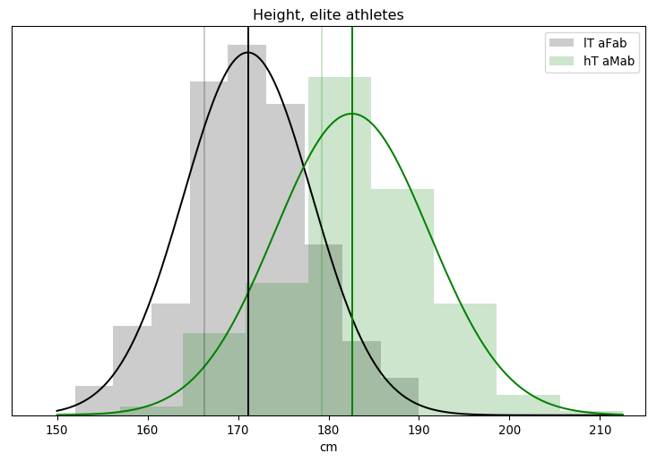
Height, elite athletes (now with a model).

If you were wondering why I didn't make much of a fuss out of the asymmetry in the height distribution, it's because I've already seen this graph. A good fit isn't necessarily the best though, and I might be able to get a closer match by incorporating the sport each athlete played.

(Click here to show the code)
            Assigned-female Athletes            
         sport              below/above 171cm   
           Power lifting:  1 / 0
              Basketball:  2 /12
                Football:  0 / 0
                Swimming: 41 /49
                Marathon:  0 / 1
                Canoeing:  1 / 0
                  Rowing:  9 /13
    Cross-country skiing:  8 / 1
           Alpine skiing: 11 / 1
          Weight lifting:  7 / 0
                    Judo:  0 / 0
                   Bandy:  0 / 0
              Ice Hockey:  0 / 0
                Handball: 12 /17
         Track and field: 22 /27

Basketball attracts tall people, unsurprisingly, while skiing seems to attract shorter people. This could be the cause of that asymmetry. It's no guarantee that I'll actually get a better fit, though, as I'm also dramatically cutting the number of datapoints to fit to. The model's uncertainty must increase as a result, and that may be enough to dilute out any increase in fitness. I'll run those numbers for the paper, but for now the Gaussian model I have is plenty good.

(Click here to show the code)
Fitting the height of hT aMab athletes to a Gaussian distribution ...
     0: (-2503.079578) mu=150.000061, sigma=15.001179
    64: (-1482.315571) mu=179.740851, sigma=10.506003
   128: (-1451.789027) mu=182.615810, sigma=8.620333
   192: (-1451.748336) mu=182.587979, sigma=8.550535
   256: (-1451.759883) mu=182.676004, sigma=8.546410
   320: (-1451.746697) mu=182.626918, sigma=8.538055
   384: (-1451.747266) mu=182.580692, sigma=8.534070
    ML: (-1451.746074) mu=182.591047, sigma=8.534584
median: (-1451.759295) mu=182.603231, sigma=8.481894

We get the same results when fitting the model to >5 nmol/L assigned-male athletes. The log likelihood, that number in brackets, is a lot lower for these athletes, but that number is roughly proportional to the number of samples. If we had the same degree of model fitness but doubled the number of samples, we'd expect the log likelihood to double. And, sure enough, this dataset has roughly twice as many assigned-male athletes as it does assigned-female athletes.

(Click here to show the code)

Height, elite athletes (now with both models)

The updated charts are more of the same.

Unfortunately, adjusted BMI isn't nearly as tidy. I don't have any prior knowledge that would favour a particular model, so I wound up testing five candidates: the Gaussian, Log-Gaussian, Gamma, Weibull, and Rayleigh distributions. All but the first needed an offset parameter to get the best results, which has the same interpretation as last time.

(Click here to show the code)
Fitting the adjusted BMI of hT aMab athletes to a Gaussian distribution ...
     0: (-410.901047) mu=14.999563, sigma=5.000388
   384: (-256.474147) mu=20.443497, sigma=1.783979
    ML: (-256.461460) mu=20.452817, sigma=1.771653
median: (-256.477475) mu=20.427138, sigma=1.781139
(Click here to show the code)
Fitting the adjusted BMI of hT aMab athletes to a Log-Gaussian distribution ...
     0: (-629.141577) mu=6.999492, sigma=2.001107, off=10.000768
   384: (-290.910651) mu=3.812746, sigma=1.789607, off=16.633741
   ML: (-277.119315) mu=3.848383, sigma=1.818429, off=16.637382
median: (-288.278918) mu=3.795675, sigma=1.778238, off=16.637076
(Click here to show the code)
Fitting the adjusted BMI of hT aMab athletes to a Gamma distribution ...
    0: (-564.227696) alpha=19.998389, beta=3.001330, off=9.999839
   384: (-256.999252) alpha=15.951361, beta=2.194827, off=13.795466
ML    : (-248.056301) alpha=8.610936, beta=1.673886, off=15.343436
median: (-249.115483) alpha=12.411010, beta=2.005287, off=14.410945
(Click here to show the code)
Fitting the adjusted BMI of hT aMab athletes to a Weibull distribution ...
    0: (-48865.772268) k=7.999859, beta=0.099877, off=0.999138
  384: (-271.350390) k=9.937527, beta=0.046958, off=0.019000
   ML: (-270.340284) k=9.914647, beta=0.046903, off=0.000871
median: (-270.974131) k=9.833793, beta=0.046947, off=0.011727
(Click here to show the code)
Fitting the adjusted BMI of hT aMab athletes to a Rayleigh distribution ...
    0: (-3378.099000) tau=0.499136, off=9.999193
  384: (-254.717778) tau=0.107962, off=16.378780
   ML: (-253.012418) tau=0.110751, off=16.574934
median: (-253.092584) tau=0.108740, off=16.532576
(Click here to show the code)

Adjusted BMI, elite athletes (now with a LOT of models).

Looks like the Gamma distribution is the best of the bunch, though only if you use the median or maximal likelihood of the posterior. There must be some outliers in there that are tugging the mean around. Visually, there isn't too much difference between the Gaussian and Gamma fits, but the Rayleigh seems artificially sharp on the low end. It's a bit of a shame, the Gamma distribution is usually related to rates and variance so we don't have a good reason for applying it here, other than "it fits the best." We might be able to do better with a per-sport Gaussian distribution fit, but for now I'm happy with the Gamma.

Time to fit the other pool of athletes, and chart it all.

(Click here to show the code)
Fitting the adjusted BMI of lT aFab athletes to a Gamma distribution ...
    0: (-127.467934) alpha=20.000007, beta=3.000116, off=9.999921
   384: (-128.564564) alpha=15.481265, beta=3.161022, off=12.654149
ML    : (-117.582454) alpha=2.927721, beta=1.294851, off=14.713479
median: (-120.689425) alpha=11.961847, beta=2.836153, off=13.008723
(Click here to show the code)

Adjusted BMI, elite athletes (now with two Gamma models superimposed)

Those models look pretty reasonable, though the upper end of the assigned-female distribution could be improved on. It's a good enough fit to get some answers, at least.

The Nitty Gritty

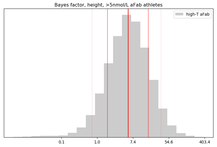
It's easier to combine step 3, applying the model, with step 5, calculating the Bayes Factor, when writing the code. The resulting Bayes Factor has a probability distribution, as the uncertainty contained in the posterior contaminates it.

(Click here to show the code)
Summary of the BF distribution, for the height of >5nmol/L aFab athletes
         n       mean   geo.mean         5%        16%        50%        84%        95%
        19      10.64       5.44       0.75       1.76       5.66      17.33      35.42

Percentage of BF's that favoured the primary hypothesis: 92.42%
Percentage of BF's that were 'decisive': 14.17%

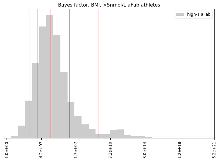
Bayes factor, height, >5nmol/L aFab athletes

That looks a lot like a log-Gaussian distribution. The arthithmetic mean fails us here, thanks to the huge range of values, so the geometric mean and median are better measures of central tendency.

The best way I can interpret this result is via an eight-sided die: our credence in the hypothesis that >5nmol/L aFab athletes are more like their >5nmol/L aMab peers than their <5nmol/L aFab ones is similar to the credence we'd place on rolling a one via that die, while our credence on the primary hypothesis is similar to rolling any other number except one. About 92% of the calculated Bayes Factors were favourable to the primary hypothesis, and about 16% of them crossed the 19:1 threshold, a close match for the asserted evidential bar in science.

That's strong evidence for a mere 19 athletes, though not quite conclusive. How about the Bayes Factor for the height of <5nmol/L aMab athletes?

(Click here to show the code)
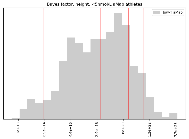
Summary of the BF distribution, for the height of <5nmol/L aMab athletes
         n       mean   geo.mean         5%        16%        50%        84%        95%
        26   4.67e+21   3.49e+18   5.67e+14   2.41e+16   5.35e+18   4.16e+20   4.61e+21

Percentage of BF's that favoured the primary hypothesis: 100.00%
Percentage of BF's that were 'decisive': 100.00%

Bayes factor, height, <5nmol/L aMab athletes

Wow! Even with 26 data points, our primary hypothesis was extremely well supported. Betting against that hypothesis is like betting a particular person in the US will be hit by lightning three times in a single year!

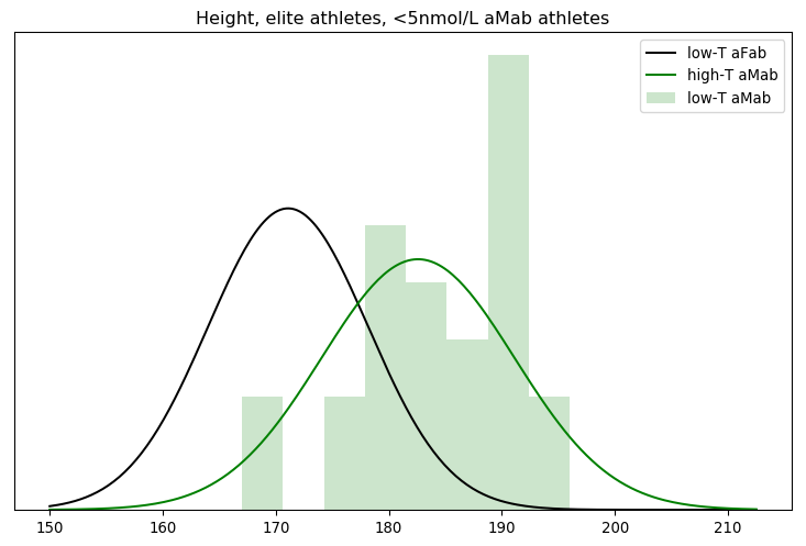
That seems a little too favourable to my view, though. Did something go wrong with the mathematics? The simplest check is to graph the models against the data they're evaluating.

(Click here to show the code)

Height, elite athletes, <5nmol/L aMab athletes

Nope, the underlying data genuinely is a better fit for the high-testosterone aMab model. But that good of a fit? In linear space, we multiply each of the individual probabilities to arrive at the Bayes factor. That's equivalent to raising the geometric mean to the nth power, where n is the number of athletes. Since n = 26 here, even a geometric mean barely above one can generate a big Bayes factor.

(Click here to show the code)
26th root of the median Bayes factor of the high-T aMab model applied to low-T aMab athletes: 5.2519
26th root of the Bayes factor for the median marginal: 3.6010

Note that the Bayes factor we generate by using the median of the marginal for each parameter isn't as strong as the median Bayes factor in the above convolution. That's simply because I'm using a small sample from the posterior distribution. Keeping more samples would have brought those two values closer together, but also greatly increased the amount of computation I needed to do to generate all those Bayes factors.

With that check out of the way, we can move on to \(\overline{BMI}\).

(Click here to show the code)
Summary of the BF distribution, for the adjusted BMI of >5nmol/L aFab athletes
         n       mean   geo.mean         5%        16%        50%        84%        95%
         4   1.70e+12   1.06e+05   2.31e+02   1.60e+03   4.40e+04   3.66e+06   3.99e+09

Percentage of BF's that favoured the primary hypothesis: 100.00%
Percentage of BF's that were 'decisive': 99.53%
Percentage of non-finite probabilities, when applying the low-T aFab model to high-T aFab athletes: 0.00%
Percentage of non-finite probabilities, when applying the high-T aMab model to high-T aFab athletes: 10.94%

Bayes factor, BMI, >5nmol/L aFab athletes

This distribution is much stranger, with a number of extremely high BF's that badly skew the mean. The offset contributes to this, with 7-12% of the model posteriors for high-T aMab athletes assigning a zero percent likelihood to an adjusted BMI. Those are excluded from the analysis, but they suggest the high-T aMab model poorly describes high-T aFab athletes.

Our credence in the primary hypothesis here is similar to our credence that an elite golfer will not land a hole-in-one on their next shot. That's surprisingly strong, given we're only dealing with four datapoints. More data may water that down, but it's unlikely to overcome that extreme level of credence.

(Click here to show the code)
Summary of the BF distribution, for the adjusted BMI of <5nmol/L aMab athletes
         n       mean   geo.mean         5%        16%        50%        84%        95%
         9   6.64e+35   2.07e+22   4.05e+12   4.55e+16   6.31e+21   7.72e+27   9.81e+32

Percentage of BF's that favoured the primary hypothesis: 100.00%
Percentage of BF's that were 'decisive': 100.00%
Percentage of non-finite probabilities, when applying the high-T aMab model to low-T aMab athletes: 0.00%
Percentage of non-finite probabilities, when applying the low-T aFab model to low-T aMab athletes: 0.00%

Bayes factor, BMI, <5nmol/L aMab athletes

The hypotheses' Bayes factor for the adjusted BMI of low-testosterone aMab athletes is much better behaved. Even here, the credence is above three-lightning-strikes territory, pretty decisively favouring the hypothesis.

Our final step would normally be to combine all these individual Bayes factors into a single one. That involves multiplying them all together, however, and a small number multiplied by a very large one is an even larger one. It isn't worth the effort, the conclusion is pretty obvious.

Truth and Consequences

Our primary hypothesis is on quite solid ground: Athletes with exceptional testosterone levels are more like athletes of the same sex but with typical testosterone levels, than they are of other athletes with a different sex but similar testosterone levels. If we divide up sports by testosterone level, then, roughly 6-8% of assigned-male athletes will wind up in the <5 nmol/L group, and about the same share of assigned-female athletes will be in the >5 nmol/L group. Note, however, that it doesn't follow that 6-8% of those in the <5 nmol/L group will be assigned-male. About 41% of the athletes at the 2018 Olymics were assigned-female, for instance. If we fix the rate of exceptional testosterone levels at 7%, and assume PyeongChang's rate is typical, a quick application of Bayes' theorem reveals

$$ \begin{align} p( \text{aMab} \mid \text{<5nmol/L} ) &= \frac{ p( \text{<5nmol/L} \mid \text{aMab} ) p( \text{aMab} ) }{ p( \text{<5nmol/L} \mid \text{aMab} ) p( \text{aMab} ) + p( \text{<5nmol/L} \mid \text{aFab} ) p( \text{aFab} ) } \\ {} &= \frac{ 0.07 \cdot 0.59 }{ 0.07 \cdot 0.59 + 0.93 \cdot 0.41 } \\ {} &\approx 9.8\% \end{align} $$

If all those assumptions are accurate, about 10% of <5 nmol/L athletes will be assigned-male, more-or-less matching the number I calculated way back at the start. In sports where performance is heavily correlated with height or \(\overline{BMI}\), then, the 10% of assigned-male athletes in the <5 nmol group will heavily dominate the rankings. The odds of a woman earning recognition in this sport are negligible, leading many of them to drop out. This increases the proportion of men in that sport, leading to more domination of the rankings, more women dropping out, and a nasty feedback loop.

Conversely, about 5% of >5nmol/L athletes will be assigned-female. In a heavily-correlated sport, those women will be outclassed by the men and have little chance of earning recognition for their achievements. They have no incentive to compete, so they'll likely drop out or avoid these sports as well.

In events where physicality has less or no correlation with sporting performance, these effects will be less pronounced or non-existent, of course. But this still translates into fewer assigned-female athletes competing than in the current system.

But it gets worse! We'd also expect an uptick in the number of assigned-female athletes doping, primarily with testosterone inhibitors to bring themselves just below the 5nmol/L line. Alternatively, high-testosterone aFab athletes may inject large doses of testosterone to bulk up and remain competitive with their assigned-male competitors.

By dividing up testosterone levels into only two categories, sporting authorities are implicitly stating that everyone within those categories is identical. A number of athletes would likely go to court to argue that boosting or inhibiting testosterone should be legal, provided they do not cross the 5nmol/L line. If they're successful, then either the rules around testosterone usage would be relaxed, or sporting authorities would be forced to subdivide these groups further. This would lead to an uptick in testosterone doping among all athletes, not just those assigned female.

Notice that assigned-male athletes don't have the same incentives to drop out, and in fact the low-testosterone subgroup may even be encouraged to compete as they have an easier path to sporting fame and glory. Sports where performance is heavily correlated with height or \(\overline{BMI}\) will come to be dominated by men.

Let's Put a Bow On This One

[1:15] In a nutshell, I find the arguments and logic that currently permit transgender women to compete against biological women to be remarkably flawed, and I’m convinced that unless quickly rectified, this will KILL women’s sports.

[14:00] I don’t want to see the day when women’s athletics is dominated by Y chromosomes, but without a change in policy, that is precisely what’s going to happen.

It's rather astounding. Transgender athletes are a not a problem, on several levels; as I've pointed out before, they've been allowed to compete in the category they identify for over a decade in some places, and yet no transgender athlete has come to dominate any sport. The Olympics has held the door open since 2004, and not a single transgender athlete has ever openly competed as a transgender athlete. Rationality Rules, like other transphobes, is forced to cherry-pick and commit lies of omission among a handful of examples, inflating them to seem more significant than they actually are.

In response to this non-existent problem, Rationality Rules' proposed solution would accomplish the very thing he wants to avoid! You don't get that turned around if you're a rational person with a firm grasp on the science.

No, this level of self-sabotage is only possible if you're a clueless bigot who's ignorant of the relevant science, and so frightened of transgender people that your critical thinking skills abandon you. The vast difference between what Rationality Rules claims the science says, and what his own citations say, must be because he knows that if he puts on a good enough act nobody will check his work. Everyone will walk away assuming he's rational, rather than a scared, dishonest loon.

It's hard to fit any other conclusion to the data.

The Death of the ACA

I’ve been catching up on YouTube videos, and this interview with John Iacoletti and Chelsea Rodriguez really hit me. It’s bad enough that some jerks threw transgender people under the bus to protect a bigoted YouTuber, but think about what else these people have done:

Almost every organization runs on trust. The exceptions, like the US Department of Defense and Facebook, can only get away with it because their “customers” have no alternative. People in need of a medium-sized atheist/skeptic non-profit have a number of good alternatives to pick from, in contrast.

At this point, would you trust the ACA enough to collaborate with them instead of another organization? Would you donate money to help keep them afloat? [Read more…]

Texas Sharpshooter

Quick Note

I’m trying something new! This blog post is available in two places, both here and on a Jupyter notebook. Over there, you can tweak and execute my source code, using it as a sandbox for your own explorations. Over here, it’s just a boring ol’ webpage without any fancy features, albeit one that’s easier to read on the go. Choose your own adventure!

Oh also, CONTENT WARNING: I’ll briefly be discussing sexual assault statistics from the USA at the start, in an abstract sense.

Introduction

[5:08] Now this might seem pedantic to those not interested in athletics, but in the athletic world one percent is absolutely massive. Just take for example the 2016 Olympics. The difference between first and second place in the men’s 100-meter sprint was 0.8%.

I’ve covered this argument from Rationality Rules before, but time has made me realise my original presentation had a problem.

His name is Steven Pinker.

(Click here to show the code)

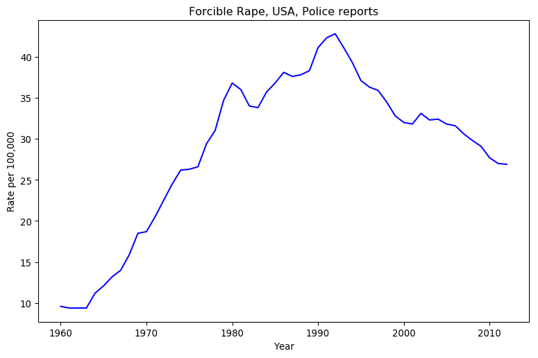
Forcibe Rape, USA, Police ReportsHe looks at that graph, and sees a decline in violence. I look at that chart, and see an increase in violence. How can two people look at the same data, and come to contradictory conclusions?

Simple, we’ve got at least two separate mental models.

(Click here to show the code)
Finding the maximal likelihood, please wait ... done.
Running an MCMC sampler, please wait ... done.
Charting the results, please wait ...

The same chart as before, with three models overlaid.

All Pinker cares about is short-term trends here, as he’s focused on “The Great Decline” in crime since the 1990’s. His mental model looks at the general trend over the last two decades of data, and discards the rest of the datapoints. It’s the model I’ve put in red.

I used two seperate models in my blog post. The first is quite crude: is the last datapoint better than the first? This model is quite intuitive, as it amounts to “leave the place in better shape than when you arrived,” and it’s dead easy to calculate. It discards all but two datapoints, though, which is worse than Pinker’s model. I’ve put this one in green.

The best model, in my opinion, wouldn’t discard any datapoints. It would also incorporate as much uncertainty as possible about the system. Unsurprisingly, given my blogging history, I consider Bayesian statistics to be the best way to represent uncertainty. A linear model is the best choice for general trends, so I went with a three-parameter likelihood and prior:

p( x,y | m,b,\log(\sigma) ) = e^{ -\frac 1 2 \big(\frac{y-k}{\sigma}\big)^2 }(\sigma \sqrt{2\pi})^{-1}, ~ k = x \cdot m + b p( m,b,\log(\sigma) ) = \frac 1 \sigma (1 + m^2)^{-\frac 3 2}

This third model encompasses all possible trendlines you could draw on the graph, but it doesn’t hold them all to be equally likely. Since time is short, I used an MCMC sampler to randomly sample the resulting probability distribution, and charted that sample in blue. As you can imagine this requires a lot more calculation than the second model, but I can’t think of anything superior.

Which model is best depends on the context. If you were arguing just over the rate of police-reported sexual assault from 1992 to 2012, Pinker’s model would be pretty good if incomplete. However, his whole schtick is that long-term trends show a decrease in violence, and when it comes to sexual violence in particular he’s the only one who dares to talk about this. He’s not being self-consistent, which is easier to see when you make your implicit mental models explicit.

Pointing at Variance Isn’t Enough

Let’s return to Rationality Rules’ latest transphobic video. In the citations, he explicitly references the men’s 100m sprint at the 2016 Olympics. That’s a terribly narrow window to view athletic performance through, so I tracked down the racetimes of all eight finalists on the IAAF’s website and tossed them into a spreadsheet.


(Click here to show the code)
Rio de Janeiro Olympic Games, finals
Athlete  Result  Delta
     bolt    9.81   0.00
   gatlin    9.89   0.08
de grasse    9.91   0.10
    blake    9.93   0.12
  simbine    9.94   0.13
    meite    9.96   0.15
   vicaut   10.04   0.23
  bromell   10.06   0.25

Here, we see exactly what Rationality Rules sees: Usain Bolt, the current world record holder, earned himself another Olympic gold medal in the 100m sprint. First and third place are separated by a tenth of a second, and the slowest person in the finals was a mere quarter of a second behind the fastest. That’s a small fraction of the time it takes to complete the event.

(Click here to show the code)
Race times in 2016, sorted by fastest time
Name             Min time         Mean             Median           Personal max-min
-----------------------------------------------------------------------------------------------------
gatlin                        9.8         9.95         9.94         0.39
bolt                         9.81         9.98        10.01         0.34
bromell                      9.84        10.00        10.01         0.30
vicaut                       9.86        10.01        10.02         0.33
simbine                      9.89        10.10        10.08         0.43
de grasse                    9.91        10.07        10.04         0.41
blake                        9.93        10.04         9.98         0.33
meite                        9.95        10.10        10.05         0.44

Here, we see what I see: the person who won Olympic gold that year didn’t have the fastest time. That honour goes to Justin Gatlin, who squeaked ahead of Bolt by a hundredth of a second.

Come to think of it, isn’t the fastest time a poor judge of how good an athlete is? Picture one sprinter with a faster average time than another, and a second with a faster minimum time. The first athlete will win more races than the second. By that metric, Gatlin’s lead grows to three hundredths of a second.

The mean, alas, is easily tugged around by outliers. If someone had an exceptionally good or bad race, they could easily shift their overall mean a decent ways from where the mean of every other result lies. The median is a lot more resistant to the extremes, and thus a fairer measure of overall performance. By that metric, Bolt is now tied for third with Trayvon Bromell.

We could also judge how good an athlete is by how consistent they were in the given calendar year. By this metric, Bolt falls into fourth place behind Bromell, Jimmy Vicaut, and Yohan Blake. Even if you don’t agree to this metric, notice how everyone’s race times in 2016 varies between three and four tenths of a second. It’s hard to argue that a performance edge of a tenth of a second matters when even at the elite level sprinters’ times will vary by significantly more.

But let’s put on our Steven Pinker glasses. We don’t judge races by medians, we go by the fastest time. We don’t award records for the lowest average or most consistent performance, we go by the fastest time. Yes, Bolt didn’t have the fastest 100m time in 2016, but now we’re down to hundredths of a second; if anything, we’ve dug up more evidence that itty-bitty performance differences matter. If I’d just left things at that last paragraph, which is about as far as I progressed the argument last time, a Steven Pinker would likely have walked away even more convinced that Rationality Rules got it right.

I don’t have to leave things there, though. This time around, I’ll make my mental model as explicit as possible. Hopefully by fully arguing the case, instead of dumping out data and hoping you and I share the same mental model, I could manage to sway even a diehard skeptic. To further seal the deal, the Jupyter notebook will allow you to audit my thinking or even create your own model. No need to take my word.

I’m laying everything out in clear sight. I hope you’ll give it all a look before dismissing me.

Model Behaviour

Our choice of model will be guided by the assumptions we make about how athletes perform in the 100 metre sprint. If we’re going to do this properly, we have to lay out those assumptions as clearly as possible.

  1. The Best Athlete Is the One Who Wins the Most. Our first problem is to decide what we mean by “best,” when it comes to the 100 metre sprint. Rather than use any metric like the lowest possible time or the best overall performance, I’m going to settle on something I think we’ll both agree to: the athlete who wins the most races is the best. We’ll be pitting our models against each other as many times as possible via virtual races, and see who comes out on top.
  2. Pobody’s Nerfect. There is always going to be a spanner in the works. Maybe one athlete has a touch of the flu, maybe another is going through a bad breakup, maybe a third got a rock in their shoe. Even if we can control for all that, human beings are complex machines with many moving parts. Our performance will vary. This means we can’t use point estimates for our model, like the minimum or median race time, and instead must use a continuous statistical distribution.This assumption might seem like begging the question, as variance is central to my counter-argument, but note that I’m only asserting there’s some variance. I’m not saying how much variance there is. It could easily be so small as to be inconsequential, in the process creating strong evidence that Rationality Rules was right.
  3. Physics Always Wins. No human being can run at the speed of light. For that matter, nobody is going to break the sound barrier during the 100 metre sprint. This assumption places a hard constraint on our model, that there is a minimum time anyone could run the 100m. It rules out a number of potential candidates, like the Gaussian distribution, which allow negative times.
  4. It’s Easier To Move Slow Than To Move Fast. This is kind of related to the last one, but it’s worth stating explicitly. Kinetic energy is proportional to the square of the velocity, so building up speed requires dumping an ever-increasing amount of energy into the system. Thus our model should have a bias towards slower times, giving it a lopsided look.

Based on all the above, I propose the Gamma distribution would make a suitable model.

\Gamma(x | \alpha, \beta ) = \frac{\beta^\alpha}{\Gamma(\alpha)} x^{\alpha-1} e^{-\beta x}

(Be careful not to confuse the distribution with the function. I may need the Gamma function to calculate the Gamma distribution, but the Gamma function isn’t a valid probability distribution.)

(Click here to show the code)
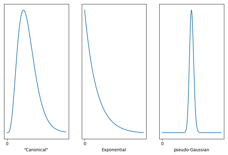
Three versions of the Gamma Distribution

Three versions of the Gamma Distribution.

It’s a remarkably flexible distribution, capable of duplicating both the Exponential and Gaussian distributions. That’s handy, as if one of our above assumptions is wrong the fitting process could still come up with a good fit. Note that the Gamma distribution has a finite bound at zero, which is equivalent to stating that negative values are impossible. The variance can be expanded or contracted arbitrarily, so it isn’t implicitly supporting my arguments. Best of all, we’re not restricted to anchor the distribution at zero. With a little tweak …

\Gamma(x | \alpha, \beta, b ) = \frac{\beta^\alpha}{\Gamma(\alpha)} \hat x^{\alpha-1} e^{-\beta \hat x}, ~ \hat x = x - b

… we can shift that zero mark wherever we wish. The parameter sets the minimum value our model predicts, while α controls the underlying shape and β controls the scale or rate associated with this distribution. α < 1 nets you the Exponential, and large values of α lead to something very Gaussian. Conveniently for me, SciPy already supports this three-parameter tweak.

My intuition is that the Gamma distribution on the left, with α > 1 but not too big, is the best model for athlete performance. That implies an athlete’s performance will hover around a specific value, and while they’re capable of faster times those are more difficult to pull off. The Exponential distribution, with α < 1, is most favourable to Rationality Rules, as it asserts the race time we’re most likely to observe is also the fastest time an athlete can do. We’ll never actually see that time, but what we observe will cluster around that minimum.

Running the Numbers

Enough chatter, let’s fit some models! For this one, my prior will be

p( \alpha, \beta, b ) = \begin{cases} 0, & \alpha \le 0 \\ 0, & \beta \le 0 \\ 0, & b \le 0 \\ 1, & \text{otherwise} \end{cases},

which is pretty light and only exists to filter out garbage values.

(Click here to show the code)
Generating some models for 2016 race times (a few seconds each) ...
# name          	α               	β               	b               
gatlin          	0.288 (+0.112 -0.075)	1.973 (+0.765 -0.511)	9.798 (+0.002 -0.016)
bolt            	0.310 (+0.107 -0.083)	1.723 (+0.596 -0.459)	9.802 (+0.008 -0.025)
bromell         	0.339 (+0.115 -0.082)	1.677 (+0.570 -0.404)	9.836 (+0.004 -0.032)
vicaut          	0.332 (+0.066 -0.084)	1.576 (+0.315 -0.400)	9.856 (+0.004 -0.013)
simbine         	0.401 (+0.077 -0.068)	1.327 (+0.256 -0.226)	9.887 (+0.003 -0.018)
de grasse       	0.357 (+0.073 -0.082)	1.340 (+0.274 -0.307)	9.907 (+0.003 -0.022)
blake           	0.289 (+0.103 -0.085)	1.223 (+0.437 -0.361)	9.929 (+0.001 -0.008)
meite           	0.328 (+0.089 -0.067)	1.090 (+0.295 -0.222)	9.949 (+0.000 -0.003)
... done.

This text can’t change based on the results of the code, so this is only a guess, but I’m pretty sure you’re seeing a lot of α values less than one. That really had me worried when I first ran this model, as I was already conceding ground to Rationality Rules by focusing only on the 100 metre sprint, where even I think that physiology plays a significant role. I did a few trial runs with a prior that forced α > 1, but the resulting models would hug that threshold as tightly as possible. Comparing likelihoods, the α < 1 versions were always more likely than the α > 1 ones.

The fitting process was telling me my intuition was wrong, and the best model here is the one that most favours Rationality Rules. Look at the b values, too. There’s no way I could have sorted the models based on that parameter before I fit them; instead, I sorted them by each athlete’s minimum time. Sure enough, the model is hugging the fastest time each athlete posted that year, rather than a hypothetical minimum time they could achieve.

(Click here to show the code)

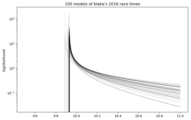
100 models of blake's 2016 race times.

Charting some of the models in the posterior drives this home. I’ve looked at a few by tweaking the “player” variable, as well as the output of multiple sample runs, and they all are dominated by Exponential distributions.

Dang, we’ve tilted the playing field quite a ways in Rationality Rules’ favour.

Still, let’s simulate some races. For each race, I’ll pick a random trio of parameters from each model’s posterior and feet that into SciPy’s random number routines to generate a race time for each sprinter. Fastest time wins, and we tally up those wins to estimate the odds of any one sprinter coming in first.

Before running those simulations, though, we should make some predictions. Rationality Rules’ view is that (emphasis mine) …

[9:18] You see, I absolutely understand why we have and still do categorize sports based upon sex, as it’s simply the case that the vast majority of males have significant athletic advantages over females, but strictly speaking it’s not due to their sex. It’s due to factors that heavily correlate with their sex, such as height, width, heart size, lung size, bone density, muscle mass, muscle fiber type, hemoglobin, and so on. Or, in other words, sports are not segregated due to chromosomes, they’re segregated due to morphology.

[16:48] Which is to say that the attributes granted from male puberty that play a vital role in explosive events – such as height, width, limb length, and fast twitch muscle fibers – have not been shown to be sufficiently mitigated by HRT in trans women.

[19:07] In some events – such as long-distance running, in which hemoglobin and slow-twitch muscle fibers are vital – I think there’s a strong argument to say no, [transgender women who transitioned after puberty] don’t have an unfair advantage, as the primary attributes are sufficiently mitigated. But in most events, and especially those in which height, width, hip size, limb length, muscle mass, and muscle fiber type are the primary attributes – such as weightlifting, sprinting, hammer throw, javelin, netball, boxing, karate, basketball, rugby, judo, rowing, hockey, and many more – my answer is yes, most do have an unfair advantage.

… human morphology due to puberty is the primary determinant of race performance. Since our bodies change little after puberty, that implies your race performance should be both constant and consistent. The most extreme version of this argument states that the fastest person should win 100% of the time. I doubt Rationality Rules holds that view, but I am pretty confident he’d place the odds of the fastest person winning quite high.

The opposite view is that the winner is due to chance. Since there are eight athletes competing here, each would have a 12.5% chance of winning. I certainly don’t hold that view, but I do argue that chance plays a significant role in who wins. I thus want the odds of the fastest person winning to be somewhere above 12.8%, but not too much higher.

(Click here to show the code)
Simulating 15000 races, please wait ... done.

Number of wins during simulation
--------------------------------
gatlin                       5174 (34.49%)
bolt                         4611 (30.74%)
bromell                      2286 (15.24%)
vicaut                       1491 (9.94%)
simbine                       530 (3.53%)
de grasse                     513 (3.42%)
blake                         278 (1.85%)
meite                         117 (0.78%)

Whew! The fastest 100 metre sprinter of 2016 only had a one in three chance of winning Olympic gold. Of the eight athletes, three had odds better than chance of winning. Even with the field tilted in favor of Rationality Rules, this strongly hints that other factors are more determinative of performance than fixed physiology.

But let’s put our Steven Pinker glasses back on for a moment. Yes, the odds of the fastest 100 metre sprinter winning the 2016 Olympics are surprisingly low, but look at the spread between first and last place. What’s on my screen tells me that Gatlin is 40-50 times more likely to win Olympic gold than Ben Youssef Meite, which is a pretty substantial gap. Maybe we can rescue Rationality Rules?

In order for Meite to win, though, he didn’t just have to beat Gatlin. He had to also beat six other sprinters. If pM represents the geometric mean of Meite beating one sprinter, then his odds of beating seven are pM7. The same rationale applies to Gatlin, of course, but because the geometric mean of him beating seven other racers is higher than pM, repeatedly multiplying it by itself results in a much greater number. With a little math, we can use the number of wins above to estimate how well the first-place finisher would fare against the last-place finisher in a one-on-one race.

(Click here to show the code)
In the above simulation, gatlin was 39.5 times more likely to win Olympic gold than meite.
But we estimate that if they were racing head-to-head, gatlin would win only 62.8% of the time.
 (For reference, their best race times in 2016 differed by 1.53%.)

For comparison, FiveThirtyEight gave roughly those odds for Hilary Clinton becoming the president of the USA in 2016. That’s not all that high, given how “massive” the difference is in their best race times that year.

This is just an estimate, though. Maybe if we pitted our models head-to-head, we’d get different results?

(Click here to show the code)
Wins when racing head to head (1875 simulations each)
----------------------------------------------
LOSER->       gatlin      bolt   bromell    vicaut   simbine de grasse     blake     meite
gatlin                   48.9%     52.1%     55.8%     56.4%     59.5%     63.5%     61.9%
bolt                               52.2%     57.9%     55.8%     57.9%     65.8%     60.2%
bromell                                      52.4%     55.3%     55.0%     65.2%     59.0%
vicaut                                                 51.7%     52.2%     59.8%     59.3%
simbine                                                          52.3%     57.7%     57.1%
de grasse                                                                  57.0%     54.7%
blake                                                                                47.2%
meite                                                                                     

The best winning percentage was 65.8% (therefore the worst losing percent was 34.2%).

Nope, it’s pretty much bang on! The columns of this chart represents the loser of the head-to-head, while the rows represent the winner. That number in the upper-right, then, represents the odds of Gatlin coming in first against Meite. When I run the numbers, I usually get a percentage that’s less than 5 percentage points off. Since the odds of one person losing is the odds of the other person winning, you can flip around who won and lost by subtracting the odds from 100%. That explains why I only calculated less than half of the match-ups.

I don’t know what’s on your screen, but I typically get one or two match-ups that are below 50%. I’m again organizing the calculations by each athlete’s fastest time in 2016, so if an athlete’s win ratio was purely determined by that then every single value in this table would be equal to or above 50%. That’s usually the case, thanks to each model favouring the Exponential distribution, but sometimes one sprinter still winds up with a better average time than a second’s fastest time. As pointed out earlier, that translates into more wins for the first athlete.

Getting Physical

Even at this elite level, you can see the odds of someone winning a head-to-head race are not terribly high. A layperson can create that much bias in a coin toss, yet we still both outcomes of that toss to be equally likely.

This doesn’t really contradict Rationality Rules’ claim that fractions of a percent in performance matter, though. Each of these athletes differ in physiology, and while that may not have as much effect as we thought it still has some effect. What we really need is a way to substract out the effects due to morphology.

If you read that old blog post, you know what’s coming next.

[16:48] Which is to say that the attributes granted from male puberty that play a vital role in explosive events – such as height, width, limb length, and fast twitch muscle fibers – have not been shown to be sufficiently mitigated by HRT in trans women.

According to Rationality Rules, the physical traits that determine track performance are all set in place by puberty. Since puberty finishes roughly around age 15, and human beings can easily live to 75, that implies those traits are fixed for most of our lifespan. In practice that’s not quite true, as (for instance) human beings lose a bit of height in old age, but here we’re only dealing with athletes in the prime of their career. Every attribute Rationality Rules lists is effectively constant.

So to truly put RR’s claim to the test, we need to fit our model to different parts of the same athlete’s career, and compare those head-to-head results with the ones where we raced athletes against each other.

(Click here to show the code)
     Athlete First Result Latest Result
0      blake   2005-07-13    2019-06-21
1       bolt   2007-07-18    2017-08-05
2    bromell   2012-04-06    2019-06-08
3  de grasse   2012-06-08    2019-06-20
4     gatlin   2000-05-13    2019-07-05
5      meite   2003-07-11    2018-06-16
6    simbine   2010-03-13    2019-06-20
7     vicaut   2008-07-05    2019-07-02

That dataset contains official IAAF times going back nearly two decades, in some cases, for those eight athletes. In the case of Bolt and Meite, those span their entire sprinting career.

Which athlete should we focus on? It’s tempting to go with Bolt, but he’s an outlier who broke the mathmatical models used to predict sprint times. Gatlin would have been my second choice, but between his unusually long career and history of doping there’s a decent argument that he too is an outlier. Bromell seems free of any issue, so I’ll go with him. Don’t agree? I made changing the athlete as simple as altering one variable, so you can pick whoever you like.

I’ll divide up these athlete’s careers by year, as their performance should be pretty constant over that timespan, and for this sport there’s usually enough datapoints within the year to get a decent fit.

(Click here to show the code)
bromell vs. bromell, model building ...
year	α	β	b
2012	0.639 (+0.317 -0.219)	0.817 (+0.406 -0.280)	10.370 (+0.028 -0.415)
2013	0.662 (+0.157 -0.118)	1.090 (+0.258 -0.195)	9.970 (+0.018 -0.070)
2014	0.457 (+0.118 -0.070)	1.556 (+0.403 -0.238)	9.762 (+0.007 -0.035)
2015	0.312 (+0.069 -0.064)	2.082 (+0.459 -0.423)	9.758 (+0.002 -0.016)
2016	0.356 (+0.092 -0.104)	1.761 (+0.457 -0.513)	9.835 (+0.005 -0.037)
... done.

bromell vs. bromell, head to head (1875 simulations)
----------------------------------------------
LOSER->   2012   2013   2014   2015   2016
   2012         61.3%  67.4%  74.3%  71.0%
   2013                65.1%  70.7%  66.9%
   2014                       57.7%  48.7%
   2015                              40.2%
   2016                                   

The best winning percentage was 74.3% (therefore the worst losing percent was 25.7%).

Again, I have no idea what you’re seeing, but I’ve looked at a number of Bromell vs. Bromell runs, and every one I’ve done shows at least as much variation, if not more, than runs that pit Bromell against other athletes. Bromell vs. Bromell shows even more variation in success than the coin flip benchmark, giving us justification for saying Bromell has a significant advantage over Bromell.

I’ve also changed that variable myself, and seen the same pattern in other athletes. Worried about a lack of datapoints causing the model to “fuzz out” and cover a wide range of values? I thought of that and restricted the code to filter out years with less than three races. Honestly, I think it puts my conclusion on firmer ground.

Conclusion

Texas Sharpshooter Fallacy: Ignoring the difference while focusing on the similarities, thus coming to an inaccurate conclusion. Similar to the gambler’s fallacy, this is an example of inserting meaning into randomness.

Rationality Rules loves to point to sporting records and the outcome of single races, as on the surface these seem to justify his assertion that differences in performance of fractions of a percent matter. In reality, he’s painting a bullseye around a very small subset of the data and ignoring the rest. When you include all the data, you find Rationality Rules has badly missed the mark. Physiology cannot be as determinative as Rationality Rules claims, other factors must be important enough to sometimes overrule it.

And, at long last, I can call bullshit on this (emphasis mine):

[17:50] It’s important to stress, by the way, that these are just my views. I’m not a biologist, physiologist, or statistician, though I have had people check this video who are.

Either Rationality Rules found a statistician who has no idea of variance, which is like finding a computer scientist who doesn’t know boolean logic, or he never actually consulted a statistician. Chalk up yet another lie in his column.

Matt Dillahunty is Garbage

Here’s something weird. Listen to Matt Dillahunty talk about the recent hosts who had left the ACA:

[29:57] There are four people who were previously on The Atheist Experience, who have left The Atheist Experience. Some of them have left the ACA to go pursue their own interests, and other things, some of them are still involved in ACA or taking a break, or whatever else, and that would be Tracie, Jen, Phil, and John Iacoletti.

Wait, what about Clare Wuellner? She too was a former host, and she too left. She certainly didn’t host as often as Tracie or Jen, but she was a board member for six years, and responsible for both restarting Godless Bitches and starting Parenting Beyond Belief. Clare was no small part of the ACA, so her omission is odd. It’s possible Matt wasn’t too close to her, but they both hosted AXP at the same time within the last year, and when Matt wanted to complain during the livestream he messaged Clare.

Some evidence could explain the omission, though. [Read more…]

Cherry Picking

With the benefit of hindsight, I can see another omission from Rationality Rules’ latest transphobic video. In his citations, he cites two sporting bodies: the International Association of Athletics Federations and the Australian Sports Anti-Doping Authority. He relies heavily on the former, which is strange. The World Medical Association has condemned the IAAF’s policies on intersex and transgender athletes as “contrary to international medical ethics and human rights standards.” The IAAF has defended itself, in part, by arguing this:

The IAAF is not a public authority, exercising state powers, but rather a private body exercising private (contractual) powers. Therefore, it is not subject to human rights instruments such as the Universal Declaration of Human Rights or the European Convention on Human Rights.

Which is A) not a good look, and B) false. If you won’t take my word on that last one, maybe you’ll take the UN’s? [Read more…]

The Progressive Secular Alliance

I was a little amazed at how few people wanted the Atheist Experience blog to remain on FtB. I counted two people arguing for them to remain, one that was ignoring the contents of the original post, and the other had a history of transphobia themselves, before the thread inevitably descended into debating whether or not transgender women are women. The Atheist Community of Austin’s new board have trashed the organization’s prior reputation and destroyed people’s trust, and the odds of them rebuilding it are effectively zero thanks in part to Matt Dillahunty‘s shoddy leadership.

But I was also surprised that a name never came up. When any organization of that size undergoes this sort of scandal, it’s inevitable that some former members will branch off and form their own group. In this case, that group is the Progressive Secular Alliance. They currently have a YouTube channel and Facebook page. It’s still early days, but so far I’ve heard good feedback about them. If you’re an Austin-area atheist, give them a look, and even if you’re not remember that many of these people helped build and maintain the former ACA. Their content will likely be similar to that which drew you into being a fan of the ACA originally.


Rationality Rules Is Delusional

I glossed past something in my last post. Emphasis mine:

[9:18] You see, I absolutely understand why we have and still do categorize sports based upon sex, as it’s simply the case that the vast majority of males have significant athletic advantages over females, but strictly speaking it’s not due to their sex. It’s due to factors that heavily correlate with their sex, such as height, width, heart size, lung size, bone density, muscle mass, muscle fiber type, hemoglobin, and so on. Or, in other words, sports are not segregated due to chromosomes, they’re segregated due to morphology.

I think it’s time we had a look at his science on this. Of the eleven scientific studies I counted in RR’s citations, only two dealt with muscle fibre composition:

Oertel, Gisela. “Morphometric Analysis of Normal Skeletal Muscles in Infancy, Childhood and Adolescence: An Autopsy Study.” Journal of the Neurological Sciences 88, no. 1 (December 1, 1988): 303–13. https://doi.org/10.1016/0022-510X(88)90227-4.

Staron, Robert S., Fredrick C. Hagerman, Robert S. Hikida, Thomas F. Murray, David P. Hostler, Mathew T. Crill, Kerry E. Ragg, and Kumika Toma. “Fiber Type Composition of the Vastus Lateralis Muscle of Young Men and Women.” Journal of Histochemistry & Cytochemistry 48, no. 5 (May 2000): 623–29. https://doi.org/10.1177/002215540004800506.

From that, we can extract the key charts on fibre composition. I’ll dim the irrelevant sections. [Read more…]