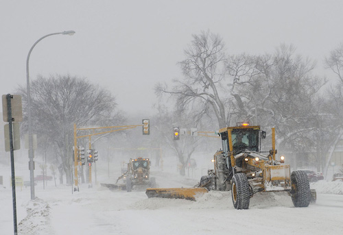
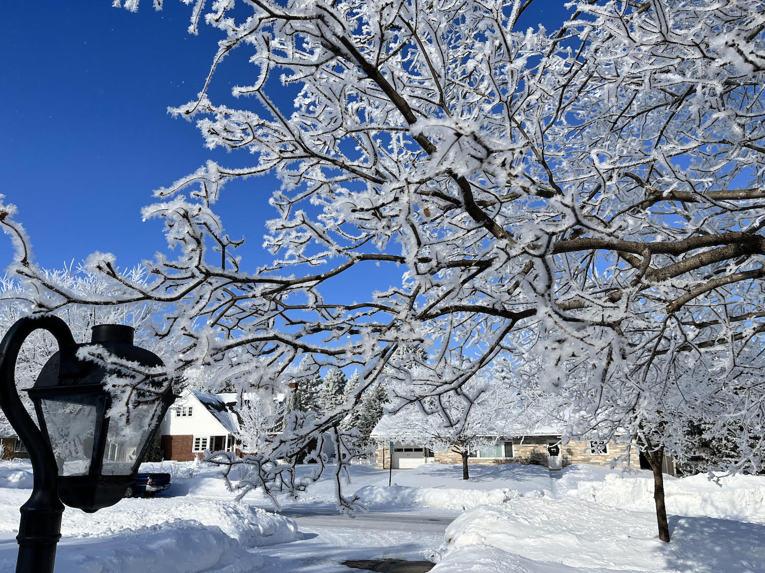
Here’s the pretty kind. We’ve been getting dense fog and sub-zero temperatures, which does interesting things to the trees.
Then there’s the horrible kind, brain fog. I thought I was over my cold, but it has come roaring back with stuffed up sinuses, a bad cough and sniffles, and some kind of brain goo. I’ve been struggling with it this weekend, just trying to get Monday’s lecture in shape, and it took far, far longer than it ought to.
One consolation: I ran out to the store to pick up some cold relief and cough drops and the like, and the place had been cleaned out! Bare shelves! I couldn’t get anything, but at least I can tell myself the entire goddamn town is suffering with me.