I’m going to write 1000 words now on something that amuses me. I came up with the name for this fundraiser while I was in the dentist chair, and told my dentist about it. She was amused, said, “Well, it’s all about getting attention.” That it is, but it can also be about yuks.
Inspired by this financial predicament and my funny little idea, I scribbled the banner image in a notebook, right there in the car. Here’s the drawing, snapped with my cellphone camera later that night:
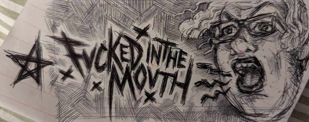
I snagged the banner from my last fundraiser to get an idea of the proportions I needed to squeak it into, using that as the foundation in photopea. It was tricky. First order of business, I had to scale the self-portrait to fit the right end of the banner well, not get cut off too awkwardly.
Next I stretched a copy of the title to fit the space left to it, leaving room above and below for the words I meant to add later with a text tool. This did not fill the space with my hatchy background texture right, so I used a combo of distorted duplicate layers and the clone tool to fill the area around the words.
You may have noticed the title is blurred subtly toward the left side of the image. If this was not meant to look like a sketchy pile of shit, I would have taken a new photo of the image to get past that. However, sketchy style, stuff can look rough. I copied a layer and did unsharp mask until it looked more legible, which blew out the other end of the pic. Then I used a quickie layer mask to make only the part I wanted look crisped.
At this point, my boyfriend would be preserving every layer, but I get refrigerator blindness when I see a bazillion layers, so I merged that shit.
Next comes text. I like something in the ballpark of horror novel cover fonts, circa the early 80s. So Benguiat -esque. Photopea’s collection of I-presume-legally-public-domain fonts does not include Benguiat, and this one was kinda sorta close enough. I did it bold, but it didn’t look bold enough, so I added a one pixel stroke in the same color as the font. I used outer glow instead of drop shadow, changing it to a dark color and blending style, to make the white font pop from the predominantly white page.
Remember the floating star from the original photo? I was thinking ahead when I drew that. I knew I wanted to make it white and splash it around the finished image. One of my “Great American Satan” bits of iconography is the five point star of the american flag, inverted to resemble the goat pentagram of satanism. I made a layer of pure white and copy-pasted the star into a layer mask on it. I adjusted the levels to remove most of the background, then brushed out the rest in a few seconds. I applied the layer mask, and voilà, little star.
Then I carefully scaled it and put it into parts of the image where it wouldn’t interfere with the composition. A little dark glow to make them pop, and I really liked the end result. The scratchy pen strokes have almost a 3d quality to them.
Oh, and one last thing. The color of the image at this point was a slightly pukey pink-grey-brown. I made a red white and blue gradient layer, then scrolled through blend styles until I found one I liked, then reduced the opacity a little, to get the subtle americana look of my beauteous masterpiece.
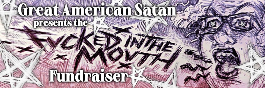
This image amused me a lot. The idea for the name amused me, and the image turned out great, at least to my eyes. The drawing aspect isn’t brilliant. My skills are a bit degraded from lack of use. No, not because I’ve been doing AI. Just because I don’t have an ideal space for drawing, and my vision is getting worse, and I’ve been busy with lots of other things – particularly writing. But the drawing didn’t have to be great. It’s a scratchy mess in a scratchy mess.
That’s a bit shy of a thousand words, so maybe a bit more about how I’ve done as an artist, throughout my life. I used to be among the best few artists in my high school of about 2000 students, which gave me a big head. I came to art school, and I was only in the top 20%, which was a bit humbling. Then, as part of that education and practice, I started paying closer attention to the artwork I like, and comparing myself to the greats.
That was very humbling. Enough to make me decide, hey, I don’t even wanna bother competing with that. There’s this philosophy espoused by the H. Jon Benjamin character Coach McGuirk, on the old cartoon Home Movies, goes something like, “Why bother to do anything if you’re not immediately good at it? Playing guitar is hard. Martial arts are hard.” I was only willing to do what it takes to be skilled at art as long as it wasn’t difficult. When it came to the big leagues, I was like, eh, minor league is good enough for me.
Maybe this is projection, but I think everybody does this, and the greats of art just had more talent to start with than I did. For them, it was easy, the same way I had enough talent to coast past a few thousand other kids, once upon a time. Years of practice helps. I have no doubt that many of my fellow high schoolies could have spent a decade of discipline getting better than me if they had the time and inclination. But the discipline to get good at something through effort is a much rarer quality than raw talent itself.
But in the words of ZZ Top, I might be mistaken.
–
Leave a Reply