I don’t want to give the impression that I think it is perfect — there are some flaws. This one had me scratching my head.
What the hell is this?
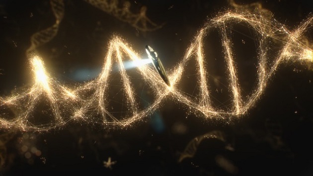
I’m used to noticing if a diagram of DNA has the correct right-handed twist of B-DNA or the proper number of bases per rotation of the spiral, but jebus…what are these random dots and lines and this strange stringy attenuated look that corresponds to nothing in the molecular structure? Is this what happens when an astronomer tries to draw a molecule?
I wonder if every other biologist’s brain came to a screeching halt when this animation came on the screen.

At a guess, it tries to show the atoms and molecular bonds that hold them together. It fails — I don’t think base pairs are quite that long — but eh: it’s pretty and it looks enough like what people expect DNA to look like that it serves its illustrative purpose.
Uh! Oh! PZ, you’ve done it now. I’m sure that Jay Richards, Master of Divinity, Master of Theology, Ph.D. in philosophy and theology, former instructor in apologetics at Biola, Senior Fellow of the Discovery Institute will be trumpeting that you disagree with Cosmos…IN ITS ENTIRETY.
(I’m new to this, did I get the caps right?)
Damn I forgot the dozen exclamation points and the apostrophe in IT’S, please mentally add them
I just thought it was supposed to be indicative of stars and constellations, implying that the cosmic scale reaches from the very small to the incomprehensibly large.
More importantly, you forgot to add in a lot of ones in the line of exclamation points, like this:
“…ENTIRETY!!!!!111!!!one!!1!1eleven!!!1!!”
That’s how to do it properly, I believe.
Raquel Welch is in that ship.
Geez. Obviously, that is what Jesus’ DNA looks like (see: “Don’t Masturbate!”). Obviously, his DNA is made of stars and stardust instead of these pitiful tiny molecules and atoms, so Cosmos is keeping the creationists in mind.
However, since this image can only be created by computer simulation, such DNA does not exist in real life. With all ensuing consequences.
…
Hang on, I think my logic is broken.
But it’s a pretty picture.
I too was looking for the mollecular structure of the base pairs in those squiggles. My guess is that they purposefully went with an artsy representation of the “idea” of DNA to make the connection between atoms and stars, as the commentary certainly tried to.
The funny part is NdGT got all bothered by the post-sinking scene in Titanic because they got the stars in the sky wrong, even to the point of pestering James Cameron about it when they met at a dinner.
Somebody really needs to rib him about this gaffe… :-)
I didn’t care for the way he referred to kinesin as “creatures”….
THANK YOU saganite, I WILL TRY TO DO BETTER!!!!!111!!!one!!1!1eleven!!!1!!
I started swearing at the screen when I saw that, and I am not a biologist. It just had too many atoms–I assumed the gold blobs were supposed to be atoms—so the simple elegance was gone. Then there was the evenness of the spacing between the two helixes—they are not really opposite each other. That is about all that I know, and it was all wrong!
There was another animation where the crosspieces looked almost like vines, with little splits. It was like somebody wanted to make a giant tree out of it.
Another thing that I notice, because it had me confused for a long time, is that a lot of artists focus on the outer helixes, and kind of pencil in the crossbars as much smaller, as less important. They seem to think the helix part is the magic part, and the rungs are just spacers, supports for the mojo spirals.
This raises the rather obvious question of what a “better” representation would look like. The van der Waals surface? Volumetric fog representing the electron density?
There aren’t any sticks in the real thing, that’s for sure.
I just realised that sounds like “well, what would you rather they use” which isn’t what I mean at all. (It’s not a good call when you substitute a good but somewhat wrong abstraction like balls and sticks for a equally confusing, more wrong abstraction.) I would be really interested in alternatives.
My God, it’s full of stars!
WITCH HUNT!! Neil deGrasse Tyson PZ Myers’ latest victim. Film at eleventy.
/braveheroesnews
Yes! Accurate depicitions of chromosomes should look like a shrubbery and the double-helix represented as rubber bands on gravel!
I don’t know the context for the image — whether it was meant to illustrate an actual DNA strand or whether it’s just an evocative image — but this is what you get when you hand off an illustrative job to an artist without exercising a little editorial oversight.
Very few artists aspire to da Vinci’s breadth of knowledge, they just like to make pretty images. They’ll be familiar with the iconography of the DNA spiral without having the slightest idea of its chemistry or biological functioning, never mind issues of visualising things smaller than wavelengths of light. And that’s fine, not everyone knows this stuff or even can. But if you want a specific kind of image out of them that doesn’t stray too far from what you know, you have to engage in a certain amount of creative communication with the artist, to translate your ideas into their image.
It took me a couple of minutes to even recognize it as DNA. That was a poor graphic.
I’m not a biologist by training; I’m a protein chemist. And that crazy strand thing made me twitch. And not in a good way.
To be fair, some of the space shots are almost equally bad, when they show the kupier belt and Oort cloud they show a belt packed with rocks, when in reality the average distance between each rock is something more like the earth-sun distance. Showing them nearly bumping into each other is MASSIVELY wrong. Also, the distances between the inner and outer planets.. Sure, it wouldnt be great TV to show the actual distance, but there has to be ways to show that there is a massive difference between the earth-mars distance, and the mars-jupiter distance.
For that matter, what does a black hole look like?
We’re talking about images of things we can’t see, created in order to make them visible; they’re not accurate representations, they’re intended to be evocative. So they’re always going to be more or less fictions.
Those electron microscope(is that what they are?) images are awesome, though! What would it look like if we could get closer? Jiggly clouds?
PZ, et al, there’s a “teaching moment” here, for me anyways. Your comment made me realize that I (and very likely millions of others also watching) have no idea what DNA would ACTUALLY look like at the scale used on Cosmos. I’m only familiar with the standard illustrative textbook drawings or computer graphics of DNA of which many variations are easily found on the Google.
Could someone provide a link to some examples (e.g. pictures, video, illustrations) that better represents a “true” close-up of DNA? Thanks.
I just watched the 1st episode again — the 2nd didn’t air here yet. There’s little or no new stuff in it, but I think it nicely done. The DNA helix doesn’t bother me much, but I agree it could’ve been done a whole lot better, the artist could’ve looked up some video animations on Youtube.
Anyway, I rather liked the charming Tiktaalik (strange pronunciation, Neil) animation. That could win over some youngster to become a palaeontologist or a geologist or a biologist.
Hey, PZ, it suddenly crosses my mind that you wanted some more knowledge of geology. An absolute must-read and a charming introduction is “The Map that Changed the World” by Simon Winchester.
As an aside to my remarks re: Cosmos, at the end NdGT reads the dedication by Carl Sagan in the book he was presented. That moved me. As a young kid I met the author of a booklet titled “Between Sun and Electron” in which he wrote and signed a dedication “to the future atom engineer” that I did not become, but it surely contributed to my interest in all things scientific.
#22, #23
best we’ve got is this
Don’t you remember PZ’s post on this topic?
So the grey jiggly image is as good as we’re getting so far I guess. Documentary artists, rubber bands on gravel I say, get on it!
I’m not a biologist and even I knew it wasn’t correct.
So what?
It’s a science show on network television (and a suite of cable channels) on Sunday night. It doesn’t matter that it’s not accurate. All that matters is that it’s interesting.
I don’t think it was ignorance on the part of the producers and animators to depict DNA incorrectly. I suspect they made a decision to go with visuals that viewers would be familiar with rather than an accurate depiction. So asteroids look like Star Wars and DNA look like a ladder. They not only looked cool, but have the fringe benefit of getting bloggers to write about them two days after the show aired, thus keeping the buzz going. The people who know that DNA isn’t really ladder-shaped and bear ovaries aren’t really like landscapes from Tron aren’t the target demographic.
My three-year old son loved it. That’s what’s important.
Comment #17 has some which are actual images, not illustrations. Zooming in some more (to get the same scale as Cosmos attempted) wouldn’t make a big difference as far as I know. But atoms are mostly empty space, and they aren’t incandescent. So I don’t think there’d be much to see if you got close enough.
I was also a bit surprised by the image from the first episode, showing the big bang as basically a very large Hollywood-style car explosion with flames and shit, while Tyson stood there watching it “from the outside” and wearing sunglasses. It always bothers me that they start from a point and go out, as if at that time we would somehow only able to see the now-observable part of the universe when it was very small. I know it wouldn’t be as eye-popping, but the whole screen ought to go from black to white instantly, though I guess even that assumes a lot about whether there was a prior state and what that would be like.
Google “Journey Inside the Cell”.
They’re either kind of tricky to see.
Either a rough sphere or torus that glows faintly in the infrared but is basically invisible, except as a shadow occulting the background stars or one of the brightest objects in the universe.
I’m not in a country where they’ve shown that program (so far as I know), so I haven’t had any chance to see it, but I would like to know whether this post is indicative of the Gell-Mann Amnesia effect in operation. Anyone?
Edit: And by “torus”, read “oblate spheroid”, i.e. a sphere slightly flattened at the poles. I’m not sure what I was thinking.
I’m with Gruber@#26.
I’m not a science professional. I’m not a professor or a chemist or a physicist or any of the cool things that so many folks around here are. I thought the graphic was pretty and a nice tie-in to the cosmic theme. If that makes me disdainfully ignorant or a science poseur, so be it. I will continue to engage in my small, plebeian enjoyment of science-y stuff.
I know the balls and bars visual model for molecular structures is a technically incorrect visual representation, but at the very least it allows you to see the structure, where each atom would go, the angle of atomic bonds, etc. Also, it is the model that is used almost universally in teaching chemistry, so it is familiar and understood by the majority.
And as a personal note….i think it´s beautiful when you see a large molecule being depicted with that model. The larger and more complicated, the prettier xD
as a lay-engineer and somewhat of a nerd; I thought the DNA as shown on COSMOS was _elegant_. Not rigorously accurate but evocative of the forces binding the atoms into molecules being bound into the helical structure, with little dots of light representing the atoms themselves, with the strands of light for the forces; not the particles. I thought it far more accurate than the “balls and sticks” usually used to represent atoms into molecules. It seemed to me more accurate: by depicting both the particles and the forces as roughly the same glowing dots of light. I fear that to be “perfectly accurate”, the images would just be fuzzy balls with hardly any discernible structure. I grant them “artistic license” to try to convey both ideas with a single animation. I guess I’m too gentle and not GNERD enough to demand *perfection* from such a prestigious show :-(
Picky, picky, picky. Perhaps some of the illustrations doesn’t reflect the most current concepts, but the broad brush strokes are right on target. I could pick at “The Ship of the Imagination” which apparently travels at super luminal speeds. That makes the picture of the DNA strand look perfect in comparison. I think the original Cosmos, as it’s 2014 re-imagining, was a introductory popular science program aimed at the people with a poor grasp on scientific thought. If it’s pissing off the Disco Institute then it has to be doing something right.
Wrong! and Double Wrong! I.E. The “oblate spheroid” is the shape of the Earth, not Black Holes, ever. Black Holes can indeed be a torus (i.e. donut) if it was spinning when it collapsed into the black hole definition. I read, somewhere, that a toroidal black hole is how to safely pass through a black hole to time travel great distances in an instant; blah, blah, blah; timey-wimey falderall, etc. Seriously, passing through the ‘donut hole’ of a toroidal black hole, avoids the singularity, spaghettification, and crushing, of passing into a point-like Black Hole, but still involves intense warping of the spacetime continuum to result in […uhhh…] weird effects.
Keep your eyes peeled for Black Toroids!!
Maybe we’ll just have to wait for the DVD commentary.
Myself, I was a little disconcerted by the explanation focusing so much on the “code” “alphabet” “instructions” metaphor. It might have been a good opportunity to clear up the misconception promulgated so fiercely by the cdesign proponentsists that DNA is literally (literally) a real constructed language rather than molecules and chemistry causing chemical reactions.
No, I suspect its much more a case of this is what happens when the SFX department tries to think of a cool way to visualise DNA in a series that’s primarily about cosmology.
Chalk it up to a bit of artistic licence and enjoy the show.
Even an electron micrograph image is only an interpretation of what the instrument is detecting, the designers having decided to show the data this way rather than another. You can make a good case that the micrograph is the best way to show the data in a way our monkey brains can understand, or at least, a good way to show it, but it’s no more “real” or even “realistic” than the Cosmos artist up top.
I think they could at least have put in different sequences of colors along the rungs to represent the regions of hydrogen-bond donors/acceptors. I don’t think it had to be uniformly golden…
…gosh, maybe this is how all those people who think that conception begins at life think of the “sacredness” of unique genetic material – it shines with the glow of a thousand stars… :-p
* “that life begins at conception”
Goshgolly, my fingers do fly.
My guess is that the artist clicked on “generate random particles in a spiral”, then clicked on “connect particles closer than X” and clicked “render” (all of this is easy to do in various special effects packages). The result was evocative of the superstructure of the cosmos so the producers ran with it.
Oh! So that’s supposed to be an actual strand of DNA? I thought they were trying to do an astronomy/biology mash-up for some sequence in the show, like a DNA constellation or something being visited by an astronaut. But yeah, as an attempt at showing an actual strand of DNA, that looks purty darn ridiculous.
Our problem was that our kids asked what the little dots were. We had to say, “Well… not base pairs… maybe atoms? We have no idea.”
(Note: Not biologists, though my wife’s a physician, so that counts for something.)
#30
Personally I would say no. An inaccurate brief graphic would not be enough of a trigger, and the first episode was equally enjoyed as this one.
It is quite good, decently living up the the original series so far.
The point is not to be exacting in every field, but to inspire non-science minded people and children to take more interest in the sciences and be entertaining. The original Cosmos was wildly successful, and inspired a generation of people to take an interest in science. Not to mention a good number of people to become scientists. The US really needs a media source to do this right now. Badly.
Just more evidence that the so-called “theory” of atoms is a leftist conspiracy against Jesus!
Its just a bit of graphical flourish by the animator. It’s a super trendy effect done with a plug-in called Plexus, if you keep your eyes peeled you’ll see it everywhere these days.
My brain exploded during that scene in Spider-Man where we see Peter Parker’s DNA, and there are spiders crawling all over it.
Tell me though, how many bases are there in one helical rotation?
If you haven’t seen it already, it is well worth your time to listen to the following lecture by the person who led the team to find Tiktaalik. It is science in action, and even touches on some of the ‘sausage making’ aspects like “we didn’t have funding at the time to go someplace fancy, so we followed the road construction crews around Pennsylvania and sifted through their road cuts.”
Thanks. That was nice video.
Although it was computer animated, it looked very “real”. After watching it I did some more searching on YouTube and found another good one (www.youtube.com/watch?v=4PKjF7OumYo).
Yeah, I had the same (brief) reaction. If they’re going to go to that much trouble to animate it, why not just render the friggin’ molecule instead of putting up some artistic fluff? Granted, all molecular renderings are models/abstractions, but the idea is to convey useful information rather than making your molecule looking like some vaporous spirit.
It can vary depending on the energy state, but 10-10.5 per full rotation is the commonly accepted answer for B-DNA. As I recall, the animations didn’t even look like normal DNA helices with major and minor groves, so we’re not even to the point where getting the right number of base-pairs is relevant.
I have lot of peeve on this Cosmos. I don’t know why so much cartoons for no reason. I wonder what if the Bruno narration was given with human drama ? You know there is a reason why 12 years of Slave was not taken as Cartoon/Animation movie. Sagan’s Cosmos has full human touch. This one lacks totally.
And in the second episode when Tyson describes the mass extinction, it is so incoherent in story telling. Ordinary people won’t even grasp the time scale of 20, 40 thousands of years, and he is going directly to Permian Extinction. There is no presentation of geographical timeline, when is Cambrian Era, When is Permian, when is Triassic, when is Jurassic, how long are each those era, nothing was told, it is like spilling the beans. Totally incoherent. And while Tyson was talking, what was his frigging thunderous loud music annoyingly louder than Neil’s narration.
After he finished Permian Extinction, at the end they just simply showing Carl Sagan’s phylogeny video. I felt they took a nice Cosmos series and butchered it. Its better they could have shown original Cosmos instead.
Mine sure did, and I’m not even a molecular guy.
eternalstudent @9:
I had exactly the same thought!
Scott Gruber @26:
I actually agree that that’s the most important thing, but I disagree that it’s the only important thing. The thing is, DNA doesn’t really “look like” anything at that scale, at least as I understand it. The physics of light interacting with molecules, even macromolecules like DNA, just doesn’t resolve to a clear image. So of course there is and ought to be artistic license taken in depicting DNA as seen by the “ship of the imagination.” The animation team of Cosmos clearly took that artistic license and produced a very cool-looking graphic, which I think was pretty effective at conveying the concept they were trying to get across. So in that sense there’s no problem.
But, they had a choice. They could produce a slick artistic interpretation focused only on getting across the idea that DNA is a double helix with information encoded on the “rungs” of its “ladder”, and ignoring everything else, or they could produce a slick artistic interpretation that conveyed this idea but also respected the true geometry of DNA. They chose the former, but from a purely artistic or didactic perspective, I see no advantage to simplifying it in this way, so why not go with the latter? As it stands, their animation sequence is good for conveying the basic concept of DNA to people who have never encountered it before. Had they respected the true structure of DNA, biology teachers ALSO could have used the clip in classrooms to help students visualize its structure more accurately, even if it wasn’t something that was mentioned in the Cosmos narrative at all. So basically, they made an arbitrary choice in visualization which makes the pedagogical utility of their show slightly more limited in scope. It’s a minor disappointment.
I think for biologists there’s probably also a bit of an “uncanny valley” effect here. Had the animation actually been more cartoony, the not-quite-right-ness of the DNA structure would have been less jarring.
I’m curious, though, about the depiction of some of the molecular machinery. I thought the kinesins (they were kinesins, right? Like I said, not a molecular guy) transporting vesicles around was actually pretty cool and fit my mental model of what that should look like pretty well. But what about the helicase and DNA polymerase animation? Was that big arm with the “gears” on it swinging around to couple intermittently with the helicase reflective of an actual biophysical phenomenon? If so, that’s pretty awesome. If not, uh, weird choice, I guess?
numerobis
As someone who does visual effects (not special effects, those are practical) for a living, I guarantee you that the artist who did this effect had to deal with endless pixelfucking from the producers until they ran out of time and ended up with this.
That’s pretty much how this shit goes, every. single. time.
kyoseki is basically correct, though I’m sure being a weekly TV series meant that they couldn’t go to the extremes of pixel-fucking as something with the budget of, say, “The Avengers” could.
I worked a bit on the visual effects for the “Cosmos” opening title sequence. We had a bit more latitude with our images than I’ll bet the actual series artists had i.e. the opening title sequence is more about pretty, arresting and poetic type images. But even so, Ann Druyan had editorial control over our images and the way we were depicting things.
My guess is that the show walks a fine line with their imagery, caught between hard accuracy and the desire for pretty pictures, and they might not always land on the right side of that line to satisfy everybody. But they are trying for that with this show.
RickR @56:
Cool. You did a good job, it’s a great sequence.
I think that’s inevitable with any visualization of complex scientific ideas intended for public consumption, and I certainly don’t condemn them for making different decisions than I would have — they’re the ones that did the hard work of actually making the damn thing, criticism is easy. At the same time, though, this is a case where I don’t think there was a real necessary tradeoff between hard accuracy and pretty pictures. I expect they had a biologist on consult for the making of that sequence, who happens to have different pedagogical sensibilities than I do. Or, as you and Kyoseki suggest, it was a case of “Yeah, let’s have a visual motif of starstuff making up the DNA! Wait, it doesn’t look quite right. Can we redo it? What, we’re out of time/money for the shot? Well, it’s not perfect, but it’s good enough.” Anyway, as PZ said, it’s a little quibble.
RickR, I loved the opening sequence.
Yeah, my brief venture into animation was ruined by my bosses. I had to render some computer models of fans into 3D and video. I worked hard to get the virtual lights just right, with highlights and specular magic. It looked real, like they were sitting in a showroom. The one boss told me I had left blotches all over, and was only happy with matte grey. The other boss jumped in, did a quick learn, and made a crap video that looked like a cheap computer cartoon. He got the rendering work from then on, I got the twitches whenever I saw it.
Some people won’t argue with bosses, some people won’t argue with artists. Sometimes that can work out badly.
As PZ says, it’s quibbling.
Wait that was supposed to be DNA? (my actual reaction during the show.)
RickR
Yeah, it’s a double edged sword with tv/commercials work, on the one hand you have to get this shit done as quickly as possible, on the other, there’s no room for them to constantly noodle it – I was on the verge of a nervous breakdown chasing my tail on one effect for a couple of months because nobody really knew where it was supposed to go; now THAT was a learning experience (it was a terrible movie, too).
The executive producer is Seth McFarlane, whose day job is cartoons.
*cough cough*
It’s star-stuff. It’s a visual portrayal of the idea that we are all made of star-stuff, right down to our DNA (and further).
WMDKitty, I like that.
I have to agree with those saying “pretty” won out over accuracy. But I have to admit… I was a little more shocked by the… armless stick figures strutting up and down… molecules, I guess…?
WTF were they supposed to be?
You know what’s sad? Those were probably a much more accurate depiction than I thought they were, and it was the accurate prediction that made me do a double-take more than the inaccurate one.
I have a long way to go.
Considering Neil was alluding to Sagan’s original quote of “Within us is a little universe” when this popped up, it struck me as fairly obvious at the time that it was supposed to be a “constellation” of DNA and not an actual representation of DNA. Just sayin’. :P
Anyway, I have to kinda agree with the comments about the cartoons… If they were in a different style, I’d probably like them more, but I’ve always hated the “marionette in Flash” style. ACTUAL marionettes would have been better than that. XP
NateHevens, those little guys were kinesin, which was new to me. It does walk, depending on the simplified animation.
On the DNA front: As best as I can make out, all DNA images/models are shown stretched out longways like a spring under tension. It really is closer to what some would call square pitch, well, 24 to 34 is what I got. The diameter is 24 Å wide, a full turn is 34 Å long/tall. That’s both helixes of the backbone getting around in one-and-a-half diameters.
If you look, the base pairs are laid flat for compactness, or maybe just drawn that way. I think the coils of the backbones are close enough to get some hydrogen bonding between adjoining loops.
So any representation is artistic, especially since the Å up there is used for measuring wavelengths of light. I think we see in lengths about a hundred times the width of a strand of DNA.
Grumble. I hated the fact that they showed Tiktaalik climbing out of the sea onto a rocky beach.
One of the things that sticks in my mind from Your Inner Fish was that Shubin et al were specifically looking for river sediments on Ellesmere Island. At one point they were finding marine fossils, and knew they were looking in the wrong place.
Tiktaalik lived in a transitional environment — shallow rivers winding through Devonian forests — not the ocean.
But I imagine that the decision to do a limited and technically incorrect animation was a matter of time and money allocation made by executive producers, as hinted at above.
Honestly looking at it – to me it looks like it might be an off the shelf VFX shader. I am enjoying the new series but I think it does lean a bit heavily on the CG. Sometimes I would like to see the real thing.
Y’know what I like?
The fact folks find little things wrong. The strange golden-glow DNA. The Tiktaalik coming from the wrong environment.
The fact these are the things we complain about? Yeah. That’s the way life should be. I mean, as opposed to complaining about textbooks excising all the stuff Texas doesn’t like.
Agreed. Doesn’t matter which bit you did. I liked it.
I also liked the music. It had its quiet and slow-paced moments, like in the original Cosmos series (but also found a way to fit in some heavier stuff in a very short time), making it a lot more dynamic than your typical space show nowadays. Or a lot more than any show I’m aware of, now that I think about it.
But why (WHYY!!?!!) did some silly person decide to make “Cosmos” at the end of the sequence look like “CosOmos” with that choice of background image? I mean, when the letters first appeared and started zooming out, I immediately thought the circle in the image would correspond to one of the Os in the word. But then it didn’t, and it made me very, very sad.
Well, the producers aren’t. They’re the ones who make it hard for the people who do the hard work of actually making the damn thing. So there’s that. But easy or not, there’s no problem with constructive criticism of an artwork. And if it’s depicting sciencey stuff on a sciencey show, then yeah, criticism along those lines is definitely okay. I don’t think I’d get so hung up on trying to induce paredolia (“gee whiz, that DNA looks like a galaxy!”) that I’d forget everything else. Maybe it’s not so terrible, but I don’t see what makes it a good decision.
Incidentally, the back part of the type specimen of Tiktaalik has now been freed from its rock matrix and described: it has a large pelvic girdle supporting powerful rear fins. The fins contain bones as well: one large bone nearer the pelvis and the beginnings of two smaller bones further away–the very beginnings, it seems, of our limb pattern. There are also strong fin rays. Four other pelves have been found. The pelvis of Tiktaalik is larger and stronger than that of a comparably sized fish, earning Tiktaalik the new sobriquet of tetrapodomorph. The paper is herePelvic girdle and fin of
Tiktaalik roseae by Shubin, Daeschler, and Jenkins.
While not strictly accurate, the DNA helix, once I recognized it, seemed to equate star-stuff and atoms.
In displaying the Big Bang accurately, the screen would go from black to more black, since it took about 100,000 years, IIRC, for the universe to thin out to a density that allowed the transmission of light.
Farish A. Jenkins, an author on the Tiktaalik (2013) paper, died of pneumonia in 2012. If his obituary is any indication, he was a gentleman and a scholar who spread the love of science.
I was cringing the whole time that thing was on the screen. My husband informed me that this is exactly how he feels every time he sees someone doing anything on a computer in television shows. Empathy +5
Yeah this bothers me so much I just can’t get past it.
It’d be trivial to do a bond network or space filling model or even a cartoon that would both look cool and not give a grossly distorted picture of what a molecule is. Really abysmal and so unnecessary.