A few months ago while talking to people about Intersectionality, I noticed there was no flag. Some people had logos, some better than others, but there was a variety of types. What I liked least of all is that none were simple and easily recognizable. Too many had fine detail that could never be recognized on a flagpole.
After much thought and several revisions, I came up with a simple flag that I think is inclusive and represents all people. It follows the North American Vexillological Association’s principles for flag design except for the use of purple.
- Keep It Simple. The flag should be so simple that a child can draw it from memory.
- Use Meaningful Symbolism. The flag’s images, colors, or patterns should relate to what it symbolizes.
- Use 2 or 3 Basic Colors. Limit the number of colors on the flag to three which contrast well and come from the standard color set.
- No Lettering or Seals. Never use writing of any kind or an organization’s seal.
- Be Distinctive or Be Related. Avoid duplicating other flags, but use similarities to show connections.
If you’ve never seen the Roman Mars TED talk on city flags, please do. It’s fun and informative.
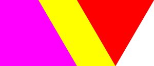
My proposal for an Intersectional Flag is this:

The Colours:
Purple (#FF00FF)
Yellow (#FFFF00)
Red (#FF0000)
Visible light is only a tiny range of light compared to ultraviolet and infrared, and white cishetero able bodied binary are but a tiny fraction of humanity. We – all other people – exist and we matter, even if governments, the news, the media, and the entertainment don’t see us or represent us. All people should be heard, recognized and protected.
The Shapes:
The trapezoid represents all differently abled and neurodiverse people.
The parallelogram represents all nonviolent dissenters (*) and marginalized people (**).
The equilateral triangle represents all genders and sexualities either known or as yet undefined.
The varying sizes and shapes (one, two or three in combination) represent all different bodies, sizes, and skin.
(* Nonviolent dissenters: Those with unpopular political, religious and social views.)
(** Marginalized people: The poor, the disenfranchised, and anyone else not defined.)
The Dimensions:
Top edge: length of 4
Bottom edge: length of 3
Right edge: length of 2
Left edge: √3
Trapezoid: Sides of length 1, 2, 2 and √3; 60°, 90° and 120° angles
Parallelogram: Sides of length 1 and 2; 60° and 120° angles
Triangle: Sides of length 2; 60° angles
I searched through databases, and the Intersectional Tricolour design is unique among flags worldwide despite its simplicity. Only two flags are triangular scalene (Polish domestic flags, white with red borders), only one flag has a trapezoid (Kuwait), and no flags contain only the three colours, red, yellow and purple. The contrasting colours are discernable to those with Colour Vision Deficiency, and the non-rectangular shape can be felt by the Blind.

Seems more like diversity than intersectionality. Wouldn’t a color scheme with blue and yellow on the ends with green in the middle be more like it?
Okay, given my -albeit quite limited-
knowledge offamiliarity with hebrew, I’m quite well aware that not everyone reads left-to-right. Nonetheless, I had an idea about how the flag feels unbalanced to me and thought what if you flipped top & bottom? Then I realized that at least for us left-to-righters, that would also make the flag’s elements seem to lean forward, which feels appropriate.Of course, what is forward in a colonizing language is often backward in other writing systems. Not sure how I feel about that. But for me the primary purpose of the change wasn’t the potential forward-lean so much as thinking it just might feel more “balanced” that way.
The purple is also a bit much (at least to my eyes). I wonder about the range from #aa00aa to #cc00cc and am curious to see if those feel any better.
It doesn’t have to be those exact shades, any red, yellow and purple will do. I selected those hex values because they will still work on any computer with a 16 colour, 4-bit palette. I’m a big believer in simplicity, legibility and backwards compatibility (note the monospace typewriter font).
As for the right to left issue, I’m left handed. My phone has an RTL setup, and I’ve written about left handedness before and might again in two weeks. August 13th is International Left Handers’ Day.
Having said all that, I think there’s also something else.
You’ve done some careful thought on the symbolism, but intersectionality is necessarily about how different elements of our lives interact. Unlike in standard flags, having a gradual fade in each border region rather than sharp dividing lines would seem to me to be far more appropriate. (Not that I don’t appreciate the work you’re doing, just offering an opinion I hope will be helpful).
Flags are not a simple as they seem
https://en.wikipedia.org/wiki/Glossary_of_vexillology#Flag_elements
Am I correct in my understanding that you are using purple to represent one extreme on the visible spectrum, juxtaposed against the red (with the yellow between representing everyone between or apart from the binary)?
In terms of wavelength, a hue much close to blue (along the lines of #0000FF) would be more appropriate for the one extreme. In terms of our perception, green features far more prominently in our sensitivity and centrality to the spectrum than yellow, whether than helps you or not for this project.
But that’s not purple, it’s magenta. Which is notable in that it corresponds to no single wavelength, it is only visible to eyes with similar structure and sensitivity as human eyes for resolving fields that are reflecting or emitting both long red wavelengths and short blue wavelengths and nothing in between. This even features in the hexadecimal code, which calculates colour with an additional system in the same way that our retina does. See how the first FF pair means red and the last FF pair is blue? The magenta you chose is coded with both. The middle FF pair is green (adds to red to make yellow).
But if it helps, a colour can only exist and be perceived by two very distinct and even disparate wavelengths intermingling seems like an excellent representation of intersectionality.
The irony of a huge transphobe who spilled a lot of electronic ink arguing against the validity of trans lives offering advice like “You should make your intersectionality flag look like my avatar” is nothing short of stunning.
I’ve been out of the loop. Explanation?
Observe colinday’s comments on Mano Singham’s recent post. Not the worst of the offenders, but that is damning with very very faint praise.
My ‘favorite’ was his claim about “transing girls” (in #37), which is nothing but the ‘gays are grooming your children’ argument from the 80s updated with a new target.