Chris Rock has been brilliant on race issues lately — he’s been saying some of the smartest stuff on Ferguson, cops strangling black people, and all the other injustices that plague this country. So what’s a no-name white conservative comedian (those two words do not go together) like Stephen Crowder to do? Accuse Chris Rock of being the real racist.
Aamer Rahman has a few things to say to Stephen Crowder.

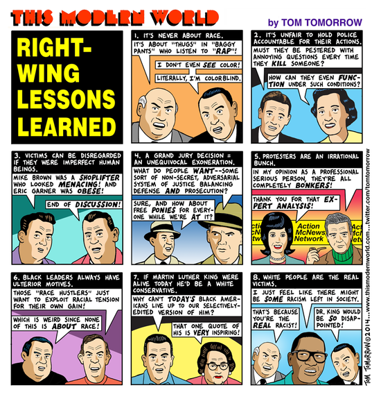
Another edition of our ghastly campus wingnut ‘alternative’ paper came out today. I’m not going to go through it page by page — it’s just gotten worse and worse with every issue. Here are the three main themes:

If you’ve ever wanted a Nobel Prize, you can bid on one: James Watson is auctioning his off, with a starting bid of $2.5 million dollars.
He says he needs the money.

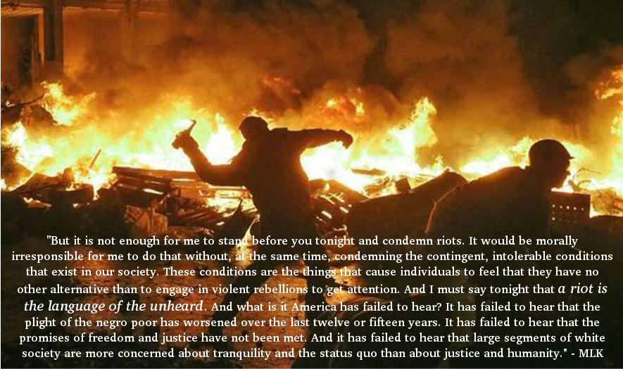
But it is not enough for me to stand before you tonight and condemn riots. It would be morally irresponsible for me to do that without, at the same time, condemning the contingent, intolerable conditions that exist in our society. These conditions are the things that cause individuals to feel that they have no other alternative than to engage in violent rebellions to get attention. And I must say tonight that a riot is the language of the unheard. And what is it America has failed to hear? It has failed to hear that the plight of the negro poor has worsened over the last twelve or fifteen years. It has failed to hear that the promises of freedom and justice have not been met. And it has failed to hear that large segments of white society are more concerned about tranquility and the status quo than about justice and humanity.

It seems that Palestinians are very familiar with injustice.


No indictment for Darren Wilson.
He was a white cop who murdered a black teenager. Did you really expect anything else?

Glenn Greenwald has a great long piece tearing Sam Harris’s ideas apart. It was so satisfying to see my own opinions reflected with such clarity and reason — I have to agree with it all. Read it. It is a thing of beauty.

I have to say one thing for Obama’s announcement of a new immigration policy: it has really smoked out the inhumane and vicious Republicans. There have been so many things said that reveal the core values of the Republican party, but this comment from a Fox News host captures the attitude perfectly.

It looks like that’s what I’m going to get, though. Mother Jones sent a reporter to the Urban Shield conference, a gathering of cops and their new toys. It’s chilling.