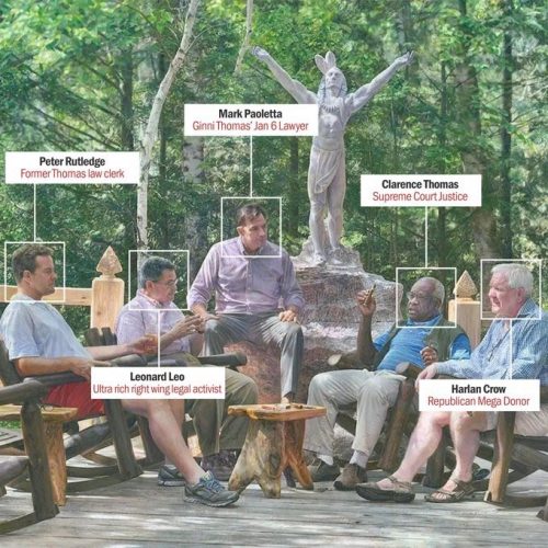
It’s pretty simple, actually. Right-wingers have been bribing Clarence Thomas for years.
Conservative judicial activist Leonard Leo arranged for the wife of Supreme Court Justice Clarence Thomas to be paid tens of thousands of dollars for consulting work just over a decade ago, specifying that her name be left off billing paperwork, according to documents reviewed by The Washington Post.
In January 2012, Leo instructed the GOP pollster Kellyanne Conway to bill a nonprofit group he advises and use that money to pay Virginia “Ginni” Thomas, the documents show. The same year, the nonprofit, the Judicial Education Project, filed a brief to the Supreme Court in a landmark voting rights case.
Leo, a key figure in a network of nonprofits that has worked to support the nominations of conservative judges, told Conway that he wanted her to “give” Ginni Thomas “another $25K,” the documents show. He emphasized that the paperwork should have “No mention of Ginni, of course.”
Harlan Crow has been celebrating this with his bought-and-paid for super-realistic art. It’s all the same small circle of cronies and their apologists.
It’s like a crime family. Charming.


