We’re teaching students how to plot data and analyze trends and do statistics in lab this week. Here’s an exercise for you. Does this curve look like it’s flattening? Or declining?
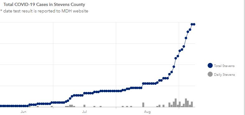
That’s us, the Stevens county frequency of COVID-19 cases. Classes are still ongoing. No changes in our plans. I guess that means the incidence must be stable or getting better?

Frankly, I’m a touch suspicious that every day doesn’t appear represented when a modest spike is already trending, suggesting perhaps, a single point of failure in the reporting chain and holidays, days employee is out on a personal/sick day and vacation would result in a lack of any reporting. That can render the data not only suspect, but potentially, a total hashed mess.
And yes, I’ve actually saw such data, which was caused by only one worker being allowed to submit data. I imagine, had that single worker died for any reason, no reporting would’ve occurred until a replacement was hired. That was both my conclusion and the assigned epidemiologist’s conclusion and that error was swiftly rectified.
Epidemics don’t take days off, so the statistics can’t either. Our charts since that oint included null, vs reported 0 cases dates to ensure capture of missing data.
The blue curve is the number of cumulative cases, which strictly speaking cannot decrease. The appropriate measure is closer to the daily cases. Maybe take a 7-day average to reduce noise. That said, it still looks like it’s going up.
I find it mildly interesting how different graphs choose to show different metrics–cumulative or daily, case counts or death counts, absolute counts or counts per capita. When case counts are low and have lots of statistical noise, they tend to show cumulative counts. When case counts get larger, daily counts are more informative. When the counts are really large that’s when we start talking about counts per capita. But Steven’s County isn’t there yet.
Zero by November 2, if I am any good at reading trend lines.
What Siggy wrote.
I suppose the gray boxes at the bottom of the graph are the daily new cases. Definitely an up-tick in the rate of new cases since the end of August, probably when school started. Not a particularly good sign. Perhaps you and your students should pray more. I understand that will help. If it doesn’t prevent your from getting COVID-19 and dying, at least you’ll have the comfort of knowing your soul is taken care of, the economy is buzzing along, and the CoC stands a better chance of reelection.
wzrd1 @1,
I would be very suspicious of gaps like you describe as well if we weren’t talking about a very small number of cases in Stevens County. I looked up the stats and found that graph (link). The maximum value of the cumulative curve is 80 cases. At the beginning of August, there were only 15. So yeah, maybe there’s bad data collection or bad reporting or even bad faith on the part of those collecting data. But given Stevens County’s low population density and relative isolation, maybe it’s not so surprising that the data looks the way it does. Probabilistically speaking, it would be far more unusual to have a smooth, regular increase of cases when the total numbers are so small. (Disclaimer: I have little practical experience with data analysis…feel free to rip my “analysis” to shreds!)
robro @5, The beginning of that cluster of bars in the lower right corresponds to August 27, so pretty close to the beginning of the school year. Damn, that’s worrisome. PZ (and everyone else), stay safe.
I still am not comfortable with a graph that doesn’t document non-reporting. That can turn into an unmitigated disaster, as repoorting zero cases indicates reporting is still ongoing, no report is a null and needs to be followed up.
Otherwise, for all anyone tabulating and coordinating data knows, there are no cases, whereas the reality on the ground could be all those who should be reporting are down and incapable of reporting. That also happened in the 1918 influenza pandemic.
@#2, Siggy:
At least it seems like nobody is pushing graphs of current coronavirus cases, and are sticking to numbers which can be measured (although obviously the “deaths from coronavirus” statistic is subject to politically-motivated tinkering, vide Florida and Texas). Apparently the number of active cases should be tracking the total new cases over the last 10 to 12 days relatively well (something like 90% of cases are resolved — recovered or dead — within that period after the first positive test), but not exactly (the other 10% or so, obviously), and I don’t know of any organizations which are attempting to keep tabs on people who are sick to see their ongoing status. When we start seeing “news” organizations peddling graphs of active cases, we’ll know that accurate data is officially a lost cause.
No offense PZ, but without a y-axis this data is useless. I’m only saying that because that’s exactly what one of my professors would have said back when I was in college and I know you’re better than that. I’m picking up what you’re laying down, but it would help your message with some hard numbers.
Ray, pretty evidently each minimal bar is one unit. We know the units are people.
Would also help to know what might be going on to know if up turn corresponds to students returning to campus and if students are being tested.
TBH no y-axis label leaving it up to the viewer to guess the magnitude of these cases. The magnitude could be inferred but shouldnt need to be. Author gets an F
I wish they would add a line to indicate when it was safe again to finally get my haircut!
The Y-axis is labelled, and the X-axis goes back to April, if one can be bothered to look at the actual plot (see the link in Sean Boyd@6 (thanks, Sean!)). The image in the OP has therefore obviously been truncated on the left←hand←side.
I find this visualization more helpful:
https://policylab.chop.edu/covid-lab-mapping-covid-19-your-community
Plug in your state and county and you get the weekly cases/100K and percent positive testing. Stevens county does not look good on these measures. These metrics are being used by many school districts for decisionmaking around whether or not to open, open with a hybrid model or remain virtual.