You can lie with numbers as effectively as you can with words, so this collection of rules for critically evaluating Big Data claims is timely. I think they missed at least one, though. It was caricatured in a recent xkcd:
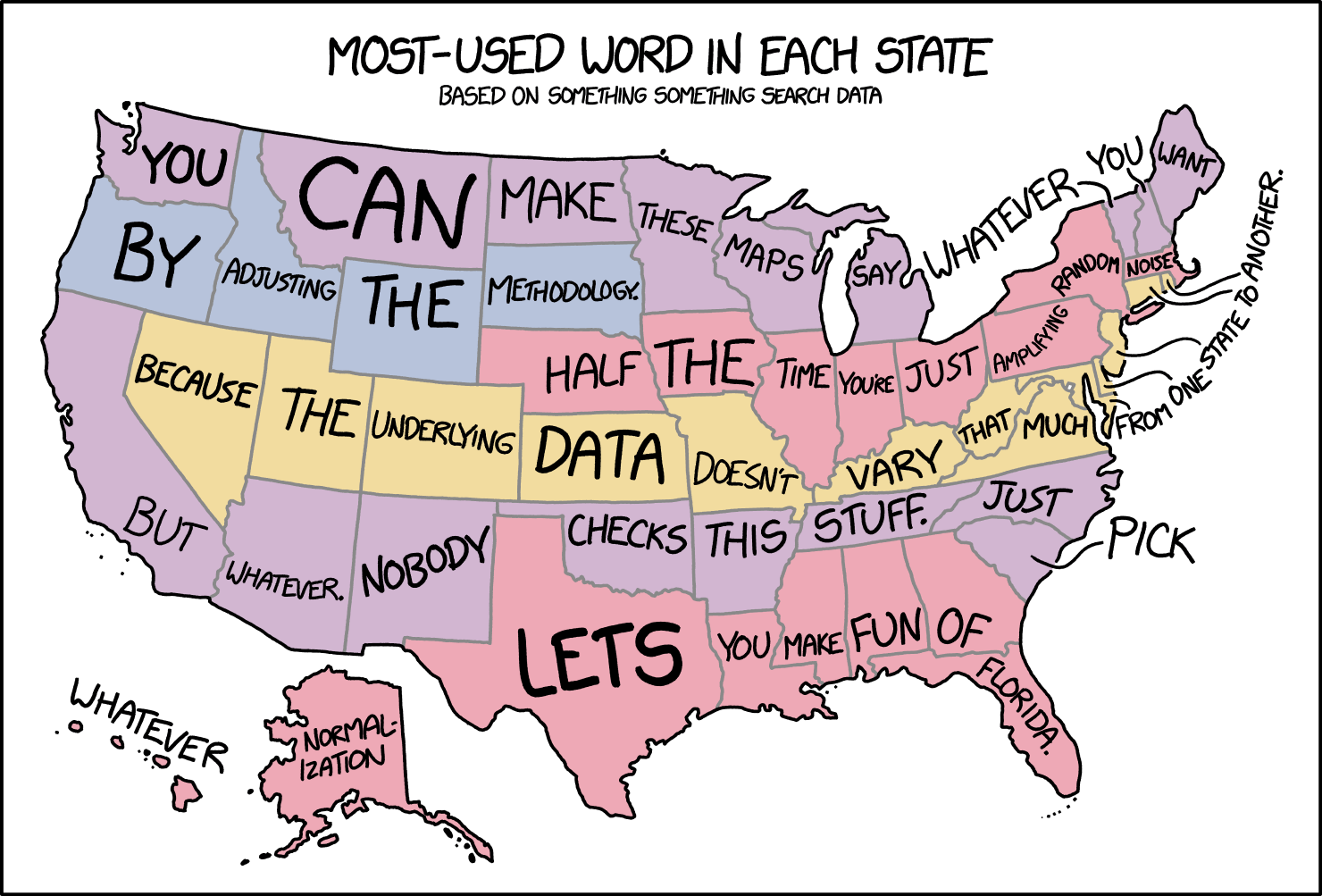
I’m seeing a lot of these lately. For example, here are the most popular porn searches by state. I’m sorry to say that this is mostly garbage data, useless to everyone.

These data are produced by basically subtracting (or dividing) away the mean and amplifying the differences. I suspect that there is a great sea of banal commonality to porn searches, and they’re more or less the same everywhere…but all the similarities are erased to accentuate slight variations that might be minuscule. If everyone in America were searching for “insect porn”, which would be an interesting and weird piece of data, and one guy in New Hampshire slipped and typed in “incest porn” instead, New Hampshire would be lit up in these maps as the freaky state that wasn’t watching mantis copulation videos.
You might be saying to yourself that this is a trivial example — OK, let’s be cautious in interpreting data techniques that rely on amplifying minor differences, since they can mislead you about the overall state of the system. However, there is a technique that gets published all over the place in the scientific literature that is doing exactly the same thing: it’s called fMRI. This is not to imply that MRI data is bogus, because it’s very good at detecting consistent differences in pattern, but it’s also very good at highlighting chance variation, and it takes a lot of processing to smooth out the roughness in the raw data, and the whole point of the technique is to erase background activity.
I used to do ratiometric imaging, which has similar potential pitfalls. We used a fluorescent dye that would exhibit subtle wavelength shifts in the presence of calcium, so you would visualize activity in the brain by taking a photo at one wavelength, and then a second photo at a slightly different peak wavelength a fraction of a second later, and then taking the ratio of the two. If there was no shift at all, the images would be identical, so every pixel would have a ratio of 1 — which we’d scale to a displayed color of black. If a pixel was fluorescing a little more at the second wavelength, you’d have a ratio slightly greater than 1, and we’d pseudocolor that to something a little brighter.
Again, this is a perfectly legitimate processing technique and the fluctuations we observed were valid and consistent, and you could even calibrate the ratios against known concentrations of calcium and get good estimates of the actual amount of free calcium at each time point in a recording. However, here’s the thing: if you looked at the raw data, or if you looked through the eyepieces at the tissue, you’d see that everything was gently glowing, and that there was actually artifactual fluorescence all over the place, and there was also continuous, low-level calcium flux everywhere, all the time. That information was discarded. Also, when you see the pseudocolored images rendered by these sort of techniques, there’s an awful lot of point variation that is smoothed away, because we tend not to like our pretty pictures spattered with lots of salt-and-pepper noise. We blur it all out.
This is a special problem for methods like MRI, which tend to be at a painfully low resolution (each pixel represents thousands upon thousands of cells), and is also grossly indirect — it’s measuring oxygen and blood flow, not actual electrical activity.
To that list of Big Data cautions, I’d also add that you have to be conscious of what is actually being measured, limitations of the technique, and how you can be misled by assumptions about the resolution. Data can be massaged into all kinds of ridiculous conclusions if you’re not aware of every step of its manipulation.


