You might have wondered why I didn’t pair my frequentist analysis in this post with a Bayesian one. Two reasons: length, and quite honestly I needed some time to chew over hypotheses. The default frequentist ones are entirely inadequate, for starters:
- null: The data follows a Gaussian distribution with a mean of zero.
- alternative: The data follows a Gaussian distribution with a non-zero mean.
In chart form, their relative likelihoods look like this.
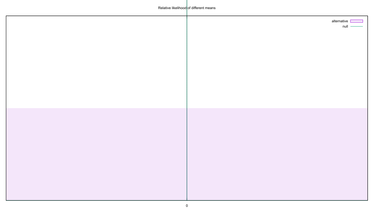
Useless. We’ll have to do our own thing in Bayes land.
As a subjective Bayesian, my first go-to would be to look for external information that puts constraints on any hypothesis. Previously, with Bem’s precognition studies I cobbled together some assumptions about our ability to notice things, added public opinion surveys and observations of how many psychics existed, and used it all to rough out a hypothesis. This time around, let’s treat the random number generator as the subject of a generic scientific study. Nearly all meta-analyses, and some plain ol’ scientific papers to boot, represent the effect size via Cohen’s d. This treats the control and treatment groups as following Gaussian distributions, and defines a dimensionless measure of difference by dividing the difference in means by the pooled standard deviation. If we treat the source of random numbers as a treatment group, with the control having a mean of zero, the mean of the treatment happens to equal Cohen’s d.
Remember this ol’ replication study from back in the day? Supplementary figure 4 crudely divides the 97 replications into two piles, those that were significant on replication and those that weren’t. If we assume every failed replication indicates a false effect (dubious, but not implausible), then there’s a 64% chance of a null effect. Assuming the effect sizes of failed replications follow a Gaussian distribution with mean 0, the sample implies that distribution has a standard deviation of 0.285. If the successful replications are all true effects, they have a mean Cohen’s d of 1.251 with standard deviation 0.95. This is enough info to build an H0 and H1.
Back in this post, though, I conceded that much of science proceeds by abduction. Post-hoc claims of effect size are common, and in practice this usually means the first few experiments would set the effect size for all future studies. So to carry on this pattern we’ll set up an H2 that uses the sample mean and standard deviation of the first experiment to estimate the population mean and corresponding standard error. And to make things as tough as possible, we’ll also define an H3 that instead combines the results of the first five experiments. If you use the default random number seed, all four look like this.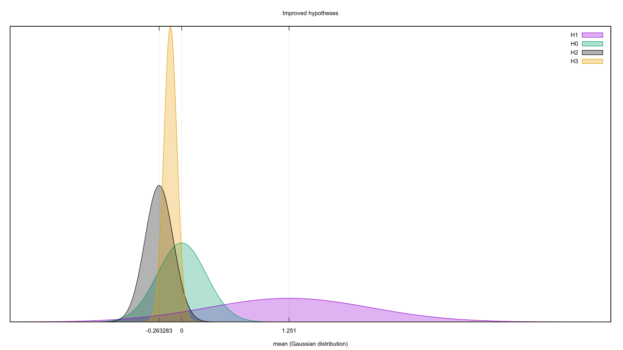 It could use one more hypothesis, though. H0 doesn’t take into account the number of datapoints in the sample: the law of large numbers implies that the more datapoints there are, the closer the sample and population means will be. But if the data generator really has a mean around 0, then as the datapoints pile in H0 will remain timid and uncertain when it should be getting bolder. So let’s propose an H4, which has the same null mean as H0 but a standard error that’s equal to the inverse square root of the number of datapoints.
There’s no scaling on that diagram, which brings us to the next problem. We’re adjusting H0 and H1 to match their relative likelihoods of 64% and 3%, respectively, so it’s only fair to do the same to those fitted hypotheses. But what sort of prior can we assign them? I’m not sure. On the one hand, they are specific hypotheses that should be subject to Benford’s Law. On the other hand, the equivalence of abduction and inference suggests that a post-hoc hypothesis pulled from a conjugate posterior should have the same probability as the equivalent pre-hoc one later evaluated against said posterior. Anything less would be altering the evidence based on the internal state of the investigator, and there be dragons. I’m leaning to the other, so I’ll leave the priors flat for H2, H3, and H4. This disadvantages H0 and H1, but their priors should be weak enough to quickly disappear under the weight of the data.
To save a lot of number crunching, we’re going to (correctly) assume the data source is Gaussian and thus captured well by the Normal Inverse Gamma conjugate prior. Assessing the likelihood of each hypothesis is reduced to sampling from the posterior, instead of doing sample runs over an ever-increasing dataset. We again need to juggle per-sample conjugates as well as a running total, but this time we need to run the experiments to generate H2 and H3, then reset everything and run again. This is a bit wasteful, but it’s easier to code than caching datapoints.
The variance is a problem too, as no hypothesis cares about it but the conjugate prior does. Rather than switch to a mean-only conjugate like I’ve used in the past, I’ll exploit the indifference and fill in that blank with an estimate based on the maximal likelihood. This will inflate each hypothesis’ probability, compared to if I’d done the proper thing and marginalized out the variance, but it should inflate them all equally.
Enough preamble. Let’s run the code and examine the per-sample results first. Rather than pit each hypothesis against each other, I’ll just chart their individual likelihoods.
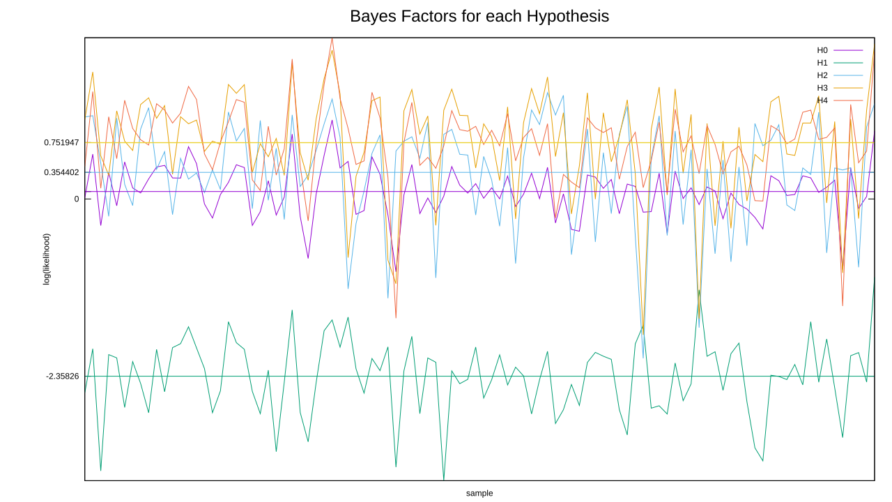 I’ve added some horizontal lines to help you see the waterline of each hypothesis. If you’re having difficulty finding the line for H4, that’s because it almost coincides with the one for H3. Both of them come out clear winners here, and poor H1 is definitely the sucker of the bunch. H0 is only able to best H1, surprisingly, due to how spread out it is.
We’re dealing with log likelihoods here, so comparing two hypotheses amounts to adding each of the samples for the first then subtracting the samples for the second. The waterline, or average value of all experiments, gives us a hint at what to expect: hypotheses with a higher waterline are more likely to win out over those with a lower one. Speaking of which, it’s time to see the aggregate data. Points above zero favor the hypothesis in the numerator, and those below favour the one in the denominator. I’ve also popped in the frequentist chart, so you can see how the two compare.

On the surface, these two couldn’t be more far apart. Frequenism starts off favouring but not committing to the alternative, but as time goes on it winds up declaring false significance. Even when we cheat by creating a fitted hypothesis, then feeding the same data we used to create the fit back through, it doesn’t take long for H4 to clearly signal it’s the best of the bunch. If you’re wondering why it does better than its waterline suggests, remember that we’re auto-scaling its standard error based on the sample count. That wasn’t a factor when we working per-experiment, as they all had the same sample count, but it certainly is when we’re working with cumulative averages here.
The timeline is interesting, too: a hypothesis fitted to five experiments’ worth of data does great until about experiment ten, and is equalised at experiment twenty. Is that a coincidence, or the sign of a predictable “evidential gravity” which pulled H3 back to Earth? The comparison between H0 and H2 is also notable; despite some jockeying early on, H0 manages to gradually gain on H2. A lousy null hypothesis can still beat out a weakly-fitted one, it seems.
At the same time, let’s not oversell this. Bayesian statistics are not magic, if you’d cut things off around experiment #10 you’d have concluded a non-null hypothesis was the most credible by a good margin. Frequentism does a good job when its underlying assumptions match reality, and this example only breaks one: the dataset is relatively small. As I mentioned last time, if you continue to pile on more data frequentism will head back into non-significant territory. This implies we should be greatly suspect of any study pool with a small sample size.
Hey, isn’t a significant chunk of science done with small sample sizes? Oh shit.
I can’t close without addressing what’s missing: where are the confidence intervals? Think about what those would represent, though: assuming the data we’d seen was representative, if we continued to roll the dice then Y percent of the time we’d calculate a Bayes Factor between X and Z. That’s not helpful, in fact it’s a counterfactual. We shouldn’t be basing our belief on mythical future data, just what we have in front of us.
How would you put a confidence interval on your confidence in a statement, for that matter? Does it make sense to say I’m 80 +-10% certain it’ll rain tomorrow? Certainly not; if I’ve followed the rules of probability, saying that is tantamount to being 80-90% certain that Socrates is mortal, given that people are mortal and Socrates is a person. I can be confident with math and logic in a way that I can’t be with the external world, so there’s no error bars on the Bayes Factor.
There is a Bayesian analog to confidence intervals, however, should you need them. Rather than precisely describe the posterior distribution, I can say “Y% of my certainty for this parameter lies between X and Z.” These “credible intervals” apply to posterior distributions only; I can’t slap them on any of the above hypotheses, for instance, because all of them only take one parameter (the mean) and all of them fix that one parameter (saying it must come from a specific distribution with a specific shape, with no flexibility). Even within posteriors, they can be problematic; here’s the Normal Inverse Gamma after one experiment, for instance.
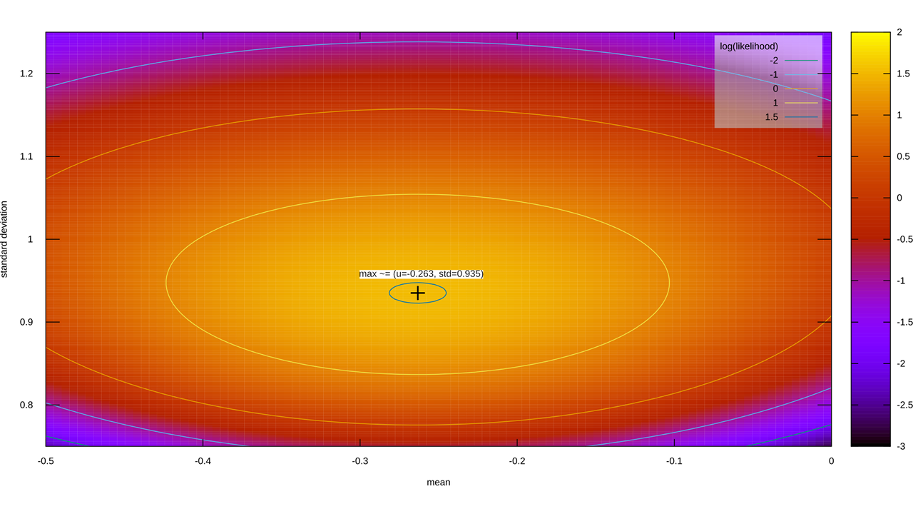
Our Y% certainty region is an ellipse that’s been left out in the sun for a bit. If I give you credible intervals for the mean and standard deviation, though, I’m giving you a rectangle. If I were to use MCMC to sample from the posterior, toss out (1-Y)% of the samples, and record the minimum and maximum extent of what remains, that box contains the melted ellipse containing Y% of my certainty, plus some extra certainty in the corners. If I were to compensate for that, then those credible intervals in isolation contains less than Y% of my certainty, because we had to exclude bits of the Y% melted ellipse to compensate for those corners.
Credible intervals are a gross simplification of the underlying posterior. That may be A-OK if everyone knows the shape of that posterior, but if they don’t the assumption may come back to bite you.