
Pffft. Multicellularity is overrated.

There deserves to be a special place in hell for smug, smarmy “pro-lifers”.
Dear @pzmyers I’ve read some of your reactions to pro-life claims on embryology. You seem to confuse biological claims with philosophical ones sir.
Oh, please, don’t “dear” and “sir” me. Have you ever noticed how some people like to paper over their stupidity with the most superficial expressions of politeness, as if it makes their argument respectable? Give me blunt honesty any day.
I also don’t need random goons on the internet telling me I have to make some distinction between science (usually, in this context, preceded by an unvoiced “mere”) and philosophy. Biology is a subset of philosophy. I get enough of that crap from real scientists.
Also, you don’t get to dignify your religious prejudices with the label “philosophy”.

Now I’m seeing exploding plants everywhere.

The Tully Monster has been an enigma for half a century. Now it’s been reconstructed on the basis of analysis of 1200 specimens.
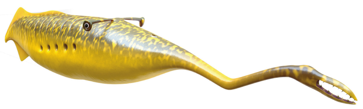
That thing is weird. It’s been extinct since the Carboniferous, though, so we’re not going to be catching any nowadays, unfortunately. Note the eyes on stalks; the tubby body; the long ‘snout’ terminating in a toothy jawed mouth. People have been grappling with its taxonomic identity for decades, and it’s been labeled as various kinds of worms, or a mollusc, or an odd relic of some Cambrian phylum.

I just had this weird thought, provoked by the recent time change, and I went browsing through apps to see if anyone had thought of it before. Nothing jumped out at me.
What I want is an alarm that can be set off at a time relative to sunrise…so, for instance, instead of setting it for 6:30, I’d set it to go off one hour before sunrise. Anyone know of such a thing, for an iPhone?
I was just wondering if it would make more sense to map one’s sleep schedule relative to the solar day, rather than some arbitrary bureaucrat somewhere telling you that this week, you’re expected to get up precisely one hour earlier than last week.

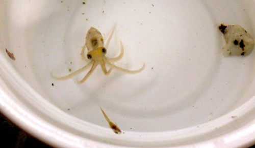
A guy finds a hole in his wall, and behind it, a strange leathery brown mass. He pulls it out — first mistake. He cuts it open — second mistake. Within…
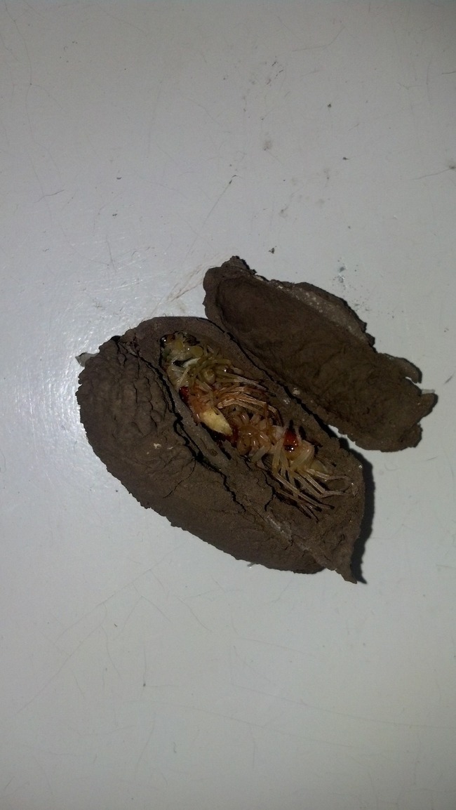
It’s a wasp nest stuffed full of dead spiders, each with an egg planted in them. It’s just adorable. There are more photos. I was kind and picked the least horrific.

Ouch. Why is Neil deGrasse Tyson doing this to himself?
If you have a gene for celibacy, you didn’t inherit it.
— Neil deGrasse Tyson (@neiltyson) March 12, 2016
No, that’s not right, for multiple reasons.
Celibacy is a behavior that almost certainly isn’t genetic in the first place. It’s more of a choice, strongly shaped by culture.
Traits that are deleterious to reproduction can get transmitted easily if they’re recessive.
You can get pregnant even if you don’t enjoy sex, and even if you are firmly committed to never having sex. Has he never heard of rape?
But really, the biggest problem here is that he’s echoing a pernicious fallacy that’s used to demonize all kinds of behavior. Haven’t you ever heard a wingnut complain that homosexuality is unnatural and can’t possibly have a genetic basis, because gays can’t reproduce? It’s the same argument. And it’s wrong.
Jeremy Yoder has torn that one apart in depth.
It’s getting weird. Tyson just keeps throwing out science canards — which is something a science popularizer shouldn’t do.

Neil deGrasse Tyson stuck his foot in it yesterday.
If there were ever a species for whom sex hurt, it surely went extinct long ago.
— Neil deGrasse Tyson (@neiltyson) March 11, 2016
Ouch. Astronomers talking about biology is probably about as painful as biologists talking astronomy. But at least it inspired the #BiologistSpaceFacts hashtag, which is amusing, and Emily Willingham put together a good summary of cases where sex hurts.
But what I find interesting is the assumption, and it is a common one, that if some phenomenon exists, it must be part of a purposeful good, and that evolution in particular produces only beneficial outcomes. We’d be extinct if it didn’t, is the way the thinking goes.
There are problems with thinking that way, though.
One: natural selection isn’t the whole of evolution. Some features simply have not become fixed in a population because they’re good for it; detrimental novelties exist and can become ubiquitous because they aren’t severe enough to be seen by selection.
Two: In cases where selection applies, advantageous does not necessarily equate to “good”, whatever that means. It is possibly advantageous to male cats to have barbed penises that rake out sperm from other males; it does not make mating more fun. Many species of salmon exert themselves so strenuously to produce and fertilize eggs that they die, and presumably fish that conserved their resources to permit multiple breeding seasons were outbred by their frantically semelparous competitors. Would we say that an explosively fecund death is “good”?
Three: Selection doesn’t demand that an organism achieve an absolute “good”. It only needs to be slightly better than other individuals. So if pain is a negative criterion for sexual success, all you have to do is hurt less than the competition to win.
Four: A twist on my second point is that we often define “good” from a subjectively human view point, and even from a narrow cultural position. We assume that sex should be fun because it is for us, mostly, but from the broader perspective of biological success, “fun” is a concept that’s orthogonal to actually getting the job done.
Tyson’s perspective as an astronomer gave him no information at all on what evolution is all about, so he lapsed into his perspective as a human being, and gave a parochial guess. It takes a major effort to think outside the box of Homo sapiens for us, and the default is always going to be far narrower than reality.

They’re adorable! And you could watch them chase down, capture, and bloodily devour guppies!
But they’re also delicate and demanding, and I sure wouldn’t rush to try…and I’m an experienced aquarist. But if you really must, here’s a discussion of a standard protocol.

Did you know they’re actually born with that excellent mustache?

