A commission has been busy redesigning our ugly state flag, and they’ve settled on a design that they will submit to state congress. They may diddle with it a bit, but generally, this is what it will look like:
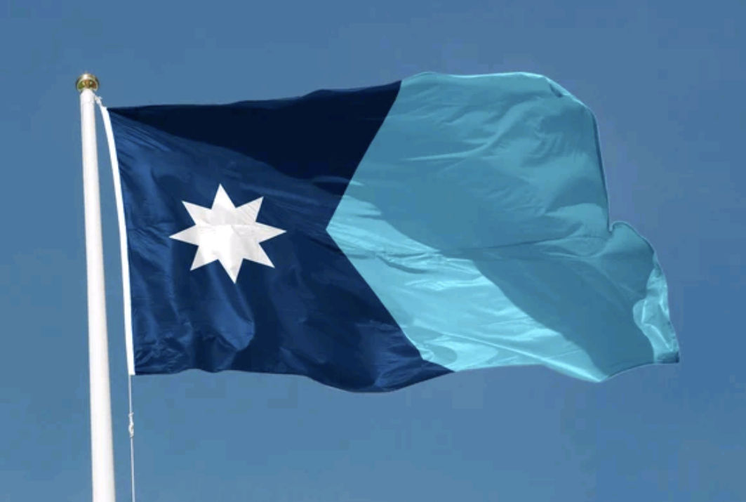
Initially, I had favored a flag that featured an Ominous Loon, but I guess this one will do. It’s clean and simple, the colors reflect our name (Minnesota is from a Native phrase that means “where the water meets the sky,”) and I think it’s just plain pretty.
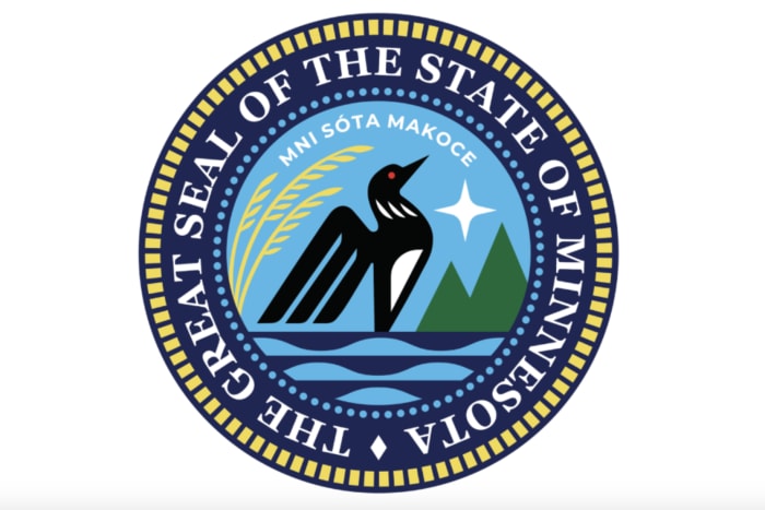
It doesn’t have a loon, unfortunately, but then our newly redesigned state seal has one.
I look forward to all the Minnesota school children being able to draw their flag this spring. Alas, my poor granddaughter lives in Wisconsin, and will be tortured with the effort to draw the cluttered abomination of the Wisconsin state flag.


