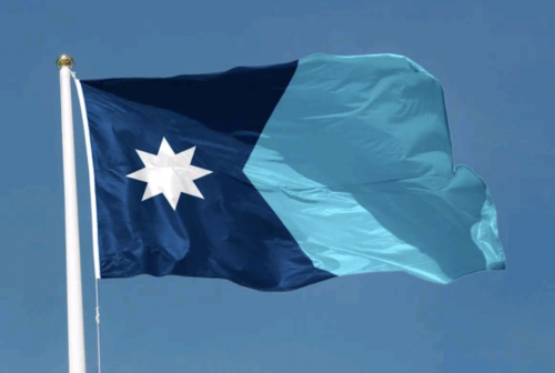
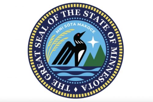
A commission has been busy redesigning our ugly state flag, and they’ve settled on a design that they will submit to state congress. They may diddle with it a bit, but generally, this is what it will look like:
Initially, I had favored a flag that featured an Ominous Loon, but I guess this one will do. It’s clean and simple, the colors reflect our name (Minnesota is from a Native phrase that means “where the water meets the sky,”) and I think it’s just plain pretty.
It doesn’t have a loon, unfortunately, but then our newly redesigned state seal has one.
I look forward to all the Minnesota school children being able to draw their flag this spring. Alas, my poor granddaughter lives in Wisconsin, and will be tortured with the effort to draw the cluttered abomination of the Wisconsin state flag.


Big improvement over the original.
I like how, to keep it local, they used the color scheme from the left half of the Replacements’ “Pleased To Meet Me” cover. ;)
Surprised you did not mention the freak-out about the supposed similarity with the flag of Somalia
It is better but kind of boring. I do, however, like the state seal.
That seal is gorgeous! Flag is simple, yet elegant.
There is no similarity with the Somali flag. The Somali flag is a light blue with a 5-pointed star in the center. That’s it. They’re not going to be confused.
The Somali flag thing is yet another contrived controversy invented by right-wing assholes.
Nice improvement! Here in Maine there is a movement to replace our current clutter with the elegant 1901 design. I think we will vote on that and minor matters next year.
How can that be the Wisconsin flag? There’s no cheese wheel anywhere on it.
The background in the center is an artfully carve cheese sculptor as only the most skilled of Wisconsin artist can do.
I love the seal. That is perfect, complete with the Dakota name for the area: Mni Sóta Makoce— “where the water meets the sky.”
Now, how about a redesign for the utterly stupid flag for the state of Warshingon. Ugh.
I saw the actual Somali flag while Googling about it and found a lot of difference between the two flags. Seriously, there’s nothing wrong with the new state flag no matter what those bigoted idiots who manufactured such needless outrage say about it.
Is the star representing Stella Polaris ?
I am using the astronomical name to avoid the north star / pole star debate
Call yourself a biologist? That’s not a seal, it’s a bloody bird. Even engineers know the difference.
@PZ: That insanity has hit JMG.
https://www.joemygod.com/2023/12/the-cult-melted-down-over-new-minnesota-state-flag/
Remember, everyone! If you’re angry that other people don’t get basic human rights, you’re a snowflake! Not a calm, rational conservative who has a screaming meltdown over a state flag. 😑
Just today I heard the vexillological term for that type of flag: SOB (Seal On Bedsheet).
Looks nice! Not nice enough to make me ever want to move back to Minnesota, but, hey, really nice.
Now to fix all the other stupid blue-background-state-seal flags.
The purpose of a flag is to be an identifier.
If you can’t identify a flag, at a glance, from a distance, it is USELESS.
Putting Michele Bachmann on the state flag would guarantee that the design became dated almost immediately. Besides, would you really want her on it? …oh, you meant the other kind of loon. Sorry.
@SQB #15:
We’ve got one of those in Jersey. In fact, outside of South Carolina, every state I’ve lived in has a SOB. I’m not a fan, it looks like they decided on the state seal and colors, then called it a day.
The only similarity with the Somali flag is a white star on a blue field. I guess we should burn all the flags with white stars on blue fields, huh? …Wait! Wait!
Do the various elements have some symbolic representation? Like the 8-point star? Or the light blue versus dark blue? The chevron shop…or whatever it’s called…that divides the two colors?
That Wisconsin flag is the most homoerotic thing I’ve seen in awhile. AND it looks like it was designed by an elementary school student.
The only thing missing from it is Monty Python’s “I’m A Lumberjack And I’m Okay”. Or maybe a song and dance number from Men In Tights.
The Minnesota state flag is pretty but the state seal is where it’s at. Nice job with the loon.
“It doesn’t have a loon” — you say that like it’s a bad thing.
Oh, I get it, you mean the flag, not the legislature (there are plenty of loons in any state legislature).
Pretty much every red state needs a loon on their flag.
I liked the one with the loon, but I think this is a great flag. (I’m not a vexillologist, but it’s a great flag in doing what it should).
Link is to a short video (under 4 min.) with commentary from an actual vexillologist.
@12. birgerjohansson : “Is the star representing Stella Polaris ?
I am using the astronomical name to avoid the north star / pole star debate.”
I gather so although it looks like a generic white star symbol to me.
As noted here too :
https://freethoughtblogs.com/pharyngula/2023/10/09/infinite-thread-xxix/comment-page-5/#comment-2205183
Also Polaris is a triple star system so technically I mean Polaris A the yellow-white F typ cepheid variable supergaint rather than its F3 V and F6 V (Procyon-like) yellow -white dwarf companions :
https://en.wikipedia.org/wiki/Polaris#Stellar_system
As for comarisons with Somalia’s flag?
https://en.wikipedia.org/wiki/Flag_of_Somalia
No. For one thing there’s the whole other different shade of blue.
^ Make that whole additional ie two rather than just one blue fields there for clarity.
I grew up in Wisconsin and I remember having to draw the flag from memory for civics class. What a stupid and pointless exercise. What an ugly fucking flag. Congrats Minnesota for abandoning the “seal on a blue field” that 30-some states still have.
The purpose of a flag should be to strike fear in your enemies. “Jolly Roger” got it right.
Or – if you are an asshole – the old South Park flag.
If Australia gets a new flag, it should emphasise the independence of London by either symbols or text. What is “fuck off, Brits” in latin?
birgerjohansson
Probably something like, “Romans go home”
https://www.mediamatters.org/white-nationalism/right-wing-media-attack-minnesotas-state-flag-redesign-great-replacement-theory
Of course the Right is finding fault.
My home state of PA has one of those SOB flags, but I’d say it’s the best of the bunch, with its frisky rearing horses and that big bird, not a loon but rather, one that was all but eliminated from the state not so very long ago. (Currently 300 bald eagle nests, up from a mere 3 in 1983.)
@21 robro —
PZ explains the colors in the O.P., and as for the shape (which puzzled me, too, at first) check out maps.google.com for a clue.
@29 Ada (re Wisconsin flag) —
Did they make you faithfully copy that hideous representation of a creature that looks nothing like a badger? Not drawn from life, that’s for sure.
I quite like it actually.
I didn’t even know what my NY state flag looked like . I thought was the orange and cyan NYC flag until I looked it up . It’s a SOB