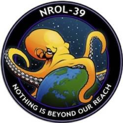
The National Reconnaisance Office has launched a new spy satellite with a logo that is rightfully mine. Or at least, I ought to steal it. I’d really expect our security agencies to exhibit a little more subtlety than your stock comic-book supervillain.


That tentacle over Russia is searching for Edward Snowden. But most of them seem to right back here in North America.
The beak is gnawing on Canada.
WESTern Canada.
What could I possibly have done?
Eh, could be that it’s searching for the Crommunist.
PZ:
Ah. Perhaps I will be among those eaten first and all that.
Where does a comic-book octopus keep its … parts?
i’m in western canada too!
Are we the baddies?
So where is their hidden volcano lair?
Can I start using the f-word to describe the government and advocating open rebellion yet?
It’s bad enough that they killed satire, must they continue to kick its corpse?
How good is octopus vision? It would be kind of ironic if they used a local on a photo reconsat of a creature that can’t see very well.
And speaking of supervillains one person has noticed the similarity to the logo of a certain fictional organisation of evil. http://james-nicoll.livejournal.com/4736589.html?thread=88003661#t88003661
Bah, logo, not local!
A very 21st-century logo: no pesky icecaps!
The next time NASA sends a mission to Mars or the outer planets they should call it “Beyond your reach” and make the logo a rover thumbing its nose at an octopus. Actually, it’d be even better if the ESA did same.
For any other government agency, this would be cute. But given that a lot of the criticism is that the government doesn’t take privacy anywhere near seriously enough, making light of it with a cutesy logo is a misstep, to say the least.
If something like that came up in a movie, people would call it too silly.
Um, most logos are now outsourced. . . cheaper labor and all.
My company thought about stealing it as well sine we have a tentacled logo too: http://www.seasucker.com
America hungers!
The people who came up with that logo are probably the same kind of people who would shoot Hellfire rockets from Predator drones. They use many different menacing names and logos/mascots for themselves and their weaponry. Because they have long given up on the pretense that they are a benevolent force. Still people can’t see through it, and think these symbolisms are just “cool” or something. Time to take it more at face value.
The one tentacle making contact is right the fuck on top of Iran, Afghanistan, and Pakistan. I do not think that’s a coincidence at all.
Rey Fox:
Fuckin’ a.
HAIL HYDRA!!!
Which I guess opens the possibility that the designer sent that out as a joke. But was then taken seriously.
Every spy-satellite launch gets a special disturbing logo. Here‘s a gallery of them at my favorite Illuminati-conspiracy site.
Chas #24
I looked at that site.
Loved the logos. Really. They are way cool (even the cryptic ones).
Do you know what They™ do with all the people in the sweat-shops who actually worked the embroidery machines?
Almost, but not quite, as Cthulhu-ifferic a logo as:
http://1.bp.blogspot.com/-d9e9oOA5jCA/TqIe3D5oOHI/AAAAAAAAAG0/KxETTYgEIw8/s400/sherman_paints2.jpg
(Which is a real thing, from a real American company, with a branch near my home.)
That’s still a bit too subtle.
They could have just gone with “PEEKABOO!”
Or maybe “IÄ IÄ CTHULHU FHTAGN”.
Christoph Burschka @ 27: I cannot for the life of me imagine why they didn’t just go with “MINE!”
So, am I the only one who noticed that the critter on the logo appears to be a pentapus? I mentioned that to my housemate and she suggested that the five arms was to fit better in the Pentagon.
Chas:
Gee, going by those, you’d never get the idea ‘merica is this great Christian nation we hear about all the time.
I’m disappointed, though, no Gamera.
A missed opportunuty to use this cover art.
Maybe next one?
Know you NOTHING of the Illuminati??!?
IT’S THE LAW OF FIVES!!!!111!!1!
As many as it needs to have “the proper amount of suction” …
The people who came up with that logo are probably the same kind of people who would shoot Hellfire rockets from Predator drones.
The kind of people who’d pee down their legs in terror or lose their minds in helpless frustration if such force was directed against them?
They won a cosmic crap-shoot and mistook it for justification. Rolling doubles doesn’t mean god is on your side. It doesn’t even mean there is a god.
@Chas #24
That was excellent :) I particularly enjoyed the part where the author claimed that a knight in a plain blue tabard was wearing “the distinctive dress of a knight Templar”. Also the bit where they referr to three snakes which are obviously cobras as “vipers”.
They do have a point about the patches being unnecessarily sinister and containing some strange themes, but I’m inclined to put this down to a sense of humour and a wish for something appropriately dramatic on the part of the designer.
@inquisitiveraven
A visual reference to the Pentagon is certainly possible, and was my first thought. But equally it could merely be an aesthetic choice; too many tentacles on display would make the small badge look cluttered.
dammit, gijoel beat me to the “Hail Hydra!”
“Can I start using the f-word to describe the government and advocating open rebellion yet?”
Fnord?
Hmm. Must be farther in the future, because Greenland is entirely above water. But by that time, there shouldn’t be anything left of the Baltic Sea…
WWII had Hell on Wheels.
And do you remember Operation Infinite Justice?
Number 9 is frankly awesome.
The other 3 tentacles are on the other side of the Earth…
See? SEE??!!!
@ Chas
I must point out that there are many old, and new, cartoons using the maligned octopus as symbol for everything from Nazism to Global Capitalism to Jewish Churchills.
Google Image “historic, cartoon, octopus” and the like, gives hours of browsing fun. Though nothing can ever beat : “lesbian, zombie, nazi, vampire, werewolf, shark, octopus, hooker with lasers …”