A painting by Piet Mondrian has been hanging upside down for 75 years with no one noticing. Here is the piece.
Despite the recent discovery, the work, entitled New York City I, will continue to be displayed the wrong way up to avoid it being damaged.
The 1941 picture was first put on display at New York’s MoMA in 1945.
It has hung at the art collection of the German state of North Rhine-Westphalia in DDusseldorf since 1980.
…Mondrian, who was born in the Utrecht region of The Netherlands in 1872, is regarded as one of the greatest artists of the 20th Century, and a pioneer of the modern abstract style, minimalism and expressionism.
Here is how the error was discovered.
Curator Susanne Meyer-Buser noticed the longstanding error when researching the museum’s new show on the artist earlier this year, but warned it could disintegrate if it was hung the right side up now.
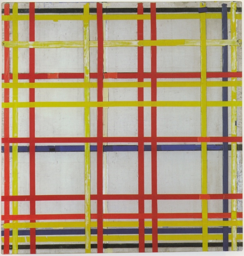
New York City I is an adhesive-tape version of the similarly named New York City painting by the same artist.
“The thickening of the grid should be at the top, like a dark sky,” Meyer-Buser told The Guardian, about the unfinished and unsigned red, blue and yellow striped lattice artwork.
“Once I pointed it out to the other curators, we realised it was very obvious. It is very likely the picture is the wrong way around,” she added when contacted by the BBC.
The evidence seems to bear this theory out, as the similarly-named New York City, which is on display at Paris’s Centre Pompidou, displays a thickening of lines at the top, rather than the bottom.
Furthermore, a photograph of the influential Dutchman’s studio, taken days after his death shows the same picture sitting on an easel the other way up.
There has been some sniggering at art aficionados who could not tell which way is up and may have been assigning deep meaning to the work not realizing the error. But that is a little unfair. In the case pf representational art like portraits or landscapes, one can tell of course which way is up. But when it comes to modernist, abstract works like Mondrian’s, there are few clues.
Furthermore, there may not be a ‘right’ way at all. Of course, the artist may have imagined it in one way and created it accordingly. But from what I have read about art by experts, when it comes to interpreting the meaning of a work of art, that meaning no longer resides exclusively with the artist but is also created by the viewer, so that different people will get different meanings. Who is to say that the meaning assigned to the upside down work is any less reasonable than the right side up? Can we even talk about there being a ‘correct’ orientation?
How do they know the one in Paris isn’t upside down?
I’d hang it sideways. (Actually I wouldn’t hang it at all.)
Jeez, another example of abstract art not really requiring talent beyond a silver tongue. Once you’ve convinced an audience that there is deep meaning to be unlocked in a random pattern of bullshit, all it takes is a good patter to go along with whatever you fart out. Better still, the target audience will even make excuses for you!
Can’t tell what on Earth the artist was trying to convey? “But from what I have read about art by experts, when it comes to interpreting the meaning of a work of art, that meaning no longer resides exclusively with the artist but is also created by the viewer, so that different people will get different meanings.” Emphasis added -- we don’t make this excuse for the similarly abstract things created by people not considered an expert. So I agree with you Mano, there really is no right way up for an abstract work -- all meanings for any orientation are invented by the poseur flattering themselves into thinking they see something deep.
As an aside, at first I was very impressed by this piece, introduced as a painting. Look at that representation of specular reflection! It looks incredibly like real coloured tape! Light sources and reflections are a truly difficult thing to display with paint, so this guy has truly mastered the- “New York City I is an adhesive-tape version of the similarly named New York City painting by the same artist.” -- Oh. It is not a painted depiction of tape, it’s actually tape.
And it just occurred to me -- this is strongly reminiscent of the ‘wine appreciators’ -- the self-styled experts of wine that will read all sorts of fanciful things into any bottle of plonk you put in front of them, provided you represent to them that the wine is an expensive one from a famous vineyard.
Maybe they should take a really good, high definition photograph of the painting, and hang that one the other way around next to this one. It could be accompanied by a little note on what happened, why it might matter if it really does at all, whether it might make a difference in what the artist was trying to say, and why they can’t just turn it around now. People could then decide for themselves what it’s about and whether it matters, and the painting could continue to be a jumping-off point for some artistic criticism and thought, rather than just a thing you see on the wall and walk away from.
Since I’m a viewer, do I get to assign a desirable meaning to the piece’s disintegration?
Mondrian had colored tape in his studio before his death in 1944? What an exotic art item it must have been at the time!
It is commonplace now. Colored tapes were just beginning to be readily available in 1970, as I remember.
No wonder the artwork would fall apart if it were hung the other way around. Cellophane tape gets brittle with age.
I hope the curators put this behind Plexiglas before the jejune food-flinging climate “activists” show up.
We apologise again for the fault in the hanging of the painting. Those responsible for sacking the people who have just been sacked, have been sacked.
@Holms the only way to demonstrate why Mondrian is celebrated for his paintings is to have you try to do one. Mondrian was an expert at non symmetrical balance. That is extremely difficult to do!
X……xx
Non-symmetrical balance. Not difficult.
The piece in question is not balanced at all top to bottom. Might be the reason it was hung upside down. The “bottom” (more stripes and more darker color stripes) makes it heavier than the “top”.
I’m not an artist at all but have had exposure with balance and symmetry in landscape design.
My understanding is that Mondrian rarely finished a painting
I’ve taken CC art classes (I was an electrical/computer engineer at the time, long before I got my geology MS, and needed a good hobby) and the best class I ever took in ANYTHING was introductory (art) design. We did lots of throwaway projects, but all were designed to make us understand how the human brain understands and processes visual displays. (As an aside, it helped me greatly with the professional communication graphics I’d need to make later in life.)
Along the way I acquired some understanding (incomplete to be sure) of what abstract artists are trying to say. I have seen lots of abstract still art that I really like. It conveys a mood, a sense of place, and so on. Other abstract art, including what I’ve seen of some early abstractionists like Mondrian and Pollock, strike me as simply exploration into what art means, how to convey sensations, mood, and impressions, and how much is enough. These folks were some of many pioneers in shifting the art world beyond thinking that if the painting doesn’t represent Aunt Millie, her farmhouse, or whatever, it has no value. I might not care for the result, but I honor that effort, at that point in time.
Now those efforts are historical artifacts, and ought to be treated as such, as the museum is clearly doing.
I would imagine any definitive answer to “Is there a right way up?” would depend if the artist had any intent to convey a meaning.
Mondrian late abstract works are experiments in precise mathematical asymmetry and proportion.
The black lines are the smallest fraction, and the primary’s and whites are multiples of that same dimension. The golden section is his basis for creating non representational art.
He was one of the first modern artists to explore the connection between geometry, and the proportions of space on a canvas which humans find esthetically pleasing.
Um, perhaps qualify your claims, Tethys.
I’m a human, and I think it’s just a mess of lines in a few colours.
What I might find aesthetically pleasing is symmetry and/or regularity.
(Nor do I see anything special about the Golden Ratio)
—
I do quite like Escher, though. I’m not a total philistine.
PS orientation would not be a problem with Angels and Devils. 🙂
John Morales
It’s a rather basic tenet of art, and it’s used in every area of design. There is no logical reason why any object in a composition is more appealing when it’s placed using the golden ratio, yet humans clearly prefer it aesthetically.
The human body also has some very precise math ratios within its proportions, which everyone who learns anatomical drawing is taught. Art has math, but Mondrian was not the first artist to notice. Greek sacred geometry has been around for quite some time.
The exhibit is called Evolution, and features several styles of Mondrians during his career. This link to a different source has a photo of this painting hanging next to a Mondrian landscape that is more surreal than abstract. I’m not a huge fan of modern art, or primary colors, and personally prefer Mondrians early works or tree studies to his compositions of lines and blocks.
https://www.thelocal.de/20221030/mondrian-painting-hanging-upside-down-for-77-years-german-museum-curator/
Tethys:
Some humans.
The Golden Ratio Is BS (Kinda) | Answers With Joe
Sure. Don’t eat beans and all that.
Wow. That art education sure has rubbed off on you.
(So, you’re thinking of Da Vinci, no?)
(sigh)
That an example of something exists does not mean it’s universally representative.
Depends, for me.
What do you think about White Painting, then? 😉
—
I might be unversed in artistic theory type of stuff, but I do know its appeal is purely subjective.
Were it not, it would not be art, it would be artifice.
The Platonic solids are useful concepts from sacred geometry even if some of it is rubbish, and yes DaVinci is the person who wrote a treatise on the subject of human anatomy and proportions. ( for instance, your forearm is the same length as your foot). He also engineered machines and was a medical Dr, in addition to being an artist.
Rude philistine.
I find it quite snobby that you imagine that your obvious lack of education in art qualifies you to render judgement on my knowledge of technical art. My education is not a fine art degree, but one that is focused on materials science, human anatomy, and biomechanics. I was quite annoyed that it required learning art history, but it was actually one of the best classes in design I’ve ever taken. The hidden symbols in medieval art work was also quite interesting, but not as useful.
The principals of design can be expressed mathematically, and apply to everything from landscapes to skyscrapers. It’s not subjective.
That’s exactly what Mondrian is exploring with his abstract lines and precise proportions. The appeal of his work IS subjective.
Tethys:
Whatever made you imagine I was rendering judgement on your knowledge of technical art?
Principles, not principals.
But OK, please do mathematically express the principles of design.
(I mean, you made the claim, but can you substantiate it?)
(sigh)
Again: You are the one who claimed “humans clearly prefer it [the so-called Golden Ratio] aesthetically”, though I’ve already told you I’m human and yet I don’t prefer it in any way, shape or form. It’s one of an infinite number of ratios!
(Also, you most certainly did not peruse my adduced video, did ya?)
And so we circle back; that is clearly the reason the painting was upside down for all that time because it was not at all subjective. Or something.
(As for your claim about mathematical ratios in the human body, I refer you to pyramidology. Same sort of apophenia)
John Morales behaving like an inhuman, psychopathic troglodyte in need of euthanasia? Color me shocked, with duct tape.
John Morales would start an argument with his left foot. Not surprising for someone who has decided that line, form, ratio, and proportion aren’t mathematical concepts.
It would be fun to take a sharpie to his wall posters or any random advertisements, and show him the basics of composition. Nothing but golden ratio, rule of thirds, etc.
“for instance, your forearm is the same length as your foot” -- Perhaps as an approximation. Proportions have some variance, and my foot is shorter than my forearm. Yes, I checked.
Heh.
Inhuman, psychopathic troglodyte that I am, I have personally perused Blue Poles in the flesh. I’ll spare you my opinion about its merit.
Mathy claims about it were made, but cf. https://people.hamilton.edu/kbrown/fractals-and-jackson-pollock
—
So, Tethys, no comment about the mathematical nature of white art?
Whether it can be hung upside-down without detriment?
Anything?
(You’re versed in this stuff, so I presume you know to what I refer)
—
PS my left elbow is about 3 cm longer than my right foot.
(The purported ratio was a social media meme recently, BTW)
—
No Respect, primitive cave-dweller though I may be, I know enough to realise when someone cannot actually make a case and so settles for what they imagine is some sort of insulting characterisation.
I know, I know… I address you in the third person, you try to make some space by using the third. Very mathematical of you! 😉
(Can’t deny your nym is eponymous, but)
No John, I really don’t care to waste my time discussing art with someone who clearly just wants to argue and doesn’t know anything about the field.
You aren’t supposed to include your elbow in your forearm. Measure from the inner crease to wrist, or just use your shoe. It will fit very nicely.
Holms
Of course there is variance. Your feet are probably not exactly the same length, most people have a few millimeters in difference.
The proportions are simply a general fact of human anatomy. The tiny asymmetries between the sides of your face are oddly enough what humans find attractive. If you mirror too perfectly it looks fake.
You mean you don’t care to try to sustain your silly claims about the nature or art (which is indeed subjective) and about the purported universal mathematical basis of abstract art and about the purported specially-likeable aesthetics of the so-called Golden Ratio. That’s the trouble when one is a bullshitter.
As for the forearm/foot thing, do you really don’t get that it’s an approximation and that different people have different proportions?
Here: https://www.buzzfeednews.com/article/kassycho/people-are-putting-their-feet-on-their-arms-to-compare
(I suppose you imagine there is only one universal ratio for finger-length, too)
Lol, if you give me a human skull I can tell you the gender, approximate age, and general race of the human with a very high degree of accuracy, based entirely on the fine differences in human anatomical proportions. Young adult males are the hardest to distinguish based solely on skull anatomy.
🙂
My forensic craneology skills are non-existent.
John
Ahem, second.
Tethys
I believe you mean sex.
Holms, heh. Yeah, I picked up on that after I posted.
I make quite a few hasty errors… e.g. it should have been ‘craniology’, but hey, it’s good when others pick up on them. It means they’re paying some attention, at least. Also, it’s not my only error in that comment.
I take this opportunity to note that Tethys’ usage is not incorrect (polysemy and all that) though its use is kinda deprecated in spaces such as this.
Oddly animal skulls are sexed, but we generally use the word gender for humans? Perhaps it’s because most of the anatomy I’ve reconstructed is for living patients who come with preferences about their genders. The science is equally applicable to forensic reconstruction, though 3D rendering programs have become a more common method than physically reconstructing all the soft tissue onto the skull.
Nah, Tethys. It’s a historical hangover, before the concept of social roles became separated from the concept of biological makeup and nomenclature changed thereby.
See https://www.oed.com/viewdictionaryentry/Entry/77468
I’m sure my various coworkers do not consult the dictionary over sex vs gender. If anything I think gender is more prevalent because some people don’t want to utter the word sex. Official Rx forms use the term sex.
As I noted, it’s a relatively recent thing (well, in terms of decades):
and, in the appendices (not biological ones!) there’s this:
Notice how the term is clearly used to refer to sex, not to gender as it is generally used today.
(https://www.ncbi.nlm.nih.gov/pmc/articles/PMC4800017/ — citations elided from excerpt)
Language is a living thing, but that does not mean older usages are so obsolete as to be useless or confusing. Context matters, not just in appreciating art.
There aren’t any anthropologists who have published work on specifically transgender morphology AFAIK. The percentage of fully mature adult skeletons that are indeterminate as regards sex is about 3%.
Um, nomenclature.
What is now called ‘transgender’ was once called ‘transsexual’.
Same concept, different terms.
I’m no expert (obs) but I reckon short of rather severe and invasive hormonal treatment during maturation, skeletons won’t change just because of body tissue cosmetic modifications.
(Again, natural language is a living thing)
It isn’t always possible to determine sex because approximately 3% of human skeletons will not display the morphological details that are used to determine sex.
Skulls have a few different structures that are used to determine sex, and the form of the hip notch is another key bit of anatomy that displays sexual dimorphism. However, some skeletons display mixed traits and could be any gender based solely on morphology. Genetic testing would be needed to reliably determine sex.
I suspect that the 3% metric has significant overlap with the transgender portion of humanity.
Transgender shows up in brain structures according to endocrinologists, but nobody has ever produced a morphology study using only transgender people to establish a database.
Ah, I see. Some skulls might be upside-down.
Or be female, but be buried with a sword so were determined to be male. Bias is strong.
Yeah, that’s the analogy; some skulls are mistakenly gendered, and some paintings are mistakenly hung upside-down. Of course, skulls aren’t abstract.
<clickety-click>
https://news.artnet.com/art-world/moma-hangs-matisse-upside-down-683900