For a change, I will actually post something about policies in this election and not about all the other sensational things in this wild and crazy election. The Tax Policy Center has analyzed the Clinton and Trump tax proposals and according to them, for Trump’s plan:
Federal revenues would fall by $6.2 trillion over the first decade before accounting for added interest costs. Including interest costs, the federal debt would rise by $7.2 trillion over the first decade and by $20.9 trillion by 2036
For Clinton’s plan:
Her proposals would increase revenue by $1.4 trillion over the next decade. Nearly all of the tax increases would fall on the highest-income 1 percent; on average, low- and middle-income households would see small increases in after-tax income..
Blogger Kevin Drum loves charts and many of them succinctly summarize important issues. This one comparing the individual tax consequences of the plans of for people in various income brackets is particularly enlightening.
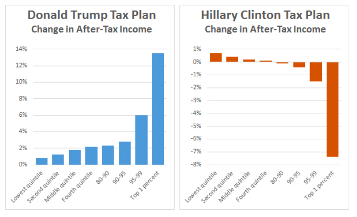
As we see, Trump’s plan will give a huge windfall for the wealthy and drive up the deficit, although he talks about the deficit as a major problem. [UPDATE: The income ranges by quintile as of 2014 can be seen here.]
Of course, these are just campaign promises. What actually gets passed as legislation, if anything gets passed at all in our dysfunctional system, could be quite different.
Many Thanks for publishing this information. I and many others might never have seen it presented in so lucid fashion.
I confess myself a little disappointed that, after that subject line, the post did not concern a man with three buttocks.
Those graphs are great. What would make them better is actual incomes along the x-axis. Most people don’t know what “quintiles” are. It would make it easier to relate to if people could see their income bracket up there in bald figures.
[meta]
sonofrojblake:
What a feeble objection; most people aren’t readers of this blog.
I put it to you that most readers will either know to what the (not particularly esoteric) term ‘quintile’ refers, or are capable of finding out easily should they wish to do so.
(You imagine you’re elite?)
No, I don’t imagine I’m elite.
I do however have certain data about my life situation that would enable to me to know, without the bother of argument, whether I’m “elite”, if you’d defined it. If by “elite” you mean “is paid more than twice the national average wage”, then yes, I am. If you mean “is paid in the top 1%”, then no, I’m not.
If you mean “is of above average IQ”, then yes, I am. If you mean “is in the top 0.5%”, then, again, yes. I’m not particularly proud of these things, but neither are they figments of my imagination.
Yes, most readers here might know or be able to find out what the term “quintile” means. However, a careful reading of what I said will reveal that I didn’t say “most people reading here”. I said “most people” and meant (since I apparently have to spell it out for you) “more than 50% of the general population”. It would seem to me natural to want to communicate the important message of that graph as widely as possible, beyond the tiny readership here who are to all intents and purposes “the converted” by any reasonable definition. Before attempting that, I offered a suggestion for an improvement. I regret that that offended you.
Also, plenty of people who know what a quintile is don’t know where the income quintile boundaries are, or even which quintile they fall into. There is a great deal of very robust evidence to show that most people have a terrible idea of both the general distribution of income and wealth, and their place within that distribution. In particular, people at both extremes of the distribution tend to believe that they’re much closer to the median than they actually are, sometimes even to the extent of believing themselves to be in the opposite half. (See, for example, Misperceiving Inequality by Vladimir Gimpelson and Daniel Treisman for the The Institute for the Study of Labor, or this article in Scientific American.)
I have updated the post to give quintile income ranges.