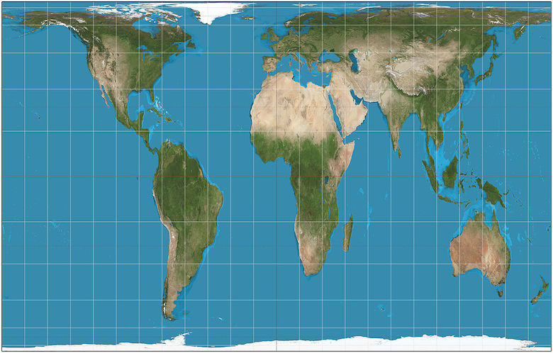
That the Earth is a globe has been known for millennia. But how does one represent a sphere on a two-dimensional surface? For a long time the projection method called the Mercator system, created by Flemish cartographer Gerardus Mercator in 1569, has been used so widely that it has seemed as if it were the only way. But it is not and there are many ways of doing so. The popularity of Mercator has a lot to do with the fact that, in addition to making the shapes of countries similar to what they look like on the globe (with the extent of distortions increasing as one approaches the poles), it gives Europe and North America a larger size and puts them at central positions on the map, thus endowing them with a prominence that they do not merit.
Here are some of the misconceptions generated by Merctor:
- Alaska is nearly as large as the continental U.S.
- Greenland is roughly the same size as Africa.
- Europe (excluding Russia) is only a bit larger than South America.
- Antarctica dwarfs all the continents.
In reality:
- Alaska can fit inside the continental U.S. about three times.
- Greenland can fit inside Africa about 14 times.
- South America nearly doubles Europe’s land mass.
- Antarctica looks like the second-smallest continent.
There are other projections that can and, in my view, should be used because they present a more realistic picture n terms of sizes and I was really encouraged by the news that the Boston school system has decided to phase in the use of Gall-Peters projection in place of Mercator.
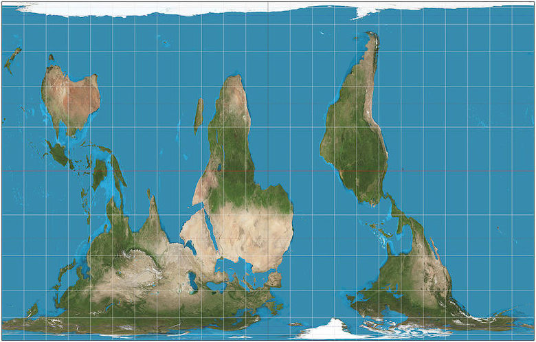
It would be even better to show it the way below since in space there are no ‘up’ and ‘down’ directions.
This clip from The West Wing gives a good discussion of the politics of map projection.
Prepare to hear howls of protest at the Boston decision as ‘political correctness’ run amuck and yet another example of how European culture is being devalued.
That’s a great clip, and more realistic projections should absolutely be used in schools, as well as both N=up/S=up so that people don’t get used to one way of thinking.
I believe Larry Wilmore’s nightly show used S=up in their projection behind Larry. I don’t know if they used Gall-Peters.
Nitpicks: Mercator is misspelled due to a typo in one place, and Alaska is part of the continental U.S., though it’s not part of the contiguous U.S.
1. Following your link, I found the following text making a fairly dubious assertion:
I’m pretty sure the hemispheres are actually the same size. Following a link to the source of that source, there is the following clarification:
Which explains the reasoning behind the figure, but in my experience + a google image search, cropping Antarctica out of the map (and hence shrinking the southern hemisphere) is quite uncommon. But even then…
2. I’m really not convinced by the claim that enlarging Europe / North America is an example of bias, even unconscious, nor that it privileges those in any way.
God dammit, messed up the blockquote close. I even previewed!
[Not to worry. I took the liberty of correcting your post. -- Mano]
Mercator’s Projection was developed as an aid to navigation. It was not supposed to represent the areas of land masses equally.
OOPS. That quote is from wikpedia.
Years ago I came across the statement that “all maps are political.” An obvious example were the maps with great swatches pink, made when Britannia ruled the waves, and who could colonize hither and thither as she pleased, but less obvious when it is argued that culture drives cartography. It gets quite post-modernist if you take it too far.
An introduction to this line of thought can seen here.
Isn’t a sphere already a two-dimensional surface? You may have have meant a flat two-dimensional surface.
But, but, what would Jesus prefer? This is for schools, right?
We need an “Ask Betsy” column.
Many years ago a friend of my visited the USSR and brought me an atlas printed there.
While I can’t read it, all the projections were made with the USSR central and undivided, and the USA shoved off into a corner or split into two sections on either side of the page. I believe the projection used was still Mercator’s, but it was still interesting to see an atlas with a different focus.
It is a bit out of date today, but still fun to flip through.
Grasshopper is correct that there is a very good technical reason for using Mercator when the hard part of navigation is ship navigation, and the hard part of ship navigation is figuring out headings graphically with a compass, a compass, and a pair of parallel rules.
So I don’t think it’s fair to say that politics is the reason it originally became so popular.
Of course, in a world where even recreational sailors never travel a route of constant heading, and position is determined to meter accuracy by timing the arrival of signals from machines falling around the planet 20,000 km above the surface, you can pretty much use whatever projection is most honest. (Protip: none of them.)
Well, a lot of the importance of ship navigation was political… Mercator was the preferred projection of imperialists, because it enabled them to go out and build empires.
Whatever happened to the Goode-homolosine?
@Holms #3.
“The North is 18.9 million square miles. The South is 38.6 million square miles.”
Dubious quote indeed. It is the reverse -- the North is twice the size of the South (Northern Hemisphere) “. Its [the North] surface is 60.7% water, compared with 80.9% water in the case of the Southern Hemisphere, and it contains 67.3% of Earth’s land.”
I like this type of projection better, visually speaking (Another type of projection). At least it gives the impression that the earth is round! Can’t say anything about its accuracy though.
Just ask Shaquille O’Neal -- all this “globe” stuff is fake news anyhow!
Of course the correct approach (and not only in a political sense) is to present several projections and discuss the pros and cons. Exactly that was done in the atlas I owned as a teen. So I’ve been knowing for several decades that Greenland is about as large as the Arabian Peninsula.
Not about map projections, but more concerned with the politics of conceptualizing geographic space in general, I enjoyed reading The Myth of Continents: A Critique of Metageography. Great title also.