Natch. That is. Brain, sleep-deprived, typing always sucks, me, here,. fucks sake. Sorry folks.
Also what a very random selection of nationalities there.. Wonder how Aussies, Kazakhs, Japanese, Germans, etc.. comapre and who chooses which groups feature here..
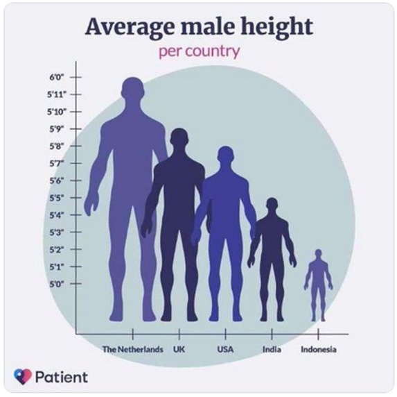
That’s not so much chartjunk as it is charttoxicwaste…
Pierce R. Butlersays
What about the average adult male height?
I don’t measure myself much, but decades ago I stood at 5’10”, and read that was the average US adult male height.
Recently, a medically-required remeasure shows I shrunk an inch – but now I’ve become an inch above average?!?
pilghamsays
I’m never sure whether scaling an image of 3-d objects in a picto graph deceives the mind as the square of the facot used or the cube. The largest man pictured might weigh 200 lbs and the smallest might be 20 lbs. Truly a graph a propagandist would love.
bcw bcwsays
Need another chart illustrated the same way with non-zero axis for average body weight.
Larrysays
I did a search for that chart. The same chart is on this site but is correctly figured starting at 0. Somebody must of doctored that.
Larry @11:
The earliest (2022) version of the article on the Internet Archive shows the deceptively scaled graph. It was corrected sometime in 2023.
davebotsays
I’m 6’3″. I tower over these puny mortals. FEAR ME!
mikeymsays
Logrhymic axes can’t be used if you demand that zero be included.
Rich Woodssays
Obviously the reason why the Dutch are at least 25% taller than everyone else is that they are the evolutionary consequence of a group of human beings choosing to live six feet below sea level.
mathman85says
Oh, dear, the scale. The scale! I’ve taught statistics far too many times to be able to let that kind of a graph crime go unanswered.
mathman85says
It’s also supposed to be a bar graph, but it’s using pictographs instead of bars, and it scales the image up in two dimensions rather than stretching it in the vertical dimension only. Ugh. I hate it.
chrislawsonsays
@15– There’s an evopsych paper right there! I can already see the headline in The Economist.
I don’t see the point of using human figures for the plot, since they don’t really match the purported measures. Even the “corrected” version has the figures levitating 4″ above the baseline, yet the 6’0″ figure still doesn’t reach the 6′ axis mark.
I think I like the giants graph better. There’s something uncannily creepy about the later version, that I can’t quite put my finger on.

Very funny graph!
The graph should have shown the top of a head peeking out like Kilroy Was Here for Indonesia. Then the same size head slightly raised for the others.
A truly terrible graph.
Wait, Indonesians are really that small?
Are they including the omo floresiensis “hobbits” ( https://en.wikipedia.org/wiki/Homo_floresiensis ) inthat or whsomething?
Becoz WTF?
H – Homo floresiensis
in that or something / what?
Natch. That is. Brain, sleep-deprived, typing always sucks, me, here,. fucks sake. Sorry folks.
Also what a very random selection of nationalities there.. Wonder how Aussies, Kazakhs, Japanese, Germans, etc.. comapre and who chooses which groups feature here..
StevoR @5:
https://en.wikipedia.org/wiki/Average_human_height_by_country
Cum grano sailis of course, but at least some attribution.
That’s not so much chartjunk as it is charttoxicwaste…
What about the average adult male height?
I don’t measure myself much, but decades ago I stood at 5’10”, and read that was the average US adult male height.
Recently, a medically-required remeasure shows I shrunk an inch – but now I’ve become an inch above average?!?
I’m never sure whether scaling an image of 3-d objects in a picto graph deceives the mind as the square of the facot used or the cube. The largest man pictured might weigh 200 lbs and the smallest might be 20 lbs. Truly a graph a propagandist would love.
Need another chart illustrated the same way with non-zero axis for average body weight.
I did a search for that chart. The same chart is on this site but is correctly figured starting at 0. Somebody must of doctored that.
https://patient.info/news-and-features/whats-the-average-height-for-men
Larry @11:
The earliest (2022) version of the article on the Internet Archive shows the deceptively scaled graph. It was corrected sometime in 2023.
I’m 6’3″. I tower over these puny mortals. FEAR ME!
Logrhymic axes can’t be used if you demand that zero be included.
Obviously the reason why the Dutch are at least 25% taller than everyone else is that they are the evolutionary consequence of a group of human beings choosing to live six feet below sea level.
Oh, dear, the scale. The scale! I’ve taught statistics far too many times to be able to let that kind of a graph crime go unanswered.
It’s also supposed to be a bar graph, but it’s using pictographs instead of bars, and it scales the image up in two dimensions rather than stretching it in the vertical dimension only. Ugh. I hate it.
@15– There’s an evopsych paper right there! I can already see the headline in The Economist.
@ 6. nomenexrecto :
Ah. Cheers! Thanks for that.
I don’t see the point of using human figures for the plot, since they don’t really match the purported measures. Even the “corrected” version has the figures levitating 4″ above the baseline, yet the 6’0″ figure still doesn’t reach the 6′ axis mark.
I think I like the giants graph better. There’s something uncannily creepy about the later version, that I can’t quite put my finger on.
A more effective graph could’ve been used. Lol!
https://www.truevaluewindscreens.com.au/gold-coast
All this time I thought Land of the Giants was a sci-fi TV show, and it turns out to be a documentary about Asian people living in the Netherlands.
“Dutch giants”? According to that graph, dutch men measure one foot from calf to head.
This explains how the Dutch were able to conquer and colonize Indonesia. Guns, germs, and steel? Nah, it was dem giants!