Balance

Science is always working a tough room. It’s inherently progressive — we’re constantly achieving incremental improvements in our understanding, with occasional lurches forward…and sometimes sudden lurches backward, when we realize that we got something wrong. We’re performing for a crowd, the general citizenry and most importantly, the funding agencies, that expect us to fix problems and make the world better, and they’re a fickle bunch who will turn on us with disdain if we don’t keep delivering new medical therapies and tinier electronics and more spectacular robots landing on alien worlds.

Unfortunately, there are a couple of sources of tension in our act.

One problem is that we aren’t doing what everyone thinks we’re doing. The world outside the sciences thinks we’re all about making material improvements in your standard of living, or increasing our competitiveness with other countries. Wrong. We do what we do to increase our understanding. There is an applied side to science that is asking about, for instance, better treatments for cancer, but it’s built on a foundation of scientists just asking, “how do cells work?”

An analogy: imagine building race cars. Everyone watching is thinking that it’s all about winning races (that’s also the case for the backers who are paying for all the machines). But the scientists are the ones who are just thinking about what’s going on inside the engine, tracing the flow of fuel and energy, optimizing and adjusting to make it work. Put a scientist in the driver’s seat, and she wouldn’t be thinking about winning the race; if she heard a mysterious “ping!” at some point, her instinct would be to just pull over then and there and take things apart until she’d figured out what caused it. And figuring out the ping would be more satisfying than finishing the race.

So everyone criticizes the scientist for not winning any races, but the scientist is feeling triumphant because her performance wasn’t what you thought it was — she learned a little bit more about what makes the engine tick, and you should be happy about that!

So that’s one source of tension. Here’s another: funding and public support thrives on positive results, that constant reassurance that yes, we’re proceeding apace towards the finish line, but science itself thrives on criticism. Probing and patching and making fruitful errors and getting criticism that forces us to reconsider our premises and rebuild our hypotheses…that’s the progressive force behind science. And we should be appreciative when someone tells us that a major chunk of research is invalid (and as scientists, we are), but at the same time, we’re thinking that if we have to retool our labs, retrain our students, rethink everything from the ground up, as exciting as it is in a scientific sense, it’s going to be a really hard sell to NSF or NIH. The granting agencies, and the media, love the safe, reliable churn of data that looks like progress from the outside.

Which brings me to an interesting argument. On one side, John Horgan gets all cynical and critical of science, pointing out deep and fundamental flaws in peer review, the overloading of science journals with poor quality work, the lack of progress in many of our goals for science, and bemoaning the reassuring positivity of the media towards science.

…I’m struck once again by all the “breakthroughs” and “revolutions” that have failed to live up to their hype: string theory and other supposed “theories of everything,” self-organized criticality and other theories of complexity, anti-angiogenesis drugs and other potential “cures” for cancer, drugs that can make depressed patients “better than well,” “genes for” alcoholism, homosexuality, high IQ and schizophrenia.

And he’s right! We don’t have any cures for cancer or schizophrenia, and as he also points out, the scientific literature is littered with trash papers that can’t be replicated.

But on the other side, Gary Marcus says wait a minute, we really have learned a lot.

Yet some depressed patients really do respond to S.S.R.I.s. And some forms of cancer, especially when discovered early, can be cured, or even prevented altogether with vaccination. Over the course of Horgan’s career, H.I.V. has gone from being universally fatal to routinely treatable (in nations that can afford adequate drugs), while molecular biologists working in the nineteen eighties, when Horgan began writing, would be astounded both by the tools that have recently been developed, like whole-genome-sequencing, and the detail with which many molecular mechanisms are now understood: reading a biology textbook from 1983 is like reading a modern history text written before the Second World War. Then there is the tentative confirmation of the Higgs boson; the sequencing of Neanderthal DNA; the discovery of FOXP2, which is the first gene decisively tied to human language; the invention of optogenetics; and definitive proof that exoplanets exist. All of these are certifiable breakthroughs.

And he’s right!

See what I mean? It’s conflict and tension all the way through. The thing is that the two are looking at it from different perspectives. Horgan is asking, “how many races have we won?” and finds the results dispiriting. Marcus is asking “have we figured out how the engine works?” and is pleased to see that there is an amazing amount of solid information available.

Here, for example, are some data on cancer mortality over time. In this instance, we are actually looking at the science as a race: the faster that we can get all those lines down to zero, the happier we’ll all be.

Charts of cancer death rates over time

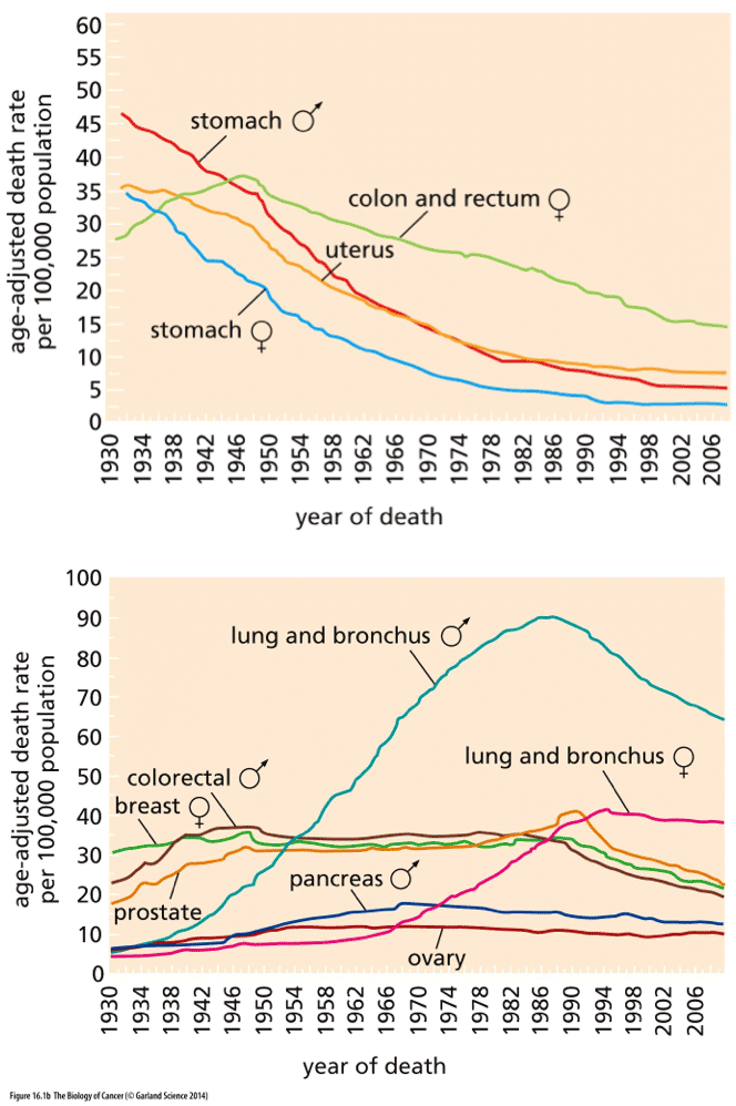
Weinberg, The Biology of Cancer

Look at the top graph first. That’s where we’re doing well: the data from stomach and colon and uterine cancer show that those diseases are killing a smaller percentage of people every year (although you can probably see that the curves are beginning to flatten out now). Science did that! Of course, it’s not just the kind of science that finds a drug that kills cancer; much of the decline in mortality precedes the era of chemotherapy and molecular biology, and can be credited to better sanitation and food handling (hooray for the FDA!), better diagnostic tools, and changes in diet and behavior. We’re winning the war on cancer!

Wait, hold on a sec, look at the bottom graph. It’s more complicated than that. Look at lung cancer; science was helpless against the malignant PR campaigns of the tobacco companies. Some cancers seem relentless and unchangeable, like pancreatic and ovarian cancer, and show only the faintest hint of improvement. Others, like breast cancer, held steady in their rate for a long time and are just now, in the last few decades, showing signs of improvement. It’s complicated, isn’t it? Horgan is right to point to the War on Cancer and say that the complex reality is masked by a lot of rah-rah hype.

But at the same time…Horgan got his journalism degree in 1983, and I got my Ph.D. in 1985. He’s on the outside looking in and seeing one thing; over that same time period, I’ve been on the inside (still mostly looking in), and I’ve seen something completely different.

If I could show my 1985 self what 2013 science publishes as routine, 1985 self would be gibbering in disbelief. Transgenic mice? Shuffling genes from one species to another? Whole genome sequencing? Online databases where, with a few strokes of the keyboard, I can do comparisons of genes in a hundred species? QTLs that allow us to map the distribution of specific alleles in whole populations? My career spans an era when it took a major effort by a whole lab group to sequence a single gene, to a period when a grad student could get a Ph.D. for completing the sequencing of a single gene, to now, when we put the DNA in a machine and push a button.

You can look at those charts above and wonder where the cure for cancer is, or you can look at all the detailed maps of signaling pathways that allows scientists to say we understand pretty well how cancer works. Do you realize that hedgehog was only discovered in 1980, and the activated human ras oncogene was only identified in 1982? It’s rather mindblowing to recognize that genes that we now know are central to the mechanisms of cancer have only emerged in the same short period that Horgan finds disappointing in the progression of science.

Everyone on the outside is missing the real performance!

Unfortunately, a growing problem is that some of the people on the inside are also increasingly focused on the end result, rather than the process, and are skewing science in unfortunate directions. There’s grant money and tenured positions on the line for getting that clear positive result published in Cell! As Horgan points out, “media hype can usually be traced back to the researchers themselves”. We’ve seen that with dismaying frequency; recently I wrote about how the ENCODE project seems to have fostered a generation of technicians posing as scientists who don’t understand the background of biology (and Larry Moran finds another case published in Science this week!). We’re at a period in the culture of science when we desperately need more criticism and less optimism, because that’s how good science thrives.

That’s going to be tricky to deliver, though, because the kind of criticism we need isn’t about whether we’re winning the race or not, or translating knowledge into material benefits or not, but whether the process of science is being led astray, and how that’s happening: by the distorting influence of big biomedical money, by deficiencies in training scientists in big picture science, or by burdensome biases of science publication, or by all of the above and many more.

But ultimately we need the right metrics and to have well-defined outcomes that we’re measuring. It doesn’t help if the NIH measure success by whether we’ve cured cancer or not, while scientists are happily laboring to understand how cell states are maintained and regulated in multicellular eukaryotic organisms. Those are different questions.

I thought they claimed to be the small government party

Now, in addition to controlling who you are allowed to have sex with and how long you are supposed to be pregnant, the Republicans want to make sure science goals are short term and in the “national interest”.

Key members of the US House of Representatives are calling for the National Science Foundation (NSF) to justify every grant it awards as being in the “national interest”. The proposal, which is included in a draft bill from the Republican-led House Committee on Science, Space, and Technology that was obtained by Nature, would force the NSF to document how its basic-science grants benefit the country.

Yeah, OK, so how does working out the interactions in the hedgehog signaling pathway “benefit the country”? How does measuring the lipid composition of neurons in the substantia nigra “benefit the country”? How does documenting the identity of waxes on the abdomens of fruit flies “benefit the country”? Shall we just stop all research that doesn’t make a profit, doesn’t improve the range of cruise missiles, and doesn’t directly improve heart disease treatments for sclerotic old conservatives?

This is a first step in imposing a patriotism requirement on science…and a first step in killing the enterprise altogether.

It’s also terrifying that judging the worth of science is being put in the hands of Republicans — the know-nothing party of ignorant Jebus-lovin’ buffoons. (It would also be terrifying to see it under the thumbs of the credulous new-agey clowns in the other party — how about keeping science apolitical?)

Ill-informed science making a case for a liberal arts education

Last month, I wrote about the terrible botch journalists had made of an interesting paper in which tweaking regulatory sequences called enhancers transgenically caused subtle shifts in the facial morphology of mice. The problem in the reporting was that the journalists insisted on calling this a discovery of a function for junk DNA — the paper itself said no such thing, but somehow that became the dominant message of the popular press coverage. Strange. How did that happen?

So Dan Graur wrote to the corresponding author to find out how the junk crept in. He found out. It’s because the author doesn’t understand the science. Axel Visel wrote back:

When I talk to general audiences (or journalists) about my research, I generally explain that the function of most of the non-coding portion of the genome was initially unclear and many people thought of it as “junk DNA”, but that it has become clear by now that many parts of the non-coding genome are functional – as we know from the combined findings of comparative genomics, epigenomic studies, and functional studies (such as the mouse knockouts in our paper).

Aargh. Non-coding is not and never has been a synonym for junk. We’ve known that significant bits of non-coding DNA are functional for a period longer than I’ve been alive…and I’m not a young guy anymore. The mouse knockouts in his paper were tiny changes in a few very short sequences — even if we had somehow been so confused that we though enhancer elements were junk, whittling away at such minuscule fragments of the genome weren’t going to appreciably increase the fraction that is labeled functional. That focus on finding more functionality in the genome flags Visel as yet another ENCODE acolyte.

Man, I’m feeling like ENCODE has led to a net increase in ignorance about biology.

Graur does not mince words in his assessment:

My problem is that junk DNA does not equal noncoding or nontranscribed DNA, and I am sort of sick to see junk DNA being buried, dismissed, rendered obsolete, eulogized, and killed twice a week. After all, your findings have no bearing on the vast majority of the genome, which as far as I am concerned is junk. Turning the genome into a well oiled efficient machine in which every last nucleotide has a function is the dream of every creationist and IDiot (intelligent designer), so the frequent killing of junk DNA serves no good purpose. Especially, since the evidence for function at present is at most 9% of the human genome. Why not call noncoding DNA noncoding DNA? After all, if a DNA segment has a function it is no junk.

Larry Moran is also a bit peeved, and explains that we actually know what a lot of that noncoding DNA does. It’s not a magic reservoir of hidden functionality.

I’ve said it many times but it bears repeating. A small percentage (about 1.4%) of our genome encodes proteins. There are many other interesting regions in our genome including …

  • ribosomal RNA genes
  • tRNA genes
  • genes for small RNAs (e.g spliceosome RNAs, P1 RNA, 7SL RNA, linc RNA etc.)
  • 5′ and 3′ UTRs in exons
  • centromeres
  • introns
  • telomeres
  • SARs (scaffold attachment regions)
  • origins of DNA replication
  • regulatory regions of DNA
  • transposons (SINES, noncoding regions of LINES, LTRs)
  • pseudogenes
  • defective transposons

These parts of noncoding DNA accounts for about 80% of the human genome. A lot of this noncoding DNA is functional (about 7% of the total genome [What’s in Your Genome?]). None of it is mysterious in any way. We’ve known about it for decades. As Dan Graur says, it’s a known known.

At least I’m in a position to do a little something about this ignorance. I’m teaching cell biology to our sophomores this semester, and next week I start the section on DNA replication, with transcription the week after. My students will know the meanings of all those terms and have a clear picture of genome organization.

And what that should tell all you employers out there is that you should hire UMM biology graduates, because they’ll actually have some knowledge of the science. Unlike certain people who seem to have no problem publishing in Science and Nature.

But the data given don’t support the conclusion

So Oakley makes a line of sunglasses that they bill as “Asian fit”, that they’re designed for the parameters of the Asian face. This article concludes that Oakley’s “Asian fit” sunglasses aren’t racist, just science, but the data given don’t really support that claim.

The obvious problems are that 1) “Asian” doesn’t describe any kind of morphological uniformity, and 2) it’s not clear that the range of variation in facial structure is sufficiently distinct. Sure, the human brain is really good at discriminating racial groups, and there are obviously general differences, but Indian/Korean/Chinese/Japanese/Thai/etc. have subtle differences in their features, too, so why are they all being lumped together? And further, the parameters that vary and that might affect the fit of a pair of glasses seem to show a lot of overlap with other groups. For instance, the article shows one morphological parameter, nasal height, and how it varies in different racial groups.

nasalheight

Whoa, look at the range in each of those groups: you would think that there might be some people of European ancestry who could use “Asian fit” glasses (with the caveat that this is one parameter, and there could be consistent patterns of covariation with others that reduce overlap).

As the article goes on to say, other companies than Oakley don’t make the Asian distinction at all, just producing a range of glasses that just fit. That seems like the wiser choice.

Methinks it is like a fox terrier

I’ve had, off and on, a minor obsession with a particular number. That number is 210. Look for it in any review of evolutionary complexity; some number in the 200+ range will get trotted out as the estimated number of cell types in a chordate/vertebrate/mammal/human, and it will typically be touted as the peak number of cell types in any organism. We have the most cellular diversity! Yay for us! We are sooo complicated!

It’s an aspect of the Deflated Ego problem, in which scientists exercise a little confirmation bias to find some metric that puts humans at the top of the complexity heap. Larry Moran is talking about the various techniques people use to inflate the complexity of the genome, making special case arguments for novel molecular gimmicks that we mammals use to get far more ooomph out of our genes than those other, lesser organisms do.

As I was reading it, I had this sense of deja vu, and using my psychic powers, I predicted that someone was going to make the argument that because we mammals have so many more cell types than other organisms, there must be some genetic trick we’re playing to increase the number of outcomes from our developmental processes, and that therefore there must be something to it. Because we are measurably more complex than other animals, there must be a mechanism to get more complexity out of our 20,000 genes than nematodes get out of theirs.

And did I call it? I did. Very first comment:

I dont think its a sign of an inflated ego to think mammals are more complex than flies. There are objective measures one could use such as cell type number, number of neurons or neural connectivity.

There’s a problem with this claim, though. Many people, including quite a few prestigious scientists, believe that cell type number in various organisms has actually been measured, and you’ll even find respected people like Valentine putting together charts like this:

cellnumberchart

That chart is total bullshit. You know how I expressed my visceral repugnance for an MRA who made up a “sexual market value” chart? I feel the same rage when I see this chart. There is no data supporting it. There we see humans listed as having 210 cell types, and everything else is lesser: birds have only 187 cell types. Do you believe that? I sure as hell don’t.

I periodically get a bit pissed off about this. I wrote about it in a thread on Talk.Origins in 2000, and I’ve put a copy of that below. I complained about it in a blog post from 2007. It hasn’t sunk in. I still run into this nonsense fairly regularly.

The short answer: this number and imaginary trend in cell type complexity are derived entirely from an otherwise obscure and rarely cited 60 year old review paper that contained no original data on the problem; the values are all guesswork, estimates from the number of cell types listed in histology textbooks. That’s it.

The long answer, my digging from 13 years ago:

This is a topic in which I’ve long had an interest, of a peculiar and morbid sort. It’s been a case of occasionally running into these arguments about cell types, and wondering whether I’m stupidly missing something obvious, or whether the authors of these claims are the cockeyed ones. I can’t see a middle ground, it’s one or the other. Maybe somebody here can point out how idiotic I must be.

The issue is whether we can identify a good measure of organismal complexity. One way, you might think, would be to look at the number of different cell types present. I first ran across this metric in the late ’70s, in JT Bonner’s book _On Development: the biology of form_. He has a number of provocative graphs in that book, that try to relate various parameters of form to life history and evolution. Some of the parameters are easy to assess: maximum length, or approximate number of cells (which is just roughly proportional to volume). Others were messy: number of different cell types. Bonner didn’t push that one too much, just pointing out that a plot of number of types vs. total number of cells was sorta linear on a logarithmic plot, and he kept the comparison crude, looking at a whale vs. a sequoia vs. a sponge, that sort of thing. He also said of counting cell types that it was “in itself an approximate and arbitrary task”, but doesn’t say or cite where the numbers he used came from, or how they were obtained.

It came up again in Stuart Kauffman’s work. He tried to justify his claim that the number of cell states (or types) in an organism was a function of the number of genes, and he put together a chart of genome size vs. number of cell types. It was glaringly bogus. He (or someone) clearly selected the data, leaving out organisms with what I guess he would consider anomalous genome sizes — and Raff and Kaufman thoroughly trashed that entire line of argument in their chapter on the C-value paradox in _Embryos, Genes, and Evolution_, showing that one axis of Kauffman’s graph has to be invalid. Nobody has touched on that other axis, the number of cell types, and I’m still wondering how anybody determined that humans have precisely 210 different kinds of cells, while flies have 50 (those numbers seem to have become canonized, by the way — I’ve found several sources that cite them, +/- a bit, but very few say where they came from).

And then Morton mentions this interesting little paper that I hadn’t seen before:

Valentine, JW, AG Collins, CP Meyer (1994) Morphological complexity increase in metazoans. Paleobiology 20(2):131-142.

[note to Glenn: the citation on your page is incorrect. It’s in Paleobiology, not Paleontology]

Abstract.-The number of cell types required fo rthe constructon of a metazoan body plan can serve as an index of morphological (or anatomical) complexity; living metazoans range from four (placozoans) to over 200 (hominids) somatic cell types. A plot of the times of origin of body plans against their cell type numbers suggests that the upper bound of complexity has increased more or less steadily from the earliest metazoans until today, at an average rate of about one cell typer per 3 my (when nerve cells are lumped). Computer models in which increase or decrease in cell type number was random were used to investigate the behavior of the upper bound of cell type number in evolving clades. The models are Markovian; variance in cell type number increases linearly through time. Scaled to the fossil record of the upper bound of cell type numbers, the models suggest that early rates of increase in maximum complexity were relatively high. the models and the data are mutually consistent and suggest that the Metazoa originated near 600 Ma, the the metazoan “explosion” near the Precambrian/Cambrian transition was not associated with any important increase in complexity of body plans, and that important decreases in the upper bound of complexity are unlikely to have occurred.

At least, the paper *sounds* interesting. After reading it, though, I’m left feeling that it is an awful, lousy bit of work.

The first major flaw: there is no data in the paper. The first figure is a plot of cell type number against age, in millions of years before the present — the numbers and groups described are listed on Glenn Morton’s page. These are the observations against which several computer models will be compared. These data were not measured by the authors, but were gleaned from the literature. The sources for these critical numbers are listed in an appendix, about which more in a little bit.

The bulk of the paper is about the computer models they developed. The final figure is the same as the first, showing the data points from the literature with the plot generated by their best-fit simulation superimposed. It’s a very good fit. From this, they make several conclusions: 1) that their model is in good agreement with the historical data, 2) that the rate of increase in complexity was greatest near the origin of metazoans, 3) that that origin was relatively late, and 4) there was no particular change in rate during the Cambrian explosion. It is a fine example of GIGO.

The work is completely reliant on the validity of the data about cell type number, which is not generated by the authors, and worse, which is not even critically evaluated by the authors. It is just accepted. That data left me cold, though, with lots of questions.

What is a cell type? There was no attempt to define it. Histologically, it’s a fuzzy mess — you can go through any histology text and find long lists of cells types that have been recognized by morphology, location, staining properties, and so forth. I just skimmed through the index of an old text I have on hand (Leeson and Leeson), and without trying too hard, counted a bit more than a hundred distinct, named, vertebrate cell types in the first 5 pages…and there were 25 more pages to go. What criteria are the authors using? How well do these superficial criteria for identification mesh with the molecular reality of the processes that shape these cells?

Why did they throw out huge categories of cells? The nervous system is simply not considered — it’s ‘lumped’. This seems to me to be grossly inappropriate. Here is this HUGE heap of cellular diversity, in which half the genome is involved, and it is discarded in what are supposedly quantitative models. I can guess that it was thrown out because it is impossible to quantify…but that doesn’t sound like a good excuse if you are trying to model numbers. Furthermore, they only count cells in adults, so cell types found only in larvae or juveniles are rejected. Whoops. Isn’t that an admission that complexity in arthropods is going to be seriously underestimated? I don’t know, since they don’t say how they define a cell type.

How did they get these tidy single numbers for a whole group? ‘Arthropods’ have only 50 cell types. They admit that “within some groups there is a significant range of cell type numbers”. The range of variation, however, is not reflected in any of their graphs, nor which groups exhibit this range. Instead, they say, they picked a representative “primitive number” of cell types from “the more primitive living forms within each group”. I guess the more primitive living forms haven’t done any evolving.

A really bothersome and related point: the high end of their plot is anchored by the hominids, with 210 cell types and a time of origin within the last few million years. Remember, they are going to fit all these computer-generated curves to these data, and they explicitly scale everything to this endpoint and an earlier one. This point is invalid, though. We humans don’t have any novel cell types that were generated a few million years ago — that number of 210 cells ought to be applied to all of Mammalia, and the time of origin shoved back a hundred million years. Or more. Is there any reason to think 200 million year old therapsids were lacking any significant number of histological cell types found in mammals today?

For that matter, why should we think that these cell type numbers are anything but arbitrary indicators of the relative amount of time histologists have spent picking over the tissues of these various organisms? Do fish really have fewer cell types than mammals, or just different ones? Fish may lack all the cell types associated with hairs, but we don’t have all the ones that form scales. The authors show amphibians as being more complex than fish, on the basis of cell type counts in living forms…and that is completely the reverse of what I would expect, if I thought there was any difference at all.

What was really the killer for me, and what I was really looking for, was the primary sources for these numbers. These are listed at the very end, in a separate appendix. A few are easy: it’s not hard to imagine being able to count all the different cell types in a sponge or a jellyfish. One is admitted speculation by Valentine — he estimates the number of cells a primitive hemocoelic bilaterian must have had. Another, the number of cells in arthropods, is cited as an unpublished ms by Valentine. However, almost all of the counts boil down to one source, a critical source I haven’t yet been able to find. This very important paper, that purports to give cell type numbers for echinoderms, cephalopods, fish, amphibians, lizards, and birds, is:

Sneath, PHA (1964) Comparative biochemical genetics in bacterial taxonomy. pp 565-583 in CA Leone, ed. _Taxonomic biochemistry and serology_. Ronald, New York.

It’s a paper about bacterial taxonomy? And biochemistry? The only discussion in the text of the Valentine paper about this source mentions that it compares DNA content to cell type number, a measure that Raff and Kaufman have shown most emphatically to be invalid. And it’s from 1964, although the author seems to still be around and active in bacterial taxonomy and molecular biology right up until at least a few years ago. He doesn’t look like a histologist or comparative zoologist though, that’s for sure.

It’s from 1964. Oh, boy. I did manage to track down a copy of this volume in a library a few miles away, but I haven’t yet been able to get out and read it. I’m not too inclined to even try right now, because this appendix also has a little subscript in fine print at the bottom…virtually every source in this list, including Sneath, is marked with an asterisk, and the fine print tells us that that means “estimates NOT [my emphasis] documented by lists of cell types or by references to published histological descriptions”. In other words, there ain’t no data there, either.

I’m afraid to look up Sneath, for fear that it will turn out to be an estimate of cell number derived from measures of DNA content, with a bit of subjective eyeballing tossed in. At least that would explain why Kauffmann could find a correlation between DNA content and complexity, though.

From my perspective right now, this whole issue of cell type number is looking like a snipe hunt, a biological myth that is receding away as I pursue it. Does anybody know any different?

I didn’t have quick access to the all-important Sneath paper, but Mel Turner did, and he summarized it for everyone.

…there’s no original data. Here’s the relevant text:

“Although there are many possible correlations, for example, that between cell size and DNA content (135), it seems plausible to suggest that the amount of DNA is largely determined by the amount of genetic information that is required and that this will be greater in the more complex organisms. Fig. 38-2 shows the distribution of DNA contents of haploid nuclei taken from the literature, mostly from several compendia (4,10,87,128,134,135). The haploid nucleus was chosen for uniformity, and because the genetic information in diploids is presumably mostly reduplicated. The values are plotted against the number of histologically distinguishable cell types in the life cycle of the organism (suggested by a figure of Zimmerman (141)). This number is some measure of complexity, and was estimated from standard textbooks (5,13,85,126). In Fig. 38-2 organisms incapable of independent multiplication (e.g., viruses) have been assigned to the 0.1 cell level. The values for some well-known organisms are shown in Fig. 38-3.”

Fig. 38-2 is a graph of number of cell types (Y-axis) vs. log content of DNA/gamete, with a extra superimposed x-axis of “number of bits” (“one nucleotide pair = two bits”).No species names are indicated, but there are clusters of multiple separate points plotted for “mammals”, “birds”, “fish”, “angiosperms”, “bacteria” “algae & fungi”, “viruses”, etc. [oddly, he scores “RNA viruses” as having DNA content].

Fig. 38-3 purports to show “the histological complexity of some well-known organisms” with a log graph placing examples like “Man, Mammals” at the top with ca. 200 cell types, and “birds”, “reptiles”, “amphibia”, “fish” [again, no species names] just below that, then various cited generic names of plants animals, protists and bacteria [e.g., Pteromyzon (sic), Sepia, Helix, Ranunculus, Polypodium, Escherichia, etc.; about 50 taxa altogether]. Strictly unicellular organisms with different cell types during the life cycle [cysts, spores, gametes, etc. are properly scored as having histological complexity; e.g., Plasmodium scored with ca. 6 cell types]

There’s also discussion of the significance of the reported rough correlation of complexity and DNA content, a suggestion that histologically complex organisms should require disprortionately many times the DNA amounts of simple ones [cell specialization and regulation], a mention of some plants and amphibia with ‘unexplained’ very large DNA contents, and a page of stuff on base-pair changes, informational “bits”, & Kimura.

Table 38-3 “estimated amount of genetic and phenetic change in vertebrate evolution” looks pretty odd indeed [especially in a paper on bacterial biochemistry!]; it apparently tries to say something about times of origin and amounts of DNA change [% and in “bits”] for classes, orders, families, genera, species…. a bit dubious, to put it mildly.

Looking at the References list for the anatomical data sources cited for Figs 38-2 and 38-3, the “standard textbooks” were indeed just that:

5. Andrew, W. 1959. Textbook of Comparative histology. Oxford Univ. Press, London

13. Borradaile, L.A., L.E.S. Eastham, F.A. Potts, & J. T. Saunders. 1941. The Invertebrata: A manual for the use of students. 2nd ed. Cambridge Univ. Press, Cambridge.

85. Maximow, A.A. & W. Bloom. 1940. A textbook of histology. W. B. Saunders Co., Philadelphia.

126. Strasburger, E., L. Jost, H. Schenck, & G. Karsten. 1912. A textbook of botany. 4th English ed. Maximillian & Co. Ltd. London.

The Zimmerman citation from above is: Zimmerman, W. 1953. Evolution: Die Geschichte ihrer Probleme und Erkenntnisse. Alber, Freiburg & Munchen 623 pp.

Stephen Jay Gould wrote about a similar issue in Bully for Brontosaurus, in his essay on “The Case of the Creeping Fox Terrier Clone”, which describes how certain conventions, like describing the size of a horse ancestor as being as large as a fox terrier, get canonized in the literature and then get reiterated over and over again in multiple editions of textbooks.

This one isn’t as much a textbook problem as it is a deeply imbedded myth in the scientific literature. We haven’t even defined what a cell type is, yet somehow, again and again, we find papers and books claiming that it has been accurately quantified, and further, that it supports a claim of increasing complexity that puts humans at the pinnacle.

STOP IT.

I seem to have written about this problem every 6 or 7 years, to no avail. I’ll probably complain again in 2020, so look for a version of this post again, then.

Let’s simplify time zones!

I like this idea: end the fall and spring clock jiggering, consolidate time zones, and just have two fixed time zones in the continental US.

It would seem to be more efficient to do away with the practice altogether. The actual energy savings are minimal, if they exist at all. Frequent and uncoordinated time changes cause confusion, undermining economic efficiency. There’s evidence that regularly changing sleep cycles, associated with daylight saving, lowers productivity and increases heart attacks. Being out of sync with European time changes was projected to cost the airline industry $147 million a year in travel disruptions. But I propose we not only end Daylight Saving, but also take it one step further.

proposed-time-zones

But then, that’s easy for me to say: my job is all done under artificial lighting anyway. But when I look at what, for instance, farmers are doing, they don’t seem to care about the clock that much either, and the cows and pigs sure don’t care much about what the hands on the clock say.

In case you haven’t got the hint yet, you were supposed to turn your clock back last night. Or if you’re living in the digital age anyway, your computers all automatically adjusted everything for you.

I’d dismissed the problems with Obamacare enrollment…until now

I know it seems to be the comedy routine du jour to mock the software glitches plaguing the new health care program rollout. I hadn’t worried about it: I’d heard nothing but encouraging words about the program itself, and putting together a huge web service for the entire country is a gigantic undertaking, and I could imagine lots of ways it would run into problems, problems that would eventually shake out. I remember when we first fired up FtB, and saw it buckle under the traffic immediately!

But then I saw what the Oregon state health exchange website put up.

Oregon health exchange requires Microsoft Internet Explorer!

Holy hell. Who designed this abomination? It’s 2013, and they’re requiring users to access the site with Microsoft Explorer? And the submit button doesn’t work on any other browser?

I’m not usually a conspiracy theorist, but this is so ridiculous and such bad design that I’m thinking sabotage.