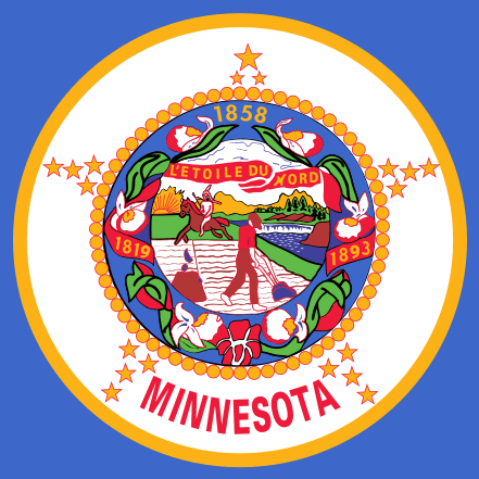
Minnesota has a state flag, and it is hideous. They stuck the state seal on a blue background and called it done, so it’s this horribly busy smear with a farmer and a fleeing Indian and flowery glop and a bunch of dates on it. It’s tasteless and ugly.
Ick. Not that the flag is particularly important, but could we at least have one that isn’t embarrassing?
A few people are lobbying for a new flag, an effort that doesn’t have a high priority right now, but they’ve definitely got some better designs. I like this one.
It’s simple and distinctive. I’d vote for it. Heck, I wouldn’t be ashamed to fly it in front of my house, if I bothered with flags at all.

The “star made of stars” thing is weird. The top point has 3 stars, one of them out-sized, while all the others have 3 equal sized stars. What is that about?
source
Uh, so it was the 32nd state? And this is so important that they want to celebrate it with a visually clumsy rendering of the number 19? Obscure and stupid.
I see what PZ is up to. He wants Minnesota to be known as the “lone star state.” Maybe he is still angry about the Minnesota North Stars hockey sportsball team leaving for warmer climes.
Flags with a single star
It’s already a long list.
Add a few runes saying “Kilroy Was Here 1362”? Replace the star with a spider? Here we have a “local” flag that was promoted by a local radio station, less than 1500 people participated in the vote. It’s pretty hideous too:
https://en.wikipedia.org/wiki/Flag_of_Derbyshire#/media/File:Derbyshire_flag.svg
The splodge in the middle looks like custard pie in the face.
I’m sure the usual suspects are howling about “woke historical revisionism” and “cancelling” the brave pioneers who were taming an uncivilized land and the “savages” that opposed them.
If you hadn’t said it was a flag, I would have assumed it was a souvenir dinner plate.
It might be a little interesting if they took self-similarity out a few levels to give it a fractal look.
“Do you have a flag?”
I’m going to be conservative and say I don’t like a wavy line. But a straight line would be simple and distinctive.
It reminds me of the old Molson Pilsner beer label.
Wots with the ring of Oranges? I thought it was too cold to grow stuff like that.
The real problem is that the people who design flags–and state seals–are almost universally ignorant of the rules of heraldry. The ultimate goal should be: can you tell who it represents at a distance? Get some heralds to do a new flag (and a new state seal).
whheydt@10 I can’t even figure out the horseback guy up close. It also took too much work to parse out “L’etoile du nord.” though I know enough French to read it. That “N” is messed up.
Our flag is horrible, and the Indian is just racist.
I would never guess those are supposed to be Showy Lady Slippers without knowing that it’s our state flower.
I am not impressed by any of the proposed replacements, but it needs to be a proper eight pointed “star of the north” rather than the typical five found in the USA flag.
We are absolutely NOT the Lone Star state. That would be Texas. We don’t wish to discuss the hockey team. Hockey. In Texas. Where there aren’t 10,000 lakes that all freeze solid every winter. Pshaw.
All of the early US state flags, the ones that have a blue field with the state seal on them, are stupid. They’re completely indistinguishable from each other and nobody can draw them.
The New Mexico state flag is arguably the best of the lot. Unique and instantly recognisable.
Minnesota could have one with a stylised pasty white head with a tick on side and a mosquito on the other. That would work.
Let’s see. Of states I’ve lived in… The California Bear Republic flag is just too much of a literal picture for me. I see it enough to get used to it, but it’s not a great design. I had to look up the Pennsylvania flag. It’s better, but just way too complicated. Horses, an eagle, a ship.
I have always liked Maryland’s state flag, probably because it is based on a heraldic shield.
The California state flag I guess it is literal? Each of the three symbols is the symbols of the ragtag armies that fought for independence from Mexico/taxes or more cynically perhaps adding another free state to the USofA/goldupintharhills! If those symbols were meant to mean anything other than battle flag markers I never learned it.
I think the proposed new flag for your state of Minnesota PZ should have the star floating above the middle instead of being in canton, and it should have lots of pointy points on it to demonstrate it’s THE North Star. Otherwise, it’s pretty good.
My initial impression is that it looks like a uniform patch for a baseball team. Upon closer inspection, I see that for some reason the farmer has set up a science fair volcano in his field, and mysteriously there is a mini-Devil’s Tower in the middle of the Mississippi River.
Further investigation reveals that originally the volcano was a tree stump at the edge of the cultivated field, not in it, and the lava ejections are apparently the last remnants of a rifle and powder horn that were previously fully illustrated. I can find no explanation of the mini-Tower, but I’m thinking it might be an unfinished beaver dam?
In none of the versions of the seal or flag does the Indian look to me to be “fleeing.” In the original version of the seal, he’s just cruising by on his horse, taking no notice of the farmer at all. In the updated versions he’s been given a spear, so I guess he’s out hunting, and is just giving the farmer the side-eye as he rides by, passive-aggressively guiding his mount to trample the tilled field.
I do really like the CA flag, but I agree that NM is probably my favorite. Then there’s Ohio’s flag, which is pretty much a pennant rather than a flag.
At least the old flag had a First Nation member riding away and not showing the largest single hanging of tribal members at on time on USA soil.
There are five rules to good flag design, and one of them is “It should be so simple a child could draw it from memory.” The new flag gets that right, and all the others, too.
whheydt @10 , another good rule of thumb I think is “can a 10 year old draw the flag with crayons a get it pretty much correct?”
Am I the only one who gets images of leggings and bodysuits when I look up state flags? I have to believe all of these are computer generated, unless there are many people who feel the need to show their state pride in their pelvis.
I did like this Maryland state (male I think) body-suit.
“I am Calvert-bot.”
Your birth-state flag is also pretty awful and embarrassing. Highlights a slave-owner, too.
@ridana
The beaver dam/ devils tower is supposed to be St. Anthony Falls in Minneapolis. It was encased in concrete decades ago to prevent the falls from moving upstream as the river eroded away the limestone bedrock.
That “flag” looks like an excessive xmas decoration, or a child decorated a tree.
I saw this proposal for a flag, and it’s just as hideous with way too many details, but it could be improved. (My computer is hanging or I’d do a mock up to show.)
1) Make it a rectangle, not a pennon.
2) Get rid of that circle and the ring of stars.
Having only the offset yellow and blue four pointed star on the green and blue background would look a lot better.
https://newmnflag.org/designs/north-star-state-flag
nomaduk (#13) –
Simplicity is always better. New Mexico, Alabama, Texas and Alaska are all winners. The rest all need help.
The flag of Cornwall is very similar to the Scandinavian flags (also, the Greek flag). Simple, you just need to recall two colors.
Since Minnesota has a huge number of Scandinavian descendants this pattern of flag would be consistent (and never mind the cross- that kind of symbol predates Christianity, just as a partial moon predates islam).
The flag of Colombia is very simple and quite beautiful.
A flag horizontally divided in three fields, one covering 50%, the others 25% each.
Famous people from Minnesota: Bob Dylan, Prince and Charles M. Schulz.
Put Snoopy on the flag!
Well, as to the current design, I have to ask for some consideration of the 19th-century educational level of Minnesota’s immigrants. No-know-things.
Not that I have high expectations of present-day Minnesotans, or of any Murricans.
I like seals/logos/coats of arms from smaller governments like states/provinces or cities and towns that are just a mess. I don’t want to see a well crafted logo, I want to see something a committee put together and thought looked good.
nomaduk @13
My state (Massachusetts), avoided the “state seal on blue background” trap.
Instead, they put the state seal on a white background, which arguably looks even worse.
Well duh. Canton is in Ohio.
Ow, my eyes.
Yes, and you can always tell Ohio’s flag since it is the only one shaped like a pennant.
Funny TED talk on bad flag design. https://www.youtube.com/watch?v=pnv5iKB2hl4
TED talk on bad flag design. https://www.youtube.com/watch?v=pnv5iKB2hl4
Speaking of heraldry, surely it also raises the question: Can you give a description of it, in such detail that a stranger could reproduce it without ever having seen the original?
Otherwise, heraldry is just pointing and going “That thing!”
Well heraldry does have a specific vocabulary for describing things (for instance that star in the flag at the top is a “mullet” which is a straight edged star by default with five points); however, in the US it is a free for all for design (a lot of other countries have official groups of heralds to design things).
I note the only thing the New Jersey flag has going for it is a distinctive background color.
Whoever designed that new Minnesota flag seems to have cribbed freely from the Doug flag of Cascadia.
Getcher own pipe dream!
@38 More likely the other way around. The proposed North Star Minnesota flag was designed in 1989 (https://newmnflag.org/designs/northstar). The Doug flag dates to 1994/95.
@ 22 Tethys: The Falls are further upstream on the flag. I think the “beaver dam” is actually supposed to be the cliff on the far shore of the Mississippi, eroded between ground level and river level, as seen on the left in this painting:
https://en.wikipedia.org/wiki/Saint_Anthony_Falls#/media/File:George_Catlin-_The_Falls_of_Saint_Anthony.jpg
I am in favor of putting a seal in the middle of your state flag, if it is one of those cuddly seals. Not walruses or elephant seals. Unless it is Texas, they always go for big things.
In Alabama or Florida, they might try with a simple bundle of “fasces”.
@birgerjohansson #27
Snoopy, Prince, and Dylan? Place Snoopy on a Purple field bordered with wavy lines of Tangled Up In Blue!
I am nostalgic for the flag of my native Wyoming, but they could leave off the great seal with its misleading Equal Rights motto. The white bison is distinctive and quite obviously male, reflecting the macho cowboy culture.
https://www.countryflags.com/wyoming-flag-image/
Surely the star should be supported by a spider and a squid, rampant?
ridana
That is possible, since the river is down in a narrow gorge with vertical cliffs at St Anthony Falls. It’s literally in the middle of downtown Minneapolis.
I suppose the people who designed this considered St. Anthony to be the priest who “discovered” the falls.
It would be great if our flag reflected the native populations in more than the name Minnesota.
I
Why is the sun rising (or setting), in the northwest?
The second one at the link clearly has the Nato star on it. It’s even got the circle smaller than the star. Strange.
The star of the north is a compass rose, the thing you use to find Polaris, the north star. That’s why it needs eight points rather than five. NATO does use the same symbol, as do maps.
@Larry
The Mississippi flows from west to east through Minneapolis, so the sun is actually setting in the right place.