The witch hunts never really went away

Over the last few years, I’ve had a gradual realization that has honestly made me pretty worried about the future of humanity. I’ve been an atheist for over a decade now, and in that time, I definitely went through a phase of anger at the degree to which our world is governed by magical thinking. At the same time, knowing and respecting a large number of religious people, I knew that most of them are perfectly rational people whose day to day thoughts and actions fit with a naturalistic understanding of the world. Hell, I generally tried to make decisions rationally, though I would pray over/meditate on important or difficult ones.

I also grew up learning about strange and horrible things “from the past”, like witch hunts, which happened because of superstition, and possibly contaminated grain? But all of that was in the past. We know better, now, and those areas that still have people murdered for being “witches”, well, they’re just backwards and primitive, and… Boy, when you lay it all out it starts to sound pretty bad, doesn’t it?  Almost as if I grew up within a society constructed around white supremacy, and bought into a fair amount of it, particularly about places to which I had never been. I bought the narrative of Africa as a poor continent, that was strangely slow to develop technologically, and they weren’t doing education well enough, so superstition filled in the gaps in people’s understanding, and that led to stuff like problems being blamed on witches. That, and a dim awareness of religious and spiritual practices outside my own experience as a white, middle-class, Quaker kid from New England.

As with most misinformation and misunderstanding, there are fragments of truth there. I still believe that magical/religious thinking leads people in bad directions, and to bad conclusions, it’s just that there are a myriad of other ideas and ideologies that do the same, and are often far more destructive in the process. White supremacy is a good example, not just in its most blatant and bloodthirsty forms, but also in the more subtle ways it excuses the abuses of the rich and powerful, and masks the real causes of societal problems. In fact, bigotry in general seems to operate very like a magical belief. The beliefs that drive it tend to have connections to a bigot’s sense of self, and so they will tend to cling to those beliefs even in the face of falsifying evidence.

Through that lens, we can see that the social dynamics leading to things like witch hunts have changed in appearance, but they have not gone away. The Renegade Cut video below does a good job of breaking this down, but think about things like the Satanic Panic of the 1980s, where lives were destroyed over accusations of, well, practicing dark magics and human sacrifice. Think of current moral panics.

The horrifying reality is that this stuff never went away. Not in poor countries, and not in rich countries. Some of us just managed to convince ourselves that our society had gotten past all that. We haven’t, any more than we’ve gotten past white supremacy, and that fact has me worried about our capacity to actually change things for the better. I think we can do that, but it seems that as a species, we’re far too good at convincing ourselves that the mere passage of time has moved us “forward”. It seems that this is a problem that will not go away by itself.


If you like the content of this blog, please share it around. If you like the blog and you have the means, please consider joining my lovely patrons in paying for the work that goes into it. Due to my immigration status, I’m currently prohibited from conventional wage labor, so for the next couple years at least this is going to be my only source of income. You can sign up for as little as $1 per month (though more is obviously welcome), to help us make ends meet – every little bit counts!
Tegan Tuesday: Cursed without cursive?

Every couple of weeks I’ll see yet another article bemoaning the state of education because darn kids and their darn texting aren’t learning cursive! Occasionally the article will appeal to parents and educators from a pedagogical point of view: this argument is about how people remember things differently when typed or when handwritten, and, obviously, cursive is the fastest writing so it should be used. Sometimes the argument is an appeal to preservation and history: kids can’t read non-typed documents oh no! The rare article sticks to complaining about Kids These Days and how they need to learn cursive just because. Because I had to. Because they hate it. Because they’re on their phones too much. Just, because. Depending on how frothing at the mouth the author of the article is, I either laugh or roll my eyes at every single one. Because each argument is nonsense.

Those who argue that memory is aided by the process of writing by hand have flawed methodology in their research. The question is not ‘which is better, typing or handwriting data?’ but rather, ‘does a person learn better when using the data preservation method they were trained on?’ Up until extremely recently, the predominant method of data recording was by hand. Even the coding that took the men to the moon was done by hand, because processing power was expensive and because the human computers had trained that way. As a millenial, I learned to take notes and write essays by hand. This means that my first training was in manual recording and it is my default. Any time I type I am surrounded by paper with hand-scrawled notes and notebooks for additional commenting. I often do essay planning or rough drafts longhand and my processing speed is different for handwriting and typing. I am a touch typist, so when I have a script to follow, I have a fairly swift typing speed. When pulling from thoughts, there are stops and starts and stuttering of my keyboard as I think slower than I type. Whereas by hand? I rarely pause because my thoughts move at a speed related to my hand speed. This combines with my visual learning style to mean that writing and seeing a handwritten note is much stickier, mentally, than a typed comment. Most of my typing rarely sticks in my thoughts at all — it’s more dictation, even when it comes from my own brain.

Contrast this with Gen Z who have been typing since they were small and have had computers in the classroom their whole lives. Many of them barely have functional handwriting at all, because typing has been their default for decades. But they are the first generation to have this pedagogical change, and thus the first to possibly truly answer the research question mentioned above about how people best learn. Any research prior to the past few years has, naturally, been conducted on people who learned handwriting first. Surprise! They remember details best when handwritten. But how does this hold up when confronted with students who learned typing first? I suspect that Gen Z thinks through their fingers on a keyboard the same way that I think with a pen in my hand. Anecdotally, I dated someone with dysgraphia for a number of years, and their brain could not actually form the pathways to build the muscle memory to write. They were gifted a typewriter for Christmas when they were 7 and never looked back. This person, naturally, thought best through a keyboard where writing by hand was an exercise in frustration.

The other argument worth addressing about cursive — or its lack — is its value to history. If children aren’t taught cursive, they won’t be able to read texts from the past! Well, I’m sorry to say that that has always been the case. Scripts have always been regionally- and temporally-based, and it is difficult to read ones outside of your own time and area. Heck, I sometimes can’t read the handwriting of the person next to me and I have to ask what a word is! Learning cursive allows for more fonts to be pre-loaded into mental storage but Spencerian is different from Secretary Hand  which is different from Palmer Method or Chancery or Sütterlin. A postdoc application that I read once included the detail that because the scholar was already familiar with the 19th century composer’s handwriting, they could actually read their diaries in all of its historical German shorthand glory. Because that’s the other thing about historical writings: the format and actual text differs from situation to situation. The go-to examples of this are diaries which often have abbreviated phrasing and spellings that are individual decisions, or handwritten recipes which have standard abbreviations that might vary from culture to culture and by time period. Where my grandmother would write “van,” or my mother would write “1 t van,” I would be more likely to write “1 tsp vanilla” — and we would all mean the same thing. But let’s take a look at an example from my research.

This is the inside page of a dictionary published in 1749. In the second inscription, (“The Gift of Anna Maria Botterell, to Bridgett Hawkins, on June the 24th 1778”) there’s an 18th century handwriting convention of spelling ‘the’ as ‘ye’ with the ‘e’ a superscript above the ‘y’. This is an artefact from when the English language included the letter ‘thorn’ and it stuck around as a shorthand in words like ‘the’ for centuries. But also look at the way Anna Maria Botterell writes ‘Hawkins’ compared to Bridgett (‘B’) Hawkins, the next Hawkins who’s first name or initial I cannot parse, or Maria Bratt Hawkins. I only know that Maria Bratt’s married name is Hawkins because of its proximity to all of the other names — and that’s nothing on how differently she wrote her location (‘Edgbaston’) from the previous person! The first writer, Sarah Botterell, has a clear difference in script between her handwriting and Anna Maria’s, although both are fairly clear to read. These five people were literate, valued book-learning (this is inside of a dictionary that remained in use for a century after publication), and even in an inscription had varying levels of legibility. How much less legible would their diaries or a note to the grocer be!

When considering the historical handwriting question, I am reminded of a dilemma from other historical pursuits. Often people living in historical homes are interested in returning the house to its previous life and spend hours searching for paint chips or evidence of wallpaper. But there is no evidence whatsoever that the previous owners of the house had taste! Just because the wall used to be lime green does not mean that you need to paint it lime green in order to “restore” the building to some form of former glory. And just as our ancestors may not have had good taste, they might have had bad handwriting. A child learning cursive only gains an extra mental font — it does not guarantee ease of handwriting decipherment.

The skill I wish schools actually taught? Proper typing. When I learned cursive, there was a great deal of emphasis on proper hand shape and how to best hold a pen. Students are typing more than ever, and there are equally more cases of repetitive stress injuries than ever before and at younger and younger ages. Please teach your kids how to hold their hands properly! We only get one set of them and trashing them with repeated use in awkward and terrible positions from a young age does no one any good. But cursive? Eh, I could take or leave it. The kids who are interested in it will find their own way (I know a lot of people who are interested in calligraphy and paleography) and rather than chivvy along a group of recalcitrant children that time could be better spent on more productive things like preventing injurious typing behavior.


If you like the content of this blog, please share it around. If you like the blog and you have the means, please consider joining my lovely patrons in paying for the work that goes into it. Due to my immigration status, I’m currently prohibited from conventional wage labor, so for the next couple years at least this is going to be my only source of income. You can sign up for as little as $1 per month (though more is obviously welcome), to help us make ends meet – every little bit counts!

Video: Münecat DISMEMBERS body language experts!

Body language analysis is one of those fields that makes me worry for the future of humanity. I don’t have a problem with some level of “seems like that person’s acting oddly” when we’re comparing someone’s behavior to their own personal baseline, but at best that should be a starting point for investigation, not evidence from which to draw a conclusion. Unfortunately, there seems to be a whole industry of self-described Body Language Experts who make a living opining on the inner thoughts and feelings of people they’ve never met, and also helping the police prosecute people based on their bullshit pseudoscience. As always, Münecat gives us an entertaining and blunt (adult language) dissection of the issue, coupled with her unique musical stylings.

Tegan Tuesday: Backstage Beauty

The joy of doing gig work in the performing arts means that sometimes you are in non-public facing areas of interesting places. Now, I am someone who likes both history and architecture, so it’s not always hard to find something I’d consider interesting, but the specific quality of hidden or forgotten parts of a place that only exist once you’re past the ‘Employee Only’ door are always unexpected and sometimes truly bizarre. I know when I worked in the box office of a theatre in Boston I’d find abandoned safes, decades-old and abandoned merch, and we had a collection of several hundred CDs collected over the years. If I looked hard enough, I’d also find tape cassettes and inside jokes from dead actors scrawled on the walls.

This week I am in and out of Ireland’s National Concert Hall in Dublin. I had actually attended concerts here prior to my ever going ‘backstage.’ But this building has only loosely abandoned its earlier uses. Let’s take a brief photo journey through some NCH history.

The first image is a modern picture of the National Concert Hall from the street.

An image of a stone building, taken at a slight angle. It has columns and wings extending beyond a central point, and there are three visible floors.

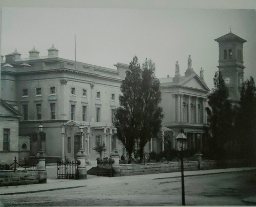
This next image is one that’s posted in the upstairs hallway of an earlier life of the building. The accompanying caption reads: The Royal University Dublin pre-1908. During major University College Dublin reconstruction work, the campanile was dismantled and removed to the Royal College of Science in Dublin’s Merrion Street around 1915.

A photo of the previous building, clearly an older version. There is a front section with a cornice and pillars that is missing from the modern image.

That’s right! The NCH used to be one of the buildings for University College Dublin (one of the Irish state schools, along with others like UC Cork and UC Limerick) back when all of the Dublin universities were downtown. It makes sense that a state-owned building would remain a state building when UCD moved to their Belfield-area campus in the 1970s. According to wikipedia, the building was originally an exhibition hall until it was repurposed into a university in the late 19th century, so going from university to concert hall is hardly its first rebranding.

Just being an old school building or exhibition hall isn’t particularly fancy, as any number of buildings are abandoned schools, or churches, or supermarkets. It’s probably more common for a building to have had multiple uses throughout its life than to remain one single entity forever. The Boston theatre mentioned previously had been a church in its past, for example. But like so many areas of downtown Dublin, there were important connections to the Irish civil war too.

A black and white photo of a large room with molding on the walls and in archways. The room is full of benches and chairs, mostly visible from the back.

The caption accompanying this picture states: Council Chamber of UCD, now the Kevin Barry Room, where the Treaty debates took place between 14th December 1921 and 10th January 1922. On the reverse of this photograph, it was noted at the time ‘would not be allowed take photo during sitting.’ There are actually quite a few photos on the walls of civil war and independence relevant images and details, and so even wandering the halls can be an interesting experience. But notice the benches in that photo of the Council Chamber?

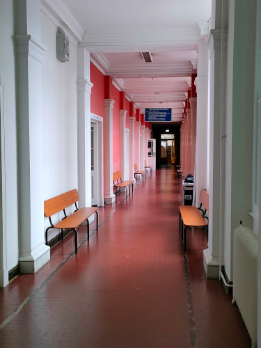
A photo of a hallway painted pink and white. Distinctive benches made of oblong planks are visible running the length of the hallway.

Those benches are still here! This is one end of the first floor hallway, each of these rooms are currently small rehearsal spaces and lesson rooms. They could of course be repro, but they are such an unusual shape I feel like it would be easier to just re-use old benches rather than source a modern recreation. It does look like some of the hardware has been changed, but the overall appearance is the same.

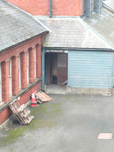
I have, however, saved the best secret for last. Any building can have a past. Any building can reuse furnishings from said past. But let’s take a peek out the windows of that hallway with all of the benches.

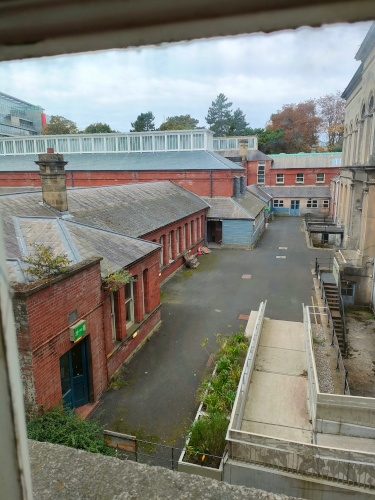
A photo of an outdoor area with low brick buildings and a driveway.

See it yet?

A zoomed-in photo of the previous driveway are, however the doorway in the back is visible and labled 'Pathology.'

A pathology lab! This UCD building had been where medicine and engineering studied and these traces are absolutely everywhere that concert patrons are not. Many of the rehearsal rooms and offices are labeled as the offices of former professors or different departments or specific classes. As many of these doors are starting to lose some of their letters, and I was technically working, I only snapped one quick photo of a particularly nice example of this.

A photo of a set of double doors. The focus is on the label 'Physiology' written on the glass above the doors.

Isn’t that just so charming? I love how the professors and students stepped out of this building one day and the building has waited for their return. As the main concert hall only opened in 1981, a friend of mine said his father had attended UCD when it was here, and that the concert hall was the exam room. It had apparently made for a nervewracking first concert experience, trying to overcome the training of four years worth of fear and stress that lurked behind the doors to that room.

What history is hidden in the buildings you frequent? Even the simplest thing gains shine when viewed from decades away, and it is often a fun game to try and find the evidence of the past.


If you like the content of this blog, please share it around. If you like the blog and you have the means, please consider joining my lovely patrons in paying for the work that goes into it. Due to my immigration status, I’m currently prohibited from conventional wage labor, so for the next couple years at least this is going to be my only source of income. You can sign up for as little as $1 per month (though more is obviously welcome), to help us make ends meet – every little bit counts!
Video: How Corruption Leads to Conspiracy Theories

Well, today may have been better than yesterday, but if so it was not by much. I’m glad it wasn’t worse, and I have my fingers crossed for tomorrow. It’s still basically just congestion, and just a hint of an impending sore throat that has yet to arrive. Oh, and some difficulty with temperature regulation. I think my head feels a little clearer today, but the fact that I’m so uncertain seems to imply otherwise.

Anyway, here’s a video that I think is useful. The ruling class of the US has spent the last century or so making corruption so much a part of daily operations that a lot of people can’t even tell it’s there. Growing up, I remember hearing about corruption in other countries – through media of various sorts – and it was always presented as a pyramid of officials shaking people down, and shaking each other down, all the way to the top, all outside the actual laws. I’ve grown up a bit since then, but even so it’s hard to really pick apart just how much the United States has been designed over the years to have a scared and obedient workforce that willingly gives almost all of everything they create or earn to corporations.

In that setting, is it any wonder that people believe in conspiracies? Add in the various conspiracies that we know have happened, and I think it would be more surprising if people didn’t start seeing patterns where none actually exist. This video is an interesting dig into some research into why people believe conspiracy theories, and how government corruption can lead to them. As always with Rebecca Watson’s videos, you can find a full transcript on Skepchick.org.


Tegan Tuesday: The Banality of Bigotry

This is a tale of heartbreak. A tale of death. A tale of perpetual life. A tale of political outreach and artistic expression. This is a mystery, as well. A famous work – a minimalist political artistic representation of grief – was briefly denied the chance to be either political or grief-inducing. While the situation has been corrected, the mystery has not been solved, and may never be. Even so, let us explore this saga.

For those who follow queer art and art news, this will probably not be your first introduction to minimalist Félix González-Torres, and his many “Untitled” works. His “Untitled (Portrait of Ross in L.A.)” (1991) is among his most famous and rightfully so. As I do not have the digital image rights to this work, please have a quick glance at this youtube video from the National Portrait Gallery.

As described in the video, it is an extremely simple installation of 175lbs of candy. This weight represents the ideal, healthy body weight of González-Torres’s partner, Ross, prior to his illness and death due to AIDS in 1991. As visitors are encouraged to pick a candy from the pile, the slow diminishing of ‘Ross’ represents both the disease devouring his body and the societal dismissal and diminishing of those afflicted. It’s an incredibly moving piece, made all the more so by the participation and complicity of the gallery patron. It’s far from the artist’s only AIDS related art, but it is probably his most famous. In 1996, González-Torres himself passed from AIDS at age 38.

I also cannot emphasize enough: this piece is incredibly well-known and so is the context. I’ve discussed it in classes, I’ve read articles and gushing accounts of its impact on personal lives for at least a decade, and I’ve certainly seen pictures of it all over the web.

Imagine my surprise when I came across this bombshell of a tweet yesterday:

Published on September 28th of this year, the tweet came out the same day as an equally inflammatory letter published in The Windy City Times (The Voice of Chicago’s Gay, Lesbian, Bi, Trans and Queer Community Since 1985).  Both the tweeter, Will Scullin, and the letter-writer, Zac Thriffiley, noticed that the signage for the Art Institute of Chicago’s installation of “Untitled (Portrait of Ross in L.A.)” had removed any and all mention of Ross, AIDS, death, memorial, or anything personal at all. There were many pointed comments on Twitter about the concept of the 175lbs referring to “the average body weight of an adult male,” and a few mentioning “ideal weight.”

I tromped all over the internet, trying to source reasons or explanations, only to discover that, hallelujah! The text had been changed yet again and now included Ross and his death as well as opening the door to more abstract interpretations.

Felix Gonzalez-Torres produced meaningful and restrained sculptural forms out of common materials. “Untitled” (Portrait of Ross in L.A.) consists of an ideal weight of 175 pounds of shiny, commercially distributed candy. The work’s physical form and scale change with each display, affected by its placement in the gallery as well as audience interactions. Regardless of its physical shape, the label lists its ideal weight, likely corresponding to the average body weight of an adult male, or perhaps the ideal weight of the subject referred to in the title, Ross Laycock, the artist’s partner who died of complications from AIDS in 1991, as did Gonzalez-Torres in 1996. As visitors take candy, the configuration changes, linking the participatory action with loss—even though the work holds the potential for endless replenishment.

Problem solved, yes? Well, yes and no. The first change as well as the second were implemented with no fanfare, and according to some sources, this has been on-going since 2018. (Also, for all the wall text changed, the museum’s audio description remains unchanged from 2015)

Then the work was de-installed [in 2017], and when it was put back on display in the summer of 2018, it was accompanied by a wall label that made no mention of AIDS and focused solely on the work’s aesthetic value. (The accompanying audio focuses heavily on Laycock and the AIDS crisis and has gone unchanged since 2015, according to a museum spokesperson.)
“Felix Gonzalez-Torres’s work is characterized by a sense of quiet elegy,” read the new label. “He possessed an uncanny ability to produce elegant and restrained sculptural forms out of common materials.” The text acknowledged that 175 pounds “corresponds to the average body weight of an adult male” but excluded any biographical information.

“Untitled (Portrait of Ross in L.A.)” was taken down again in the summer of 2018 and reinstalled this July [2022], once more accompanied by the newer text that avoided any mention of AIDS. This time, visitors voiced their concern.

This, emphatically, does not make sense to me. Why would an incredibly famous AIDS-activism artwork be stripped of all of its context? One theory, put forth in both the article quote above and on twitter, lays the blame for this situation at the representative for the artist’s estate, David Zwirner of the Zwirner Gallery.

Well, sure, I’m always happy to think ill of the ‘men in suits’ who move the money in the art world, but I still couldn’t prove anything one way or the other, and I realized that I also had no real understanding of what could potentially be the motives from the institution side of the equation. Thankfully for me and my mystery, being in a performing arts department of a university means that I could find someone who knew.

A lovely hour-long discussion with the head of Art History at my school brought forth several revelations, if no clear answers. Firstly, the Zwirner Gallery is incredibly well-known in the art world, and there is absolutely no financial incentive or advantage to their demonstrating homophobia in 2022. Aside from museum directors, who are almost exclusively white, cis-het men, the art world is generally pretty queer. Whether it’s artists, collectors, buyers, curators, interns, patrons- many of the people in the art world just aren’t straight. The Zwirner Gallery would lose the representation of many of its artists as well as many lucrative sales or museum loans if this omission was known to come from them, so while this is possible that David Zwirner could have the influence on the wall plaque, it’s unlikely that he would have removed any mention of AIDS or of Ross.

It is also unlikely to have come from the board, or any donors of the Art Institute of Chicago. According to the professor I spoke with, the three areas of art that have censorship issues are: sex, body parts that are normally clothed, body fluids and scat. A pile of candies that is representative of the impact of AIDS hardly qualifies. It’s also unlikely to have censorship coming from the city government of Chicago in 2022. This isn’t Texas in the 1980s. Perhaps there are US galleries in communities that have such strict control over messaging that this work would be censored, but that isn’t the case here.

The likely reason for the signage change comes from one of two places, according to my source. If it’s a top-down decision, it likely comes from the family of the artist. González-Torres was Cuban-born and had strong family connections to the Cuban community in Florida. This community is often extremely conservative, extremely Catholic, and perhaps that someone in the family who is associated with the González-Torres Foundation is attempted to straight-wash the history of the artist. It is unusual that the gallery would bow to the whims of an estate on the verbiage of a wall plaque, but perhaps the visual rights could be held out of reach until such changes were made. It’s possible.

The other possibility? The poorly-received text was written by an intern, with very little oversight from a curator. Apparently writing the text for things like wall plaques is the museum version of grunt work that often gets fobbed off onto interns or Art History undergrads. This potential anonymous intern could equally have had an axe to grind about González-Torres’s representation as a gay artist who created art about AIDS (it seems unlikely that such an important thing would be changed “by accident”). And with the amount of work that is needed to put together exhibits and keep museums running, much of this grunt work is checked off as ‘done’ without much attention paid to the details by someone further up the food chain.

I guess the only way to discover the actual solution to this mystery is will be to watch González-Torres’s works in future exhibits. If the artist’s personal details continue to get lost from museum catalogs, then perhaps an outside influence like a family member is pulling some strings. If this remains a freak accident, it might very easily have been an intern’s barely-approved text getting printed. Either way, I am pleased that this story at least has a happy ending: the artist’s life details have been reunited with his art for future visitors to learn about this powerful and wonderful work. Who needs to solve mysteries anyway?


If you like the content of this blog, please share it around. If you like the blog and you have the means, please consider joining my lovely patrons in paying for the work that goes into it. Due to my immigration status, I’m currently prohibited from conventional wage labor, so for the next couple years at least this is going to be my only source of income. You can sign up for as little as $1 per month (though more is obviously welcome), to help us make ends meet – every little bit counts!

Friday Film Review: The Sandman

Growing up, a lot of my taste in media was influenced by my older brother. I’ve encountered a lot of good stuff (and some bad stuff) based on either his recommendations, or on what he just had on his bookshelf. The Sandman was “good stuff”. It’s a surreal, and sometimes horrific comic about the anthropomorphic personification of The Dreaming – a world made up of the collective dreams of all beings. Those of you with the fortitude to read my first novel will probably notice rather a lot of influence from him in my writing at that point. While I’m grateful that I’ve outgrown that copycat phase in my own writing, Gaiman’s work – especially Sandman – remains some of my favorite fiction.

So I felt nervous when I hear there was going to be an adaptation of it. My mind tends to hold on to details from stories I read or watch, and so film adaptations have been a sore spot for me for a long time. The effects tend not to be as I imagined or hoped, the characters are interpreted differently, the plots are changed – it’s annoying to see an adaptation that falls short of what I feel the story deserved.

I was very worried about Peter Jackson’s Lord of the Rings adaptation. Overall it was wonderful, and the effects were fantastic, but there were choices made that bothered me enough to sour the experience. I didn’t appreciate Frodo being turned into a sort of piteous burden, carried through the journey by others. It’s not that he didn’t need their help in the books, but he didn’t go catatonic every time the ringwraiths showed up. Likewise, I feel that Jackson butchered the character of Faramir, and his justification for it was rubbish.

All I will say about his adaptation of The Hobbit, is that I could barely make it through the first film, and didn’t bother with the others.

So yeah – my initial intent was to avoid this new adaptation like the plague. I don’t appreciate having schlocky film versions cluttering up my memories of a good story. That lasted for a while, but eventually my curiosity got the better of me. I’m glad it did.

I’d heard that Gaiman was working closely with this adaptation, which was a good sign. I also liked the recent adaptation of Good Omens – a collaboration between Gaiman and Terry Pratchett. The fact that the original was in comic form also meant that the original vision was already there to copy. Combine that with recent advances in visual effects, and you’ve got everything you need for a good adaptation, at least in theory.

Even with newly elevated hopes, this show exceeded my expectations.

The first thing to note is that it’s very clear a lot of care went into recreating the visuals from the comics. The story will be familiar to those who’ve read them, and most of the characters will be largely what you expect. There are changes in appearance, and in some cases gender for a number of the characters, but in my opinion, they’ve done an admirable job in capturing the characters I’ve loved for so long.

Second, I want to talk about the changes. Any adaptation has changes from the original text. For all they’re both visual media, comics and film are still very different, and Sandman relies heavily on text narrative in addition to visuals and dialogue. The Sandman comics were also a part of the DC comics universe, and so a number of characters from that universe, like John Constantine or Martian Manhunter, needed no real introduction. This series is separate from that superhero universe, so some changes were made to allow for that, while keeping the central plot intact.

And honestly? A lot of the changes just made the story better. Violence and gore are some of the things that don’t tend to have a one-to-one translation from comics to film. While this series does have violence and gore, it’s less explicit than in the comics, and much more in service to plot and characters. A great many side characters are far more fleshed out, in ways that serve the story very well. The show also makes masterful use of suspense that’s effective even for those of us who know where the story’s going.

I get the feeling that Gaiman’s view of his own work has shifted, slightly, in the decades since the the first volume came out, and this show was a chance for him to do it all better. It may be that they’ll blow it in later seasons, but that seems unlikely to me. I now have very high hopes for the rest of the series, and I expect that this will remain one of my favorites for a long time.


If you like the content of this blog, please share it around. If you like the blog and you have the means, please consider joining my lovely patrons in paying for the work that goes into it. Due to my immigration status, I’m currently prohibited from conventional wage labor, so for the next couple years at least this is going to be my only source of income. You can sign up for as little as $1 per month (though more is obviously welcome), to help us make ends meet – every little bit counts!


Tegan Tuesday: Another day, another dollar stolen from creatives

HBO Max’s decision last week to scrub 36 titles from the internet has sent shockwaves throughout a lot of people either involved with, or emotionally invested in the arts. It’s not surprising, per se, when considering the merge with Discovery+, the discussion of how the streaming service had already lost the streaming wars before it started, or of course the shock from earlier this month how the new Batgirl movie would not be released, ever. There are rumors that 70% of the development staff for the media conglomerate will be laid off.

Media companies closing doors is hardly news. Media companies cancelling beloved shows is hardly news – remember Firefly? But what is new is the way that Warner Bros Discovery (the media conglomerate with more assets than I can shake a stick at) has handled the cancellations: silently removing the media without even telling the creators. An article from before the quarterly reports came out stated the issue quite plainly:

Like other streaming services, HBO Max issues monthly updates about titles being added and removed — for example, it announced that all eight original “Harry Potter” films will be exiting HBO Max at the end of August, while it’s also adding a big bucket of content including 28 films from A24 such as “Room” and “Ex Machina.” But none of the Warner Bros. original films purged from HBO Max were included in recent updates.

And, ok. Sure. Don’t announce to the general public that you’re doing shady business. That’s standard operating procedure for every corporation. But not even telling the artists? The creators of the most recent wave of cancelled shows mostly found out via twitter.

There are more tweets – from more creatives – as most of animation twitter was in mourning last week, but I feel these give enough of a flavor without dwelling in abject misery. Adding insult to injury, none of these creators even have copies of their work. If they want to watch their own creations, their own artwork, they now have to pirate the media. The art director of cancelled show Tig N’ Seek, Levon Jihanian tweeted as much last week.

This seemingly-bizarre disconnect between artist creation and the artist actually viewing their work, led many to wondering how, why, and what caused this situation. In response to such questions, an anonymous industry animator described the draconian working conditions of animation on tumblr:

https://kibbits.tumblr.com/post/693162180367007744/i-just-said-this-on-twitter-but-im-a-bit-awed-at

And these are only the shows that are completely scrubbed from the web, aside from piracy. Shows which remain on the streaming site might still lose more than 200 episodes, like Sesame Street had happen. Sesame Street — ah yes, what a useless show that no one ever watches. I’m sure that no parent or child noticed those missing episodes.

A media conglomerate pulling titles after a merger feels familiar, however. Where have I seen companies putting newly acquired media into vaults before… Ah yes — good ol’ Papa Walt, the champion of ridiculous copyright law and the vigilante against evil daycare centers. The primary difference that I can see between the Disney/20th Century Fox merger in 2019 and the HBO/Warner Bros Discovery merger of this year is that Disney was vaulting older, repertory titles. Warner cancelled existing shows that had already created their new episodes. Keep in mind, I hate both actions. But at least when The Name of the Rose (1986) or Cocoon (1985) were pulled from US markets in 2020, all creatives involved had already been paid. (Although the Vulture article linked above discusses the negative impact on small, local, repertory theatres.) I wonder if animation is likely to be the next media industry to see massive amounts of people leaving the industry for good. Digital effects artists have already started that process and I could easily see animation being next. Apparently it was industry practice to show examples of your work on streaming sites as part of your portfolio — how can you do that when all references to the media have been pulled?

At this point, many people from within and without the industry have begun speaking louder and louder about the value of owning physical media and pirating digital media. The more copies of any given item, the more likely that it will exist in the long run. There are many examples of lost films being found in attics or buried in archives, and media conservation is a serious issue. In a discussion on the value of media preservation via piracy, conservation policies were brought up:

https://renthony.tumblr.com/post/693041372584886272

Please – let’s try and keep modern media and culture available. Buy physical media, pirate digital media; don’t let corporations and streaming services decide what’s important. If art is important to you, it’s worth saving.


If you like the content of this blog, please share it around. If you like the blog and you have the means, please consider joining my lovely patrons in paying for the work that goes into it. Due to my immigration status, I’m currently prohibited from conventional wage labor, so for the next couple years at least this is going to be my only source of income. You can sign up for as little as $1 per month (though more is obviously welcome), to help us make ends meet – every little bit counts!
Video: True Facts about the giraffe

As always, Ze Frank gives the most analytical and academic of looks at his video’s subject. What’s unusual about this one is his revelation about the truth behind the Great Giraffe Lie, which simultaneously explains something that the theory of evolution never could, and serves as a warning. If lions have been using tools all along, what else are they capable of? Are we even safe? Could there be a lion behind us right now? We may never know.


The Renegade Cut takes a look at the enforcement of patriarchy

This is the second video in The Renegade Cut‘s series on the enforcement of hierarchies. If you haven’t seen the introduction, I’ve linked it below. This video looks at what patriarchy is, what it is not, and how it’s enforced. It also delves into the history of the subject, and some of how it intersects with other vectors of oppression. Leon has set a high bar with his past work, and in my opinion this video is no exception.


Here’s the series introduction: