Welcome to Minnesota, where all the women are strong, all the men are good-looking, and all the children are above average.
The thing is, we occupy the headwaters of the Mississippi, and we’re all busy pissing on the states downstream of us.
Welcome to Minnesota, where all the women are strong, all the men are good-looking, and all the children are above average.
The thing is, we occupy the headwaters of the Mississippi, and we’re all busy pissing on the states downstream of us.

You must be logged in to post a comment.
Every time I flush, I think of Texas.
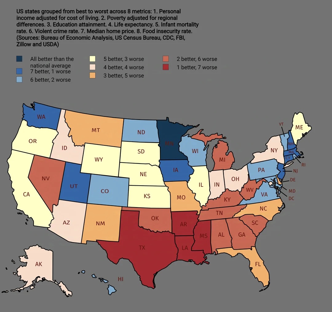
Median Home Price – which is better, high home prices or low home prices? I think it would depend on whether you are buying or selling.
So you’re telling me there aren’t any states where all 8 metrics are worse than the national average? I call bullsit!
Looks like the southern tier continues to have quality of life issues. And what is going on with Michigan and Nevada?
Is there a link to the data behind this?
This map is very funny!
Well, PZ, you’ve found another (and more valid) aspect of the repugs’ trickle-down theory.
Hmmm… it looks like they don’t factor in how temperate the weather is. (;
@3 Walter Solomon.
it’s not surprising that there isn’t any state that is below average for all 8 metrics.
if you assume that each category is independent (probably not), and ignore the constraint that half are above average and half below average for each category, you get 2^8 = 256 ways a state can be placed into each metric category. (same as flipping a coin 8 times)
with 256 ways to categorize 50 states, it is not unrealistic to see no state below average in all categories.
anybody reading this have math background in stats, chance, binomial theorem, n choose k type stuff?
i assume if you take into account the constraint, and incorporate some dependence between the metrics, that the 256 ways will reduce to say, between 64 and 128, which still means it is not unlikely that no state got below average in all metrics.
The rest of the states have a ways to ketchup, ketchup, ketchup…
<Steve Rogers voice>I understood that reference!<Steve Rogers voice>
https://en.wikipedia.org/wiki/Lake_Wobegon#Recurring_monologue_elements
Notably missing is prevalence of spiders.
robro, sources are in the other graphics: https://www.reddit.com/r/MapPorn/comments/1n12pmk/us_states_grouped_from_best_to_worst/
@13 to be fair – sources were in this graphic also
of course my brain immediately jumps to: “what is the correlation of the data? of all the ‘bottom tier’ states (more bad than good) all but 2 are run by GOP (Michigan, and New Mexico) ”
but is that my political bias screaming for attention? what else would explain the facts? are there confounding data that inflate /exaggerate the dichotomy? (for example remove median home value as a metric, isn’t that the same as measuring the poverty rate and cost of living? would the map look the same?) if we are rating ‘best to worst states’ and we want objective data (as opposed to opinion surveys/ happiness indexes) maybe include suicide rates per capita, or some other proxy for ‘happiness’ – but yea something tells me that if we included access to mental health care/ suicide prevention, per capita suicide rates, minimum wage, paid time off/ vacation days taken, mass shootings, natural disasters, vaccination rates, COVID deaths, etc…the map would look similar (with maybe Michigan and New Mexico NOT being in the bottom tier any more)
Hey, don’t dis Texas, PZ! We have a lot more black widow spiders than Minnesota does!
…
Maybe we don’t want to mention that in our tourism brochures, now that I think about it.