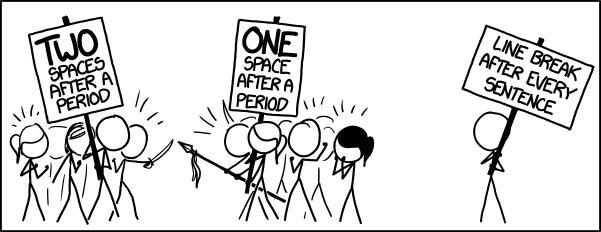
Should you use one space after a period, or two? I learned to type in the 1970s, on a manual typewriter, and our instructor was adamant that you must always press the spacebar twice at the end of sentence.
Fortunately, I learned the error of my ways in the 1980s (after I finished my Ph.D. thesis, which was printed on a monospaced daisy wheel clunker of a printer, and has double spaces everywhere): You may only use one space to separate sentences, or your readers will all scream and tear their eyeballs out, and bleed all over your copy.
There will be no argument on this matter.

I learned two myself from Brother Bernard (Catholic High School). I still hit the space bar at least twice after every sentence. Sometimes thrice! See!
You used a : at the end of a sentence.
And there are way too many commas.
And I just started a sentence with ‘and’.
Twice.
Maybe where you live, there won’t be any argument on this matter. Where I live (and where I work, too) there has been, and will be, considerable argument on the matter. The Significant Other is among the “monospace” generation, and is still putting in double spaces after a full stop. So do people at work (some of whose text it is my job to proof).
I keep telling these people that the wonders of modern technology (1980s-vintage? I am not sure) mean they don’t need to do this any more, but do they listen to an English grad? Of course not.
However, I am not totally unbalanced about this – still have full use of both eyes, and haven’t screamed at anyone … recently.
By the way, I only learned this myself because I picked up The Mac is Not a Typewriter at a used book sale many years ago; a very useful book for a word processing newbie, back then.
How many spaces after a period? It all depends. Are you trying to squeeze 5 pages worth of description into 3 pages or are you trying to fill up at least 5 pages when you only have 3 pages of things to say?
Now that that’s settled, what about that Oxford comma? (Runs away quickly before the guns are drawn.)
Spaces? Periods?!
Kids these days!
Scripto continuo was good enough for our Fathers, and it will be good enough for you! And boustrophedon, too, you philistine!
It’s all silly. Let the software take care of it.
I’m in the line break camp.
Hitting return is more fun than hitting space.
It’s much easier to read.
It’s just good science.
Immutable arbitrary rules for grammar are silly. I use two spaces after a period at the end of a sentence to ensure that my readers can determine the difference between the end of a sentence and the end of an abbreviation.
corwyn #8
You can put as many spaces as you like. Software gets rid of them.
I once worked for a double-spacer so dedicated that he made me code a function to override HTML’s stripping of his double spaces after a period on his webpage.
* its trivially easy now what with the kids these days and their CSS. Whippersnappers.
I think we should create a new HTML entity. Introducing and-ambiguspace-semicolon. Then offer multiple style sheets, so people can have it look as wide or narrow as they prefer…
… also, of course, multiple print runs, for people looking for hard copy. Everyone wins. Especially the publisher, who will charge $35 for the ‘enhanced’ eBook format allowing this.
Yes, genius, I know. But that’s nothing. The real genius is the stuff that does this retroactively, to existing material, through browser and various reader extensions for electronic media, and with VR goggles and real-time text recognition and re-rendering, for dead tree formats. Type it however you want, you bastards, we’ll have it our way! (And better still, we’ll also fix all your quotes to typographically correct ones, and turn all your double dashes to ems. Nothing will stand in the way of our Typesetters’ utopia!)
It is two (2) spaces. How else can I write a five (5) paragraph paper while repeating my thesis statement at the end of every paragraph? I also put all my footnotes on index cards. It is the only way to write a paper. All of the good papers follow this format. Oh, shit; the last sentence should have been my conclusion. My thesis is now fucked.
I believe HTML reformats double spaces to single for rendering to a screen image. But text file behind the scenes is untouched. Word processing programs save every space exactly as entered. Text editors do too.
As a quick experiment, I checked the properties on empty text document in my home folder. It says 0 bytes. I just created one with nothing but 100 spaces with a line feed after every 10. File size is 111 bytes. I wonder how much space could be recovered from all the world’s disk drives by eliminating all those extraneous spaces?
BTW, I double spaced throughout this post because I’m old and can’t help myself.
In this day and age of pay by click, next sentence Only a link to the next sentence is acceptable. next sentence Period, or not.
You can have my double spaces when you pry them from my cold, dead fingers.
Stevendorst @14 wins the thread.
The correct answer is NO spaces after a period. The character that follows a period is properly thought of as a sentence break, and its width should be dependent on font, kerning, and other typographical settings.
Everyone who writes should read Practical Typography by Matthew Butterick. He has a section on this.
In fact, he has a whole list of bad typewriter habits!
(Seriously though, Practical Typography is awesome and if you like it and find it useful, you should consider paying for it.)
remyporter #17
But I don’t have a “sentence break” key :(
@8 This isn’t technically grammar, this is orthography.
Also, the correct answer is don’t use word processors and let LaTeX handle it.
The guy on the right probably inputs his text using vi and formats it using ms macros in nroff.
Typographers use one space. Excellent explanation here. They do this because they know how to make it look good, and the rest of us don’t notice why it looks better.
If you’re still typing on a typewriter, then carry on double-spacing: it’s the only way to make it readable.
@10 and 13. That’s the beauty of html display. I can type two spaces at the end of each sentence, as God intended, but it is only displayed as one space for you heretics. No court orders, no contempt charges. :)
I’ve been doing two spaces for so long, my muscles just do it by habit. The few times I’ve tried to use just one, I end up having to edit the text and take out all the extra spaces I didn’t even realize I put in.
I got in the habit of using two spaces after the end of sentence period when I took a tying class using manual typewriters 50 years ago. Hard to break the habit, as the thumbs seem have a mind of their own on the keyboard.
One space on Twitter, out of necessity. Two spaces everywhere else.
If spaces aren’t really, really important, why is the space-bar so huuuge?
eh?
why?
In math publishing double spacing after sentence terminating periods is used. This is in large part due to the overabundance of intersentence periods. It gets to the point where clarity is lost otherwise. Given the commonality of acronyms in biology, you should be ashamed, PZ. (I am actually the copy editor of a math journal irl.)
I was being taught proper typing during that hazy period where teachers were dealing with those newfangled computers but didn’t see exactly why that should CHANGE anything. They’re probably just a fad anyway. Typing’s too impersonal, and nothing beats a real hand written letter to loved ones.
It’s rare when I can say that as a kid I was just so absolutely RIGHT about every single one of my angry predictions of the future of letters vs computers & internet, so I’m going to say it, I was SO ABSOLUTELY RIGHT Mrs. Steiningstein!
Nevertheless, I was taught the double-space method, and I still do it to this day. Frankly, we probably don’t even need that single space after a comma, do we? I still do that though. Fortunately, every modern OS since OS9 and Windows 95 uses variable width fonts, so it’s not as much of a nightmare to read as PZ’s monospace days.
Nowadays, there’s another big problem. Professional web sites all know to use black on white (or, in extremely rare cases, white on black). The point is, to read something clearly, you need high contrast. People new to web site design don’t understand this rule and prefer to get “creative”, demanding, say, pink text on a blue background. There really isn’t even a discussion here. No matter what your intent was, people can’t read your text very easily without high contrast! 000000 on FFFFFF! That’s what you need. (Subtitles are best done with a contrasting border around the letters themselves, to avoid the letters being completely invisible when the scene changes to white. It’s rather annoying that my XBox One’s default is to have no borders, because “flat” is the new fad for design and “borders” aren’t flat enough.)
This is entirely subjective by the way, but I really don’t like how everyone is picking the most childish fonts they can. It’s really “talking down” when you see Google going the sans route and animating that change with a child drawing the new logo with colored chalk, then “playfully” tilting the ‘e’ on the end. I miss when they actually would make the attempt to look like they’re professionals, that they are better than us at their job. Stop trying to sink down to our level as equals!
I shall continue to type two spaces after a sentence-ending* period until they pry the keyboard from my cold, dead hands. Seriously, I can’t stop. I think it’s all that caffeine**.
* Periods used in other contexts are exempt. Particularly in programming languages, where they’re just ridiculous. It’s like you’re trying to make a line of code look bigger to scare predators.
** Or C/C++/Java programming, where and is
&&and or is||.@Dark Jaguar #28
Making the contrast TOO high can cause eyestrain, particularly for those lost souls still using a CRT. I heard somewhere once that green on beige is optimal. My Terminal window is set for charcoal(?) on light brown, and my Nook uses dark brown on light brown. I’d imagine any pastel background and dark-but-not-black text (in a contrasting color) would have the same extent. Much easier on these old, myopic eyes.
OTOH, I agree about fonts. Classic-looking serifs for preference, although sans-serif is OK for short text or low-resolution displays. Comic-sans is right out, Papyrus is sorta OK but overused, and script fonts (childish or cursive) are usually too painful to read. For programming I discovered a fascinating monospace font called Hack, which distinguishes similar looking glyphs, e.g. l/I/1 (el/ai/one) or 0/O. The giant dot in the middle of the zero is, perhaps, overkill, but the hook on lower-case L is genius.
I learned two spaces. Now, I generally use one, except in cases where kerning requires two.
Never heard of the two spaces till today – only been typing for 41 years.
Given that most stuff is on the web these days and will contract multiple spaces to one its a bit moot.
It seems like the argument over fonts – on the web you get to choose the font you read in* so dont waste time on that – make sure the actual content is legible.
*I’ve worked on web accessibility and most of the visually impaired people I worked with use their own style sheets to override the writers learned (in that floor of their company) preferences.
LaTeX and HTML don’t give a shit how many times you hit the space bar, they just typeset it correctly for you. That’s the correct solution.
madtom 1999 @32
Well there’s your problem, you’re just a kid; you didn’t learn to type until two years after I got married. ;^) ;^) ;^)
Slightly related anecdote: Daughters #1 and #2 had a pizza-box Mac to use for HS classes. When they turned in exercises with the proper use of italics, such as exempli gratiae or Drosophila, their keyboarding instructor gigged them for not using underlines.
fusilier
James 2:24
French spacing has won. Historical context: In typeset material, back in pre-computer days, “standard spacing” (the actual name) in the US called for enlarged spacing at the end of a sentence. This was usually an invariant thin space in addition to a variable word space, rather than two word spaces, or sometimes an em-space instead of both. Look at a book from the 1920s. Typists followed this as best they could by using two spaces, both of them invariable. The French, however, used a single space, and when automation came in that eliminated the possibility of making a line break between the thin and word spaces, which would of course have messed up the lines. (Computers have improved.) Personally I like the old type, but it’s so buried in history that the valuable link above does not even mention it. French won.
@fmitchell #29:
I ALWAYS HATED COBOL.
I’m one of those annoying paper collaborators who finds-and-replaces every double space in the paper. Buahaha.
From the article linked in the OP:
That’s funny, I have the exact inverse impression. In debates like this, double-spacers tend to be like “oh well, I just like it better, whatever”, whereas single-spacers are all smugly explaining the Real Truth.
Here’s a very interesting article about this, much more precise than Slate’s: “Why two spaces after a period isn’t wrong (or, the lies typographers tell about history)”. It shows, among other fascinating remarks, how the Chicago Manual of Style gradually reduced the space required after periods (without any justification) in its editions between 1914 and 1949. Also, the post-scriptum is spot on:
Ha! I think I used your book in typing class, because the pictures were in black and white and all the people in them were women (because typing is
ladies’girls’ work).Our teacher, Mrs. Gray, said that if she saw our left thumb touch anything, she’d WACK it with a ruler. Only the right thumb was allowed to touch the spacebar, and she would jump on any student who failed to double-spaces after each sentence. I swear she could tell when a student hit a period and single space only by the way it sounded.
Inarguably one of the most practical classes I ever took, but my psyche is probably still scarred by the experience.
+1 for Numerobis’ point in #33
I learned 2 spaces in grade school, and I still type that way out of habit. But the most common document format I read and write in today is HTML, and a browser’s output to the screen will automatically reduce to single spaces regardless of how many spaces are in the document’s source code. So an author can put as many spaces as they like, but the reader (for whom the extra space is at least ostensibly inserted for) will only ever see one, making the choice entirely moot for more modern document formats like HTML over, say, printed paper.
But this gave me a thought. The visual output of a digital document is mutable, unlike printed text which is set (in stone or on paper). And since the extra spacing, I would assume, is for the reader’s benefit, I think the reader rather than the author ought to be the one making the decision on whether a new sentence begins with 1 or 2 or more spaces. So really, if people cared enough, it ought to be a configuration setting on your browser (or whatever program you use to output a digital document to a screen) – similar to how you can set how wide a tab’s indent will be in most text editors.
First shalt thou indent thy paragraph. Then shalt thou write thy sentence. One shall be the number of spaces thou shalt count between sentences, and the number of the counting shall be one. Two shalt thou not count, neither count thou three, as it is an abomination. Five is right out. Once the number one, being the original number, be reached, then thou mayest proceed to thy second sentence.
As someone who runs the production department of a publisher, I can say this: I DON’T CARE.
We’re going to do a whole pile of search-and-replace on your manuscript to get rid of all the fakakta formatting. Not only will we turn all your double-spaces into single-spaces, we’ll remove the places where you hit space twelve times in order to fake alignment of a chart or poem. We’ll delete all the weird tabs you put in, especially the places where you used six tabs in a row because you couldn’t be arsed to set actual tabs in the bar and just tabbed until you got to the 3.5″ mark.
We will nuke all your double paragraph breaks. Gnash our teeth as we convert your tables to plain text so we can make proper tables. Scream like Vengeance as we have your shitty Powerpoint charts redrawn in Illustrator so they don’t print as fuzzy white text on grey blobs.
Two spaces between sentences? Pfft. That’s nothing. Professional writers commit far more heinous crimes against formatting than that.
P.S. Our copyeditors, Heckle and Jeckle, will put Oxford commas all over the place because failure to use Oxford commas is failure to understand basic grammar.
frog@42: I’ve never worked with a publisher that actually did any editing — I didn’t know that was still a thing.
numerobis@43: I was 14 years with a big NY trade publisher, and now 7 with an academic press. Every book I’ve ever worked on has been copyedited. Some CEs are better than others (and some authors more or less accepting of the edits…), but it’s been the standard for my entire career.
For perspective, “every book I’ve ever worked on” is at least 5000 titles (conservative estimate) over those 21 years. Even in mass market paperback novels, we churned them out, but they went through editing.
frog @42: Yup.
numerobis @43: I work on high-quality textbooks, often biology. Pedant is my professional name. The pictures are pretty, even if the typographical standards are sinking. Nowadays most of the publishers won’t even allow the use of ligatures. Oh well. The poor students have to pay (in more senses than one), but the checks I get don’t bounce, and the direct deposits are even better. Such is life in late capitalism.
frog@44: interesting. My publishing experience has been in journals (and CS conference proceedings, which are run mostly like journals). The author is expected to typeset everything properly. Reviewers may point out typos; the journal for sure won’t. And so, indeed, you get atrocities left and right.
frog @42
The Oxford comma is an elitist tool whose sole purpose is to subjugate the lumpen proletariat, the plebs and the working class.
I am with corwyn @8 on this question.
How do I make HTML leave both of my spaces? Should I hide a period between them and turn it the same color as the background?
@48: use ampersand nbsp semi-colon to add a non-breaking space (though that has other side effects as well)
It took me quite awhile to retrain my fingers to do one space instead of two, but I’ll never go back now. And on twitter, I sometimes use NO SPACES after punctuation if I really need those characters (although it hurts me to look at).
Ah, something I almost know something about. Since the introduction of desktop publishing, the rule has been to use a single space after an end stop character (period). As I understand it, this was already the rule in newspaper and magazine publishing. This has to do with the way the font system works, padding space after the end stop character. Typewriters can’t do that, of course, so a single space looks cramped, thus you learned to use two spaces. If you’re writing on a computer, then using two spaces after the period looks too wide. Almost anyone in publishing would immediately notice it, and may look on the double-spaces as bad form.
HTML will only display two consecutive regular spaces. It’s something that was in HTML from the beginning. If you want to use spaces to separate items, and need more than two, you can use non-breaking spaces but that’s not something that most of us do.
Along about 1963 I was booted out of a High School typing class for having the temerity to sign up for it while being male. It took them a few weeks to realize what had happened.
From back in the days of the dinosaurs, I seem to recall that in FORTRAN boolean operators ( .and. .or. .not.) were bracketed with periods. The period was an upper case character on keypunches, so when I just typed the last sentence I hit the shift key out of habit. It is strange how some habits persist.
As a kid I was taught double-spacing between sentences, always indent the first line of a paragraph, and have an extra line between paragraphs. But now as a chemist, the formatting and grammar of chemical names such as (2R,3S,4R,5R)-2,3,4,5,6-Pentahydroxyhexanal [glucose] winds up creating plenty of more difficult formatting issues. So I don’t tend to worry about spacing between sentences, line spacing, and the Oxford comma. As long as people can understand what I am trying to communicate, that’s the important thing. Spelling and grammar are secondary to meaning.
Dear god, no! Don’t use HTML to style things, that’s what CSS is for!
The property you want is
white-space. It allows the white space to be rendered as you typed it, without any stupid global replacement or scripting malarkey.@52: One of the best things about my 1960 ninth grade was that both boys and girls were required to take a full semester of typing (I’m male). One benefit of typing ability: a few years later I spent my US Navy boot camp in an office helping to run our recruit battalion rather than out on the grinder marching.
Some how this reminded me of Stick Man Banging Head On Keyboard – YouTube
https://www.youtube.com/watch?v=opcO5edCzZY
And to be on topic, it’s two spaces after the period (exclamation point). DAMMIT!
Usernames #39
I can state that males were the small minority in my class. I think there were 4-5 males in the class of 25-30. I only took the class because my uncle (only 5 years older than me) recommended it. He was the first in my family to go to college, and I was the second. Definitely helped.
Big Boppa wrote:
Very, very little.
The first hurdle is block size. Few filesystems store things by byte boundaries. Both that 0 byte file and the 111 byte file typically consume around 4096 bytes (allocation block sizes can vary between 512 bytes and 65536 bytes, but 4096 is most common on Windows, MacOS X and Linux), depending on the storage medium. Storage systems that aren’t totally block oriented may see a small space recovery, but the majority of those implement data compression, which brings me to my second point.
Compression can eliminate most of the overhead of extra spaces by storing things like “. ” as a single symbol rather than three. Most modern document formats also make use of compression, including both OASIS/OpenOffice’s OpenDocument and Microsoft’s Office Open XML formats.
Data transmission might see some improvement to abandoning the double space after sentence break, but there is often compression in use there, as well.
There’s no argument on my side, either. I WILL use 2 spaces. Period.
I used two spaces after a period until Spell-checkers started flagging them.
Unfortunately, the line break after every sentence is the way some people write on the internet.
When they want people to think that their every sentence is a topic sentence.
And is of vital importance.
And you must remember.
It annoys me.
As you can probably tell.
By my sarcasm.
It’s a very simple thing — LaTeX will only let me use one space, so one space it shall be!
Let’s all type in Japanese where the issue is moot because you don’t add any spaces since there’s already a space incorporated within the period character itself and there are no spaces between individual words.
I learned two spaces, and the muscle memory has been ingrained for a long time now. For a long time I held out even thinking about changing it, but a few years back PZ shared a blog from a terminally ill gentleman facing his demise with dignity, and I read back on his blog some. One thing he mentioned was the uselessness of the double space after a sentence and it finally stuck with me. So out of respect for that guy I’ve made the effort.
Putting two spaces after a period is a thing?
I took typing back when an IBM Selectric was the cutting-edge. It had a curved plastic case and a type-ball that rotated, tilted and struck for each letter. It was so honking ridiculous that I knew it couldn’t last. And, being a high-school student, I somehow concluded that typing would never be important in my life, so I didn’t pay attention in class.
So I can’t tell you what I learned about spaces at the end of a sentence, but I’d say it is as archaic as indented paragraphs. I now just put in one space, probably out of laziness. And, as others have said, it all comes down to the electronic rendering of the appearance.
Something that I have not seen mentioned is the width of the period character. If your font makes a period as a single pixel of black, with no other width, the kerning takes over, but the font might show a period as a pixel of black and a couple pixels of white space to follow. The space is built in, maybe.
(What is “keming”? The result of poor kerning.)
Half my devices take a period as a direction to switch to capitalization, so who knows what is going on with spacing in there. The others take a period and a space as the switch to capitalizing.
Big Boppa @13 wrote:
Shouldn’t it amount to 110 bytes, instead? :-)
(La)TeX and t\nroff have it correct, it that it depends on context, more than input.
The usual HTML rendering has it wrong in that it (usually) ignores context.
All three are correct in that the input can be written like this paragraph with a newline (line break) not only at the end of each sentence
but also in middle, and be typeset legibly.
(However, the Borg Shiteware used at this site confuses the issue by treating intra-paragraph linebreaks as always significant — hence the above is less-legible than it should be, and is also not rendered as intended.)
As a person with less-than-perfect vision I find it Very Fatiguing to read text with no assistance at end-of-sentence.
Is two spaces an American thing? I’d not encountered it before until I was reading something written by an American friend’s. I don’t remember ever being told about it, or seeing double spacing in old typed documents.
@rey fox, #61:
I apologize to you. i do that sometimes when I’m writing a complex, multi-clause sentence where I think it’s easier to understand and remember a single introduction to multiple following clauses by setting off the clauses individually from the introduction. Though, I suppose, that’s usually (not always) within a sentence, not just forcing every sentence to be a statement of major emphasis.
Pierre Le Fou
It’s probably 100 spaces, 10 linefeeds, and one end of file/text marker.
I took one semester of a Typing Class in Junior High School, to fill in a blank spot on my schedule, and never used it for about 6 years. I can actually type about 20 words a minute, if I put my hands on the home keys and concentrate on nothing else. The biggest advantage from the class is that I know where all the keys are. I can’t remember anyone telling me how many spaces to put at the end of a sentence. I had no idea it was an issue until I saw it here.
My method for years has been to look at the keyboard, and I am not very fussy about which finger I hit the keys with. I often accidentally bump the Caps Lock, Tab, Alt, Enter, or Control keys, and then I get an unpleasant surprise when I look up at the screen after typing a couple sentences.
When I worked on DEC PDP8s, 11/03s, and 11/34s in the early 1960s, 32k of core memory was a lot of memory, and the biggest disks available stored around 5 megabytes. There was an idea that if any text did not actually convey information, then it was wasteful to store it on the computer. That is where I learned to use a single space between sentences, not to indent paragraphs, and also permanently lost the period after most abbreviations.
Typing Mr, Mrs, Dr, St, Ave, Sr, and Jr convey the same information as the traditional forms, and saved 33% of storage every time you used them.
Of course, my cell phone today has more computing power than Michigan State University had in 1957, and all our computers are equipped with a vast wasteland of both RAM and disk storage, but as many others have said, old habits are hard to break.
Didn’t linotype machines have a split space bar? One side put an en-space between words, the other put a (wider) em-space between sentences. (You can get both of those space widths in MSWord.) That’s where the typewriter double space originated; a poor simulation of the em space.
#8, Corwyn, said it all, but other comments have ignored that one. If you write a lot of abbreviations (microbiologists like me constantly use stuff like S. aureus, C. albicans, P. aeruginosa) the sentences become so full of periods you can’t easily chunk your reading unless the gap between sentences is a bit wider.
I actually do still have a CRT (a high resolution high refresh one, so it looks great). I’ve never had an issue with high contrast text on it, but then again I don’t have the astigmatism. (That’s an old person thing right? That is, referring to every new term you learned after age 40 as “the x”?)
I like that “hack” font, but yeah, that big dot on the 0’s is a bit odd. Whatever happened to the diagonal slash on the 0? I seem to recall that being a thing in the past, and it worked great.
it appears Berke Breathed has been following your blog:
https://scontent.fphx1-2.fna.fbcdn.net/hphotos-xfa1/t31.0-8/s2048x2048/11754857_1052501844780568_3159481018977395289_o.jpg