Fun times ahead for #Adobe designers. Today, if you open a PSD (even one that's 20 years old) with an obscure PANTONE colour, it will remove the colour and make it black. Pantone want US$21/month for access, and Solid Coated goes behind the paywall in early November. pic.twitter.com/BUxzViYFaQ
— Iain Anderson (@funwithstuff) October 28, 2022
It has been 0 days since fresh nonsense from Adobe. This round of unfriendly-to-users action is a team effort between Adobe and Pantone, both. Effective today, Pantone colors are paywalled and any programs that run with Pantone colors, like Adobe Photoshop and Illustrator, no longer work without a monthly subscription (the author of the above tweet mistook USD for AUSD, and later corrected to say that the price is AUS$21/month, or US$15). This is part of a larger trend from tech in general and Adobe in particular. You can only use the approved programs our technofeudal overlords tell us to use, in the manner that they require us to do so, or you are not only courting being out of step with industry standards (like the Pantone/Adobe situation) but you are in danger of felony charges if you alter a program to better suit your uses or budget.
A full breakdown of the situation by Cory Doctorow can be read here, and I do recommend reading his work if you haven’t yet – he’s probably one of my favorite non-fiction writers today. For this post, the short answer on why this is so tragic for digital artists requires looking into both Adobe and Pantone as companies and integral components of modern visual art.
It should be well-understood at this point that Adobe is a household name for digital image software. However for nearly a decade Adobe has used a Software as a Service (SaaS) model, with subscription fees forever. The days of just buying a program and being done with it are dead and buried, and Adobe has always been one of the worst offenders. This means that any changes to the program or the licensing go into effect immediately with no option to roll back to a previous version. Funnily enough, the first place that I’d ever heard about the old trick of changing the clock on your computer to a time before your license expired was in order to use Adobe products. The way Adobe got around this well-known hack? They got rid of the ability to use the program without web access so there’s no opting out of updates and license expirations. I’ve always been a little resentful when I lose a sneaky little computer trick, and Adobe’s been in my black books for decades for this and similar moves against users. It’s also fairly expensive AND the industry standard. Gotta love monopolies; Adobe also has the same hobby as other monopolies, buying their competition.
Why is Pantone in particular so important? The fact is that they have been the industry standard for physical and digital prints since the 1960s (even colored filters and films for stage lights are often described and ordered using Pantone colors). Part of working with Pantone is a very specific color blend, and, for physical printing, even the formula for making the ink or pigment. The company and their proprietary color system have been deeply embedded into every field that cares which particular red goes where. As Doctorow points out in his article on the situation, however, it also goes beyond that. Normal print is based around the combination of Cyan-Magenta-Yellow-blacK, or CMYK.
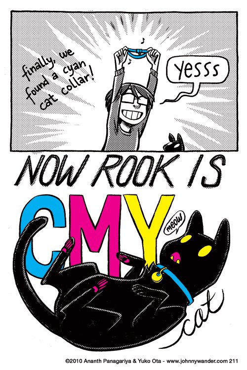
A strip from webcomic Johnny Wander, showing how with the addition of a cyan collar, their black cat ‘Rook’ is fully CMYK compliant with yellow eyes and ID tag, and magenta mouth and toe beans.
But Pantone also uses over a thousand ‘spot colors’ which can include fluorescents, metallics, pastels, and any number of colors not found in traditional CMYK printing. Beyond industry uses, Pantone is also fairly important culturally. Since 2000 the company has declared a Color of the Year (2022 is Very Peri) which impacts interior design, fashion, and cosmetics. Pantone colors are also specified for country flags, to ensure ‘brand standard’ across printing and manufacturing of materials for or with flags (the US flag uses Blue PMS 282 and Red PMS 193, also known as #002868 and #BF0A30 in hex). Pantone and its proprietary color system would be incredibly difficult to root out of modern culture, which means this move to a subscription model is devastating.
Unsurprisingly, many guides or alternatives around Pantone restrictions have already sprung up. A number of designers on Twitter were wondering if this is perhaps their push to move away from Adobe products and give Krita a go. This has the layered effect of keeping your new products out of step with the industry, potentially losing old work, and requires learning a new system at a professional level. But the colorful hero of the hour is of course, your friend and mine, Stuart Semple.
Semple and his (extremely talented!) chemistry shop made news when he protested Aneesh Khapoor’s copyrighting of ‘Vantablack,’ a proprietary “blackest black to ever black” pigment that was matte, absorbed nearly all light, and was also fairly toxic. Semple has since released three non-toxic versions of a “Blackest Black,” the “Pinkest Pink,” the “Glitteriest Glitter,” and a number of other proprietary colors like “TIFF” (a Tiffany blue knock-off) and “Easy Klein” (an Yves Klein blue knock-off). The mission statement of his company, Culture Hustle, is a quote from Semple:
I believe art should be for everyone, that self-expression is a basic human right. To do that well, we need the best materials.
The fact that all of his materials are non-toxic bears repeating, because at industrial chemistry levels of pigment innovation, that is really not the standard. Semple’s approach to art is to encourage and raise up other artists, and hope that they stay in the field a long time to make more art and devise innovative ways to use existing materials. You can’t do that if exposure needs to be limited because of toxicity. All of this means that it makes sense that Semple, the champion of artists everywhere for open access to materials and colors, would create a Pantone clone. It’s called Freetone, because of course it is, and it is free to download and use, forever.
Unlike a lot of the workarounds linked above, Freetone is a one-to-one substitution for Pantone that has the full portfolio of colors and uses the same number identification system. Any program that uses Pantone colors can use Freetone seamlessly. The goal was to be as helpful and immediately useful as possible, and I think that Semple achieved that. But this is only a stopgap until Adobe tightens its walls and makes it harder to import different third-party color portfolios. It’s a never-ending arms race against companies who want to raise the walls and narrow the laneways of use, and I for one am tired to always have to worry about it. Wouldn’t it be nice if we reached a point again where when you bought a thing it stayed bought? Where your own work stayed yours? Here’s hoping for a brighter — more colorful? — future with fewer corporate monopolies steering the world.
If you like the content of this blog, please share it around. If you like the blog and you have the means, please consider joining my lovely patrons in paying for the work that goes into it. Due to my immigration status, I’m currently prohibited from conventional wage labor, so for the next couple years at least this is going to be my only source of income. You can sign up for as little as $1 per month (though more is obviously welcome), to help us make ends meet – every little bit counts!