A music festival called the Bay Area Deathfest does not appeal to me at all — I suspect there will be a lot of croaking and howling and thrashing guitars, and everyone will be dressed in black. But I could be wrong. My sons both listen to music like that, and while most of it makes me want to back away slowly, at least some of it is…interesting.
But I have to say that I get an impression of uniformity from the festival poster. It seems that almost every band in this genre has to have a completely illegible logo. The top two bands are “Cattle Decapitation” and “Psycroptic”, which I only know because I read the text of the web site. I’m not going to try to decipher the rest.
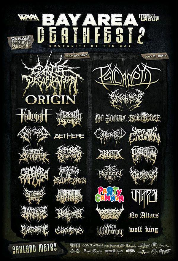
Except “Party Cannon”. Way to go against the expectations of the masses, Party Cannon!

Indecipherable names are how you know it’s a good band. If it’s remains indecipherable even after you’ve been told what the band name is, that means they’re gods. Or that they really suck. Or they came up with the name via compromise.
But, yeah, Party Cannon looks festive. I’ve never heard of them though that doesn’t mean much. I hope they’re not some Insane Clown Posse wanna-be’s.
I see they’ve skipped my (nonexistent) band ThorAxe again this year.
You can try to interpret the script. I see the bands include Lobster Laughter and Turkey Ottering, both sound fun.
Also, Oakland Metro sounds hardcore.
Just looked up Party Cannon online, (with a name like that, I had to) and I have two conclusions to make:
1) They sound pretty much like any other Death Metal band to me, a lot of growling, screaming, and I couldn’t understand most of the lyrics.
2) They do at least have some interesting song titles, like “Tyrone, you put that sugar down” and “There’s a reason you’re still single”.
The band names made me think of Sesame Street: https://www.youtube.com/watch?v=FClGhto1vIg
The music from Sesame Street is also more my style than metal, so it was a great way to start my day. Thanks.
I don’t know Party Cannon, but i think they deserve a slow clap.
I enjoy some deathmetal myself, although i have to admit, most of it is really annoying, i’m rather peculiar about which bands and songs i actually like. Some of it can be surprisingly emotive and beautiful.
I have a feeling the logos are designed to work well as tattoos. They fit very much in that aesthetic, and I’d guess that a lot of fans are also fans of tattoos.
Raise your hand if you can totally see Jack Black’s character, Dewey Finn, from School of Rock fronting any one of these bands and doing stage dives into the crowd, all the while shredding the faces of anyone there.
#8: Nope. Can’t. Jack Black doesn’t take himself seriously enough.
Eh, I can read most of it just fine. I like metal, and I like some death metal. I like some of most music, really. One thing I’ve always done is to avoid judgments and stereotypes based on a particular style. That might be because of the time I grew up, with all the judgments and pronouncements of doom upon the ‘sex, drugs, and rock ‘n’ roll’ peoples. Heh.
They must be getting so many questions these days about whether they were deliberately referencing My Little Pony. One of Pinkie Pie’s signature props is a party cannon, and it looks like their Facebook page starts in 2010, same as the first year of FiM.
Ponies do death metal?
That looks like an example of common descent. I wonder which band logo is the LUCA for these?
re @7
my thoughts exactly
I’m surprised my son hasn’t mentioned Oakland Metro. He’s kind of into industrial metal and some of this might qualify. He has been to a small club over there that does something like folk-punk, which I find charming.
He actually has quite broad tastes. The other night at a pizza place, a song was playing which he said he liked. It was Greg Kihn. I was amazed.
I don’t particularly like any metal. It sounds noisy, and I can’t understand the lyrics. I guess I’m too much of an old, hippy, folky with my head warped by too many Grateful Dead concerts…or somethin’. I’m only slightly amused that my reason is pretty much the reason the old folks back home didn’t like Janis Joplin, Jimi Hendrix, Arthur Brown, and a bunch of other performers I listened to in the late 60s.
Venom.
Purification by Fire. Okay.
If you have trouble understanding the lyrics of death metal bands, check out this guy’s reworkings of old death metal classics for the more discerning listener…
https://www.youtube.com/watch?v=KRg8KjYROkM
https://www.youtube.com/watch?v=E92zCs4sWto
It’s the sameness of it all (except Party Cannon) that gets me.
I wonder if anyone will be selling cough drops at the venue?
I once asked a graphic designer at a metal label what specific aesthetic concept bands tried to achieve when they selected these kinds of logos. He answered “I have no idea whatsoever. They all look like stomped-on spiders to me.”
Tabby Lavalamp:
Right, ’cause that’s never happened with other genres, nope. Not at all. Ever.
Origin aren’t really trying, are they?
There is a particular music genre called “witch house“. Bands in the Witch House genre seem to go in for digging odd symbols out of the Unicode repertoire for their names: LAKE R▲DIO, ✝ DE△D VIRGIN ✝, Bl▲ck † Ceiling to name a few from the linked page. See, you don’t even need a fancy graphic designer to come up with an illegible name for your band!
They look to me like they are all auto-generated with the QuickMetalLogo app. Also, that festival was back in July.
To each their own, I guess. If I did not get the hint, I would not even be capable of recognizing that there are supposed to be actual letters somewhere in that mess of white lines on black background. And I have just as well trouble of discerning any melody in metal (and forget the lyrics). But again, whatever floates one’s boat. Just do not expect me to listen to it or to pretend that I like it (with possible rare exceptions).
I find that most of this music makes me think of pigs getting sodomized by pineapples wrapped in barbed wire. And that’s not even what I really dislike about this genre.
Caine @22
I’m pretty sure there are posters out there featuring a lot of punk bands with cut out ransom demand letters for their names, some posters featuring country bands with Western looking fonts for their logos, but that’s all irrelevant. We’re discussing this one poster featuring a lot of logos with this one style. I’m not sure why you seem to be getting defensive over my comment in particular.
So the first punk festival poster I found had only two logos that fit my expectation. Overall it’s a lot more diverse than the poster above. http://www.punk-disorderly.de/img/Banner/pud_435.jpg
@28
Without wanting to speak for Caine, i can tell you that i at first also reacted negatively to your comment because it sounded similar to a common criticism made to this types of metal, that they are all the same, just people screaming, no melody or musical quality (see @26 and @27). It gets fucking annoying…and it’s complete bollocks…
Mind you, i realise you were making reference to the similarities of the designs in the poster alone, not the music.
The way movies, books, music, television, etc. always went for sameness always perplexed the confounded shit out of me well into my late 40s before I finally realized that they did it because they and the audience liked the sameness. They figure if it’s formulaic then it’s by following the formula it’ll be good.
It’s so simple. But it’s so astonishingly counter to my thinking I honestly could never comprehend it. Totally confused me for decades.
Now I understand it. It doesn’t confound me. It just pisses me off.
I assume it’s Lobster Slaughter.
Say, how ’bout that band Publication By Fire. Made up of junior faculty, are they?
One of them looks to be The Kennedy Yeti. I rather like that. It deserves legibility.
Can anyone tell me the practical difference between checking the box marked “Notify me of followup comments via e-mail.” versus “Notify me of follow-up comments by email.” ? I can see the hyphens are swapping places, but beyond that I’m mystified.
“No altars”, there’s a sentiment we can appreciate, at least.
@31
Or, you know, maybe having similar qualities that identify a particular style is the very fucking definition of genre, and this one, like all the others, actually contains a shitload of diversity whithin it. But snobbism feels good, doesn’t it? I should know, i used to say the same shit about other genres and think i was oh so clever for it. It’s nothing but ignorance, though, and it’s your problem, not the genre’s.
@26
Some of the most melodically elaborate and beautiful music i’ve ever heard has been metal. There are some really excellent musicians in metal, many with actual musical degrees and international recognition for their virtuosism.
Serifs gone wild…
I very often think the music awesome.
Until the vocalist opens his mouth.
I never got why death metal in particular has that. I’m a fan of power metal myself (aka music to slay dragons to) and there’s a pretty decent smattering of fonts and colors.
Not a fan of the silly glow on some, but at least they’re readable and discernible from one another.
It is the “Oakland Metro Operahouse” which makes it even more hardcore than “Oakland Metro” ;) and though it is a great venue the sound system isn’t always that great.
Caine @ #22 — Exactly. After an hour of Blue Grass, you can’t distinguish one I-IV-V song from another.
Dreaming of an Atheistic Newtopia @30
Oh no. Death metal isn’t for me, but I would never shit on it like that. Musical snobbery annoys the hell out of me and often it seems like a cover for other prejudices (as seen by a lot of the criticism aimed at music enjoyed by young women or African Americans, for example). Just because I don’t like something it doesn’t mean it’s bad.
I am administrator for a music video wikia, and someone had posted death metal bands and music videos articles. One video was from Cattle Decapitation and it was very disturbing (NSFW).
@41
I know the one you’re talking about and it’s fucking metal as shit.
Say, how ’bout that band Publication By Fire. Made up of junior faculty, are they?
Those are the guys that did “Publish or Perish” right? That track is ruthless.
I prefer my metal sans lead growler. Check out Deathmøle:
Fifty Goddamn Skeleton Warriors
It’s by the author of Questionable Content
@Vivec #37
There is an interesting similarity of cover art styles among the various subgenres of metal. Swedish artist Kristian Wåhlin, aka Necrolord, has created the cover art for a number of metal bands for the last twenty-five years, with the suitably metal-appropriate theme being something that looks like it’s out of Lord of the Rings or HP Lovecraft.
Back in the early ’90s some of the more serious black metal bands didn’t take too well to the colorful fantasy feeling of this type of album art and responded with some very monochromatic album covers–Darkthrone’s Transilvanian Hunger and Gorgoroth’s Pentagram are two prime examples. They also stripped down the production as well, but if you’re not into that type of music I’d recommend you just take my word for it.
And always good for a laugh if any this sounds too dark, there’s Manowar’s cover art over the years (with a fairly simple and readable logo); like some sort of gloriously unironic bodybuilder version of Spinal Tap.
Vivec wrote:
It looks pretty heavy on the gothic style fonts to me.
There is some defensiveness in this thread. The thing being laughed at here is not the music nor the musicians, but the musicians-playing-at-graphic-design who all came up with a logo that looks like a pile of detached hairy spider legs.
#46 To the same degree of sameness as the OP? No.
@13: Very astute! It is indeed something of an evolutionary process, and you can see the gradual transformation of metal logos from the very simple, legible ones in the late 1970s, to the advent of symmetry in the 1980s, and the gradual trend towards ever more ornamentation and stylization, and different evolutionary branches of metal logos (power metal, death metal, and thrash metal logos tend towards differing styles despite having a common ancestor somewhere back in the depths of the ’70s).
@36: If you don’t like growlers, you can always listen to power metal, which has belters instead, as demonstrated by Daniel “D Above Soprano C” Heman:
https://www.youtube.com/watch?v=tBJktWY6u0I
Q: What purpose do tight pants on a power metal singer serve?
A: Fine tuners.
Eh, I prefer Doom Metal and Stoner Metal.
One thing everyone should remember about the Deathfest logos is that slam death metal/deathcore is a fad right now and, like with any musical fad, there are hordes of copycat Cattle Decapitation clones who are just following what everyone else is doing and thus their logos all look alike. The less inspired ones will soon be winnowed out when slam becomes passé and the new trend arrives.
Wow.
https://en.wikipedia.org/wiki/Heavy_metal_subgenres
(Such minutiae!)
@ Dreaming of an Atheisitic Newtopia # 34 & comments about snobism.
I am aware of that, I have been told multiple times and I have no reason to dispute it. But I cannot (mostly) evaluate that for myself, because most of metal I ever heard is so unpleasant to me, that I am unable to make it through more than a few seconds. There have been rare exceptions, but really when some of my metal-loving friends (or my brother) tried to point me to some masterpiece in an effort to convince me that I should too try metal because it is awesome, mostly I did not make it throught the first third.
I am not saying that metal is simple or inferior or anything of that kind. I am just saying that it is not my cup of tea. I am sorry that I did not formulate my comment better, but I tried to offer my personal perspective, not objective judgement.
The beauty always lies in the eye (ear) of the beholder.
I do have to agree with the sentiment that these aren’t
– I want to point out that these are serious musicians, who take the musical aspects of their creations with all the seriousness it deserves. That screaming you hear is very carefully pitched screaming; it’s rather impressive, what you can do with a human voice.
I used to be a metal fan in my teens, until I found out how artistically conservative the metal scene is. Can you imagine the logos have been like this since the mid-eighties? For the music it has been the same. The quality of metal lies mostly in technical skills, less in composition.
¡a callar! It’s the, the, the ILLUMINATI!!!!1!!!
A post by Zoe Quinn listing some of the genres of death metal. We have polka metal, dinosaur metal and… whatever the hell BABYMETAL is…
@54 Correction:
“how artistically conservative [some small part] of the metal scene is”
“For the music it has been the same.”
Take a look at the list of metal genres on wikipedia again. The realize, that the majority of those didn’t even exist in the 80s. And then recognize that despite that long list, lots of metal bands appear every year that fit nowhere into that list, without attaching a whole string of qualifiers (“melodic progressive ambient metal with a hint of djent, but not really…”). Just some new stuff within the last 5 years or so:
Disperse, David Maxim Micic, Leprous, Haken, Organized Chaos, Destrage, Tesseract, Periphery, Novallo…
As always when people say “all music nowadays sounds the same/is shit” – if you think that, you haven’t even tried to find interesting stuff, which is easier now than ever before…
Cat Mara @56
Babymetal isn’t a genre, it’s a band and one of the BEST BANDS EVER!
It looks like the visual equivalent of heavy distortion.
@47 holms
What makes you think that advertizing the genre of music your band plays with your logo is a bug rather than a feature?
@Dennis Müller #57 – Well, that’s another thing. Already in the mid-eighties the metal scene kept separating in genres and subgenres and subsubgenres. That’s about as much a sign of progressiveness as a list of protestant sects is. Proponents of every genre were about as tolerant to each other as protestant sects are. And please don’t give me that “you haven’t even tried to find interesting stuff” crap. The stuff you find interesting is boring.
#60
Why is ‘advertising the genre of music your band plays’ down to the font or logo of your band name?
@61 – “That’s about as much a sign of progressiveness as a list of protestant sects is.” no, it’s a sign of diversification. You know, the opposite of the “everything sounds the same”-thing. I could give you a similar list of sub- and subsubgenres for jazz. Because one thing that metal and jazz have in common, is that they’re not narrow genres with clearly defined borders. Jazz is more a compositional/improvisational approach, whereas metal is more like a sound texture. Not coincidentally, there’s such a thing as jazz metal, which combines improvisation and complex harmonies with a metal sound (Panzerballett are a great example).
“The stuff you find interesting is boring”. Well, either that’s just your uninformed opinion, in which case I don’t what why you seem to deem it necessary to spew it forth here in the first place, or you’re just uninformed. If you know anything about composition, you’ll instantly hear that (just as ONE example) David Maxim Micic is a trained jazz musician, not because of his technical prowess but because of his intricate and elegant compositions.
It’s one upmanship gone wild.