One of the maxims that occasionally go around the internet is: if a piece of information perfectly aligns with and reinforces your understanding of the world, that is when it’s most important to investigate its validity. I like to forget this rule, because clearly I, personally, am the one person in the world immune to propaganda. But in a world of click-bait-y, impotent-rage-inducing articles, I fell for yet another one.
Perhaps you’ve seen these charts floating around the internet the past week or so.


They are from a recent study that, I was told, proved with Science! that color was disappearing from the world. The article I saw, of course helpfully gave examples of colorful aspects of life (such as carpets, or McDonald’s) that are now minimalist greys. I, a synaesthete and lover of color, got as upset as I was intended to do. I fully intended to write an article this week on the injustice of our increasingly colorless world. However, I noticed last night that there was a link to the source paper.
And who could have guessed that this was not the goal nor the conclusion of the original paper? The paper was on using machine learning on a photographic dataset of a museum collection. It’s a really interesting project, and there are some pretty charts and visual graphics depicting the team’s findings, but there are also some clear limitations on the use of these findings, because the selection of objects is neither even nor representative. For example, any museum item that had been photographed in black and white was disqualified from the survey, ditto any item that did not have a uniformly colored background. The color green is unusually well-represented in the 1980s and 1990s due to an exhibit on computers and the information age. This excerpt from the paper I think clearly offers both the conclusion and the warning about said conclusion’s general use:
The most notable trend, in both the chart and the video, is the rise in grey over time. This is matched by a decline in brown and yellow. These trends likely reflect changes in materials, such as the move away from wood and towards plastic. A smaller trend is the use of very saturated colours which begins in the 1960s.
While things appear to have become a little greyer over time, we must remember that the photographs examined here are a just a sample of the objects within the collection, and the collection itself is also a non-random selection of objects. Moreover, these trends will continue to change as new objects are acquired.
So what is the deal with the colorless world? Because it is certainly true that it feels like color is harder and harder to find in depictions of everyday life. Everyone and their mother has noticed that movies are impossible to watch due to lack of lighting, with the big battle scene at the end of Game of Thrones, that no one could see, making headlines. One article describes part of the issue thusly:
Another reason is that so many big-budget movies and shows shoot using green screen and rear projection, and lighting for film and TV has become a bit of a lost art. This could sound curmudgeonly, but I swear it’s not.
The thing is, cinematographers on a lot of these shoots aren’t lighting anymore. It’s being done in post, and those people may not have the eye for it. Sure, there are lots of good projects out there, but the bad ones stand out.
Ah yes. Everyone’s favorite “let’s just do it on greenscreen and hire the underpaid and non-union VFX team to fix it.” Always a classic.
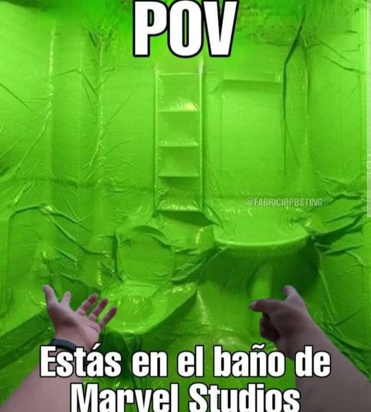
POV: You are in the bathroom at Marvel Studios
Some of this lack of color relates to more information about safety: the metallic mint-green 1964 Buick Skylark from the movie My Cousin Vinny would not exist today thanks to the research showing that white cars are the safest on the road. Thanks to the speeds that most roads are today, compared to the 1960s, that extra 12% visibility can be the difference between a safe drive and an accident, especially in low-light or dangerous weather situations.
Ok, well that explains the monochrome cars. For once the colorlessness is helping. But why are all of our interior designs boring? That one, I think we can blame on capitalism. The two biggest factors in deciding interior design (or exterior design) are: resell factor, and ‘calming’ or ‘soothing’ space. I’m not really going to bother talking about resell factor, because my thoughts are really simple: you live there now, who cares about the next owners. But this concern to have your living space act as a retreat from the big bad outside world is… definitely a problem. To quote an article on the top ten monochrome soothing colors,
Now more than ever, our homes are our retreats from the chaos going on outside. Whether you live in an apartment in one of the world’s biggest city or a farmhouse on a sprawling estate, it’s important that our abodes are designed to be restful, calming spaces where we can easily recharge at the end of the day.
I don’t have a lot of smart things to say, nor a lot of statistics to quote. People who study this more than I can feel free to chime in with where I’m wrong. This makes me think about the rise in gig economy and of how many people I know with multiple jobs in order to make ends meet. Of the long hours spent in those multiple jobs, and of how many part-time jobs are customer-facing (aka, draining). I could see the appeal of creating a soothing, restful, calming cave of a home in order to quiet how loud it is outside. There’s also a lot to be said of the value of natural light, and white or light walls reflect the most sun. The fastest way to make a small room smaller is to paint it in dark colors, after all, so paint it white and open the windows and your small apartment doesn’t feel so small any more! I’m also reminded of a conversation with an acquaintance where he said that colored paints were three times the price of white, so he painted everything in his house white and called it a done deal. I also know that a lot of people honestly like the blank canvas of a white wall, all the better to put their own personality. I admit, all of my art is in black frames, often with white mats, so that there is a cohesion between my otherwise incredibly unrelated artworks.
When it comes to this kind of frustratingly dull landscapes, it helps me to remember that colors come and go in trends as much as anything else. In the 1910s, a great many bathrooms were white. White enamel sinks and tubs, white porcelain commodes, white tiled walls and floors, white ceilings. Bright, washable, white. This was because the general public had just learned about germs and the importance of a clean bathroom space. A white bathroom will show the dirt (and germs) and so you will be able to raise your children in comfort, knowing that your shiny white bathroom is clean and safe.
What is the point of making me despair at the world and society’s Forcing Monochrome Upon Me? I will never know the reason for this particular article, but sometimes its to drain your energy. Sometimes its literally to make you feel like nothing can change so why bother? That was the primary thing Russian agents did on social media during the 2016 election. Sometimes its because the author themselves had a knee-jerk reaction and didn’t bother to fact check, so they’re passing those time savings onto you! And there’s always the oldie but a goodie of just Clickbait Title.
I don’t really have a moral for this week’s post. I guess don’t fall for a pretty infographic that reinforces your biases? And curate your own spaces however you like, in whatever way makes you happy – stop caring about who’ll inherit your space.
If you like the content of this blog, please share it around. If you like the blog and you have the means, please consider joining my lovely patrons in paying for the work that goes into it. Due to my immigration status, I’m currently prohibited from conventional wage labor, so for the next couple years at least this is going to be my only source of income. You can sign up for as little as $1 per month (though more is obviously welcome), to help us make ends meet – every little bit counts!
Leave a Reply