Holy crap. Take a look at this monstrosity that was shown in a congressional committee by Republican Rep. Jason Chaffetz to show the need to defund Planned Parenthood. It’s appalling. In my universe, there would be guards with meathooks who would have dragged Chaffetz out of the room, he would be cashiered out of office, and all of his votes would be retroactively nullified.
That’s simply evil.
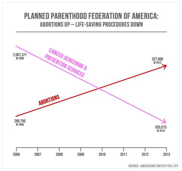
Notice that the vertical axes are not labeled. That’s because the two lines use different scaling. On the left side, cancer screening has a value of about 2,000,000; abortions, about 290,000. As you might expect, 2,000,000 is above 290,000. On the right, cancer screenings has a value of 936,000, and that is somehow below the number of abortions at 327,000. It’s also somehow below 290,000!
I am simply flabbergasted. If a student tried to pass that off to me, I’d fail them forever. That isn’t just dishonest, it is intentionally and proudly dishonest. It comes from Americans United for Life, and they are bragging about its use in congress.
Video: @CecileRichards confronted with AUL chart using data taken from #PlannedParenthood's own annual reports https://t.co/WFEXXuzIGN
— AUL (@AUL) September 29, 2015
Fuck me. No. Watch this smug asshole in action.
He’s going to check his sources and get to the bottom of it, right. If Chaffetz had any intelligence at all, he’d have looked at the graph and seen immediately that it was rank bullshit.
Those anti-abortionists really are among the most dishonest people I’ve ever met.

Abortion up 10%, cancer screening down 50%. It’s something policy makers (particularly at PP) might discuss. I assume there’s some simple explanation.
Of course if it came up in a congressional circus act it was just to drive an “””agenda“”” (GOPish for bullshit).
To take a devil’s advocate view of it, you could claim that the percentage of cancer treatments dropped by the same percentage that the abortions rose. But when you do the actual math, the graph grossly exaggerates the difference. A 54% percent drop in cancer treatments to just about a 12% rise in abortions. I wouldn’t consider that very well correlated.
A bit of brain bleach and a dose of reality: Senator Cummings exposing the pretext of the Republican agenda.
Sorry, that’s Congressman.
Whilst this graph is grossly dishonest, I suspect a more dishonest one might be one which AGW deniers were circulating some years ago. It purported to show average temperatures as unchanged, but did so by tilting the axis, so instead of looking like this / in a graph orientated conventionally like this L, looked approximately like — due to the graph being orientated like this V.
PZ–chill a little. I’m as devoutly pro-choice as anybody, but I have to say, this graph was more sloppy and amateurish than dishonest. It would only have been dishonest if they used inaccurate numbers. Did they? You didn’t say.
There’s no reference to say where they got the numbers. For all we know he made them up. I wouldn’t put it past him. Plus given confidentiality laws, accurate numbers may not be possible to get.
dam no matter what ever anyone calls that thing it is not a graph. there is no scaling and only one axis named. it does not convey any concrete information
It is an info graphic a picture meant to illustrate the position and aimed at the audience (at home “the base”) who will see it and give it credibility because it was in a congressional committee hearing
the tactic is just advertising hard sell
uncle frogy
Are coordinates numbers? Yes. This is why you can use graphs to (accurately or not, honestly or not) represent numbers. That is what they are designed to do, which happily is possible because geometry is a real honest-to-fuck field of mathematics.
Does it use these numbers honestly, or even consistently? No.
Mr Collier: You are a fucking idiot.
Also, the numbers on the fake chart are not the same as the numbers in PP’s report.
ericcollier, I absolutely disagree – it is clearly dishonest; the clear intention is to give the impression that abortions have actually outstripped cancer treatments.
Of course, if they honestly love wacky coordinate systems, why didn’t they choose one in which bigger numbers are represented on the bottom of the graph? Then abortions would be “down” and cancer screening/prevention would be “up.” That would be a totally honest way for me to represent it in a graph, right? I mean, I’ll even use accurate “numbers” with my totally honest upside-down graph. That’s what makes it okay, yes? Heck, I might even think about consistently using the same scale throughout the graph, if such things really mattered to you. But they apparently don’t. Would you like my graph more then, or less, or would you like it just the same?
It’s very telling that whenever conservatives now talk about cancer with regard to Planned Parenthood, they only talk about “mammograms.” There’s a few reasons I’m guessing are part of that. They know that PP doesn’t actually perform the mammogram in office (few OB/GYNs do because that requires a radiologist). But there’s also the “wages of sin is death” thing. Cervical cancer is usually caused by HPV which you contract from having sex. Thus, if a woman gets cervical cancer, it’s her own fault and she deserves it for being such a slvt. Ain’t no way we’re going to use that vaccine to prevent her from getting cancer in the first place.
I’m surprised that that wasn’t the immediate response to Chaffetz:
“Senator, Planned Parenthood is devoted to helping people with their reproductive health, including fighting cancer. We have a known measure that can help prevent most cases of cervical cancer as well as other cancers of the anus and throat: It’s the HPV vaccine. To defund Planned Parenthood would then cut off a vital resource people can use to prevent cancer.”
Replotted that data for you. Its here:
http://scottrobson.org/wp/wp-content/uploads/2015/09/real_graph.png
For crying out loud, ericcollier@6: if you think that using real data excludes the possibility of dishonesty, then maybe you’d like to buy Brooklyn Bridge. It’s going for a song. As you know, it’s a real bridge. (Plus, as PZ points out, the data was wrong too.)
I’m feeling generous. I’ll even fill in the gaps if there’s some actual data, instead of drawing a line between two widely separated points. Still upside down and using any other shenanigans I want. But with the right numbers, sort of…. you know, to keep me honest.
Oh, and PP does do Pap smears in office.
Anyone who thinks that plot for congress was not a deliberate attempt to deceive has to accept whoever made that graph is unaware of what numbers actually mean.
@12 opposablethumbs
Who is it supposed to fool though? Are your congressmen stupid enough to be persuaded by such a thing?
The childishly comic presentation of the graph is dishonest.
@19 nomadiq
Well, either the creator is unaware what numbers actually mean – or the creator expects the audience to be unaware what numbers actually mean. I’m not sure which alternative is worse.
@20, erik333:
Yes. Why do you think they made it?
And it’s also to deceive the voters who saw it who certainly didn’t pay attention to the numbers on it. They just saw a graphic that showed abortions are now more common than cancer screenings.
After all, 97% of what Planned Parenthood does is abortions, as another congresscritter once said.
Do you really think that was a mistake?
Cross-posted from the Moments of Political Madness thread.
Here are a few more telling details related to the hearings that Congress held today concerning Planned Parenthood.
http://www.msnbc.com/msnbc/planned-parenthood-president-grilled-hill
Cross-posted from the Moments of Political Madness thread.
As Republicans in the House of Congress try to defund Planned Parenthood, with threats to shut down the government if they don’t get their way, one of their major talking points is that there are thousands of already-existing clinics that could replace Planned Parenthood. That talking point is a lie, patently false, easy to disprove.
Yes, there’s a list of 13,540 clinics, listed by state, that the Centers for Medicare and Medicaid Services (a branch of the Department of Health and Human Services) put out. Most of the clinics listed do not have a certified OB-GYN on staff. They do not have the expertise, nor in most cases the medical equipment, to provide reproductive health services for women.
Many private clinics do not take Medicaid patients. About half of Planned Parenthood patients rely on Medicaid.
“my congressmen”? Hard to answer that, seeing as how there is no congress here.
Gosh, it’s OK to give data dishonestly, in as deliberately misleading a form as possible, just as long as you do a cack-handed job of it now?
The intention is to mislead. The presentation is dishonest. And nobody in the world ever spent a single dollar on advertising, because we all know advertising never ever sways anybody either consciously or subliminally or any combination of the two.
The only thing one can assume from this graph are four numbers exist. By drawing lines it implies these are consistent trends. They may be. I’m a bit surprised cancer screenings are down by 50%. But they may not be and the numbers vary year to year. That one year has 10% more abortions than another year is utterly meaningless by itself. The 50% difference in screenings is odd but may or may not mean anything as there are only two numbers. To super impose them without a common scale implies abortions have overtaken screenings. They haven’t and this dishonesty has pz in fits. I guess, I’m not particularly shocked. Exaggerating scales by a narrow focus to make a tiny range seem huge is so common (and so fucking wrong; and this does that too) that this just seems the same.
Actually it is okay to have two scales on the same graph if one realizes the comparison is now a proportion so this would say, if the rest were accurate, abortions passed a certain percentage of screenings. But as the initial base points a skewed we can’t. We’d have to say abortions above any arbitrary base amount surpassed a certain percentage of screenings above another arbitrary base point. And that’s pretty fucking meaningless. And as we only have four pieces of information… well, this is nothing.
Cross-posted from the Moments of Political Madness thread.
Planned Parenthood President Cecile Richards testified before Congress. Pity her.
The disrespect that Republican members of the house showed Cecile Richards is off the charts.
http://talkingpointsmemo.com/livewire/jason-chaffetz-cecile-richards-hearing
Scroll down to watch video.
ericcollier @6:
wrong!! That is not the only way to be dishonest. Yeah the honest numbers are on the graph, Yet the presentation qualifies as “dishonest”
Look at the graph, in the OP.:
(1) – 327,000 > 935,573
(2) – 935,573 < 289,750
explain where you see any kind of honesty there.
One graph I got a hoot from: as an argument for why I should vote my 100 shares for the compensation package of the directors, they plotted CEO pay versus stock price increase for a bunch of companies. No correlation whatsoever. Then they plotted the diagonal, to give the impression that returns increased linearly with pay.
It’s called “pious fraud”. They feel their cause is a righteous one, so absolutely anything goes.
There is difference between evidence and propaganda, exemplified by this chart. Fact checking. Which those Rethugs looking at the chart didn’t do, as it appeared to show what they wanted to hear, and thus they didn’t ask what the real facts were. Then they ended up with egg on their face when Richard’s lawyer recognized the source as a bunch of religious liars for Jebus. The retort by Richards was newsworthy.
Mammography probably did decrease in the given period by a huge amount due to changes in guidelines between 2006 and 2013. Under revised guidelines mammography screening begins at age 50, instead of age 40, and continues to age 75 (no specific end guideline before). Planned Parenthood affiliates don’t do mammograms (although they do give referrals).
As to the increase in the number of women who had abortions that were medically appropriate (as decided by the patient and a competent consulting physician, which is the only standard that counts according to the US supreme court): all of them. Which would make any increase (if there really is one) a good thing!
That being said, the increase may not actually be real.
Increase in number of abortions delivered by Planned Parenthood affiliates between 2006 and 2013: 9%. Increase in the number of healthcare center affiliates of Planned Parenthood in that period: 11.4% (most of them large). Increase in the US population in that same period: 6%. Increase in the number of women for who have medical insurance that covers the cost of abortions: more than 6% (anyone?). Increase in the number of women who get to choose what medical procedures are in their own best interest without interference by misogynistic controlling men who base their morals on bronze aged superstition: uncertain.
@33
Richards did indeed cite change in policy for the change in screenings. I imagine if we had the data year by year we’d see a single precise drop in the year the policies went into effect.
ericcollier @ 6;
In addition to the point made by various other commenters that it is eminently possible to mislead with accurate data depending upon how it is presented, and that the lack of a labeled vertical axis here allows the forced birthers to disingenuously pretend that abortions have outstripped cancer treatments, there is another, if anything even more problematic element at play.
Look at the graph, and try to do so without an analytical, mathematician’s eye. Consider that, to the layperson with little understanding of mathematics (and especially to a person already primed to oppose abortion and any expression of female bodily autonomy as morally offensive and ‘ungodly’), the general shape of the graph and the labeling of the coloured lines has been constructed in such a way as to imply that, as abortions have risen, cancer treatments have experienced a commensurate fall, and that there is a causal link between the two phenomena. That somehow those additional abortions have prevented cancer treatment from being made available to those who need it.
This obviously makes no rational sense, but this kind of propaganda isn’t about sense or reason, it is about rallying one’s knee jerk, misogynistic base and manufacturing outrage about ‘irresponsible sluts’ and their access to abortion services (and remember that in the twisted worldview of the forced birthers abortion = child murder) preventing innocent (or at least innocent when it suits the forced birthers – as noted by others, sufferers of cancers linked to HPV do not have the veil of innocence extended to them) cancer patients from receiving the treatment they need, thus making women who have abortions ‘murderers’ twice over, don’tchaknow.
This type of manipulative lie through mathematical equivocation can gain wholly unjustified momentum in the toxic brew of patriarchal politics and religiously mandated sexism, and when it is used to further erode women’s access to reproductive healthcare women die needlessly, and that is reason enough not to ‘chill’. That should be the takeaway from all this; graphs like this one contribute to the support for policies that kill women. Arguments over whether it is fair to call the creation of graphs like this one dishonest (just for the record – it is entirely fair) because the actual numbers used aren’t faked is neither here nor there.
Yes. The drop in cancer screenings was a result of those changing standards. It was found that too many false positives were resulting (as proven by Bayes’ Theorem, incidentally), so that in fact less medical harm results from dropping cancer screenings considerably. This was a universal policy change, BTW. All medical organizations would be adopting the same standards, not just Planned Parenthood, and the recommendations came from government agencies and top medical societies.
These reductions included raising the age of first breast cancer screen by ten years and reducing its frequency and no longer even doing it after age 74 (since breast cancer takes far longer to kill you than expected lifespan at that point), but also the frequency of cervical cancer screening (both of which changes started in 2009).
The new standards for cervical screening cut recommended rate to one third; for breast screening, to one half. So an observed reduction of one half overall is not unexpected, particularly as cervical screening was more common to begin with (that had been the annual pap smear).
And yes, not mentioning this, is lying.
if your raison d’être is to fight the great evils of Satan and the facts about your declared foe do not match the picture of evil you believe to be true you obviously feel free to bend the facts to match the black and white story you are selling or so I am learning by their example,
uncle frogy
That’s Graphwang!
Screening changes for both cervical and breast cancer occurred in 2009, you say? Oh look, the graph begins in 2008. What a surprise.
Hey, maybe they think it’s an honest graph.
Maybe they don’t realize that 300,000 is less than 900,000.
Man, this graph feels like an onion! So many layers to it:
-The units are not defined. For all I know it could be dollars spent on the activities (the more feasible alternative) or number of procedures or something else entirely;
-Supposing it is the quantity of cash spent on these activities and that abortions did in fact sap resources out of screenings, it could only account for roughly 3,5% of the loss AND the expense on abortions would still be much smaller than that on screenings;
-As any person with more than one neuron will remember, correlation doesn’t imply causation;
-And if Mr. Chaffetz is concerned with the amount of available cash to screenings, shouldn’t he be asking for MORE funds to Planned Parenthood?
-Not to mention the underlying presumption that abortion is something negative.
To his credit, at least he cited the source, I suppose!
@ sunburst #42
No he didn’t. He claimed that he got it from Planned Parenthood, when it actually came from Americans United for Life. It was Ms. Richards’s lawyer who pointed out who the chart actually came from.
@6 ericcollier
Three of the four numbers are accurate according to the planned parenthood annual reports available online. The number of abortions performed in 2013 according to those reports was 327,653 not 327,000.
Without more detailed and honest data than AUL/Chaffetz provide, I can’t say for sure – but we do know that during the interval cited many state legislatures increased abortion regulations in multiple ways that did little or nothing for better care but drove a lot of smaller independent clinics out of business.
Many of the patients who would have gone to those clinics surely turned to Planned Parenthood; quite possibly enough to raise the overall number of procedures at PP by 10%.
I watched Philomena on Netflix over the weekend. Right to lifers seem pretty tight with human traffickers. Baby sellers could be a better name for them. The amount of money that exchanges hands to adopt a child is staggering. I know people that paid $25,000 each for their foreign adoptions. Many adopted kids are freely traded away to child molesters and traffickers. It wouldn’t seem be too hard to make a video of people offering money for a baby at one of the so called pregnancy crisis centers.
nomadiq #15
That is a very good graph.
@microraptor
Forgive me, I was looking only at the graph. Can’t these guys even cite the correct source? Strike that one out of the record.
If you are going to make a chart with two different scales (rarely a great idea, but sometimes necessary), the absolute least you can do is make them proportional to each other. Failure to do even this is generally intent to deceive, as far as I’m concerned.
The entire hearing is nonsense anyway. This isn’t about anything Planned Parenthood is doing or even accused of doing. This is an excuse for conservative politicians to grandstand so that they can show their constituents how seriously they’re taking the abortion thing, and so they can justify new anti-abortion laws. They don’t really care what PP is doing, or even what the actual accusations are.
Citing the correct source would make them look bad.
Well I’m up here in Canada and I may have misheard something but I believe Planned Parenthood doctors actually do no abortions at all, they simply refer women to clinics that do. If so the abortion figures given are actually an out and out lie.
I am confusion.
Ok, so they didn’t label the axes, or use a consistent scale on each line… but those lines are perfectly straight. Are they just drawing a line between two data points? Does the data for the intervening years show such an incredibly steady rate of change for both that it’s reasonable to just draw a straight line between the two points? Or is this essentially just statistical noise? Is it just me, or does the abortions line, even assuming the consistency that would justify the line, read an awful lot like it would be an almost straight line on a graph with consistent scales? Assuming the consistency that would justify the line, is the reduction in cancer screenings a deliberate thing, a coincidental issue stemming from availability elsewhere or something similar, or is it a result of the targeted gutting of planned parenthood clinics over the last few years?
Embodiments of bewilderment wish to be informed!
Also, since I’m asking questions, how do any of these people have jobs? I mean, seriously, we expect politicians to be economical with facts, it’s apparently sadly unavoidable, but how do people who are outright deceiving the electorate manage to retain their position? Is that not an impeachable offence? If not, why not?
Haha, wow, that’s amazingly blatant.
@53
It’s a graph that shows four numbers. The only thing we can honestly derive from it graphically is that there were fewer screenings in 2013 than 2008 and there were more abortions in 2013 than 2008. Anything else including scale and progression absolute or relative change can not be determined. *four* numbers. Just forget it. *sigh*
Since abortion is my beat, I decided to go in-depth on this graph. The nut of it:
Oh, and here’s an honest infographic about Planned Parenthood, using the same data. Share away!
ericcollier
Bullshit. A graph, a chart, a diagram are tools used to convey information quickly in visual form. A graph like this is supposed to show you how two variables developed in comparison to each other without having to look at the exact numbers. What I ant to know from such a graph is
-what went up
-what went down
-Is there a correlation?
Using different values on the Y axis (better said, none at all) to make it look like there was a huge increase in one and a huge decrease in the other and that an actually Lower number looks higher than the other number is dishonest.
You CAN Also be totally dishonest by using accurate graphs with accurate numbers by cherry picking your time frame, as AGW deniers love to.
+++
But if you ever need any video demonstration of “man interrupting woman”, just bookmark this.
A few things to note about the changes in cancer screening:
The recommendations for cancer screening have changed in the last decade. HPV testing makes it possible to screen for cervical cancer once every 3 years for low risk women rather than annually. Mammography is controversial in women age 40-49 now, whereas it was pretty standard a decade ago. Thus, one would expect the number of cancer screening cases to go down as the recommended number went down. All that proves is that PP is following the standard of care for cancer screening.
Abortions at PP may well be up because there are fewer and fewer places willing to provide abortions. A friend of mine who is an OB regularly gets death threats because she provides abortion. Not everyone is willing to put up with that sort of thing. Not to mention all the Catholic hospitals that are not allowing abortion in their facilities.
And dammit, PZ, how did you manage to find something that pushed ALL my buttons at once? Between the sexism, abuse of data, arrogance, and self-interested self deceit of this guy I’m thoroughly pissed off. (Yeah, yeah, I know, universe, me, not epicenter and all that but damn.)
“cancer screenings”
how much do you want to bet that “cancer screenings” has been selectively defined to include mammograms but exclude other services PP provides? there has been a huge move away from mammograms, which may do more harm than good with so many false positives (not to mention the added radiation exposure).
i’m sure phrenological exams are probably down too.
#35
What’s more, it doesn’t even have to fool anyone for long. Just long enough for them to vote on the legislation, and poof, doesn’t matter any more.
#39
Win.
#40
Another very good point. Gosh, my doctor is providing me worse care now, because I only have to get pap smears every three years instead of every year! My rate of cancer screenings just got cut by two-thirds! Oh, wait, that’s because the guidelines changed and it turns out that every year is unnecessary overtesting.
#42
Also very good point.
#60
Also this!
That concludes Carlie’s thread highlights.
Being a fan of perfectly straight lines, I especially like how the increases and decreases were exactly the same each year.
That graph was a monstrosity – who did the science behind it, Ben Carson?
ericcollier, #6
Line 1: Number of violent movies ericcollier has seen over the last decade
Line 2: Number of violent crimes in ericcollier’s city over the last decade
Are those trends *really* straight lines? Or are there only 4 data points on that graph? Where is the rest of the data?
How dare you say this graph is dishonnest?
If you all had looked well enough, you would have noticed that the two lines cross in december 2009, the 10th to be precise, which is the day Barack Obama accepted the peace Nobel prize. It can’t be a coincidence!
corwyn
I’m sorry ma’am, the dog has eaten it
This an elementary example of how to lie with graphs.
Yes, there are only two data points for each line. The lines are just a line of best fit for the beginning and ending data point. Data in the intervening years is simply ignored.
What is that data?
http://www.plannedparenthoodrx.com/annualreport/report-04.pdf
http://liveaction.org/research/wp-content/uploads/2011/06/2005-2006-Planned-Parenthood-Annual-Report.pdf
http://www.mdrtl.org/files/PP_AnnualRpt08_vFinal.pdf
http://liveaction.org/research/wp-content/uploads/2011/06/2009-2010-Planned-Parenthood-Annual-Report.pdf
http://www.plannedparenthood.org/files/4913/9620/1413/PPFA_AR_2012_121812_vF.pdf
http://www.plannedparenthood.org/files/7413/9620/1089/AR-FY13_111213_vF_rev3_ISSUU.pdf
(I am providing some extra years before 2006 as well to see what happens)
Year Cancer Screening Abortions
*2002: 1,062,727 * 230,630
*2003: 921,451 * 244,628
2004: 2,157,849 255,015
2005: 2,610,069 264,963
2006: 2,007,371 289,750
2007: 1,900,850 305,310
2008: Cannot find.
2009: 1,830,811 331,796
2010: 1,596,741 329,745
2011: 1,307,570 333,964
2012: 1,121,580 327,116
2013: 935,573 327,653
*Document from this year had different format. Added up cancer services manually, could not find data for pap tests or HPV tests.
As you can probably tell….not a straight line. (For abortions, at least). Though I will say that it does not appear to be the case that he deliberately cherry picked the years to look the worst that he could find. So there’s that.
So we have:
Using two random data points and presenting it as a linear trend.
Using two different scales for the different lines to make abortions seem bigger.
Not displaying the scales.
Selecting only “cancer screening services” as the ONLY basis of comparison when there is a reason why such services dropped.
The only way it could be more dishonest is if he had deliberately cherry picked the years to use. Or to make the absolute most dishonest chart ever, they could have also used completely different years in the comparison.
And the spaces got eaten so now my numbers are unreadable. Joy.
Chaffetz began proceedings with a weepy statement that his parents died of cancer, and maybe if the money given to Planned Parenthood had been used for cancer research they would have lived. It made me wonder what his voting record on defense spending and the Iraq war is. You could fund a lot of cancer research if the US decided it could do with one less aircraft carrier and its associated aircraft and escort warships. (Chaffetz is probably the kind of guy who would bring up the fact the US Navy has less warships than in 1917, ignoring the fact today’s warships can do the work of several 1917 era ships.)
Owen@40
It starts in 2006. Were you assuming no-one would look at the graph?
289750 > 935573
Terrence Howard’s been busy.
@nomadiq #15 – You may like this one even better:
http://www.motherjones.com/files/blog_pp_other_abortion.jpg
I’m not so sure about that. Who knows, maybe they (congresscritters don’t research shit, especially belligerent goons like Chaffetz) didn’t even try to get data for all of these years, and I don’t know what would count as deliberate cherry picking to you. But just look at cancer screenings:
2002: 1,062,727
2003: 921,451
2004: 2,157,849
2005: 2,610,069
2006*: 2,007,371
…
2013: 935,573
Sure he could’ve made the decline appear bit larger (and of course steady and linear, because fuck it) by selecting 2004 or 2005 as the first point. However, selecting 2002 or 2003 would’ve told a very different story: a very small decline or even a very small increase. But that’s not what you want to show people. And unless you pick 2009-11 (possibly 2008), you could still show abortions going up, using any of these points. So that’s totally arbitrary here, because you’re not going to represent any of it honestly in the graph anyway.
Besides, whatever the numbers looked like, if all of the data’s easily available, it sure is cherry picking to leave out most of it (intentionally or not). You’re making it way less informative than it could be, and it’s hard to imagine there’s any good honest reason to do that.
*People keep repeating “2008” in this thread, but the pseudo-graph shows 2006.
But obviously those are also the two years when you added things up yourself. It’s a pretty big jump from 2003 to 2004. Sure you didn’t miss a whole lot of something? Or what caused the figure to suddenly double — they introduced new services, increased funding for stuff they were already doing, new policies went into effect, new health research…?
Thanks for that data. I added the amount of funding they receive from the government and graphed everything:
https://i.imgur.com/zj0VBO1.png
Damn the x-axis got chopped off.
My bad – misread the graph, it does indeed start in 2006. Obviously I need to clean my glasses. Sorry for confusing the thread.
@80 because 2006 makes the graph so much more professional and legit?
Owen@80
Yeah, I misread your comment (I thought you were suggesting the changes occurred before the graph started when you were pointing out the trick they probably used, just with the dates shifted), so I guess we’re even?
dout
If you wanted to show percentage (fractional changes) honestly then you should use a logarithmic scale. However, i expect the concept of a logarithmic scale would be forever beyond the understanding of the typical Rethug congresscritter.
ugh. The ONLY hint of “justification” for such a graph is to show one value rising while the other falling, over a specified time period. So vertical axes and scaling (and background grid) are irrelevant. Plot one set of values on one transparent slide, plot the second on a second slide, overlay the two transparencies, viola –> PPTslide.
The point gets completely confounded by trying to analyze the lines as being on a single grid. To which I call the graphical form of GishGallop: “All 4 points are the actual values of those quantities, Q.E.D. , chart is accurate.”
, [paraphrasing] House Oversight Committee Chair Jason Chaffetz