If you like numbers and charts and stuff, you’re going to love FredBlog! [fredblog]
.. and GeoFRED!
FRED Blog is new charts every day, drawn against the FRED database, with explanation of how they were constructed and an opportunity to customize them. It is a mini masterclass in representing data.
GeoFred [GeoFRED] is the same sort of thing, but with lovely geographic data to index against:
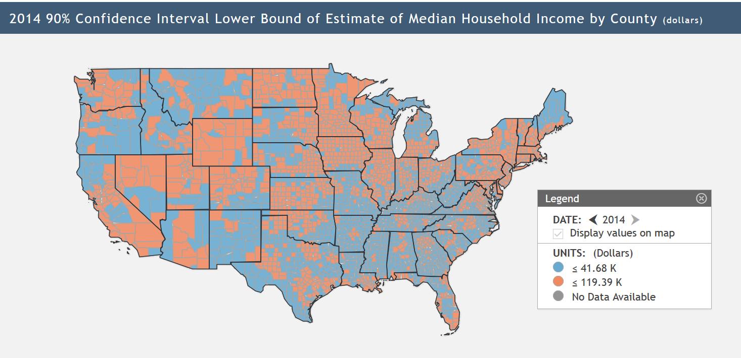
The maps are all dynamic and the interface is beautifully designed. Click on a region and it’ll show you a pop up of the different data sets FRED has for it.
You can sign up for an email newsletter and get this kind of data-rich goodness in your in-box automatically.
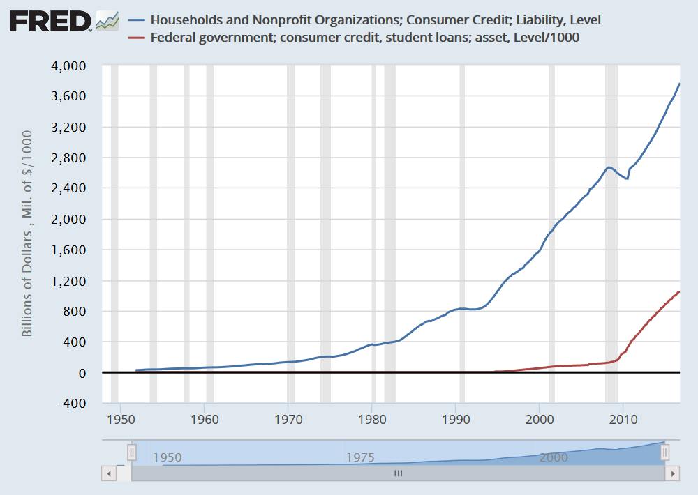
My mad animation skills
The chart above took me more time to animate in photoshop (I just did two renderings of the data, overlaid them, and did a blur transition in imageready)
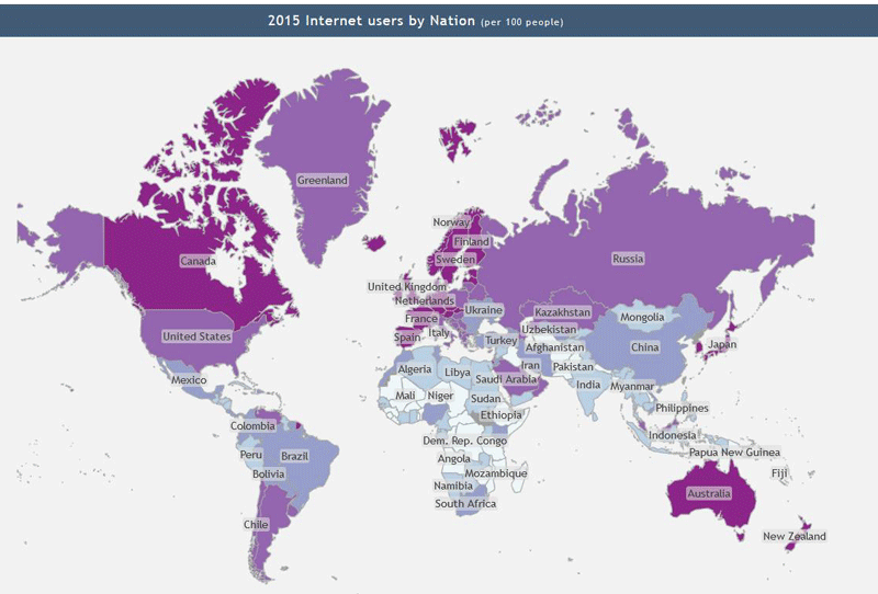
Those “maps” of the United States of America that have a straight ( or curved) line at the 49th parallel are stupid.
Chigau@#1:
I don’t understand. Is there a problem with the maps?
Marcus
Just a personal thing. I often use maps to navigate. I hate “maps” that show a river or a mountain range or even a road, disappearing at a political boundary.
Marcus Ranum @ # 2: Is there a problem with the maps?
Mercator projection: Greenland is not larger than Africa. (Admittedly, if that’s what you have to start with, moving the data-colors to a different format would provide hours of aggravation for the whole family.)
No scale: just how big is the difference between lavender & magenta, f’rinstance? And no explication – should we conclude that the less internet people have, the more time they spend making babies?
chigau@#3:
Aha! Thank you for explaining.
I think maps would be better without political scribblings on them, but I’m afraid that would just encourage politicians to be more grabby.
Pierce R. Butler@#4:
And no explication – should we conclude that the less internet people have, the more time they spend making babies?
I don’t know. I was just trying to illustrate what you can do with FREDmap in 2 minutes. It probably says more about poverty and access to contraception. I was not trying to illustrate anything in particular so I didn’t include an explanation.
chigau, Why is this a problem? It’s clear from watching US weather reports that weather only happens in the United States and in countries the US is at war with at the time. Why should any other geographic features cross national boundaries?
timberwoof
re: weather
Not so.
I have seen any number of US weather reports that blame shitty weather on “Canadian” High (or Low) Pressure Systems.
chigau@#8:
I have seen any number of US weather reports that blame shitty weather on “Canadian” High (or Low) Pressure Systems.
Trump demands apology for Canadian weather: “Its bad. Really bad weather. I know weather and I’m smart and this is really bad stuff.”