In the case of the Spanish flu pandemic of 1918, most of the deaths occurred during the second wave of the disease that occurred towards the end of that year and it was feared that the current pandemic might follow a similar pattern. That fear may be coming true. This graph tracks the number of new confirmed cases per week in the US for the current pandemic.
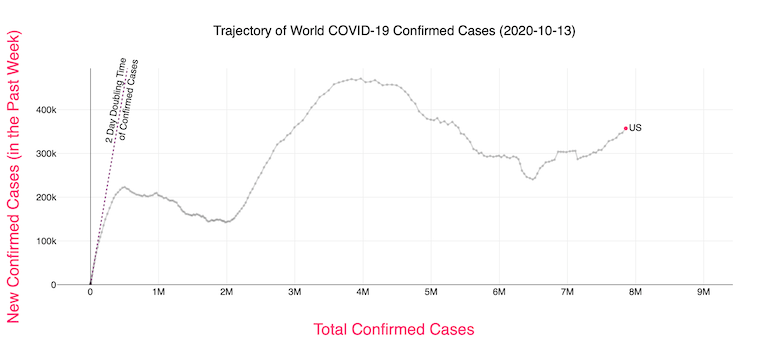
The graph shows how the curve in the US reached the first peak of 223,000 on April 10th, then dipped a little before shooting up to 471,000 on July 22, then falling again to 240,000 on September 12, and is now steadily rising again, with the current value at 366,000, well above the first peak level back in April. If one ignores the small first dip, then we are now in the second wave. Otherwise we are in the third wave. (What I have shown above is a screenshot taken from an interactive dynamic website. To get a graph, dates, and numbers for any country, you need to go to this website and select the country and the linear scale.)
In the case of the UK, the first dip occurred on July 3 but has skyrocketed since then, with the current value at 111,000, way higher than its first peak value of 34,000 back on April 10.

France and Spain show patterns similar to that of the UK.
As a whole, the number of cases in Europe is rising faster than in the US. This graph shows that yesterday marked the first time when the average number of new daily cases (per million residents) in Europe has equalled that of the US.

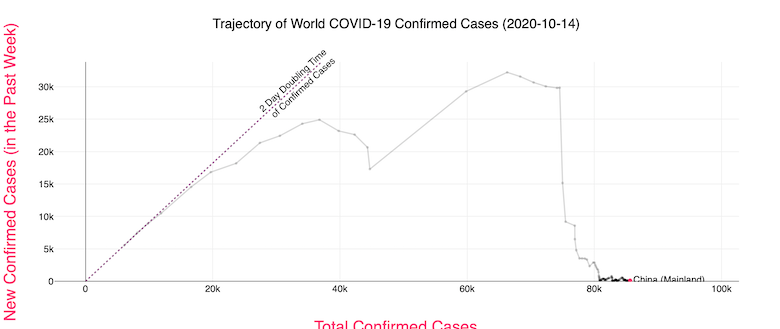
Compare this to China which had its first peak of 32,000 cases per week back in February 14 before dropping to almost zero by March 24 and staying there.
If one wants to see at least a little silver lining for the US (if one could even call it that), we can look at the number of confirmed deaths. After the first peak of 16,000 per week on April 24 it dropped to a low of 3,600 on July 6 before rising again to a second peak of 8,000 on August 1. It now seems to have plateaued at about 5,000.
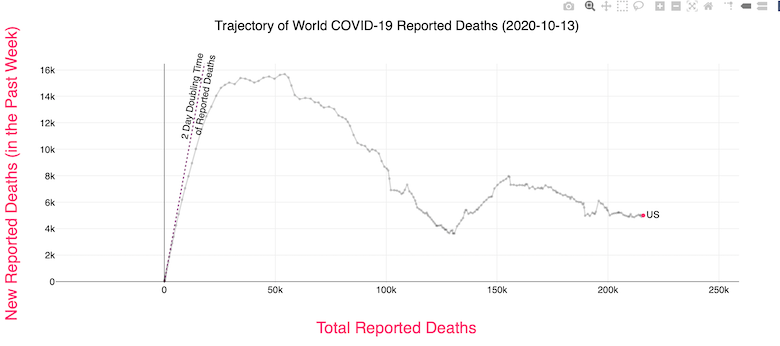
While the fact that the death rate in the US is not rising is something, a plateau is simply not good enough. At that rate, we would have a total of 300,000 deaths by the end of January. We have to bend that curve down quickly.
Meanwhile the Wold Health Organization has issued an ominous warning that within months the number of cases could rise to as high as five times the peak we saw in April. That would be terrible.
The graphs are confusing. One expects the X-axis to be time, but it’s not. While it’s a parameter that is likely to be monotone non-decreasing, so it’s a function of time, but it’s more like a time integral of the Y-axis values.
Also, some corrections: in the US, we have at this point over 8 million total cases and 222 thousand total deaths. (https://ncov2019.live/data)
According to https://globalepidemics.org/key-metrics-for-covid-suppression/, we are at around 50,000 new cases per day, and rising. Since there’s a time lag between diagnosis and death, I would expect the death rate to rise in a few weeks.
Maybe statisticians define a rise after even a minor dip as a “second wave”; to my non-mathematical eye, it looks like the US infection rate remains in its first wave.
I don’t even get what the point of this talk about “waves” is supposed to be, other than to get people to take things less seriously when one seems to have passed. “Journalists” need “good news” to “report” every now and then, but very often they’re just scraping the bottom of the barrel.
I don’t know how many times I’ve had to tell people since March/April that the thing’s not even close to done, and it won’t be in six weeks or six months, so get used to it. They have thoughts and prayers that I’m wrong, and I very sincerely don’t give a shit. They’re not Trump voters or science deniers or anything of the sort. They don’t know what to believe (anymore if they ever did), and it’s very hard to shake that out of them.
The decline from the middle of April to the middle of June certainly doesn’t look like much to me, compared to the rest of the picture. Besides, falling to “only” 140-150k in early June obviously didn’t mean we could conclude it’s not such a big deal anymore. That’s what we were dealing with around March 31 or April 1, mere days before the April 10 “peak” (but really, as mountains go, it’s more like a hill). So if people weren’t freaking the fuck out in either or both situations, then I just don’t know what the hell they were thinking.
Allison:
Well, it’s not just “likely.” It must move to the right or stop where it is, since there can’t be a negative number of new confirmed cases per week. How quickly it moves to the right is a function of how high that figure is above zero. But going left is impossible.
On the site, it does display the dates above and below the charts (dynamically/interactively). Also, you can do a mouseover with any point on the graph to get the numerical values.
What happened in Australia around August 1? I want some of that, pronto.
The UK figures as usually presented are highly misleading. The number of new infections is most emphatically not higher now than it was back in late March or early April.
The reason for this is that these are absolute numbers of positive test results, not positive results per test done. The testing capacity we had back in March/April at the first peak was around 50,000 per day, when we were getting something like 5000 new cases per day. Now we’re running about 250,000 tests per day and getting about 15,000 new positives. So it’s more like 3/5 of what it was back in March than three times what it was.
Which is still worrying, of course. We need to take more action. But it’s not as if we’re in a worse place now than we were in March -- that’s simply not the case. I don’t know whether the picture is similar for the other countries of Western Europe -- France, Spain, Italy, Germany -- but I suspect it probably is.
I think it’s better to say we just don’t know how many cases are or were unconfirmed/unreported. I don’t think it’s safe to assume that the actual rate is proportional to the number of tests, so I wouldn’t be most emphatic about that.
Your priors should more or less be that viral outbreaks spread and grow (in reality, not just what we happen to detect/report), and they don’t decline without a good reason. I haven’t followed the situation in Britain super closely, but my impression is that you Brits haven’t (yet) given the virus a good enough reason to leave your shores. (Have you tried telling the viruses that you’re British and that you deserve better?) It probably has grown, but like you’re saying, it may not be by the amount that the “confirmed” figures would suggest. In other words, it was always sort of bad, maybe worse than some realized or wanted to admit, but that’s different from saying it’s actually better now.
Also, looking at it from a different angle, counting tests isn’t counting people. Some have been tested numerous times — pro athletes, politicians and various flavors of rich folks are some examples that come to mind for me — while others have not been tested at all. That fact remains, even with increasing numbers of tests, because the distribution of tests is correlated with various social/economic factors like that. Sometimes, it’s because people are asymptomatic, sometimes because they can’t/won’t go to a doctor, sometimes because they think it’s something else…. In the US, it’s certainly a worse problem — we’re seriously in desperate need of universal healthcare — but I’m sure for you there’s still a fairly big gap between those who get tested multiple times and those who get tested zero times.
Number of deaths seems to me to be he best measure.Or maybe the number of excess deaths over expected should be looked at.
I have friends who are low level healthcare workers who have been tested dozens of times. Positives as a proportion of total tests is close to meaningless at this point. I have had one test, the day before my son was born. If it were not for that event, I wouldn’t have been tested at all. Here in the UK, the pattern of testing has changed drastically since March. Then, people WITH symptoms were being shipped off out of hospitals into care homes WITHOUT being tested. People were paranoid, but couldn’t easily access testing. Now, frankly, a lot of people I know are… well, bored with it. They wash their hands, mask up, keep their distance, but fatigue and a complete lack of faith in the government are leading to people pretty much ignoring the specific advice/instructions/laws. Oh, I can go to work but I can’t go into my neighbour’s garden? Fuck that. I can go to the pub but I can’t see my mum? Double fuck that. I can’t take a trip outside my county but the PM’s chief adviser can, and when caught doesn’t lose his job or even apologise? Fuck with a side of ALL that.
Best of a bad bunch. I’ve not seen (and I have looked) any reliable data that indicates we can even trust the figures on deaths. There are numerous anecdotes (yes, I know) concerning the three confounding cases:
1. people who die of something else (e.g. cancer) following a positive Covid result.
2. people who die of Covid but don’t get recorded as such because they had an underlying condition (e.g. cancer) and that gets recorded as the cause
3. people who were never infected, never in danger of getting infected, but died either because the health service in their area was on its knees coping with covid, or because they didn’t seek help because they didn’t want to be a bother. Rates of death from heart attack in hospitals absolutely plummeted in early summer, for instance -- we didn’t get better at stopping heart attacks, we just made peole with heart conditions too terrified to leave the house, much less go to a hospital.
I’ve a friend who teaches epidemiology. It’s less use than you’d think, because his main advice is: we don’t know, and can’t know, even in principle, wtf is going on right now. Epidiemiology, he says, is fundamentally history. You only get to understand what was going on in a pandemic after it has passed. While you’re in it, there are simply too many variables that you can’t control or even recognise until later. We’re very much still in it, and his prediction (with a pretty low confidence level) is that we’ll still be in it for low single digit years. Perhaps no more than five, but almost certainly not fewer than three. No politician (perhaps none outside NZ…) wants to deal with that reality.
There’s also the people who got COVID and died, but either never went to the hospital or else went and were turned away. From what I’ve heard, in NYC, especially the poorer parts (whose hospitals were already inadequate), the hospitals were overwhelmed and were turning people away.
DonDueed @4, lockdown after an outbreak in Victoria.
Yep, definitely healthcare workers too. The lack of proper equipment and so forth, especially in the first couple of months, probably hit them very hard. (Is there any good data on that specific population? I don’t know.) Of course, even with better protection, patients coming to the hospital wearing their own masks, etc., healthcare workers should still be tested all the time, hopefully with a lot of negative results.
@4, DonDueed, a politician took charge and locked down a city of 5 million (Melbourne) and held his ground. That polly, one Daniel Andrews, remains resolute despite the constant barrage from conservative pundits demanding he accede to their perceived right to kill people for profit.
John, then clearly what the US needs is more outbreaks in Victoria, as soon as possible. Get to it!
Oh, right, “lockdowns.” It’s always got to be the reasonable option with you people.
cr, I’m amused at your response. As if reporting facts were somehow policy advocacy.
Here:
https://www.theguardian.com/australia-news/datablog/ng-interactive/2020/oct/16/coronavirus-australia-map-cases-covid-19-tracking-stats-live-data-update-by-state-suburb-postcode-how-many-new-active-case-numbers-today-statistics-corona-deaths-death-toll
I mean, yeah, 14 people sick out of a 6.7 million population is pretty bad.
Shoulda been more, um, “reasonable”, perhaps?
(816 out of 904 total deaths in Australia so far are in Victoria, so yeah)
Just about eveey country in Europe that enacted a lockdown relaxed it too soon and too far, without having a low enough number of cases that a test-trace-isolate system could keep them in check (as has been done in advanced countries like Vietnam, Thailand, Taiwan and South Korea). My guess is that this relaxation is the main cause of the rapid increase in cases across Europe, but that colder weather and a more contagious variant of the virus may also be contributing.
There’s no single measure that tells you how the situation now compares with that in March/April. Certainly a larger proportion of cases are being detected now than then, but as has been said above, the proportion of positive test results doesn’t tell you everything. As for deaths, the medics have got better at treating severe cases, notably with dexamethasone (the only treatment shown in double-blind randomised tests to cut the death rate), but also learning when to put people on ventilators, placing them on their fronts rather than their backs, giving anti-clotting agents…, so all that partly accounts for the lower CFR (Case Fatality Rate, i.e. what propotrtion of diagnosed people die).
Yikes. If you check that site as I write, the up trend is about to exceed the previous peak forming a new high. 🙁