Recall how climate change skeptics use the tactic of picking a year when the average global temperatures were unusually high as their starting point and then arguing that the relative flatness of temperatures for some years after that year ‘showed’ that global warming is a myth. Kevin Drum says that Donald Trump may be using that same tactic when it comes to his claims about the effectiveness of a wall in reducing crime, when he uses the border town of El Paso as an example. In his State of the Union speech, Trump said, “The border city of El Paso, Texas, used to have extremely high rates of violent crime — one of the highest in the country, and considered one of our Nation’s most dangerous cities. Now, with a powerful barrier in place, El Paso is one of our safest cities.”
Of course, as with almost everything Trump says, that is a lie.
Drum provides a chart showing crime rates in the city that seems to support the claim.
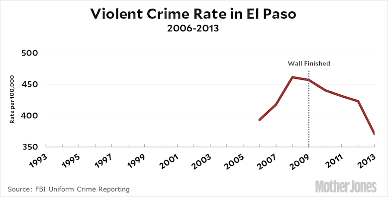
Wow, pretty dramatic confirmation of Trump’s point, no? But then Drum gives the figures going back to 1993 and we see that violent crime has been steadily decreasing since then and the wall had no significant effect.
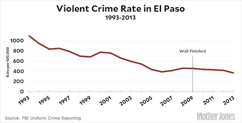
In fact, this is part of a nationwide, long-term decline in violent crime and El Paso has long been one of the safest cities in America.
The people of that city are fed up with people like Trump portraying it as some kind of criminal hellhole.
Statement from El Paso Sheriff Richard Wiles pic.twitter.com/SSqmRSWMix
— Morning Joe (@Morning_Joe) February 6, 2019
So the moral is that whenever you see a trend line, one of the things you should pay close attention to is the choice of initial and final end points because those can be manipulated to significantly skew the inferences.
How can El Paso be one of America’s safer cities? It is full of un-heartlandishly hued people? /sarc
It is also largely Democratic in politics.
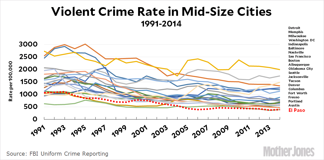
But what’s going on in Milwaukee?
I guess they just have to buck the national trend.
Flex @ 2
Apparently David Clarke was too busy pinning shiny things to his chest to do his job (I’m ignoring the horrible buck joke).
My word. I didn’t even notice that. My apologies, that was not an intended as a joke, I was just using a common idiom.
Also notice the scale of the first graph: 350 to 500. Moving the origin is another way of lying with statistics because it artificially increases the perceived change.