It turns out that when the numbers are looked at globally and on a large scale, the condition of people of the world on many different measures has actually improved over the last two centuries. The data is obtained from the site Our World In Data. There is a huge amount of data in easily digestible graphical form at this interactive site.
I have selected just one graph of how life expectancy at birth has increased from 1850 to 2012. It shows how back in 1850, life expectancy was generally low but the range was narrow, from 25 for the poorest countries to 40 for the richest. By 1950, the gap had dramatically increased from 25 for the poorest countries to about 70 for the wealthiest. By 2012, the gap had narrowed again from 50 to 85, but the number of countries with life expectancies below 65 had decreased quite dramatically.
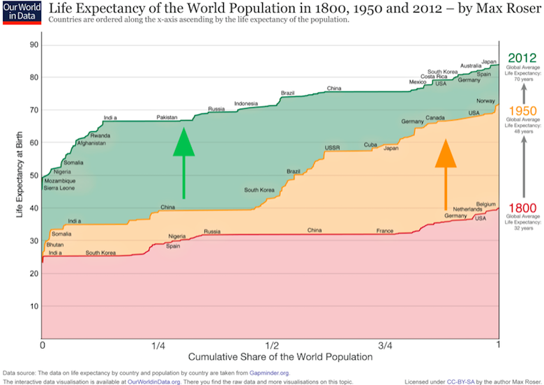
Of course, as I have said many times before, averages do not tell the whole story. Within a country, they can mislead us into a state of complacency because increased averages can mask increased inequality. But even with that caveat, there is no question that the quality of life in general has improved, with those countries that are at the bottom end of the distribution improving the most
Along those lines of “averages do not tell the whole story,” I’ve seen it pointed out that there was a lot of infant death in the past and that, if one were to adjust for life expectancy past the age of, say, 5, the averages would go up rather significantly. (Have I even seen that on this blog before???)
Actually, I decided to go to the link before posting this comment and, well, I see they addressed this, pointing out that, in the UK in 1845, life expectancy at birth was 40, but life expectancy for a 5-year-old jumps up to 55.
They also point out that maternal mortality has dropped. That is a point I did forget about.
Technically, this isn’t true; life expectancy on the low end of the score jumped about 25 years, while on the high end it jumped over 40. It looks like what really happened was the scientific revolution of the 1800’s led to a dramatic uptick in life expectancy in a few countries. This percolated around the globe such that in the present day, if you ignore 1/8th of the world, the health gap between countries is almost back to 1800’s levels. Hopefully the next fifty years will be more than enough to boost up that last 1/8th.
That has to be one on the worst-looking graphs that I have seen this year. Ninety percent of the stuff is a distraction. It’s a great example of “chart junk”.