Take a look at this logo that was designed for an outfit that was providing jazz dance classes for young people. Notice anything?
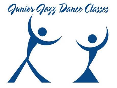
Nothing? Try focusing on the white spaces.
This was one of several logos that, on second looks, seemed to be problematic, to put it mildly.
I found the ones for The Institute of Oriental Studies and the Catholic Church’s Archdiocesan Youth Commission particularly baffling as to how they got approved.
Oh, you bet I see it. In fact, it took me quite awhile to see the intended logo.
There has to be a point where you wonder if the designer is sitting in shock that xe got away with this.
I also saw the unintended image first and struggled to see the intended. Both are nice!
Actually, I was the opposite. I had to look for the unintended image before I saw it. My first reaction was, “I don’t get it. What’s the big deal here?”
If no one had told me there was an unfortunate unintended image, I wonder how long it would have taken me to notice it on my own (assuming I was seeing the logo on a regular basis)?
I’m with Chiroptera. I didn’t see the unintended image without looking for a while at it.
LOL!
I didn’t see it until Mano’s clue, but now it is glaringly obvious. I can’t believe it is accidental.
Somebody boobed 😉
I’m calling shenanigans on that being an actual logo, let alone an accidentally naughty one. Given that “we can’t be sure where it first appeared, or where it’s from”, and that it has text saying what they’re offering but doesn’t even give a hint as to who, I think it’s more likely to be a joke instead of a real logo.
So now we exactly know who have the “dirty” minds …. like me.
As I have nothing against that particular part of the female body I think the logo beautiful.
I must really be an outlier, because even though I now know it’s there, I still have to “look for it” to see it.
So the Independent is now stooping to click bait-chasing. Next step: “you won’t believe the hidden messages in these eleven top corporate logos!”
I can think of several occasions where I’ve drawn a logo as a joke or deliberately created a ridiculous acronym, only to have it end up making it into the final product because nobody who noticed wanted to say anything. And because I have co-workers that share my warped sense of humor.
I almost got away with naming the streets of a U shaped development “Eggs” “Term” “Inate”. Unfortunately, the planning department secretary started laughing.
Are you sure the allegedly unintentional image was really unintentional?