This is an interesting comparison from David Hillis.
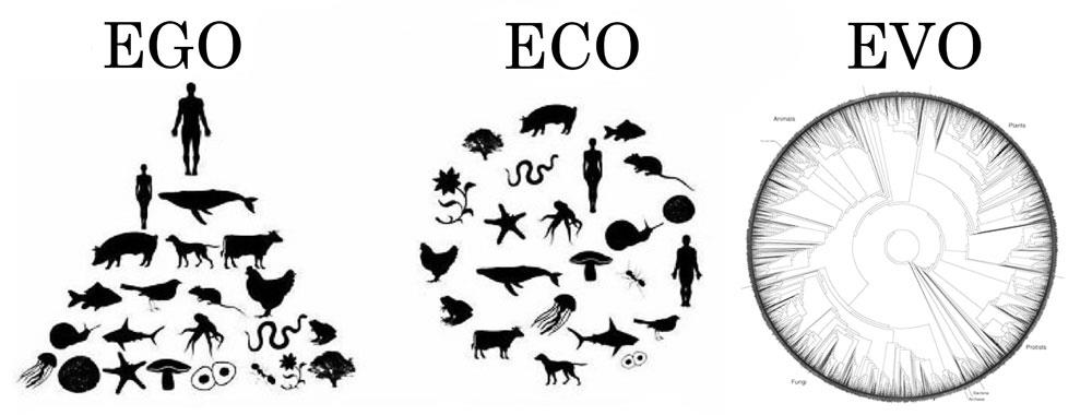
I still see a lot of Ego in the Eco diagram, since humans are the only species (out of 1.8 million species that have been described on Earth) that are represented twice, and over half of the species shown in that diagram are vertebrates like us (even though only about 5% of all described species are vertebrates). I made this version to emphasize that there is a lot of biodiversity on Earth, and all species are connected through our evolutionary history to single common ancestor. The tree shown under “EVO” represents species approximately in proportion to their described diversity, and the circular shape emphasizes that we are all equally distant from our common ancestor.
The EGO diagram is a somewhat accurate illustration of one common perspective that places humans, and especially male humans, at the top of a hierarchy…although I don’t think most people would place whales so high. Cats and dogs would be somewhere just below Noble Man, but distant animals that are rarely seen in day-to-day life wouldn’t rank so highly.
The ECO diagram is a step in the right direction, but as Hillis points out, it’s still grossly vertebrate-centric. But then, the ecologists I know wouldn’t favor that diagram, either — they’d stock it with trees and grasses and insects and bacteria and fungi.
The EVO diagram is the best of them all, but has the problem that it’s also the least easily understood and the most complicated. But then if you reduced it to a smaller number of branches to make it more graphically appealing, you’d have to choose where to prune, and unfortunately for us humans, we wouldn’t be represented at all on a fair and simplified illustration of biodiversity.

I looked before I read, and my eye went straight to EVO, glanced at the other two, and came to rest on EVO again. For whatever that’s worth.
If you prune the tree by ecological impact, I expect humans would at least show up. It’d probably be a useful representation of significance too, although working out exactly how much effect a given species has on the survival of other species sounds like a serious challenge.
if the diagrams are taken as a way to understand how we think about “nature” like “which illustration best describes nature? rank in order 1,2,3,”
I would bet that most people would rank them as they are given, most people would not even understand the EVO diagram at all.
uncle frogy
The EVO graphic looks like the cross section of a tree, which makes it all the more à propos.
Changing people’s view from ECO to EVO is like teaching people alternate forms of the periodic table. People have one way of thinking so ingrained into them that they are resistant to and unwilling to see another, even if there may be a better way.
http://www.meta-synthesis.com/webbook/35_pt/postcard.png
http://www.chemistryland.com/CHM151W/02-Atoms/Chaos/SpiralTable.jpg
#4 left0ver1under
I looked at the first, and immediately went “Oh, that’s much better than the traditional thing, it’s much more obvious how the orbital stuff affects all this, nice”. (It’s been approximately 40 years since I learned that.)
Then I looked at the second, squinted a bit, and decided that no, that one really doesn’t work. It’s even worse than the traditional table, in that it represents latter classes as exceptions to the general rule, when they most definitely aren’t.
I immediately jumped to EVO because it looks more data rich.
ECO is also data rich — the image underrepresents it.
EGO is very, very thin on data.
Wow, where can I find a super high-res version of that EVO diagram? The thumbnail is intriguing!
One or more of the three depending on the needs of the moment.
EGO has driven a lot of how we have set up our societies and is reflective of how our brains tend to function (self-referencing) so a human centered view is useful to a point. Come to think of it, doesn’t that fold EGO into EVO?
ECO is useful for how we actually fit into the the world now, and how we (and other things) fit into it at individual slices of time in the past.
EVO is useful for how we relate to all the other things I referenced in ECO, and for finding all the common denominators for how and why it is and works the way that it does.
click here
khms (#5) –
I only included two links to avoid going to moderation. There are more than a dozen (or even dozens of) different periodic tables. Each has their strengths, including the traditional table.
http://egregoralfa.republika.pl/english/newtable_p/image011.gif
http://www.academia.dk/Blog/wp-content/uploads/PeriodicTable_LIFE1949.png