I wrote this comment down on a mental Post-It note:
nathanieltagg @10:
… So, here’s the big one: WHY is it wrong to use the same dataset to look for different ideas? (Maybe it’s OK if you don’t throw out many null results along the way?)
It followed this post by Myers.
He described it as a
failedstudy withnull results. There’s nothing wrong with that; it happens. What I would think would be appropriate next would be to step back, redesign the experiment to correct flaws (if you thought it had some; if it didn’t, you simply have a negative result and that’s what you ought to report), and repeat the experiment (again, if you thought there was something to your hypothesis).That’s not what he did.
He gave his student the same old data from the same set of observations and asked her to rework the analyses to get a statistically significant result of some sort. This is deplorable. It is unacceptable. It means this visiting student was not doing something I would call research — she was assigned the job of p-hacking.
And both the comment and the post have been clawing away at me for a few weeks, when I’ve been unable to answer. So let’s fix that: is it always bad to re-analyze a dataset? If not, then when and how?
More Hypotheses = Bad?
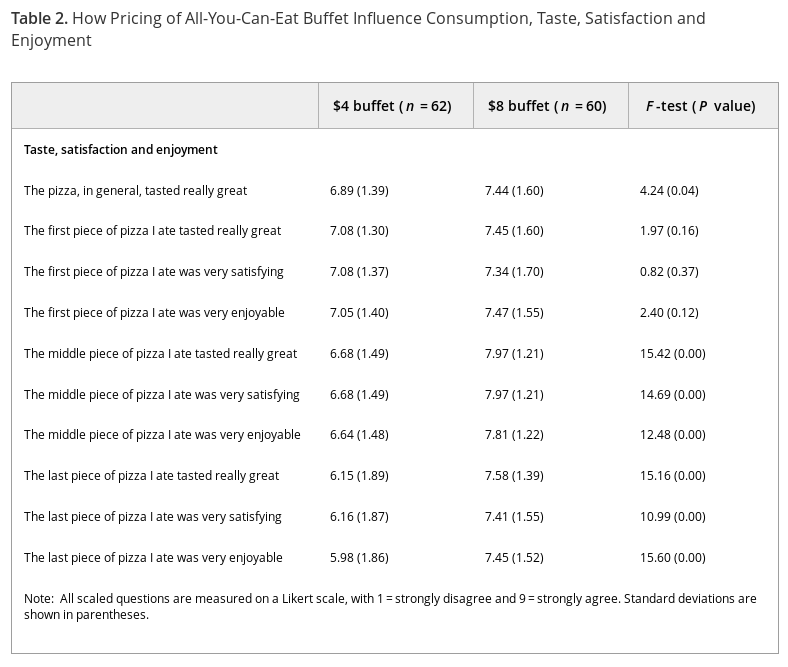
We could argue it’s always bad, because we’re evaluating hypotheses that we never considered originally. That can’t be it, though; let me dig up a chart to illustrate.
![Gender dysphoria prevalence rates, from Strang [2014]](https://freethoughtblogs.com/reprobate/files/2017/02/strang_2014.png)
The horizontal axis represents the prevalence rate, and the vertical is the relative certainty of each prevalence rate. Notice that the graph isn’t smooth, but segmented? That’s because the horizontal axis is actually discrete data. Here’s the Octave code I used to turn prevalences into certainties:
PRIORS = binopdf( linspace( 0, 1605, 1606 ) , 1605, 0.007 );
POSTERIOR_CONTROL = binopdf( 0, 165, linspace(0,1605,1606)/1605 ) .* PRIORS;
POSTERIOR_TREAT = binopdf( 8, 147, linspace(0,1605,1606)/1605 ) .* PRIORS;
Peer at the code carefully, and you’ll realize I’m testing 1,606 hypotheses at once: what is the certainty of the prevalence being 0%, given the data? What about 0.06% Or 0.62%? And so on. I then chart the relative probability of all those hypotheses, and conglomerate some of them to form other hypotheses. For instance, the hypothesis that gender dysphoria prevalence in people diagnosed with Autism Spectrum Disorder is somewhere between 0.05% and 0.1% is generated by integrating across the hypotheses that the rate is 0.056%, 0.062%, 0.068%, et cetera.
What if I was dealing with continuous data? Well, then I’d be integrating over an infinite number of hypotheses! This is how Bayesian statistics handles model parameters, it breaks them down into point hypotheses and integrates. So if the problem was purely the number of hypotheses being considered, Bayesian statistics would be hopelessly broken.
Discarded Hypotheses = Bad
Instead, multiple comparisons are where things really go off the rails. They’re easy to understand: while rolling snake eyes is rare, if you keep rolling two dice you’ll nail it at some point. Likewise, if your false positive rate is 5%, then after 14 tests there’s a greater than 50% chance at least one of them is a false positive. That isn’t much of a problem if you openly state “I ran 14 tests and only one was statistically significant,” but if you instead say “this test was significant” or even “of the tests run, one reached significance” then you’re downplaying your misses and playing up your hits.
Unfortunately, in Fisherian frequentism your false positive rate is not 5%. The exact rate depends strongly on the alternative hypothesis. Just to toss out some numbers, David Colquhoun figures p < 0.05 translates into at least a 30% chance of an individual false finding, while on the other end John Ioannidis suggests over 50% of all studies are false, most of which have multiple tests. This cranks the 50/50 line to a mere one or two trials.
How does this differ from examining multiple hypotheses? It boils down to showing your work. The hypothesis that the ASD rate in gender dysphoric children is 0.062% is nestled next to 0.056% and 0.068%, both of which have roughly the same likelihood and are worthy competitors. But take away the chart and only report that 0.062% was the maximal likelihood, and we’re left with the false impression that no other hypothesis can compete.
All those hidden comparisons would be bad enough if they were buried in the Methodology section, but more often than not they aren’t published at all. This warps the scientific record into looking more solid than it actually is. Myers should be more angry about the findings that weren’t published than the findings that were!
To work an example, let’s dig into one of the four studies that came out of Wansink’s failed dataset. Here’s part of the methodology:
Diners served themselves pizza, salad, pasta, breadsticks and soup, and could return to the buffet as often as they wanted. The modal number of pieces of pizza taken was three. As diners completed their meal, they were intercepted after they paid at the cash register following the meal, and each was given a short questionnaire that asked for demographic information along with a variety of questions asking how much they believed they ate, and their taste and quality evaluations of the pizza.
So diners had the choice of five foods, but only their opinion of one was recorded? Strange, especially since in another paper that uses the same dataset they admit to tracking more than just pizza purchases.
As illustrated through Fig. 1 and Table 2, males dining with females consumed significantly more pizza (F=3.26, p=0.02) and more salad (F=2.16, p=0.04) than males dining with males. These findings reject hypothesis 2 and fit with hypothesis 1 since males “eat heavily” when their company — or audience — includes females, and, to the extent that salad tends to be more healthy than pizza, it is visible in the first column of Table 2 that males eat more unhealthy and healthy food in the presence of females. In contrast with these patterns, the sex of a female’s eating partner did not significantly influence how much pizza and salad was consumed.
Did the researchers ask diners to rate multiple food items, but fail to mention the non-pizza items? That could change our interpretation of the results.
Poor Design = Bad
Reusing a dataset can be bad in other ways, as Myers suggests. Let’s say Wansink’s group isn’t hiding data, they honestly forgot to ask for ratings of anything but pizza. That would be perfectly fine if they were testing how buffet prices affected people’s subjective judgement of pizza.
But that’s not their stated hypothesis.
This study demonstrates that when eating in a less expensive all-you-can-eat (AYCE) buffet, people find the food less tasty.
Can we generalize from pizza to all food? That’s quite a reach. Yet they thought to ask their subjects all of this:
 What’s the difference between a slice of pizza that’s “satisfying,” “enjoyable,” or “tasted really great?” The methodology section doesn’t say if subjects had this explained to them, so they may have invented their own meanings for each term. And why are they asking about specific slices of pizza? Subjects answered all these questions after eating, so their opinions of their earlier slices would be biased by the experience of the latest ones.
Each quality is measured on a nine-point Likert scale. What’s the anchor for this scale, previous pizza slices or previous meals? That could change how people would score things, or worse, different people could use different anchors. Were these questions presented in order and without interruption? Because if so, the respondents may have gotten bored and blindly ticking the boxes rather than honestly answering them; it could explain why the general question shows less effect than the following specific ones (though Simpson’s Paradox is still on the table). And all of this ignores the interesting progression in (standard deviations) between the $4 and $8 categories.
These issues would probably have been solved had Wansink’s group set out to test their stated hypothesis from the beginning, but because of recycling they’re stuck with a poorly-designed dataset that doesn’t really answer the question they’re asking.
Choice of Statistics = Not Helping
But Fisherian frequentism itself encourages p-hacking. The p-value is defined as “the probability of getting results at least as extreme as the ones you observed [over an unlimited number of trials on similar data], given that the null hypothesis is correct.” Question: how do we define “extreme?”
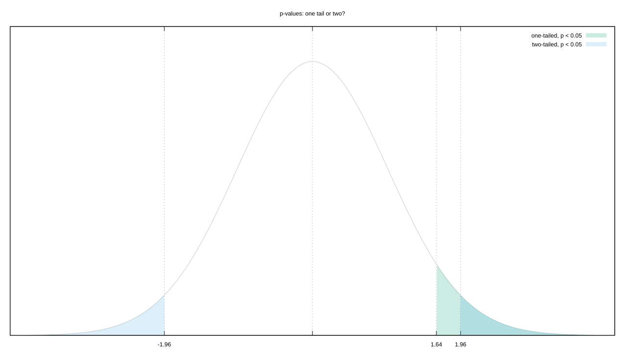
Let’s go with the most common likelihood distribution, a Gaussian. You could argue that “extreme” includes both its tails. But your observed value is almost certainly on one side of the mean. Couldn’t we also argue a test that only includes the tail on that side is more representative of “extreme?” This isn’t a trivial decision, tail choice raises or lowers the evidential bar we need to clear.
Of course, not all distributions are “normal.” Switch from a boring old 1D unimodal distribution to a 2D multimodal one, and “extreme” is a lot tougher to define.

This problem is peculiar to Fisherian frequentism. Neither Bayesian nor Neyman-Pearson statistics have anything like it.
Small sample sizes offer up another opportunity to tilt your analysis: Joseph Berkson pointed out that the limited number of possibilities can warp your rate of hitting statistical certainty. Calculating the p-value exactly makes it tougher to reach significance, using an approximation makes it easier, so you can shift your evidential boundaries even further by picking one metric over the other.
Even when a problem isn’t specific to Fisherian frequentism, it still manages to make things worse. Joseph P. Simmons et. al. published an excellent summary of how researchers can manipulate their studies. Using a combination of four methods, they could get a false positive rate of 60% from a p value of 0.05. Three of those four methods are variations on multiple comparisons, discussed already, but the fourth had to do with stopping rules.
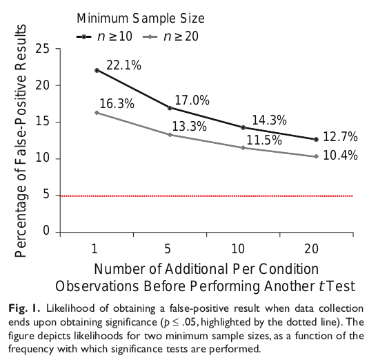
The definition of the p-value depends on your sample being representative of the whole, and that’s far more likely if you crank the sample size. If instead you start with small samples sizes and incrementally test as you add more samples, you’re much more likely to stumble on unrepresentative samples and temporarily pass statistical significance. Stop then and there, and you get a published paper and a false positive. Unfortunately, this behavior is quite common in biomedicine.
Bayesian statistics isn’t immune to this (outliers happen), but it nonetheless copes extremely well with incremental updating and small samples. The test statistic is much more sluggish to move, blunting the effects of statistical flukes.
Summaries = Good
The takeaway from all of the above:
- Don’t hide or omit failed analyses, this makes it look like the successful findings are more significant than they actually are.
- That original dataset was likely designed to plum one set of questions, so using it to answer others might be stretching it beyond what it was designed to do.
- Fisherian frequentism sucks. Bayesian statistics is usually superior, but if that’s too scary a leap then study up on Neyman-Pearson’s branch.
Respect those, and your reanalysis should be peachy keen.